🔥 Today Only: Save 30% on Premium — Offer Ends Soon! - Upgrade Now!
Line Graph

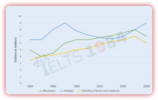
Band 5+: The graph below shows the number of overseas visitors who came to the UK for different purposes between 1989 and 2009 (in millions). Summarise the information by selecting and reporting the main features, and make comparisons where relevant.

Image for topic: The graph below shows the number of overseas visitors who came to the UK for different purposes between 1989 and 2009 (in millions). Summarise the information by selecting and reporting the main features, and make comparisons where relevant.
Our system will evaluate the answer based on this AI-generated description.
The image shows a line graph of visitors in millions categorized by purpose from 1989 to 2009. In 1989, Business visitors were 4 million, Holiday visitors 5 million, Meeting friends and relatives visitors 3 million. In 1994, Business visitors were 5 million, Holiday visitors peaked at 9 million, Meeting friends and relatives visitors were 4 million. In 1998, Business visitors were 6 million, Holiday visitors 6 million, Meeting friends and relatives visitors nearly 4 million. In 2002, Business visitors approximately 6.5 million, Holiday visitors about 7 million, Meeting friends and relatives visitors around 4 million. In 2006, Business visitors exceeded 7 million, Holiday visitors slightly below 8 million, Meeting friends and relatives visitors about 4.5 million. By 2009, Business visitors were 9 million, Holiday visitors peaked at 9 million, Meeting friends and relatives visitors about 6 million.
Given the complexity of the image, the above description may not be entirely accurate.
Note: Both the topic and the answer were created by one of our users.

The line graph illustrates the figures for foreingners choosing visit in UK with three goals such as business, holiday, meeting friends and relatives over the period from 1989 to 2009.

Overall, the data shows that all three figures, despite their differing starting points, followed a similar upward trajectory and ended higher than they began.

Between 1989 and 1994, the number of overseas visitors to holiday remained stable comparing to initial while business trended upward significant and hit the lowest point at 4 millions of visitors. After that, the amount of holidaymaker in UK experienced enormous fluctuation and increased approximately 3,5 millions in the final year. The quantity of people choosing business reached a peak before decreasing to 1 visitors in millions in 2009.

Turning to the other features, overseas people meeting friends and relatives started at a modest near by 3,5 millions , the figure surged significantly after 1989 , was 6 millions of vistors in the end of year.

Word Count: 160

Answers On The Same Topic:

The graph below shows the number of overseas visitors who came to the UK for different purposes between 1989 and 2009 (in millions). Summarise the information by selecting and reporting the main features, and make comparisons where relevant.

The line graph illustrates the data on how many foreign visitors came to the UK for different purposes during the period 1989-2009 (in millions). Overall, the number of overseas visitors to the UK showed an upward trend over the period, with holiday being the most popular purpose and meeting firends and relatives the least. The […]

The graph below shows the number of overseas visitors who came to the UK for different purposes between 1989 and 2009 (in millions). Summarise the information by selecting and reporting the main features, and make comparisons where relevant.

The line graph below illustrates the number of overseas travelers who visited the UK for business, holidays, and visiting friends and relatives from 1989 to 2009. Overall, it is clear that the number of visitors in three of these categories increased steadily during this period, although the rate and pattern of growth varied. In 1989, […]

The graph below shows the number of overseas visitors who came to the UK for different purposes between 1989 and 2009 (in millions). Summarise the information by selecting and reporting the main features, and make comparisons where relevant.

The line graph provides data on the number of overseas visitors to the US for three main purposes—holidays, business, and visiting friends or relatives—between 1989 and 2009. Overall, the number of international tourists to the US increased steadily across all three categories. Holidaymaking was consistently the most common reason for visiting, accounting for the highest […]

The graph below shows the number of overseas visitors who came to the UK for different purposes between 1989 and 2009 (in millions). Summarise the information by selecting and reporting the main features, and make comparisons where relevant.

The line graph provides information about three main purposes for which US visitors came to the US from 1989 to 2009. Overall, it is clear that there is an upward trend in the number of individuals visiting US, with the increasing figures for all three categories. In addition, people tend to travel to this country […]

The graph below shows the number of overseas visitors who came to the UK for different purposes between 1989 and 2009 (in millions). Summarise the information by selecting and reporting the main features, and make comparisons where relevant.

The line graph illustrates the figures for foreingners choosing visit in UK with three goals such as business, holiday, meeting friends and relatives over the period from 1989 to 2009. Overall, the data shows that all three figures, despite their differing starting points, followed a similar upward trajectory and ended higher than they began. Between […]

See All

Other Topics:

The line graph shows the percentage of people who used three different types of transport (car, bus, and bicycle) to travel to work in a city between 2000 and 2020.

The presented bar chart illustrates the percentage of people who used different types of transport for commuting in a city in 2000 and 2020. Looking at the overall trends, it is evident that cars were the most commonly used means of transportation in 2020, whereas bicycles were the least used in 2000. Looking more closely […]

The graph below shows the sepending on research into renewable sources of energy in four countires between 1975 and 2000.

The line graph compares the amount of money spent on research in four different nations, namely Switzerland, Denmark, Spain and the UK, over the period from 1975 to 2000. The figures are given in dollars. Overall, it can be seen that Switzerland remained the highest-spending country on research and showed an upward trend, while Denmark […]

The line graph below shows the average weekly consumption of four types of drinks in a European country between 1980 and 2020. Summarise the information by selecting and reporting the main features, and make comparisons where relevant.

The line graph illustrates the average weekly consumption of four different types of drinks namely,milk,coffee,tea,and juice in a European county from 1980 to 2020. Overall,all off thes foure different types of drinks experienced fluctuation throughout the period,where the consumption of tea and juice an upward trend.In contrast,the milk and coffee was dawnward trend in the […]

The graph below shows the consumption of fish in different kinds of meat in a European country between 1979 and 2004

The line graph illustrates the consumption of 4 types of meat per person in a European country from 1979 to 2004. Overall, chicken consumption rose considerably and became the most popular type of meat by the end of the period. In contrast, beef and lamb consumption declined substantially, while fish remained relatively stable and was […]

Task 1: The line graph below shows changes in the amount and type of fast food consumed by Australian teenagers from 1975 to 2000. Summarize the information by selecting and reporting the main features and make comparisons where relevant. Write at least 150 words.

The line graph provides information on the consumption of fast food by Australian teenagers. Overall, pizza and hamburgers consumption increased significantly over the given period, while the figure for fish and chips showed a clear downward trend. Focusing on the consumption of pizza and hamburgers, although pizza was consumed under 20 times in 1975, the […]

The graph below gives information about the percentage of the population in four Asian countries living in cities from 1970 to 2020, with predictions for 2030 and 2040.

The line graph illustrates how the population percentage changed in Philippines, Malaysia,Thailand and Indonesia from 1970 to 2040 Overall,a upward trend was observed in most categories, particularly in Malaysia and Indonesia,while the opposite was the case for Philippines and Thailand relatively stable.It is also important to note that Malaysia recorded the highest population and reach […]

See All
We have detected unusual activity on your device.
Please verify your identity to continue.
Note: This verification step won't sign you in. If you have a premium account, please log in to access the service as usual.
Google/Gmail Verification
Or verify using Email/Code
We've sent a verification code to:
youremail@gmail.com (Not your email?)
Enter it below to complete the verification process.
Ensure your email address is correct, your inbox is not full, and you check your spam folder. If no email arrives, consider using an alternative email.
You will need a Premium plan to perform your action!
Note: If you already have a premium account, please log in to access our services as usual.

Plans & Pricing

Our mission is to make quality education accessible for everyone.
However, to keep our hardworking team running and this service alive, we genuinely need your support!
By opting for a premium plan, not only do you sustain us in achieving the mission, but you also unlock advanced features to enrich your learning experience.

Free

For learners who aren't pressed for time

What's included on Free
100+ Cambridge IELTS Tests
Instant IELTS Writing Task 1 & 2 Evaluation (2 times/month)
Instant IELTS Speaking Part 1, 2, & 3 Evaluation (2 times/month)
Instant IELTS Writing Task 1 & 2 Essay Generator (2 times/month)
500+ Dictation & Shadowing Exercises
100+ Pronunciation Exercises
Flashcards
Other Advanced Tools

Premium

For those serious about advancing their English proficiency, and for IELTS candidates aspiring to boost their band score by 1-2 points (especially in writing & speaking) in just 30 days or less

What's included on Premium
Save Your IELTS Test Progress & Analyze Mistakes By Question Type
Save Your Own Flashcard Sets & Use Them On Any Device
Unlock All Courses, IELTS Tests, Section & Part Practice
Unlimited AI Conversations
Unlimited AI Writing Enhancement Exercises
Unlimited IELTS Writing Task 1 & 2 Evaluation
Unlimited IELTS Speaking Part 1, 2, & 3 Evaluation
Checked Answers Will Not Be Published
Unlimited IELTS Writing Task 1 & 2 Essay Generator
Unlimited IELTS Speaking Part 1, 2, & 3 Sample Generator
Unlimited Usage Of Advanced Tools & AI Features
Priority Support within 24h (12-month plan only)

Due to the nature of our service and the provided free trials, payments are non-refundable.