🔥 Today Only: Save 30% on Premium — Offer Ends Soon! - Upgrade Now!
Line Graph

Band 6+: The graph below shows the number of overseas visitors who came to the UK for different purposes between 1989 and 2009 (in millions). Summarise the information by selecting and reporting the main features, and make comparisons where relevant.

Image for topic: The graph below shows the number of overseas visitors who came to the UK for different purposes between 1989 and 2009 (in millions). Summarise the information by selecting and reporting the main features, and make comparisons where relevant.
Our system will evaluate the answer based on this AI-generated description.
The image shows a line graph of visitors in millions categorized by purpose from 1989 to 2009. In 1989, Business visitors were 4 million, Holiday visitors 5 million, Meeting friends and relatives visitors 3 million. In 1994, Business visitors were 5 million, Holiday visitors peaked at 9 million, Meeting friends and relatives visitors were 4 million. In 1998, Business visitors were 6 million, Holiday visitors 6 million, Meeting friends and relatives visitors nearly 4 million. In 2002, Business visitors approximately 6.5 million, Holiday visitors about 7 million, Meeting friends and relatives visitors around 4 million. In 2006, Business visitors exceeded 7 million, Holiday visitors slightly below 8 million, Meeting friends and relatives visitors about 4.5 million. By 2009, Business visitors were 9 million, Holiday visitors peaked at 9 million, Meeting friends and relatives visitors about 6 million.
Given the complexity of the image, the above description may not be entirely accurate.
Note: Both the topic and the answer were created by one of our users.

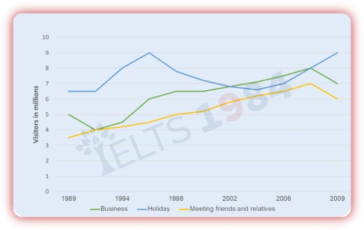
The line graph illustrates the data on how many foreign visitors came to the UK for different purposes during the period 1989-2009 (in millions).

Overall, the number of overseas visitors to the UK showed an upward trend over the period, with holiday being the most popular purpose and meeting firends and relatives the least. The largest increase occurred in business visits, while vacation-related visits experienced some fluctuations.

On one hand, holiday visitors constitute the peak between 1994 and 1998. After a small downs, holiday visitors dropped to roughly 6 million in the period 2002-2006. From there, business visitors climbed fluctuately, reaching around 8 million between 2006 and 2009. However, after that climb work-related visiting is decrease.

On the other hand, meeting friends visitors climbed sharply, reaching around 6.5 million between 2006 and 2009. Moreover, meeting friends and relatives has a downward trends. In summary, visitors who came different reasons at the UK are generally downward trend. In addition to this vacation-related visiting is increasing.

Word Count: 164

Answers On The Same Topic:

The graph below shows the number of overseas visitors who came to the UK for different purposes between 1989 and 2009 (in millions). Summarise the information by selecting and reporting the main features, and make comparisons where relevant.

The line graph below illustrates the number of overseas travelers who visited the UK for business, holidays, and visiting friends and relatives from 1989 to 2009. Overall, it is clear that the number of visitors in three of these categories increased steadily during this period, although the rate and pattern of growth varied. In 1989, […]

The graph below shows the number of overseas visitors who came to the UK for different purposes between 1989 and 2009 (in millions). Summarise the information by selecting and reporting the main features, and make comparisons where relevant.

The line graph provides data on the number of overseas visitors to the US for three main purposes—holidays, business, and visiting friends or relatives—between 1989 and 2009. Overall, the number of international tourists to the US increased steadily across all three categories. Holidaymaking was consistently the most common reason for visiting, accounting for the highest […]

The graph below shows the number of overseas visitors who came to the UK for different purposes between 1989 and 2009 (in millions). Summarise the information by selecting and reporting the main features, and make comparisons where relevant.

The line graph provides information about three main purposes for which US visitors came to the US from 1989 to 2009. Overall, it is clear that there is an upward trend in the number of individuals visiting US, with the increasing figures for all three categories. In addition, people tend to travel to this country […]

The graph below shows the number of overseas visitors who came to the UK for different purposes between 1989 and 2009 (in millions). Summarise the information by selecting and reporting the main features, and make comparisons where relevant.

The line graph illustrates the figures for foreingners choosing visit in UK with three goals such as business, holiday, meeting friends and relatives over the period from 1989 to 2009. Overall, the data shows that all three figures, despite their differing starting points, followed a similar upward trajectory and ended higher than they began. Between […]

See All

Other Topics:

The chart below shows the percentage of Australian people who were born in different places of the world.

Tha graph illustrate the data about percentage of Australian flok where were born in different areas of the world in the given period which is from 1976 to 2011 Overall, there are four places where Australians were born, which is uk, asia, total amount of borns and other areas. There are three places in the […]

The line graph below shows the number of overseas tourists (in millions) who visited France, Spain, and Japan between 1990 and 2020. Summarise the information by selecting and reporting the main features, and make comparisons where relevant.

The provided line graph illustrates the total number of tourists exploring three different foreign countries over the period of 30 years, from 1990 to 2020. Overall, the number of visitors in Spain and France surged significantly, whereas Japan increased slightly until 2000 and then declined throughout the period. Furthermore, France remained the dominant destination over […]

The graph below shows the percentage of people who accessed news in the USA between 2012 and 2015.

The line graph illustrates the percentage of people in the USA who accessed news through four types of media, namely websites, TV, print newspapers and social media, between 2012 and 2015. Overall, online news had the highest percentage throughout the period, while TV news remained relatively stable. By contrast, print news declined significantly, whereas social […]

The chart below shows the number of four different species of fish between 1982 and 2007. Summarize the information by selecting and reporting the main features, and make comparisons where relevant.

The line graph illustates four different types of fishes from 1982 to 2007. In general, while the figure for Atlantic Cod and Yellow fin Tuna showed great competition, others two did not demonstrated changes. Focusing first on bigger numbers, the number of Atlantic Cod was around 2,25,000 in 1982, and this was followed by considerable […]

The graph below gives information about the percentage of people living in Australia who were born in Asia, the UK, and other regions.

This graph shows description about The proportion of citizen living in Australia who were born and growth in Asia, UK & other regions. As we can see, Asian in Australia has been increased significantly from 1976 until 2011. The increase reached 15 percent in 2011. Data reveals a high interest among the Asian population in […]

the line graph shows the percentage of people who used five different communication methods between 1998 and 2008.

The line graph delineates the proportions of individuals utilizing five distinct communication methods over a decade, from 1998 to 2008. In summary, while all communication methods, barring landline services, experienced a notable increase in usage, cellular phone services emerged as the predominant choice by the end of the period. In 1998, the proportion of individuals […]

See All
We have detected unusual activity on your device.
Please verify your identity to continue.
Note: This verification step won't sign you in. If you have a premium account, please log in to access the service as usual.
Google/Gmail Verification
Or verify using Email/Code
We've sent a verification code to:
youremail@gmail.com (Not your email?)
Enter it below to complete the verification process.
Ensure your email address is correct, your inbox is not full, and you check your spam folder. If no email arrives, consider using an alternative email.
You will need a Premium plan to perform your action!
Note: If you already have a premium account, please log in to access our services as usual.

Plans & Pricing

Our mission is to make quality education accessible for everyone.
However, to keep our hardworking team running and this service alive, we genuinely need your support!
By opting for a premium plan, not only do you sustain us in achieving the mission, but you also unlock advanced features to enrich your learning experience.

Free

For learners who aren't pressed for time

What's included on Free
100+ Cambridge IELTS Tests
Instant IELTS Writing Task 1 & 2 Evaluation (2 times/month)
Instant IELTS Speaking Part 1, 2, & 3 Evaluation (5 times/month)
Instant IELTS Writing Task 1 & 2 Essay Generator (2 times/month)
500+ Dictation & Shadowing Exercises
100+ Pronunciation Exercises
Flashcards
Other Advanced Tools

Premium

For those serious about advancing their English proficiency, and for IELTS candidates aspiring to boost their band score by 1-2 points (especially in writing & speaking) in just 30 days or less

What's included on Premium
Save Your IELTS Test Progress
Unlock All Courses & IELTS Tests
Unlimited AI Conversations
Unlimited AI Writing Enhancement Exercises
Unlimited IELTS Writing Task 1 & 2 Evaluation
Unlimited IELTS Speaking Part 1, 2, & 3 Evaluation
Checked Answers Will Not Be Published
Unlimited IELTS Writing Task 1 & 2 Essay Generator
Unlimited IELTS Speaking Part 1, 2, & 3 Sample Generator
Unlimited Usage Of Advanced Tools
Priority Support within 24h (12-month plan only)

Due to the nature of our service and the provided free trials, payments are non-refundable.
Nếu bạn là người Việt Nam và không có hoặc không muốn trả bằng credit/debit cards, bạn có thể thanh toán bằng phương thức chuyển khoản:


Chọn gói:
419,000₫ 277,000 ₫ cho gói 1 tháng (chỉ 9,233₫/ngày)
1,239,000₫ 597,000 ₫ cho gói 3 tháng (chỉ 6,633₫/ngày)
2,469,000₫ 1,027,000 ₫ cho gói 6 tháng (chỉ 5,706₫/ngày)
4,929,000₫ 1,417,000 ₫ cho gói 12 tháng (chỉ 3,936₫/ngày)


Sau khi chuyển khoản, vui lòng đợi trình duyệt tự động điều hướng bạn trở lại Engnovate và bạn sẽ ngay lập tức nhận được mã kích hoạt tài khoản premium.
Nếu có lỗi xảy ra, bạn có thể liên hệ với team thông qua một trong các phương thức: email đến helloengnovate@gmail.com hoặc nhắn tin qua facebook.com/engnovate.
Vì toàn bộ công cụ trên website đều có thể sử dụng thử miễn phí, Engnovate không hỗ trợ hoàn tiền.