🔥 Today Only: Save 30% on Premium — Offer Ends Soon! - Upgrade Now!
Line Graph

Band 7+: The graph below shows the percentage of adults in the UK who used various communication methods on a daily basis from 2005 to 2023. Summarise the information by selecting and reporting the main features and make comparisons where relevant.

Image for topic: The graph below shows the percentage of adults in the UK who used various communication methods on a daily basis from 2005 to 2023. Summarise the information by selecting and reporting the main features and make comparisons where relevant.
Our system will evaluate the answer based on this AI-generated description.
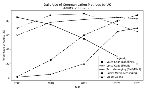
The image shows a line graph titled "Daily Use of Communication Methods by UK Adults, 2005-2023". The vertical axis is labeled "Percentage of Adults (%)" with grid intervals at 0, 20, 40, 60, and 80. The horizontal axis is labeled "Year" with points at 2005, 2010, 2015, 2020, and 2023. The legend includes five categories: "Voice Calls (Landline)" represented by a solid line with square markers, "Voice Calls (Mobile)" represented by a dashed line with x-markers, "Text Messaging (SMS/MMS)" represented by a dotted line with star markers, "Social Media Messaging" represented by a dash-dotted line with circle markers, and "Video Calling" represented by a dashed line with triangle markers. The recorded percentage data for each category across the years 2005, 2010, 2015, 2020, and 2023 are: Voice Calls (Landline): 85% in 2005, 75% in 2010, 55% in 2015, 30% in 2020, and 20% in 2023; Voice Calls (Mobile): 60% in 2005, 78% in 2010, 82% in 2015, 85% in 2020, and 83% in 2023; Text Messaging (SMS/MMS): 70% in 2005, 88% in 2010, 90% in 2015, 75% in 2020, and 65% in 2023; Social Media Messaging: 2% in 2005, 25% in 2010, 60% in 2015, 80% in 2020, and 88% in 2023; Video Calling: 1% in 2005, 5% in 2010, 20% in 2015, 65% in 2020, and 70% in 2023.
Given the complexity of the image, the above description may not be entirely accurate.
Note: Both the topic and the answer were created by one of our users.

The graphic illustrates the proportions of adults in Uk who utilized different methods of communication on daily basis between 2005 and 2023.

Overall, the the use of landlines significantly declined over the period, while social media texting increased tremendously.

In 2005, adults using landline voice calls was notably the highest at over 80%. The proportions then declined steadily to become the lowest by 2023 with less than 20% recorded users. Text messaging initially showed an increament from about 70% in 2005 to about 90% by 2010. This was followed by a five year plateau before plunging to about 60% by the end of the period.

On the other hand, Social media messaging had a totally different pattern. At first, no adults using it. However, it’s use immediately began to grow dramatically reaching a peak of 90% by 2023, surpassing all the others by the end of the 18 years. Similarly video calling rose from the initial 0% to more than 60% in 2023. The use of mobile voice calls remained consistent with recorded users ranging between 60% and 80% throughout.

Word Count: 180

Answers On The Same Topic:

The graph below shows the percentage of adults in the UK who used various communication methods on a daily basis from 2005 to 2023. Summarise the information by selecting and reporting the main features and make comparisons where relevant.

The line graph gives information about the proportion of daily use communication methods by the UK adults , between the years 2005 and 2023. Overall, it is clear that voice calls by landline became the most unpapuler method, while text messages stayed at the same level. Meanwhile, the other three methods became more used over […]

The graph below shows the percentage of adults in the UK who used various communication methods on a daily basis from 2005 to 2023. Summarise the information by selecting and reporting the main features and make comparisons where relevant.

The given line graph illustrates the proportion of UK adults who used five different communication methods- land line calls, mobile calls, text messsaging, social media messaging and video calling on a daily basis between 2005 and 2023. Overall,the largest percentage of adults in the UK used text messaging as a primary method of communication from […]

The graph below shows the percentage of adults in the UK who used various communication methods on a daily basis from 2005 to 2023. Summarise the information by selecting and reporting the main features and make comparisons where relevant.

The given line graph compares the proportion of adults in the UK who used different communication methods on a daily basis between 2005 and 2023 Overall, it is evident that voice calls (landline), voice calls (mobile) and text messaging were the most used methods of communication in 2005, while social media messaging and video calling […]

The graph below shows the percentage of adults in the UK who used various communication methods on a daily basis from 2005 to 2023. Summarise the information by selecting and reporting the main features and make comparisons where relevant.

The line graph gives information about the proportion of the British using five different ways of communication on a daily basis between 2005 and 2023. Overall, the usage of landlines and social media messaging fell during the time given. while digital communication methods experienced upwards trends. Social media messaging and video calling became the most […]

The graph below shows the percentage of adults in the UK who used various communication methods on a daily basis from 2005 to 2023. Summarise the information by selecting and reporting the main features and make comparisons where relevant.

The given chart gives information about preferences of grown-up individuals in daily used communication methods in the United Kingdom over a twenty-year period. Overall, it is clear that some of the categories raised popularity over two decades, such as Video Calling, Social Media Messaging, and Mobile Voice Calls . While other two options-Text Messaging and […]

See All

Other Topics:

The graph below shows the number of cell phone subscribers in a particular city; by gender. Summarize the information by selecting and reporting the main features1 and make comparisons where relevant.

The line graph depicts information about how many mobile phone users newly subscribed in Marysville city between 1995 and 2015, catagorised by gender. Overall, it is clear that there was an upward trend in mobile phone subscribing for both men and women throughout the period, but at certain point, the figure for men overtook women […]

The figure shows demographic trends in Scotland. Summarise the information by selecting and reporting the main feature.

The line chart illustrates the rate of birth, death, and population growth in Scotland from 1940 to 2020. Overall the population growth rate was correlated with the birth rate. Despite fluctuating, the percentage of birth and population growth generally decreased, while death rate remained stable in most of the time. The birth and population growth […]

The line graph below illustrates the proportion of electricity generated from renewable sources in five different countries (USA, Germany, China, Brazil, and India) between 2000 and 2020. Summarize the information by selecting and reporting the main features, and make comparisons where relevant.

The line graph highlights the volume of electricity in percentage , generating from renewable sources across five countries over 20 years of period from 2000 to 2020. Overall, it is immediately apparent that Brazil recorded the highest proportion of electricity generation while USA accounted for the lowest proportion until the end. Additionally, all the countries […]

The line graph illustrates the number of magazine sales by a publisher in 4 European contries betwenn 1999 and 2002.

The line graph clearly and very simply shows the sales of magazine by a publisher in four different European countries very clearly between 1999 and 2002. Overall, sales in France and Belgium went up over the period, while sales in Germany went down. In addition, Belgium experienced the most big growth of all the nations. […]

The graph below shows the number of students enrolled in two different schools. Summarize the information by selecting and reporting the main features, and make comparisons where relevant.

The graph below shows how the number of students enrolling the Litchfield School and the Riverside School changed in 3 years. Overall, the number of the Litchfield students experienced a significant increase, and the figure for the Riverside saw a gradual but contious drop. Statistics for the Litchfield school climbed progessively over the period, the […]

the graph shows comparison of the number of jobs in three different industries in the United States

The graph illustrates the number of jobs in three different indstrues in the United States. Overall, all three industries developed in different ways, but all of them changed a lot in 1980. In particular, the services raised the most. From 1975 to 1979 it showed small growth from 10 to roughly 17, but after 1979 […]

See All
We have detected unusual activity on your device.
Please verify your identity to continue.
Note: This verification step won't sign you in. If you have a premium account, please log in to access the service as usual.
Google/Gmail Verification
Or verify using Email/Code
We've sent a verification code to:
youremail@gmail.com (Not your email?)
Enter it below to complete the verification process.
Ensure your email address is correct, your inbox is not full, and you check your spam folder. If no email arrives, consider using an alternative email.
You will need a Premium plan to perform your action!
Note: If you already have a premium account, please log in to access our services as usual.

Plans & Pricing

Our mission is to make quality education accessible for everyone.
However, to keep our hardworking team running and this service alive, we genuinely need your support!
By opting for a premium plan, not only do you sustain us in achieving the mission, but you also unlock advanced features to enrich your learning experience.

Free

For learners who aren't pressed for time

What's included on Free
100+ Cambridge IELTS Tests
Instant IELTS Writing Task 1 & 2 Evaluation (2 times/month)
Instant IELTS Speaking Part 1, 2, & 3 Evaluation (2 times/month)
Instant IELTS Writing Task 1 & 2 Essay Generator (2 times/month)
500+ Dictation & Shadowing Exercises
100+ Pronunciation Exercises
Flashcards
Other Advanced Tools

Premium

For those serious about advancing their English proficiency, and for IELTS candidates aspiring to boost their band score by 1-2 points (especially in writing & speaking) in just 30 days or less

What's included on Premium
Save Your IELTS Test Progress & Analyze Mistakes By Question Type
Save Your Own Flashcard Sets & Use Them On Any Device
Unlock All Courses, IELTS Tests, Section & Part Practice
Unlimited AI Conversations
Unlimited AI Writing Enhancement Exercises
Unlimited IELTS Writing Task 1 & 2 Evaluation
Unlimited IELTS Speaking Part 1, 2, & 3 Evaluation
Checked Answers Will Not Be Published
Unlimited IELTS Writing Task 1 & 2 Essay Generator
Unlimited IELTS Speaking Part 1, 2, & 3 Sample Generator
Unlimited Usage Of Advanced Tools & AI Features
Priority Support within 24h (12-month plan only)

Due to the nature of our service and the provided free trials, payments are non-refundable.