🔥 Today Only: Save 30% on Premium — Offer Ends Soon! - Upgrade Now!
Line Graph

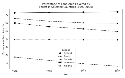
Band 5+: The graph below shows the percentage of total land area covered by forest in five different countries between 1990 and 2020. Summarise the information by selecting and reporting the main features and make comparisons where relevant.

Image for topic: The graph below shows the percentage of total land area covered by forest in five different countries between 1990 and 2020. Summarise the information by selecting and reporting the main features and make comparisons where relevant.
Our system will evaluate the answer based on this AI-generated description.
The image features a line graph titled "Percentage of Land Area Covered by Forest in Selected Countries (1990-2020)". The vertical axis is labeled "Percentage of Land Area (%)" with scale values ranging from 10 to 70 in increments of 10. The horizontal axis is labeled "Year" with points at 1990, 2000, 2010, and 2020. A box labeled "Legend" specifies five categories: Finland (solid line, diamond markers) showing ~72% (1990), ~73% (2000), ~73% (2010), and ~73.5% (2020); Brazil (dashed line, star markers) showing ~65.4% (1990), ~62% (2000), ~60% (2010), and ~59.5% (2020); Indonesia (dash-dotted line, square markers) showing ~59.7% (1990), ~55.2% (2000), ~52.4% (2010), and ~49.1% (2020); Canada (dotted line, upside-down triangle markers) showing ~38.8% across all four years (1990, 2000, 2010, 2020); and Nigeria (dashed line, x markers) showing ~17.2% (1990), ~13.1% (2000), ~9.1% (2010), and ~6.0% (2020).
Given the complexity of the image, the above description may not be entirely accurate.
Note: Both the topic and the answer were created by one of our users.

The line graph illustrates the percentage of the overall area covered by forest in five countirs which are Finland ,Brazil,Canada,Indonesia ana Nigeria between the years 1990 and 2020.

Overall,Finland and Canada shows a constantbrate of ares coverd by forest during the mentioned period.Whereas Brazil,Indonesia and

nogeria shows and gradual decrease during the years.

In detail,during the period 1990 to 2020 Finland had above 70% and Canada had below 40% which remained constant with no much changes in the area covered by forest .Whereas, in 1990 Nigeria had below 20% land coverd in forest which gradually decreased below 10% by 2020.

Moving onto further details,Brazil and Indonesia had above 60% pf lamd covered in forest during 1990 which later gradully falls to 60% for brazil and 50% in the case of Indonesia by 2020.

Word Count: 133

Answers On The Same Topic:

The graph below shows the percentage of total land area covered by forest in five different countries between 1990 and 2020. Summarise the information by selecting and reporting the main features and make comparisons where relevant.

The line graph illustrates information about the proportion of total area of land covered by forest in five countries (Finland, Brazil, Canada, Indonesia, and Nigeria) from 1990 to 2020. The units are given as percentages. Overall, the figures for Brazil, Indonesia, and Nigeria experienced a gradual decline over the period, while for Finland, it increased […]

The graph below shows the percentage of total land area covered by forest in five different countries between 1990 and 2020. Summarise the information by selecting and reporting the main features and make comparisons where relevant.

The given line graph illustrates a proportion of the forest had covered the total land area in five countries (Finland, Brazil, Canada, Indonesia and Nigeria) from 1990 to 2020. Overall, Finlands’ land area became more covered in forest, while three countries became less covered in forest (Brazil, Indonesia and Nigeria. Most notably, Canadas’ land area […]

The graph below shows the percentage of total land area covered by forest in five different countries between 1990 and 2020. Summarise the information by selecting and reporting the main features and make comparisons where relevant.

The graph represents the proportion of areas covered by forest in five certain countries between 1990 and 2020. Overall, the proprotion of lands remained relatively stable in Finland and Canada during the years, while Brazil and Indonesia percentage flactuated slightly. Proportion of covered areas in Nigeria declined significantly from 1990 and reached a minimum in […]

The graph below shows the percentage of total land area covered by forest in five different countries between 1990 and 2020. Summarise the information by selecting and reporting the main features and make comparisons where relevant.

The line graph illustrates the proportion of total surface area covered by forest in five nations from 1990 to 2020. Overall, most countries experienced a downward trend while Canada and Finland remained unchanged. The percentage of land area covered in forest significantly decreased in Nigeria, Indonesia and Brazil. In 1990, nigerian land had almost 20% […]

The graph below shows the percentage of total land area covered by forest in five different countries between 1990 and 2020. Summarise the information by selecting and reporting the main features and make comparisons where relevant.

The line graph illustrates the percentage of the overall area covered by forest in five countries, which are Finland, Brazil, Canada, Indonesia, and Nigeria between the years 1990 and 2020. Overall,Finland and Canada show a constant rate of area covered by forest during the mentioned period, whereas Brazil,Indonesia and Nigeria show a gradual decrease during […]

See All

Other Topics:

The graph below gives information about car ownership in one European country from 1975 to 2005.

The line graph illustrates the percentage of households owning zero, one, two and three between 1975 to 2005. Overall, the proportion of households owning two cars and three cars increased between 1975 and 2005. while the percentage of those without a car decreased. The figure for one-car households fluctuated but ended close to its initial […]

the graph below shows the number of shops that closed and the number of new shops that opened in one country between 2011 and 2018.

The line graph illustrates the number of retail shop closures and new shop openings in a specific nation over an eight-year period from 2011 to 2018. Overall, both metrics experienced downward trajectories over the timeframe, with new shop openings witnessing the most substantial net decrease. Additionally, while the number of newly opened shops initially outnumbered […]

The graph below shows the changes in the birth rates for women in 6 different age groups in the UK from 1973 to 2008.

The line graph illustrated the changes of birth rate for women of 6 different ages in the UK from 1973 to 2008. Overall, women from 25-29 had the highest birth rates whereas 40 and over had the lowest birth rates. For women ranging from 25-29, they had the peak of the birth rate at 1973 […]

The line graph shows the average temperature during the hottest part of the day in Australia in 2 Summarize the information by selecting and reporting the main features and make comparisons relevant.

The line graph illustrates the average peak temperature in Adelaide, Cairns, Darwis, Perth, and Sydney in 2007, temperature measured in degree celsius. Overall, it can be clearly seen that Darwin recorded the highest temperature througout the year, while Sydney which was intially second became the lowest city in terms of temperature by the end of […]

The line graph below shows the number of tourists visiting three different museums (Museum A, Museum B, and Museum C) in a city from 2010 to 2020.

The provided line graph illustrates the number of tourists that visited three different museums from 2010 to 2020. Overall, what stands out is that albeit to varying degrees and fluctuation, all the museums experienced a rise in the number of visitors throughout the given period. It is also noteworthy that museum A dominated the chart […]

The graph shows the quantities of goods transported in the uk between 1974 and 2002 by four different modes of transport

The following picture illustrates the amount of laguagge transfered in the UK Road, Water, Rail, Pipeline from 1974 to 2002 by four differents methods of transfered. Pipline had been starting five million tonnes since 1974, while Road had started point seventy million tonnes. pipline had been ending tewenty since 2002, other hand road had ended […]

See All
We have detected unusual activity on your device.
Please verify your identity to continue.
Note: This verification step won't sign you in. If you have a premium account, please log in to access the service as usual.
Google/Gmail Verification
Or verify using Email/Code
We've sent a verification code to:
youremail@gmail.com (Not your email?)
Enter it below to complete the verification process.
Ensure your email address is correct, your inbox is not full, and you check your spam folder. If no email arrives, consider using an alternative email.
You will need a Premium plan to perform your action!
Note: If you already have a premium account, please log in to access our services as usual.

Plans & Pricing

Our mission is to make quality education accessible for everyone.
However, to keep our hardworking team running and this service alive, we genuinely need your support!
By opting for a premium plan, not only do you sustain us in achieving the mission, but you also unlock advanced features to enrich your learning experience.

Free

For learners who aren't pressed for time

What's included on Free
100+ Cambridge IELTS Tests
Instant IELTS Writing Task 1 & 2 Evaluation (2 times/month)
Instant IELTS Speaking Part 1, 2, & 3 Evaluation (2 times/month)
Instant IELTS Writing Task 1 & 2 Essay Generator (2 times/month)
500+ Dictation & Shadowing Exercises
100+ Pronunciation Exercises
Flashcards
Other Advanced Tools

Premium

For those serious about advancing their English proficiency, and for IELTS candidates aspiring to boost their band score by 1-2 points (especially in writing & speaking) in just 30 days or less

What's included on Premium
Save Your IELTS Test Progress & Analyze Mistakes By Question Type
Save Your Own Flashcard Sets & Use Them On Any Device
Unlock All Courses, IELTS Tests, Section & Part Practice
Unlimited AI Conversations
Unlimited AI Writing Enhancement Exercises
Unlimited IELTS Writing Task 1 & 2 Evaluation
Unlimited IELTS Speaking Part 1, 2, & 3 Evaluation
Checked Answers Will Not Be Published
Unlimited IELTS Writing Task 1 & 2 Essay Generator
Unlimited IELTS Speaking Part 1, 2, & 3 Sample Generator
Unlimited Usage Of Advanced Tools & AI Features
Priority Support within 24h (12-month plan only)

Due to the nature of our service and the provided free trials, payments are non-refundable.