Our system will evaluate the answer based on this AI-generated description.
The image depicts a line graph of dollars per person spent on Research into Renewable Energy from 1975 to 2000 for 4 countries: Switzerland, Denmark, Spain, and the UK. Data points for Switzerland show a gradual increase from around $1 in 1975, nearing $2 in 1980, surpassing $3 in 1985, reaching approximately $4 in 1990, approximately $5 in 1995, and just below $6 in 2000. Denmark's data illustrate a similar upward trend, starting just above $1 in 1975, approximately $2 in 1980, over $3 in 1985, nearing $4 in 1990, just below $5 in 1995, and reaching $6 in 2000. Spain shows a slower rise, beginning below $1 in 1975, slightly increasing in 1980, nearing $1 in 1985, reaching $2 in 1990, nearly $3 in 1995, and barely crossing $3 in 2000. The UK's data points display a steady increment, just below $1 in 1975, over $1 in 1980, almost at $2 in 1985, above $2 in 1990, nearing $3 in 1995, and touching $4 in 2000. All four countries exhibit growth in spending, with Denmark and Switzerland showing the highest expenditure per person and Spain the lowest by 2000.
Given the complexity of the image, the above description may not be entirely accurate.
Skyrocket your IELTS band score by 1-2 points in under a month with our premium plan!
Note: Both the topic and the answer were created by one of our users.
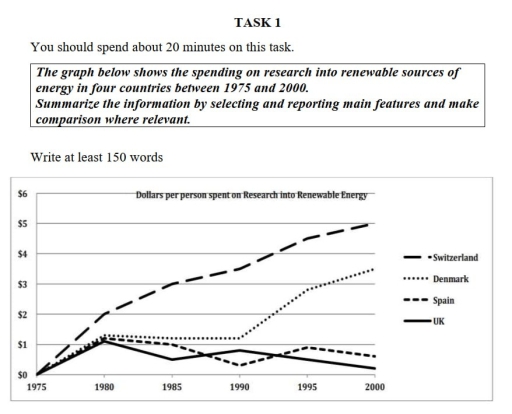
The given graph depicts information about the amount of money being spent on renewable energy resources in four different European countries from 1975 to 2000
To begin with, research done on utilizing renewable resources in the country of Switzerland cost none in 1975, but this amount grew gradually to 2 dollars after five years. then, a decade later ( 1990) the amount ratio using these resources rose significantly to 4 dollars. The number did not stop there and continued growing and reaching its highest peak by 2000. Meanwhile, the same resources used by Denmark were initially zero dollars in the first year, after a while it increased steadily and after which it remained constant for a decade from 1980 to 1990. Next, the spending reached its highest point of almost 4 dollars in the final year
furthermore, the UK and Spain showed almost the same behaviour. for the UK, it showed the zig-zag pattern from 1975 to 2000, the amount used by uk is nearly equal to 1 dollar. while Spain surged to a dollar in 1980, then it dropped to its lowest point in 1990 then after a small rise it decreased gradually in the final year
Overall, it is vividly manifested that both the countries Switzerland and Denmark spend a large sum of money and show an upward trend, whilst the remaining countries UK and Spain show a decling trend
Word Count: 232
