🔥 Today Only: Save 30% on Premium — Offer Ends Soon! - Upgrade Now!
Line Graph

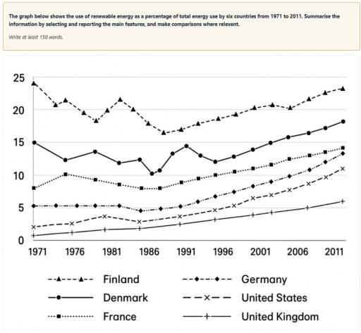
Band 5+: The graph below shows the use of renewable energy as a percentage of total energy use by six countries from 1971 to 2011. Summarise the information by selecting and reporting the main features, and make comparisons where relevant.

Image for topic: The graph below shows the use of renewable energy as a percentage of total energy use by six countries from 1971 to 2011. Summarise the information by selecting and reporting the main features, and make comparisons where relevant.
Our system will evaluate the answer based on this AI-generated description.
The image features a line graph with the vertical axis displaying values from 0 to 25 in increments of 5, and the horizontal axis showing years from 1971 to 2011 in 5-year intervals (1971, 1976, 1981, 1986, 1991, 1996, 2001, 2006, 2011). The legend lists six countries: Finland (dashed line with triangles), Denmark (solid line with filled circles), France (dotted line with squares), Germany (dash-dotted line with diamonds), United States (dashed line with crosses), and United Kingdom (solid line with plus signs). Approximate data points per country across the years are: Finland: 1971: ~24.1, 1973: ~20.8, 1975: ~21.5, 1978: ~19.5, 1980: ~18.3, 1981: ~20.0, 1982: ~21.7, 1984: ~20.1, 1986: ~17.9, 1988: ~16.5, 1990: ~17.0, 1992: ~17.9, 1995: ~18.7, 1997: ~19.3, 2000: ~20.3, 2002: ~20.8, 2005: ~20.4, 2007: ~21.7, 2009: ~22.6, 2011: ~23.2; Denmark: 1971: ~15.0, 1975: ~12.3, 1980: ~13.5, 1982: ~11.9, 1985: ~12.4, 1986: ~10.3, 1987: ~10.7, 1989: ~13.3, 1991: ~14.4, 1993: ~13.0, 1996: ~12.1, 1998: ~12.8, 2000: ~13.9, 2002: ~14.9, 2005: ~15.8, 2007: ~16.4, 2009: ~17.2, 2011: ~18.2; France: 1971: ~8.0, 1975: ~10.1, 1980: ~9.3, 1982: ~8.6, 1985: ~8.0, 1987: ~8.0, 1990: ~8.9, 1993: ~9.5, 1996: ~10.0, 1998: ~10.5, 2000: ~11.0, 2002: ~11.6, 2005: ~12.5, 2007: ~13.0, 2009: ~13.5, 2011: ~14.1; Germany: 1971: ~5.2, 1974: ~5.3, 1976: ~5.2, 1980: ~5.2, 1982: ~5.2, 1985: ~4.5, 1987: ~4.8, 1990: ~5.1, 1993: ~5.9, 1996: ~6.7, 1998: ~7.4, 2000: ~8.3, 2002: ~9.0, 2005: ~9.8, 2007: ~10.8, 2009: ~12.0, 2011: ~13.3; United States: 1971: ~2.0, 1975: ~2.5, 1980: ~3.6, 1985: ~2.8, 1990: ~3.6, 1996: ~4.6, 1998: ~5.3, 2000: ~6.4, 2002: ~7.0, 2005: ~7.7, 2007: ~8.6, 2009: ~9.6, 2011: ~11.0; United Kingdom: 1971: ~0.7, 1975: ~1.2, 1980: ~1.7, 1985: ~1.9, 1990: ~2.4, 1996: ~3.2, 2000: ~3.8, 2002: ~4.2, 2007: ~4.9, 2011: ~5.9.
Given the complexity of the image, the above description may not be entirely accurate.
Note: Both the topic and the answer were created by one of our users.

The line graph below illustrtates what proportion of total energy usage can be recycled by six countries in forty years period starting from 1971 to 2011.

Overall, in some countries-Finland and Denmark-percentage of renewable energy started from decreasing, but in other counties-France, Germany, United States, and United Kingdom it either started from increasing or stood steady. However, all six countries’ percentages of recycled energy from particular time periods only boosted.

In these shown years, countries such as United Kingdom, United States, and Germany used their renewable energy more and more, as can be seen from graph. In 1971, their’s percentages were between 1.5% and 5%, but in the following years they increased usage of this. For example in 1996, they were between 3.5% and 7%. Over the years, in these countries usage of recycled energy increased dramatically. For instance in 2011, their’s proportions were between 6% and 13.5%.

On the other hand, countries like Finland, Denmark, and France at first used renewable energy mainly, but for years their usage percentage fluctuated. Looking at the graph, in 1971 their usage percentage was high only in one country-France at 8%, Denmark at 15, and Finland at 24%. In contrast, in 2011 Finland’s usage dropped to 23%, but Denmark’s and France’s usage boomed to 18% and 14%.

Word Count: 214

Other Topics:

The graph shows how much money was spent on foreign investment in real estate for four Asian countries from 2014 to 2024.

The presented line graph depicts the amount of currency in real estate for China, Singapore , Korea and Japan was being spent on foreign investment. Time between 2014 and 2024 A glance at the graph reveals that Japan reached its highest peak on investigation in foreign real estate in 2024, while China dropped to its […]

The line graph below shows the percentage of households in Singapore owned in four different consumer items (computer, car, air conditioning, washing machine) between 1973 and 2008.

The line graph demonstrates the proportion of households with electronic devices( air conditioning, washing machine, car, computer) in Singapore, from 1973 to 2008. Overall, it is apparent that all four devices experienced an increase throughout the period. In addition, the washing machine and car recorded the highest percentage, whereas the air conditioning depicted a moderate […]

The graph shows how much money was spent on foreign investment in real estate for four Asian countries from 2014 to 2024.

The supplied diagram illustrates data on financial expenditure on investing in overseas properties for four countries in Asia between 2014 and 2024. It is evident that Japan held the top expense whereas China dropped to the pit throughout the period. As for the remainders, Korea and Singapore experienced different levels of rises and falls similarly. […]

The graph shows how much money was spent on foreign investment in real estate for four Asian countries from 2014 to 2024.

The supplied diagram illustrates data on financial expenditure on investing oversea properties for four countries in Asia between 2014 and 2024. It is evident that Japan held the top expense whereas China dropped to the pit throughout the period. As for the remainders, Korea and Singapore experienced different levels of rise and falls similarly. During […]

the graph below gives information on the number of participants for different activities at one social centre in melbourne,Australia for the perio 2000 to 2020

The graph illustrates the number of people who participated in variety of activities at specific public centre in Melbourne, Austalia from 2000 to 2020. Overall, the total of individuals who have visited the musical performance and table tennis increased, while the participation of amateur dramatics decreased throughout the entire period. The number of visitors of […]

the line graph shows the average cost of monthly contract of four different cellular companies in one european country from january to september in 2012 measured in euros.

The line graph illustrates the average cost of monthly contract of four different cellular companies in a particular country of Europe from january to september in 2012 measured in euros. Overall, the data of all four companies fluctuated, while domo cost was the highest and Alpha cost was the lowest, but later it gradually increased. […]

See All
We have detected unusual activity on your device.
Please verify your identity to continue.
Note: This verification step won't sign you in. If you have a premium account, please log in to access the service as usual.
Google/Gmail Verification
Or verify using Email/Code
We've sent a verification code to:
youremail@gmail.com (Not your email?)
Enter it below to complete the verification process.
Ensure your email address is correct, your inbox is not full, and you check your spam folder. If no email arrives, consider using an alternative email.
You will need a Premium plan to perform your action!
Note: If you already have a premium account, please log in to access our services as usual.

Plans & Pricing

Our mission is to make quality education accessible for everyone.
However, to keep our hardworking team running and this service alive, we genuinely need your support!
By opting for a premium plan, not only do you sustain us in achieving the mission, but you also unlock advanced features to enrich your learning experience.

Free

For learners who aren't pressed for time

What's included on Free
100+ Cambridge IELTS Tests
Instant IELTS Writing Task 1 & 2 Evaluation (2 times/month)
Instant IELTS Speaking Part 1, 2, & 3 Evaluation (2 times/month)
Instant IELTS Writing Task 1 & 2 Essay Generator (2 times/month)
500+ Dictation & Shadowing Exercises
100+ Pronunciation Exercises
Flashcards
Other Advanced Tools

Premium

For those serious about advancing their English proficiency, and for IELTS candidates aspiring to boost their band score by 1-2 points (especially in writing & speaking) in just 30 days or less

What's included on Premium
Save Your IELTS Test Progress & Analyze Mistakes By Question Type
Save Your Own Flashcard Sets & Use Them On Any Device
Unlock All Courses, IELTS Tests, Section & Part Practice
Unlimited AI Conversations
Unlimited AI Writing Enhancement Exercises
Unlimited IELTS Writing Task 1 & 2 Evaluation
Unlimited IELTS Speaking Part 1, 2, & 3 Evaluation
Checked Answers Will Not Be Published
Unlimited IELTS Writing Task 1 & 2 Essay Generator
Unlimited IELTS Speaking Part 1, 2, & 3 Sample Generator
Unlimited Usage Of Advanced Tools & AI Features
Priority Support within 24h (12-month plan only)

Due to the nature of our service and the provided free trials, payments are non-refundable.