🔥 Today Only: Save 30% on Premium — Offer Ends Soon! - Upgrade Now!
Bar Chart

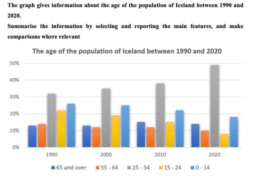
Band 5+: The graph gives information about the age of the population of Iceland between 1990 and 2020. Summarize the information by selecting and reporting the main features and make comparisons where relevant

Image for topic: The graph gives information about the age of the population of Iceland between 1990 and 2020. Summarize the information by selecting and reporting the main features and make comparisons where relevant
Our system will evaluate the answer based on this AI-generated description.
The image shows a bar chart of the age of the population of Iceland from 1990 to 2020 in five categories, with the y-axis representing percentage from 0% to 50% in 10% increments and the x-axis denoting the years 1990, 2000, 2010, and 2020. In 1990, the 65 and over category is slightly above 10%, 55-64 is just under 10%, 25-54 is about 35%, 15-24 is just above 20%, and 0-14 is close to 30%. In 2000, 65 and over rose to just under 15%, 55-64 increased to nearly 15%, 25-54 declined to around 30%, 15-24 dipped to around 15%, and 0-14 went down to nearly 25%. In 2010, 65 and over approached 20%, 55-64 jumped to about 20%, 25-54 saw a slight increase above 30%, 15-24 decreased to nearly 10%, and 0-14 dropped to just above 20%. In 2020, 65 and over continues to rise to almost 25%, 55-64 stabilizes near 20%, 25-54 decreases to below 30%, 15-24 remains around 10%, and 0-14 continues its downward trend to just below 20%.
Given the complexity of the image, the above description may not be entirely accurate.
Note: Both the topic and the answer were created by one of our users.

This bar graph illustrates the percentage of four ages groups of residents living in Iceland between 1990 and 2020. The detail of this graph will be explained remarkable as follows.

Overall, it is clear that the group of individuals whose age between 25 to 54 years old was identified to be the majority group, while the group of 55 to 64 old possessed the lowest rank of population except in 2020.

It can be specified that in the given period, 25 to 43 years old people obtained the first rank of the population, increasing gradually from more than 30% to be just lower than 40% in 1990 and 2010 respectively. In the next 10 years, there was a significant rise to approximately 50% which was its peak in this group of individuals. On the contrary, the group of 0-14 years old and over and between 15 to 24 years old presented the the different trend, decreasing moderately by around 8% and dropping steadily by 10% respectively.

In addition, it can be noticed that the was the stable trend in both groups of elderly individuals. in the case of 55-64 years old, the percentage of population fluctuated at 13%, whereas 11% was the point that the group of 65 years old and over fluctuated around.

Word Count: 214

Answers On The Same Topic:

The graph gives information about the age of the population of Iceland between 1990 and 2020. Summarize the information by selecting and reporting the main features and make comparisons where relevant

The bar chart illustrates the proportion of Iceland’s population across different age groups (0-14, 15-24, 25-54, 55-64, and 65+) in 1990, 2000, 2010, and 2020. Overall, an upward trend was noted in the 65+ and 25-54 age groups, with the latter not only exhibiting the most substantial growth but also remaining the largest group over […]

The graph gives information about the age of the population of Iceland between 1990 and 2020. Summarize the information by selecting and reporting the main features and make comparisons where relevant

The bar chart illustrates the changes in the age distribution of Iceland’s population across five age groups between 1990 and 2020. Overall, it’s clear that the population of middle-aged people remained the largest group throughout the entire period. While other categories decreased, however, the sector of older people showed minor changes, remaining stable. In 1990, […]

The graph gives information about the age of the population of Iceland between 1990 and 2020. Summarize the information by selecting and reporting the main features and make comparisons where relevant

This graph illustrate information about the age of the population of Iceland between 1990 and 2020. Overall, the proportion of older people increased over the period, while the percentage of children declined. The middle age groups showed moderate changes. In 1990, approximately 30% of the population belonged to the 25-54 age group, making it the […]

The graph gives information about the age of the population of Iceland between 1990 and 2020. Summarize the information by selecting and reporting the main features and make comparisons where relevant

The given chart provides data about the age of Iceland’s residents over the period from 2020 to 2050. It can be seen that the number of adults aged from 25 to 54 made up the highest percentage of population throughout the entire period despite a marked fall until 2040. On the other hand, there was […]

The graph gives information about the age of the population of Iceland between 1990 and 2020. Summarize the information by selecting and reporting the main features and make comparisons where relevant

The bar chart compares the ages of people living in Iceland from 1990 to 2020. Overall, it can be seen that the majority of the population of Iceland consisted 25-54 age people. Additionally, 0-14 age people were the second major group during the period. According to the bar graph, in 1990, 25-54 age group was […]

See All

Other Topics:

The chart below shows the main reasons why agricultural land becomes less productive in three regions of the world. Summarise the information by selecting and reporting the main features, and make comparisons where relevant.

The bar chart shows by main reasons (over-grazing, deforestation, over-cultivation, and other factors) why agricultural land becomes less productive in three regions of the world, namely North America, Europe, and Oceania. Overall, in Oceania, over-grazing is the main reason, and had the highest percentage compared with other regions. In contrast, caused by over-cultivation in Oceania […]

The chart below shows the main reasons why agricultural land becomes less productive in three regions of the world. Summarise the information by selecting and reporting the main features, and make comparisons where relevant.

The bar chart shows by main reasons (Over-grazing, Deforestation, Over-cultivation, and Other factors) why agricultural land becomes less productive in three regions of the world, namely North America, Europe, and Oceania. Overall, in Oceania, over-grazing is the main reason, and had the highest percentage compared with other regions. In contrast, cause by over-cultivation in Ocenia […]

The chart below shows the amount of energy generated from winds in 4 countries from 1985 to 2000.

The bar graph demonstrates the quantity of energy in megawatts generated by wind in four different countries – India, Denmark, Germany and United States in the given period of 1980 and 2000. Overall, at the beginning the United States showed the highest rate of generated energy. Later, the Denmark grew considerably and became the largest […]

The bar chart shows the percentage of students in Country X who participated in football, basketball, tennis, and swimming in 2010 and 2020.

The bar chart illuatrates the percentage of students in X country who participated in different sports from 2010 – 2020. Obseved that football was tie most greated proportion in 2010 and 2020 in the other hands tennis shows the lowest percentage over that years. Furthermore, students who participate in basketball were 40% compare to swimming […]

The bar chart below shows the percentage of Australian men and women in different age groups who did regular physical activity in 2010.Summarize the information by selecting and reporting the main features and make comparisons where relevant.Write at least 150 words.

The bar chart illustrates the proportion of Australian males and females across various age groups who engaged in regular physical activity in 2010. Overall, women generally exhibited higher participation rates than men in most age cohorts, with the most notable gap observed in the 45-54 age bracket. Conversely, men showed a clear advantage only among […]

The bar chart below shows the percentage of Australian men and women in different age groups who did regular physical activity in 2010.Summarize the information by selecting and reporting the main features and make comparisons where relevant.Write at least 150 words.

The given graph provide information about the percentage of Australian males and femalies in varies age groups who in regular physical activities in 2010. Overall, womans engaged in activities from 25 to 65 and over more than mans in similar ages,but mans particulary training more at 15 to 24 ages. Accorging to the bar chart […]

See All
We have detected unusual activity on your device.
Please verify your identity to continue.
Note: This verification step won't sign you in. If you have a premium account, please log in to access the service as usual.
Google/Gmail Verification
Or verify using Email/Code
We've sent a verification code to:
youremail@gmail.com (Not your email?)
Enter it below to complete the verification process.
Ensure your email address is correct, your inbox is not full, and you check your spam folder. If no email arrives, consider using an alternative email.
You will need a Premium plan to perform your action!
Note: If you already have a premium account, please log in to access our services as usual.

Plans & Pricing

Our mission is to make quality education accessible for everyone.
However, to keep our hardworking team running and this service alive, we genuinely need your support!
By opting for a premium plan, not only do you sustain us in achieving the mission, but you also unlock advanced features to enrich your learning experience.

Free

For learners who aren't pressed for time

What's included on Free
100+ Cambridge IELTS Tests
Instant IELTS Writing Task 1 & 2 Evaluation (2 times/month)
Instant IELTS Speaking Part 1, 2, & 3 Evaluation (2 times/month)
Instant IELTS Writing Task 1 & 2 Essay Generator (2 times/month)
500+ Dictation & Shadowing Exercises
100+ Pronunciation Exercises
Flashcards
Other Advanced Tools

Premium

For those serious about advancing their English proficiency, and for IELTS candidates aspiring to boost their band score by 1-2 points (especially in writing & speaking) in just 30 days or less

What's included on Premium
Save Your IELTS Test Progress & Analyze Mistakes By Question Type
Save Your Own Flashcard Sets & Use Them On Any Device
Unlock All Courses, IELTS Tests, Section & Part Practice
Unlimited AI Conversations
Unlimited AI Writing Enhancement Exercises
Unlimited IELTS Writing Task 1 & 2 Evaluation
Unlimited IELTS Speaking Part 1, 2, & 3 Evaluation
Checked Answers Will Not Be Published
Unlimited IELTS Writing Task 1 & 2 Essay Generator
Unlimited IELTS Speaking Part 1, 2, & 3 Sample Generator
Unlimited Usage Of Advanced Tools & AI Features
Priority Support within 24h (12-month plan only)

Due to the nature of our service and the provided free trials, payments are non-refundable.