🔥 Today Only: Save 30% on Premium — Offer Ends Soon! - Upgrade Now!
Bar Chart

Band 6+: The graph gives information about the age of the population of Iceland between 1990 and 2020. Summarize the information by selecting and reporting the main features and make comparisons where relevant

Image for topic: The graph gives information about the age of the population of Iceland between 1990 and 2020. Summarize the information by selecting and reporting the main features and make comparisons where relevant
Our system will evaluate the answer based on this AI-generated description.
The image shows a bar chart of the age of the population of Iceland from 1990 to 2020 in five categories, with the y-axis representing percentage from 0% to 50% in 10% increments and the x-axis denoting the years 1990, 2000, 2010, and 2020. In 1990, the 65 and over category is slightly above 10%, 55-64 is just under 10%, 25-54 is about 35%, 15-24 is just above 20%, and 0-14 is close to 30%. In 2000, 65 and over rose to just under 15%, 55-64 increased to nearly 15%, 25-54 declined to around 30%, 15-24 dipped to around 15%, and 0-14 went down to nearly 25%. In 2010, 65 and over approached 20%, 55-64 jumped to about 20%, 25-54 saw a slight increase above 30%, 15-24 decreased to nearly 10%, and 0-14 dropped to just above 20%. In 2020, 65 and over continues to rise to almost 25%, 55-64 stabilizes near 20%, 25-54 decreases to below 30%, 15-24 remains around 10%, and 0-14 continues its downward trend to just below 20%.
Given the complexity of the image, the above description may not be entirely accurate.
Note: Both the topic and the answer were created by one of our users.

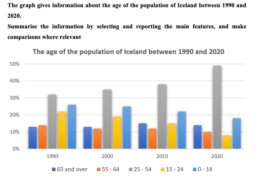
The bar chart compares the ages of people living in Iceland from 1990 to 2020.

Overall, it can be seen that the majority of the population of Iceland consisted 25-54 age people. Additionally, 0-14 age people were the second major group during the period.

According to the bar graph, in 1990, 25-54 age group was the major part of population, it was 32% of the population. The following 5 years, the proportional of this group grew gradually and reached a peak in 2020, it was almost half of the population of Iceland. In contrast, although 15-24 age people stood at 22%, it decreased significantly and dropped less than 10%, which was the lowest point, at the end of the period. Similarly, while 0-14 group was 26% of the population in 1990, it plunged 18% in 2020. Additionally, 65 or over age people remained almost constant and changed between 10% and 15% given the period. Likewise, 55-64 group experienced same trend with 65 and over age people and it was 10% at the end of the period.

Word Count: 176

Answers On The Same Topic:

The graph gives information about the age of the population of Iceland between 1990 and 2020. Summarize the information by selecting and reporting the main features and make comparisons where relevant

The bar chart illustrates the proportion of Iceland’s population across different age groups (0-14, 15-24, 25-54, 55-64, and 65+) in 1990, 2000, 2010, and 2020. Overall, an upward trend was noted in the 65+ and 25-54 age groups, with the latter not only exhibiting the most substantial growth but also remaining the largest group over […]

The graph gives information about the age of the population of Iceland between 1990 and 2020. Summarize the information by selecting and reporting the main features and make comparisons where relevant

The bar chart illustrates the changes in the age distribution of Iceland’s population across five age groups between 1990 and 2020. Overall, it’s clear that the population of middle-aged people remained the largest group throughout the entire period. While other categories decreased, however, the sector of older people showed minor changes, remaining stable. In 1990, […]

The graph gives information about the age of the population of Iceland between 1990 and 2020. Summarize the information by selecting and reporting the main features and make comparisons where relevant

This graph illustrate information about the age of the population of Iceland between 1990 and 2020. Overall, the proportion of older people increased over the period, while the percentage of children declined. The middle age groups showed moderate changes. In 1990, approximately 30% of the population belonged to the 25-54 age group, making it the […]

The graph gives information about the age of the population of Iceland between 1990 and 2020. Summarize the information by selecting and reporting the main features and make comparisons where relevant

The given chart provides data about the age of Iceland’s residents over the period from 2020 to 2050. It can be seen that the number of adults aged from 25 to 54 made up the highest percentage of population throughout the entire period despite a marked fall until 2040. On the other hand, there was […]

See All

Other Topics:

The charts below show the percentage of males and females who got married in different ages in the UK in 1996 and 2008.

The bar graphs illustrate the ages at which males and females got married across a particular country in 1998 and 2008. Overall, marriage tendencies remained largely unchanged, with both females and males entering marriage mostly at ages 25-29 or 30-34. While the popularity of getting engaged at earlier ages, especially at 16-19, was the lowest […]

The charts illustrate the number of people who were affected by four types of noise pollution in day and night in cities and rural areas in 2007.

The bar charts compare the level of human exposure to four distinct categories of noise during the day and night in a specific location in 2007. Overall, urban area residents were affected profoundly compared to people who lived in the countryside, especially during the day. Of particular note is that the noise which was generated […]

The bar graph shows the average hours of daily sunshine throughout the year in two cities of Australia. Summarise the information by selecting and reporting the main features, and make comparisons where relevant.

The bar graph compares the standard number of sunlight hours per day in Sydney versus Perth, Australia. Overall, it is clear that Perth has the highest average sunshine for almost all of the months, whereas Sydney has low sunshine duration per day. In terms of Perth, for the first three months, January to March, the […]

The bar chart shows percentages of three groups of australian children taking part in four kinds of activities in 2012. Summarize the information by selecting and reporting the main features , and make comparisons where relevant.

The bar chart provides a comparison of three age groups who participated in four leisure activities in 2012, measured in percentage. Overall, considerable differences can be observed among the categories presented. While watching TV accounted for the highest figures across all age groups, the opposite was true for art, which generally recorded comparativley lower values. […]

The bar chart shows percentages of three groups of australian children taking part in four kinds of activities in 2012. Summarize the information by selecting and reporting the main features , and make comparisons where relevant.

The bar chart provides a comparison of three age groups who participated in four leisure activities in 2012, measured in percentage. Overall, considerable differences can be observed among the categories presented. While watching TV accounted for the highest figures across all age groups, the opposite was true for art, which generally recorded comparatively lower values. […]

The bar chart below shows the number of people employed in five different sectors (sales, accounting, computing, nursing, and farming) in a region of Australia in 2001 and 2008. Summarise the information by selecting and reporting the main features, and make comparisons where relevant.

The bar chart illustrates the number of public employed in different five types of work such as ( sales, accounting, computing, nursing and farming ) on one region of Australia between 2001 and 2008. Overall, it is clear that sales had the highest component over the period, while farming was the least and declined. Moreover, […]

See All
We have detected unusual activity on your device.
Please verify your identity to continue.
Note: This verification step won't sign you in. If you have a premium account, please log in to access the service as usual.
Google/Gmail Verification
Or verify using Email/Code
We've sent a verification code to:
youremail@gmail.com (Not your email?)
Enter it below to complete the verification process.
Ensure your email address is correct, your inbox is not full, and you check your spam folder. If no email arrives, consider using an alternative email.
You will need a Premium plan to perform your action!
Note: If you already have a premium account, please log in to access our services as usual.

Plans & Pricing

Our mission is to make quality education accessible for everyone.
However, to keep our hardworking team running and this service alive, we genuinely need your support!
By opting for a premium plan, not only do you sustain us in achieving the mission, but you also unlock advanced features to enrich your learning experience.

Free

For learners who aren't pressed for time

What's included on Free
100+ Cambridge IELTS Tests
Instant IELTS Writing Task 1 & 2 Evaluation (2 times/month)
Instant IELTS Speaking Part 1, 2, & 3 Evaluation (5 times/month)
Instant IELTS Writing Task 1 & 2 Essay Generator (2 times/month)
500+ Dictation & Shadowing Exercises
100+ Pronunciation Exercises
Flashcards
Other Advanced Tools

Premium

For those serious about advancing their English proficiency, and for IELTS candidates aspiring to boost their band score by 1-2 points (especially in writing & speaking) in just 30 days or less

What's included on Premium
Save Your IELTS Test Progress
Unlock All Courses & IELTS Tests
Unlimited AI Conversations
Unlimited AI Writing Enhancement Exercises
Unlimited IELTS Writing Task 1 & 2 Evaluation
Unlimited IELTS Speaking Part 1, 2, & 3 Evaluation
Checked Answers Will Not Be Published
Unlimited IELTS Writing Task 1 & 2 Essay Generator
Unlimited IELTS Speaking Part 1, 2, & 3 Sample Generator
Unlimited Usage Of Advanced Tools
Priority Support within 24h (12-month plan only)

Due to the nature of our service and the provided free trials, payments are non-refundable.
Nếu bạn là người Việt Nam và không có hoặc không muốn trả bằng credit/debit cards, bạn có thể thanh toán bằng phương thức chuyển khoản:


Chọn gói:
419,000₫ 277,000 ₫ cho gói 1 tháng (chỉ 9,233₫/ngày)
1,239,000₫ 597,000 ₫ cho gói 3 tháng (chỉ 6,633₫/ngày)
2,469,000₫ 1,027,000 ₫ cho gói 6 tháng (chỉ 5,706₫/ngày)
4,929,000₫ 1,417,000 ₫ cho gói 12 tháng (chỉ 3,936₫/ngày)


Sau khi chuyển khoản, vui lòng đợi trình duyệt tự động điều hướng bạn trở lại Engnovate và bạn sẽ ngay lập tức nhận được mã kích hoạt tài khoản premium.
Nếu có lỗi xảy ra, bạn có thể liên hệ với team thông qua một trong các phương thức: email đến helloengnovate@gmail.com hoặc nhắn tin qua facebook.com/engnovate.
Vì toàn bộ công cụ trên website đều có thể sử dụng thử miễn phí, Engnovate không hỗ trợ hoàn tiền.