24 Hours Only: Get 39% OFF on Our Premium Plan - Check Out Now!
Bar Chart

Band 4+: The graph shows the rates of participation in three different activities in a UK sports club between 1995 and 2015.

Image for topic: The graph shows the rates of participation in three different activities in a UK sports club between 1995 and 2015.
Our system will evaluate the answer based on this AI-generated description.
The image shows a line graph titled 'PARTICIPATION BY CLUB MEMBERS' with the Y-axis labeled '% OF CLUB MEMBERS' ranging from 0% to 60% in increments of 10%, and the X-axis labeled 'YEAR' with markers for 1995, 2000, 2005, 2010, 2015. Three lines represent swimming, team sports, and gym activities. In 1995, swimming starts at just below 50%, team sports at just above 30%, and gym activities at just over 20%. By 2000, swimming decreases to just over 40%, team sports increase to just over 40%, and gym activities rise to about 25%. In 2005, swimming continues to decline to around 35%, team sports drops to just above 30%, gym activities climb to just over 30%. By 2010, swimming reaches around 30%, team sports rises to above 35%, and gym activities peak at near 40%. In 2015, swimming stabilizes around 30%, team sports decreases slightly to just under 35%, and gym activities dip to just below 40%.
Given the complexity of the image, the above description may not be entirely accurate.
Note: Both the topic and the answer were created by one of our users.

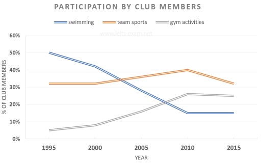
The graphs illustrates the percentage of competitors in swimming ,team sports and gym activities in a UK sports club in 1995 to 2015.

Overall, the perticipator in swimming was decreased over the time, while the percentage of gym activites experienced a significant increased. The competitors of team sports remain almost stable in rest of the time.

In 1995 , the perticipation in gym activities were around 5% which was the lowest participator in those time .However it went its peak time in 2010 (over 20%) while the number of competitors remain almost same over the period . In,1995 ,the number of swimming competitors was around 50% which was the peak time of this particullar activities. But ,it experienced a significant fall until 2010 . the percentage was almost 17% in that year and it remain same till in 2015.

The percentage of team sports activities started with almost 30% and it finished with just under 30%.

Word Count: 156

Answers On The Same Topic:

The graph shows the rates of participation in three different activities in a UK sports club between 1995 and 2015.

The line graph compares the proportion of participation in three different forms of activities (swimming, team sports, and gym activities) in a UK sports club from 1995 to 2015. The units are measured in percentages. Overall, the most considerable decrease was seen in the figure for swimming, whereas the reverse was true for gym activities. […]

The graph shows the rates of participation in three different activities in a UK sports club between 1995 and 2015.

The Line graph illustrates thale data of participation by club members in three key activities like swimming, team sport,and gym activities for year between 1995 to 2015. Overall, in 1995 swimming had higher percentage of ther members other then two activities.however, it’s decline to least favorable activities in 2015.while gym activities show sudden growth. Firstly, […]

The graph shows the rates of participation in three different activities in a UK sports club between 1995 and 2015.

The given line graph illustrates the proportion of participation in three different activities in sports clubs in the United Kingdom (UK) from 1995 to 2015. Overall, the ratio of gym activities witnessed an upward trend. Meanwhile, the percentage of swimming decreased dramatically during these periods. The figure for swimming activities only dropped year by year. […]

The graph shows the rates of participation in three different activities in a UK sports club between 1995 and 2015.

The line graph gives data on the percentages of club members who are participated to swimming, team sports and gym activities between 1995 and 2015 over the 20 years. Overall, it is evident that, although the percentages of gym activities escalated, but the proportion of swimming and team sports declined. Delving into the details of […]

See All

Other Topics:

The chart below shows different methods of waste disposal in a European country from 2005 to 2008. Summarize the information by selecting and reporting the main features, and make comparisons where relevant.

The chat provides information about several stretegies of waste disposal in a European country in the year 2005 and 2008. A glance at the chart reveals that the highest amount of waste material are thrown in the landfill in 2005, whereas the least number was burning in 2006. In terms of waste disposals, one of […]

The graph show the amount of tea and coffee imported by different countries in tonnes.

The bar chart gives information about popularity of the tea and coffee in Canada, US, UK and Germany. Overall, the most imported coffee is from Germany while the lowest one is UK. In comparison, the UK reached the peak point of the import the tea. In contrast, imported product from Canada and US was same […]

The graph below shows the percentage of self employed workers of the total workforce in five countries in 1998 and 2008.

The bar chart illustrates the proportion of independent employees of the total workforce across five countries between 1998 and 2008. Overall, despite a noticeable decline, Greece and Turkey showed the highest figures. By contrast, although there was a slight increase, the percentage of self-employed workers in the remaining countries – Russian Republic, Slovakia, and Czech […]

The diagram below shows the number of landline telephones per 1000 people in different countries over a five-year period

The provided diagram illustrates the evolution of landline telephone ownership per 1,000 individuals across several countries over a five-year timeframe. In summary, the data reveals considerable disparities in landline telephone ownership among the surveyed nations, with higher ownership rates often stabilizing or declining, while countries with initially lower ownership demonstrated a notable increase over the […]

the graph shows female unemployment in each Gandhi of the university Kingdom in 2013 and 2014

The table below represents the proportion of women unemployment figures in each land of the UK throughout 2013 and 2014. In essence, the graph notably projects and delineates that by the second investigated period, each country of the study had similar patterns of worthmentioning decreases. Additionally, it is effortless to notice that the fields of […]

the graph shows female unemployment in each Gandhi of the university Kingdom in 2013 and 2014

The table below represents the proportion of women unemployment figures in each land of the UK throughout 2013 and 2014. In essence, the graph notably projects and delineats that by the second investigated period, each country of the study had similar patterns of worthmentioning decreases. Additionally, it is effortless to notice that the fields of […]

See All
We have detected unusual activity on your device.
Please verify your identity to continue.
Note: This verification step won't sign you in. If you have a premium account, please log in to access the service as usual.
Google/Gmail Verification
Or verify using Email/Code
We've sent a verification code to:
youremail@gmail.com (Not your email?)
Enter it below to complete the verification process.
Ensure your email address is correct, your inbox is not full, and you check your spam folder. If no email arrives, consider using an alternative email.
You will need a Premium plan to perform your action!
Note: If you already have a premium account, please log in to access our services as usual.

Plans & Pricing

Our mission is to make quality education accessible and free for everyone.
However, to keep our hardworking team running and this service alive, we genuinely need your support!
By opting for a premium plan, not only do you sustain us in achieving the mission, but you also unlock advanced features to enrich your learning experience.

Free

For learners who aren't pressed for time

What's included on Free
1000+ IELTS Tests & Samples
Instant IELTS Writing Task 1 & 2 Evaluation (2 times/month)
Instant IELTS Speaking Part 1, 2, & 3 Evaluation (5 times/month)
Instant IELTS Writing Task 1 & 2 Essay Generator (2 times/month)
500+ Dictation & Shadowing Exercises
100+ Pronunciation Exercises
Flashcards
Other Advanced Tools

Premium

For those serious about advancing their English proficiency, and for IELTS candidates aspiring to boost their band score by 1-2 points (especially in writing & speaking) in just 30 days or less

What's included on Premium
Save Your IELTS Test Progress
Unlock All Courses & Content
Unlimited AI Conversations
Unlimited AI Writing Enhancement Exercises
Unlimited IELTS Writing Task 1 & 2 Evaluation
Unlimited IELTS Speaking Part 1, 2, & 3 Evaluation
Checked Answers Will Not Be Published
Unlimited IELTS Writing Task 1 & 2 Essay Generator
Unlimited IELTS Speaking Part 1, 2, & 3 Sample Generator
Unlimited Usage Of Advanced Tools

Due to the nature of our service and the provided free trials, payments are non-refundable.
Nếu bạn là người Việt Nam và không có hoặc không muốn trả bằng credit/debit cards, bạn có thể thanh toán bằng phương thức chuyển khoản:


Chọn gói:
279,000₫ 157,000 ₫ cho gói 1 tháng (chỉ 5,233₫/ngày)
819,000₫ 397,000 ₫ cho gói 3 tháng (chỉ 4,411₫/ngày)
1,649,000₫ 667,000 ₫ cho gói 6 tháng (chỉ 3,706₫/ngày)
3,299,000₫ 857,000 ₫ cho gói 12 tháng (chỉ 2,381₫/ngày)


Sau khi chuyển khoản, vui lòng đợi trình duyệt tự động điều hướng bạn trở lại Engnovate và bạn sẽ ngay lập tức nhận được mã kích hoạt tài khoản premium.
Nếu có lỗi xảy ra, bạn có thể liên hệ với team thông qua một trong các phương thức: email đến helloengnovate@gmail.com hoặc nhắn tin qua facebook.com/engnovate.
Vì toàn bộ công cụ trên website đều có thể sử dụng thử miễn phí, Engnovate không hỗ trợ hoàn tiền.