🔥 Today Only: Save 30% on Premium — Offer Ends Soon! - Upgrade Now!
Bar Chart

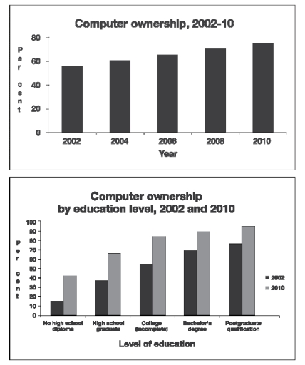
Band 6+: The graphs below give information about computer ownership as a percentage of the population between 2002 and 2010, and by level of education for the years 2002 and 2010. Summarise the information by selecting and reporting the main features, and make comparisons where relevant

Image for topic: The graphs below give information about computer ownership as a percentage of the population between 2002 and 2010, and by level of education for the years 2002 and 2010. Summarise the information by selecting and reporting the main features, and make comparisons where relevant
Our system will evaluate the answer based on this AI-generated description.
The image consists of two bar charts depicting computer ownership trends. The first chart shows computer ownership from 2002 to 2010, with the percentage of ownership increasing from approximately 58% in 2002 to around 76% in 2010, with notable increases approximately every two years. The second chart shows computer ownership by education level for both 2002 and 2010, with six categories: no high school diploma, high school graduate, some college (no diploma), college graduate, bachelor's degree, and postgraduate qualification. In 2002, the percentage of computer ownership for each category is roughly 20%, 60%, 75%, 83%, 86%, and 90%, respectively. In 2010, the percentages increase to approximately 40%, 80%, 90%, 94%, 96%, and 98%, respectively. The chart shows a correlation between higher education levels and increased computer ownership, with the most significant percentage increase occurring in the 'no high school diploma' category.
Given the complexity of the image, the above description may not be entirely accurate.
Note: Both the topic and the answer were created by one of our users.

The bar graphs indicate data about the percentage of computer ownership from the year 2002 to 2010 both by comparison of total population and education level. Overall, the computer ownership increased over a period of eight years and this number among people who have higher studies was greater than others.

According to the first graph, there was just about nearly 60% of people that own computers in 2002. This portion kept climbing up through the years gradually, finally, it reached approximately 70% in 2010.

As is observed from the second graph, the higher the education level the higher the percentage of computer ownership. For example, just about 15% of people who didn’t graduate from high school had computers in 2002 but this figure had trebled by 2010. However, it was still a small number compared to the higher levels groups: bachelors’ degree (70%) and postgraduate qualification (80%) in 2002, which later increased by 90% and 95% respectively. The last decade has seen a substantial growth in computer ownership in general, and across all educational levels.

Word Count: 175

Answers On The Same Topic:

The graphs below give information about computer ownership as a percentage of the population between 2002 and 2010, and by level of education for the years 2002 and 2010. Summarise the information by selecting and reporting the main features, and make comparisons where relevant

The provided graphs below illustrate comparative data on computer ownership as a percentage of the population between 2002 and 2010, and a breakdown by educational background specifically for 2002 and 2010. In 2002 , approximately 55% of the population owned a computer. This figure climbed steadily by roughly 5% every two years, eventually reaching a […]

The graphs below give information about computer ownership as a percentage of the population between 2002 and 2010, and by level of education for the years 2002 and 2010. Summarise the information by selecting and reporting the main features, and make comparisons where relevant

The two bar charts show the proportion of the population owning computers from 2002, as well as by levels of education in 2002 and 2010. Overall, the percentage of people owning a computer increased gradually throughout the given period. Notably, the vast majority of population with posgraduate qualification owned a computer. To begin with, computer […]

The graphs below give information about computer ownership as a percentage of the population between 2002 and 2010, and by level of education for the years 2002 and 2010. Summarise the information by selecting and reporting the main features, and make comparisons where relevant

The first of the given graphs represents the percentages of people who owned computers between the years 2002 – 2010. The second graph, on the other hand, compares the education levels of people who owned computers in 2002 and 2010. First of all, information from the first graph indicates that there had been a sequential […]

The graphs below give information about computer ownership as a percentage of the population between 2002 and 2010, and by level of education for the years 2002 and 2010. Summarise the information by selecting and reporting the main features, and make comparisons where relevant

The two bar charts illustrate computer ownership by a percent of the population from 2002 to 2010, and ownership of computers by education level in 2002 and 2010. Overall, there has been a gradual increase in the number of computers owned by individuals, with postgraduates owning the most whereas people with no high school diploma […]

The graphs below give information about computer ownership as a percentage of the population between 2002 and 2010, and by level of education for the years 2002 and 2010. Summarise the information by selecting and reporting the main features, and make comparisons where relevant

The two bar charts illustrate the rate of computer availability among citizens from 2002 to 2010, and based on their academic degree for 2002 and 2010. Overall, there was a slight increase in computer possession throughout the time frame. Although more than half of the population had access to computers in 2002,compared to other years […]

See All

Other Topics:

The graph below shows the amount of tea and coffee imported by four different countries in tonnes. Summarize the information by selecting and reporting the main points and making comparisons where relevant.

The bar graph compares four various countries with regard to importing tea and coffee in tonne terms. Overall, the UK tops the chart in terms of importing teas, while Germany holds the lead with regard to buying coffee from other countries. The UK and the USA import massive amount of tea, with the former accounting […]

The chart below gives information on UK acid rain emissions, measured in millions of tonnes, from four different sectors between 1990 and 2007. Write a report for a university lecturer describing the information shown below. Make comparisons where relevant.

The line graph delineates the acid rain emissions in the United Kingdom, quantified in millions of tonnes, across four distinct sectors from 1990 to 2007. Overall, there was a marked decline in total acid rain emissions across all sectors over the period, with the most substantial reduction observed in the electricity, gas, and water supply […]

The bar chart shows information about the favorite subjects of students from two middle schools, school A and school B. Summarize the information by selecting and reporting the main features, and make comparisons where relevant. Write at least 150 words.

The bar chart gives information about the students choosing their favourite subjects from five options such as, social science, science, language, craft/drawing, and sport, in two middle schools, school A and school B. Overall, school A shows the highest number of students who preferred subject of sport, while craft/drawing is the most chosen subject in […]

The chart below shows the main reasons why agricultural land becomes less productive in three regions of the world. Summarise the information by selecting and reporting the main features, and make comparisons where relevant.

he given bar chart depicts the differences between the reasons why agricultural land becomes less productive in North America, Europe, and Oceania. Overall, in North America, the highest percentage of degraded land is caused by over-cultivation. In Europe, the highest is caused by over-grazing. Furthermore, in Oceania, the highest percentage is caused by over-grazing. On […]

The chart below shows the main reasons why agricultural land becomes less productive in three regions of the world. Summarise the information by selecting and reporting the main features, and make comparisons where relevant.

The given bar chart depicts the defferent bettwen the reasons of why the agricultural land becomes less productive in North America, Europe, and Oceania. Overall, in North America, the highest percentage of degraded land caused by over-cultivation. In Europe, the highest one caused by over-grazing. Furthermore, in Oceania, the highest percentage caused by over-grazing. On […]

The chart below shows the value of some Australia's trading links in 2012, 2013 and 2014. Summarise the information by selecting and reporting the main features, and making comparisons where relevant.

The bar chart illustrates the value of trading links in Australia with five Asian countries namely (China, Japan, Korea, Thailand, and Vietnam) from 2012 to 2014. Data is dollar millions.Overall, the amount of trading with China, Korea, and Vietnam increased over the period while those of Japan, and Thailand experienced the reverse trends. Notably, China […]

See All
We have detected unusual activity on your device.
Please verify your identity to continue.
Note: This verification step won't sign you in. If you have a premium account, please log in to access the service as usual.
Google/Gmail Verification
Or verify using Email/Code
We've sent a verification code to:
youremail@gmail.com (Not your email?)
Enter it below to complete the verification process.
Ensure your email address is correct, your inbox is not full, and you check your spam folder. If no email arrives, consider using an alternative email.
You will need a Premium plan to perform your action!
Note: If you already have a premium account, please log in to access our services as usual.

Plans & Pricing

Our mission is to make quality education accessible for everyone.
However, to keep our hardworking team running and this service alive, we genuinely need your support!
By opting for a premium plan, not only do you sustain us in achieving the mission, but you also unlock advanced features to enrich your learning experience.

Free

For learners who aren't pressed for time

What's included on Free
100+ Cambridge IELTS Tests
Instant IELTS Writing Task 1 & 2 Evaluation (2 times/month)
Instant IELTS Speaking Part 1, 2, & 3 Evaluation (2 times/month)
Instant IELTS Writing Task 1 & 2 Essay Generator (2 times/month)
500+ Dictation & Shadowing Exercises
100+ Pronunciation Exercises
Flashcards
Other Advanced Tools

Premium

For those serious about advancing their English proficiency, and for IELTS candidates aspiring to boost their band score by 1-2 points (especially in writing & speaking) in just 30 days or less

What's included on Premium
Save Your IELTS Test Progress & Analyze Mistakes By Question Type
Save Your Own Flashcard Sets & Use Them On Any Device
Unlock All Courses, IELTS Tests, Section & Part Practice
Unlimited AI Conversations
Unlimited AI Writing Enhancement Exercises
Unlimited IELTS Writing Task 1 & 2 Evaluation
Unlimited IELTS Speaking Part 1, 2, & 3 Evaluation
Checked Answers Will Not Be Published
Unlimited IELTS Writing Task 1 & 2 Essay Generator
Unlimited IELTS Speaking Part 1, 2, & 3 Sample Generator
Unlimited Usage Of Advanced Tools & AI Features
Priority Support within 24h (12-month plan only)

Due to the nature of our service and the provided free trials, payments are non-refundable.