24 Hours Only: Get 39% OFF on Our Premium Plan - Check Out Now!
Multiple Graphs

Band 4+: The graphs below give information on the number of words spoken to children in various categories of family and the size of the vocabulary of those children.

Image for topic: The graphs below give information on the number of words spoken to children in various categories of family and the size of the vocabulary of those children.
Our system will evaluate the answer based on this AI-generated description.
The image contains two line graphs; the top graph indicates "Total words spoken to child," and the bottom graph indicates "Children's total vocabulary size." In the top graph, there are three lines representing "Higher-talking families," "Lower-talking families," and "Lowest-talking families," respectively. Each line trends upward from age 12 months to 48 months for a child, indicating an increase in the number of words spoken to the child in each family category over time, with the higher-talking families consistently having more words spoken as compared to the other two groups at each measured point. No specific numerical values are provided on the y-axis, but the number of words ranges from 0 to 50 (assuming the unit is thousands). In the bottom graph, the lines trend upward from age 12 months to 36 months, representing an increase in the child's vocabulary size over time, with higher-talking families again having a consistently larger vocabulary size compared to the other two groups. The y-axis ranges from 0 to 1200 words, with values indicated at intervals of 200; all lines start at age 12 with a vocabulary size of approximately 0 words and end at age 36 with the highest-talking family line over 1100 words, the lower-talking family line near 800 words, and the lowest-talking family line close to 600 words.
Given the complexity of the image, the above description may not be entirely accurate.
Note: Both the topic and the answer were created by one of our users.

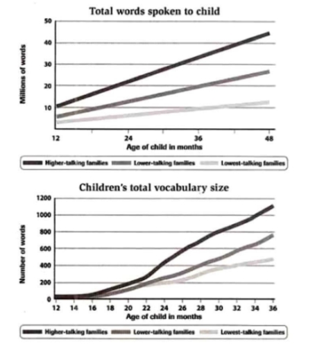
The chart shows that higher speaking families have the most significant increase of 45 million words at the age of 48 months. That is the highest digit compared to the number of words spoken by higher talking families at the age of 36 months, which is 35 million words. The higher talking families spoke 10 million words at the age of 12 months which was the least of these groups.

Compared to the lowest speaking families, the slightest words spoken to children were 3 million words at the age of 12 months. This family category experienced the lowest rises every month with a total of 9 million words over the 48 months. Whereas, lower talking families said more words (6 million words) at the age of 12 months with the highest increase of 7 million words at the age of 36 months.

On the other hand, the largest growth in a child’s vocabulary is 200 million words at the age of 24 months according to the higher speaking families. Based on the data, all three categories have been continuously increasing. At the age of 16, higher-speaking families experienced only a slight increase, amounting to 20 million words.

Unlike families with the lowest communication, who experienced a extremely smaller increase of 100 million words by 36 months. However, the greatest increase occurred at 28 months, reaching 100 million words. This section experienced a lesser growth compared to families with high communication.

Overall, these graphs have similarities and differences, especially in the family categories where families with high communication tend to experience a serious growth in words and vocabulary compared to lower communicating families.

Word Count: 272

Other Topics:

The charts below show the average percentages in typical meals of three nutrients.All of which may be unhealthy if eaten too much

The pie charts given provide information about number of three types of nutriens which are included in meals, but may be unhealthy if eaten too much. Overall, percentage of nutriens are different in each meal. Dinner contributes the largest proportion of Sodium and Saturated fat, while the biggest amount of added sugar consists in snacks. […]

The first chart below gives information about the money spent by British parents on their children's sports between 2008 and 2014. The second chart shows the number of children who participated in three sports in Britain over the same time period. Summarize the information by selecting and reporting the main features and make comparisons where relevant.

Two line graphs illustrate how much money British parents spent on their children’s sports and how many children participated in three sports in Britain between 2008 and 2014. Overall, all figures, including the amount of money and the number of children who played sports, witness an upward trend. In addition, football recorded the highest number […]

proportion of journeys made in the netherlands according to transport type

The two piecharts illustrated the proportion of four transport type journeys made in the Netherlands from the years1975 and 2000. Overall it is clear that car transport handled the Iargest percentage whereas, other had the lowest percentage .Bicycle and train journey percentage fell down from 1975 to 2000. Initialy, in 1975 car journey was accounted […]

The charts provided show the relationship between the increase in human papulation and species extinction from 1800 to today, and perccntage of species currently under threat of extinction

The bar chart represents percentage of species under threat of extinction now and the graph charts illustrates the ralationship how much rise in human population and how much kind of animal died between 1800 and today. Overall, the graph chart shows that all two graph ripidly grows over 1950 year. In the bar chart, Plants […]

Part 1: The graph below shows the weekly working hours or men and women omen in in government institutions and private institutions.

The charts compare the working hours in seven days between men and women for government and private sectors. Overall, while working over 46 hours for men in both institutions shows the highest pattern, the reverse is true for women. Notably, staff who work between 31-45 hours record similar proportion for all charts. The percentage of […]

The pie chart illustrates the main causes of global warming worldwide, while the table compares the percentage of CO₂ emissions from different sources across three continents: Europe, America, and Asia.

The pie chart illustrates percentage the source of worldwide global warming and CO2 caueses three continents in Europe, America, Asia. Overall, all of the country has same total of percentage CO2, although America and Asia touch the figure at 33% the most causes in Europe is vehicle touch a 35%. The most highest percentage causes […]

See All
We have detected unusual activity on your device.
Please verify your identity to continue.
Note: This verification step won't sign you in. If you have a premium account, please log in to access the service as usual.
Google/Gmail Verification
Or verify using Email/Code
We've sent a verification code to:
youremail@gmail.com (Not your email?)
Enter it below to complete the verification process.
Ensure your email address is correct, your inbox is not full, and you check your spam folder. If no email arrives, consider using an alternative email.
You will need a Premium plan to perform your action!
Note: If you already have a premium account, please log in to access our services as usual.

Plans & Pricing

Our mission is to make quality education accessible and free for everyone.
However, to keep our hardworking team running and this service alive, we genuinely need your support!
By opting for a premium plan, not only do you sustain us in achieving the mission, but you also unlock advanced features to enrich your learning experience.

Free

For learners who aren't pressed for time

What's included on Free
1000+ IELTS Tests & Samples
Instant IELTS Writing Task 1 & 2 Evaluation (2 times/month)
Instant IELTS Speaking Part 1, 2, & 3 Evaluation (5 times/month)
Instant IELTS Writing Task 1 & 2 Essay Generator (2 times/month)
500+ Dictation & Shadowing Exercises
100+ Pronunciation Exercises
Flashcards
Other Advanced Tools

Premium

For those serious about advancing their English proficiency, and for IELTS candidates aspiring to boost their band score by 1-2 points (especially in writing & speaking) in just 30 days or less

What's included on Premium
Save Your IELTS Test Progress
Unlock All Courses & Content
Unlimited AI Conversations
Unlimited AI Writing Enhancement Exercises
Unlimited IELTS Writing Task 1 & 2 Evaluation
Unlimited IELTS Speaking Part 1, 2, & 3 Evaluation
Checked Answers Will Not Be Published
Unlimited IELTS Writing Task 1 & 2 Essay Generator
Unlimited IELTS Speaking Part 1, 2, & 3 Sample Generator
Unlimited Usage Of Advanced Tools

Due to the nature of our service and the provided free trials, payments are non-refundable.
Nếu bạn là người Việt Nam và không có hoặc không muốn trả bằng credit/debit cards, bạn có thể thanh toán bằng phương thức chuyển khoản:


Chọn gói:
279,000₫ 157,000 ₫ cho gói 1 tháng (chỉ 5,233₫/ngày)
819,000₫ 397,000 ₫ cho gói 3 tháng (chỉ 4,411₫/ngày)
1,649,000₫ 667,000 ₫ cho gói 6 tháng (chỉ 3,706₫/ngày)
3,299,000₫ 857,000 ₫ cho gói 12 tháng (chỉ 2,381₫/ngày)


Sau khi chuyển khoản, vui lòng đợi trình duyệt tự động điều hướng bạn trở lại Engnovate và bạn sẽ ngay lập tức nhận được mã kích hoạt tài khoản premium.
Nếu có lỗi xảy ra, bạn có thể liên hệ với team thông qua một trong các phương thức: email đến helloengnovate@gmail.com hoặc nhắn tin qua facebook.com/engnovate.
Vì toàn bộ công cụ trên website đều có thể sử dụng thử miễn phí, Engnovate không hỗ trợ hoàn tiền.