Our system will evaluate the answer based on this AI-generated description.
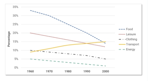
The image contains a line graph with no title, displaying trends over time from 1960 to 2000 in five different categories: Food, Leisure, Clothing, Transport, and Energy. The y-axis shows percentages ranging from 0% to 35%, increasing by 5% increments, while the x-axis lists the years in 10-year increments. Data points at 1960 show Food roughly at 33%, Leisure at 12%, Clothing at 13%, Transport at 9%, and Energy at 6%. By 1970, Food decreased to 31%, Leisure increased to 14%, Clothing decreased to 12%, Transport increased to 11%, and Energy remained at 6%. In 1980, Food continued to drop to 27%, Leisure rose to 16%, Clothing fell to 11%, Transport continued to rise to 13%, and Energy stayed at 6%. By 1990, Food dropped further to 23%, Leisure went up to 18%, Clothing declined to 10%, Transport rose to 14%, and Energy stayed consistent at 6%. Finally, in 2000, Food decreased to 20%, Leisure increased to 21%, Clothing decreased to 9%, Transport increased to 15%, and Energy continued at 6%. No data points for individual years between the decades are provided. The lines for Food, Clothing, and Energy have negative slopes, while the lines for Leisure and Transport have positive slopes.
Given the complexity of the image, the above description may not be entirely accurate.
Skyrocket your IELTS band score by 1-2 points in under a month with our premium plan!
Note: Both the topic and the answer were created by one of our users.
The line graph depicts the the percentage of expenditure on five different aspects, namely food, leisure, clothing, transport, and energy, over the course of 40 years, starting from 1960 in an European nation.
Overall, with the exception of clothing, which presented an upward trajectory, most categories showed a dramatic decline throughout the period shown. Moreover, the amount of money spent on food showed the most significant decline, while the least drop was seen in the spending on energy.
Regarding the prominent categories, around 32% of money was allocated for food, which was the most dominant expenditure in 1960. Subsequently, this figure witnessed a constant decrease to around 14% in 2000. In contrast, the proportion of expense on clothing rose considerably to exactly 15% in 2000 after starting at nearly 10% in the first year of the period.
Turning to the remaining categories, 20% of expenditure was distributed for leisure in 1960, declining to approximately 13% in 2000. Similarly, the allocation of money for transport dropped from 10% in 1960 to 5% in 2000, which was two times lower than the starting point. Finally, the percentage of spending on energy experienced a modest figure, which stood at 5% in 1960 and decreased to virtually 1% in the final year of the timeframe.
Word Count: 211
