🔥 Today Only: Save 30% on Premium — Offer Ends Soon! - Upgrade Now!
Line Graph

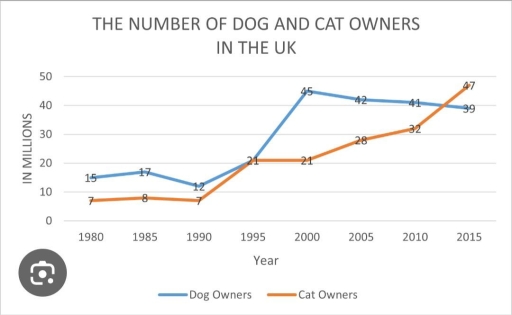
Band 7+: The number of dog and cat owners in the UK.

Image for topic: The number of dog and cat owners in the UK.
Our system will evaluate the answer based on this AI-generated description.
The image illustrates a line graph titled "The number of dog and cat owners in the UK" measured in millions from 1980 to 2015; the blue line represents dog owners, the orange line represents cat owners. In 1980, there were 7 million dog owners and 8 million cat owners; by 1985, both increased to 15 million and 17 million respectively. In 1990, dog owners slightly decreased to 14 million, while cat owners rose to 21 million. By 1995, dog owners increased to 28 million and cat owners to 32 million. In 2000, dog owners reached 35 million, while cat owners peaked at 42 million. By 2005, dog owners declined to 32 million, and cat owners slightly decreased to 44 million. In 2010, dog owners slightly increased to 39 million, while cat owners decreased to 44 million. By 2015, dog owners reached a peak of 47 million, while cat owners decreased to 39 million.
Given the complexity of the image, the above description may not be entirely accurate.
Note: Both the topic and the answer were created by one of our users.

The line graph presented illustrates the total number of people who own cats and dogs in UK during the period from 1980 to 2015. The unit of measurement used is millions.

Overall, the data indicate a notable growth in the number of owners of both dogs and cats, while cats were less popular as pets in the beginning, but they were able to capture the top spot at the end of the given timeframe.

In 1980, dog owners commenced at 15 million, which then fluctuated between 17 million and 21 million from 1985 until 1995, before reaching its zenith of 45 million in the year 2000; after that, it started to decline and reached its lowest point of around 39 million at the end of 2015. Conversely, cat owners began at a mere 7 million in 1980, exhibiting significant growth as they surged to around 47 million at the end of the period.

These data show the rise in the popularity of cats among people.

Word Count: 165

Answers On The Same Topic:

The number of dog and cat owners in the UK.

The line chart illustrates the number of dog and cat owners in the UK. Overall, dog and cat owners adhered to rising trends, albeit to varying degrees. Dog owners experienced a higher number in the initial year, but cat owners surpassed them by the end of the year. The dog owners started with 15 million […]

The number of dog and cat owners in the UK.

The line chart illustrates the number of dogs and cats owners in the UK. Overall, dog and owners adhered to rising trends, albeit to varying degrees. Dog owners experienced higher score in the initial year, but cat owners surpassed it by the end of the year. The dog owners started with 15 at the beginning […]

The number of dog and cat owners in the UK.

The line graph delineates the trends in the number of dog and cat owners in the UK from 1980 to 2015, quantified in millions. Overall, both dog and cat ownership exhibited distinct trends over the given period, with dog ownership ultimately surpassing that of cats towards the end. Despite an initial predominance of cat owners, […]

The number of dog and cat owners in the UK.

The line chart illustrates the number of dogs and cats owners in the UK from 1980 to 2015. Overall, dog and owners adhered to rising trends, albeit to varying degrees. Dog owners experienced higher score in the initial year, but cat owners surpassed it by the end of the year. The dog owners started with […]

The number of dog and cat owners in the UK.

The line graph illustrates the number of individuals who adopt dogs and cats in the UK. The statistics are provided in millions and contain a 35-year span from 1980 to 2015. Overall, each category increased significantly at the end of the period. Initially, the number of dog owners dominated over the number of cat owners, […]

See All

Other Topics:

The line graph shows the number of tourists visiting three different countries between 2005 and 2015.

The line graph illustrates the number of visitors three different countries from 2005 to 2015. Overall, it is clear that the number of visitors to country C was at the top of the chart in the first year, while by the end of the period, the number of tourists visiting to country A peaked. Country […]

The graph below shows radio amd television audiences throughout the day in 1992. Summarize the information by selecting and reporting the main features and make comparison where relevant

The graph illustrates radio listeners and television watchers during the day in the UK in 1992. Overall, television was the most watched in the evening, whereas users listened to the radio more in the morning. It is also evident that both media were least used in the early morning. In terms of radio listening, the […]

The graph below depicts information about international tourist arrivals (in millions) in five countries.

The graph elucidates information about international tourists in five countries (Brazil, Egypt, Malaysia, France, and the USA) between 1995 and 2010, where the unit is presented in millions. Overall, it is clear that the number of international visitors increased in all countries over the period. Looking at 1995, Egypt and Brazil stood at about eight […]

the line chart shows the number of people who used different communication services in the world

The line graph illustrates changes in telecommunication services between 1998 and 2008. Overall, cellular phone service experienced the most significant increase, while landline service remained relatively stable. Internet service also showed a considerable upward trend, whereas fixed broadband and mobile broadband increased slightly towards the end of the period. Looking first at internet service, the […]

The line graph shows the number of students who used the school library and sports centre between 2019 and 2023. Summarise the information by selecting and reporting the main features, and make comparisons where relevant.

The provided line graph compares the number of students using school facilities, including the library and the sports center, over a four-year period between 2019 and 2023. Overall, it is clear that both school services witnessed an upward trend over the given period. Another striking detail is that while the library was initially more popular, […]

The graph below shows the number of students enrolled in two different schools. Summarize the information by selecting and reporting the main features, and make comparisons where relevant.

The chart illustrates how many students enrolled in Riverside School and Litchfield School from 2011 to 2015. Overall, the two schools moved in completely opposite directions. Litchfield grew sharply to become the clear leader, while Riverside tended to decrease considerably after peaking early, leading to the two schools ending the period further apart than when […]

See All
We have detected unusual activity on your device.
Please verify your identity to continue.
Note: This verification step won't sign you in. If you have a premium account, please log in to access the service as usual.
Google/Gmail Verification
Or verify using Email/Code
We've sent a verification code to:
youremail@gmail.com (Not your email?)
Enter it below to complete the verification process.
Ensure your email address is correct, your inbox is not full, and you check your spam folder. If no email arrives, consider using an alternative email.
You will need a Premium plan to perform your action!
Note: If you already have a premium account, please log in to access our services as usual.

Plans & Pricing

Our mission is to make quality education accessible for everyone.
However, to keep our hardworking team running and this service alive, we genuinely need your support!
By opting for a premium plan, not only do you sustain us in achieving the mission, but you also unlock advanced features to enrich your learning experience.

Free

For learners who aren't pressed for time

What's included on Free
100+ Cambridge IELTS Tests
Instant IELTS Writing Task 1 & 2 Evaluation (2 times/month)
Instant IELTS Speaking Part 1, 2, & 3 Evaluation (2 times/month)
Instant IELTS Writing Task 1 & 2 Essay Generator (2 times/month)
500+ Dictation & Shadowing Exercises
100+ Pronunciation Exercises
Flashcards
Other Advanced Tools

Premium

For those serious about advancing their English proficiency, and for IELTS candidates aspiring to boost their band score by 1-2 points (especially in writing & speaking) in just 30 days or less

What's included on Premium
Save Your IELTS Test Progress & Analyze Mistakes By Question Type
Save Your Own Flashcard Sets & Use Them On Any Device
Unlock All Courses, IELTS Tests, Section & Part Practice
Unlimited AI Conversations
Unlimited AI Writing Enhancement Exercises
Unlimited IELTS Writing Task 1 & 2 Evaluation
Unlimited IELTS Speaking Part 1, 2, & 3 Evaluation
Checked Answers Will Not Be Published
Unlimited IELTS Writing Task 1 & 2 Essay Generator
Unlimited IELTS Speaking Part 1, 2, & 3 Sample Generator
Unlimited Usage Of Advanced Tools & AI Features
Priority Support within 24h (12-month plan only)

Due to the nature of our service and the provided free trials, payments are non-refundable.