🔥 Today Only: Save 30% on Premium — Offer Ends Soon! - Upgrade Now!
Line Graph

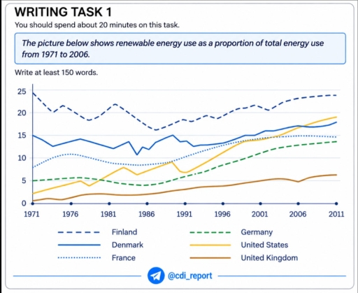
Band 6+: The picture below shows renewable energy use as a proportion of total energy use from 1971 to 2006.

Image for topic: The picture below shows renewable energy use as a proportion of total energy use from 1971 to 2006.
Our system will evaluate the answer based on this AI-generated description.
The image presents a line graph with a vertical axis ranging from 0 to 25 with tick marks and horizontal grid lines at increments of 5 (0, 5, 10, 15, 20, 25) and a horizontal axis marked at 5-year intervals with dots: 1971, 1976, 1981, 1986, 1991, 1996, 2001, 2006, and 2011. A legend specifies six series: Finland (dashed line), Denmark (solid line), France (dotted line), Germany (dashed line), United States (solid line), and United Kingdom (solid line). Approximate plotted values across years are: Finland: 1971: 24.5, 1974: 20, 1976: 21.5, 1982: 22, 1987: 16, 1991: 18.5, 1996: 19, 2001: 21.5, 2006: 23, 2011: 24; Denmark: 1971: 15, 1974: 12.5, 1977: 14, 1982: 12, 1985: 10.5, 1989: 15, 1991: 13.5, 1996: 13, 2001: 15, 2006: 17, 2011: 17.5; France: 1971: 8, 1976: 11, 1981: 9, 1986: 8.5, 1991: 10.5, 1996: 13, 2001: 14.5, 2006: 14.8, 2011: 14.8; Germany: 1971: 5, 1976: 5.5, 1981: 5, 1986: 4, 1991: 6, 1996: 8, 2001: 11, 2006: 13, 2011: 13.5; United States: 1971: 2, 1976: 4.5, 1977: 5, 1978: 3.5, 1983: 8, 1985: 6.5, 1989: 9, 1991: 6.5, 1996: 10, 2001: 14, 2006: 16.5, 2011: 19; United Kingdom: 1971: 0.5, 1976: 1, 1981: 2, 1986: 2, 1991: 3, 1996: 4, 2001: 5, 2006: 4.5, 2011: 6.
Given the complexity of the image, the above description may not be entirely accurate.
Note: Both the topic and the answer were created by one of our users.

The usage of renewable energy as part of overall energy consumed from 1971 to 2006 can be observed in this line graph. This picture also shows the statistic of energy use in different countries such as Finland, Denmark, France, Germany, United States and United Kingdom.

It can be seen that almost in every country the consumption of the renewable energy rose with the exception of Finland where the level of usage was quite high even in the past.

The graph introduces us smooth change of renewable energy usage in Germany, France and in United Kingdom. These lines gradually rose but in 1986 the slight decrease can be observed. The UK had a considerably low amount of consumption of renewable energy comparing to the other countries and in 2011 this country remained with the lowest numbers among all countries shown in the graph.

However, in Finland, US and in Denmark the amount of green energy usage fluctuates. This can be noticed especially in the period from 1976 to 1991. The renewable energy used by Finnish citizens vary through the time with the highest figure of almost 25 in 1971 and 2011. The lowest usage of such energy in this country can be observed slightly after 1986 but still Finland remained the highest level of usage among other countries.

Word Count: 217

Answers On The Same Topic:

The picture below shows renewable energy use as a proportion of total energy use from 1971 to 2006.

The line graph compares six different countries (Finland, Denmark, France, Germany, the US, and the UK) in terms of their energy use as a share of total energy consumption between 1971 and 2006. Overall, a sustainable energy usage as a proportion of total energy use witnessed a noticeable increase almost all the given countries with […]

The picture below shows renewable energy use as a proportion of total energy use from 1971 to 2006.

The graph illustrates data about renewable energy use as a proportion of total energy use,over a thirty five-year period between 1971 and 2006. Overall,what stands out of the graph is that there were considerable upward trends in total energy use in United Kingdom,Germany,United States,France and Denmark,while the total energy use in Finland don’t see any […]

The picture below shows renewable energy use as a proportion of total energy use from 1971 to 2006.

The line graph illustrates the share of renewable energy used between 1971 and 2006. Overall, Finland displayed the biggest proportion at the beginning of the period, but its percentage dropped slightly, yet it became the most popular of all. Meanwhile, Denmark became more popular by the end of the period. However, France, Germany and the […]

The picture below shows renewable energy use as a proportion of total energy use from 1971 to 2006.

The line graph illustrates changes in the proportion of total energy consumption in six different countries over a 40-year period starting in 1971. In general, it is noticeable that only upward trends were observed in all the given nations throughout the period, with the exception of Finland. Finland recorded the highest percentage of energy use […]

See All

Other Topics:

The chart shows the number of shops that closed and the number of new shops opening in a country from 2011 to 2018.

The line graph tracks the number of shops that closed and the number that opened in one country over the eight years from 2011 to 2018. Overall, closures outstripped openings in all but two years, 2011 and 2015. Openings declined markedly over the period as a whole, whereas closures, despite an extraordinary but brief collapse […]

The graph below shows the production levels of the main kinds of fuel in the UK between 1981 and 2000. Summarise the information by selecting and reporting the main features, and make comparisons where relevant.

The line graph below illustrates the level of production of UK main types of fuel from 1981 to 2000. Overall,it is clear that petroleum fluctuated but was the leader of energy units through the years. Additionally, coal fluctuated sharply in the beginning and both coal and natural gas production experienced a opposite trend by 2000 […]

The graph below shows the number of international students enrolled in universities in Australia, Canada, and the UK between 2000 and 2020. Summarize the information by selecting and reporting the main features, and make comparisons where relevant.

The line graph illustartes international student numbers with studying in three different countries over a 10-years period starting from 2010 to 2020. Overall, it is clear that the number of foreigners in Country A fell steadily, whereas there found the international students in Country B increased gradually. In the part of Country C started with […]

The chart below gives information about car ownership in the UK from 1975 to 2005. Summarize the information by selecting and reporting the main features and make comparisons where relevant.

The chart illustrates the trend in car ownership in the UK between 1975 and 2005 across various categories. Overall, the proportion of individuals owning one car remained the highest throughout the 30-year-period. Simultaneously, two and three cars ownership experienced an upward trend, whereas non-car ownership declined sharply. In 1975, the volume of households owning no […]

Number of books borrowed from four villages from four village libraries

The provided line graph illustrates the quantity of borrowed books from 4 different villages with 4 various libraries over a 4 month from June to September. Overall, it is clear that in Ryeslip books were more in demand among others, however throughout the period it started to lose its audience gradually. While Sutton Wood was […]

See All
We have detected unusual activity on your device.
Please verify your identity to continue.
Note: This verification step won't sign you in. If you have a premium account, please log in to access the service as usual.
Google/Gmail Verification
Or verify using Email/Code
We've sent a verification code to:
youremail@gmail.com (Not your email?)
Enter it below to complete the verification process.
Ensure your email address is correct, your inbox is not full, and you check your spam folder. If no email arrives, consider using an alternative email.
You will need a Premium plan to perform your action!
Note: If you already have a premium account, please log in to access our services as usual.

Plans & Pricing

Our mission is to make quality education accessible for everyone.
However, to keep our hardworking team running and this service alive, we genuinely need your support!
By opting for a premium plan, not only do you sustain us in achieving the mission, but you also unlock advanced features to enrich your learning experience.

Free

For learners who aren't pressed for time

What's included on Free
100+ Cambridge IELTS Tests
Instant IELTS Writing Task 1 & 2 Evaluation (2 times/month)
Instant IELTS Speaking Part 1, 2, & 3 Evaluation (2 times/month)
Instant IELTS Writing Task 1 & 2 Essay Generator (2 times/month)
500+ Dictation & Shadowing Exercises
100+ Pronunciation Exercises
Flashcards
Other Advanced Tools

Premium

For those serious about advancing their English proficiency, and for IELTS candidates aspiring to boost their band score by 1-2 points (especially in writing & speaking) in just 30 days or less

What's included on Premium
Save Your IELTS Test Progress & Analyze Mistakes By Question Type
Save Your Own Flashcard Sets & Use Them On Any Device
Unlock All Courses, IELTS Tests, Section & Part Practice
Unlimited AI Conversations
Unlimited AI Writing Enhancement Exercises
Unlimited IELTS Writing Task 1 & 2 Evaluation
Unlimited IELTS Speaking Part 1, 2, & 3 Evaluation
Checked Answers Will Not Be Published
Unlimited IELTS Writing Task 1 & 2 Essay Generator
Unlimited IELTS Speaking Part 1, 2, & 3 Sample Generator
Unlimited Usage Of Advanced Tools & AI Features
Priority Support within 24h (12-month plan only)

Due to the nature of our service and the provided free trials, payments are non-refundable.