Our system will evaluate the answer based on this AI-generated description.
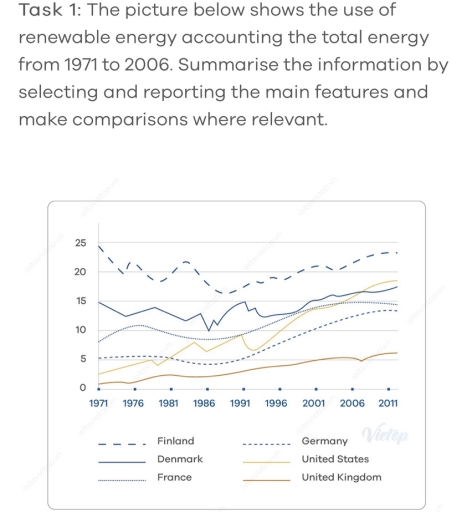
The image displays a line graph comparing the use of renewable energy from 1971 to 2006 in six countries: Finland, Denmark, Germany, United States, France, and United Kingdom. The y-axis represents the percentage use of renewable energy ranging from 0 to 25%, while the x-axis covers selected years from 1971 to 2011 (1971, 1976, 1981, 1986, 1991, 1996, 2001, 2006, 2011). The lines fluctuate as follows: Finland starts near 15% in 1971, peaks around 25% in 1996, then slightly declines to just below 25% in 2006. Denmark begins slightly above 5% in 1971, shows a rising trend to nearly 20% by 2006. Germany starts at around 5%, gradually increases to approximately 10% by 2006. The US stays consistently around 5% throughout the entire period. France begins near 10% in 1971, decreases to about 5% in 1981, then remains stable through to 2006. The UK line remains consistently around 0%-2% from 1971 to 2006.
Given the complexity of the image, the above description may not be entirely accurate.
Skyrocket your IELTS band score by 1-2 points in under a month with our premium plan!
Note: Both the topic and the answer were created by one of our users.
The line graph illustrates the number of renewable energy were used accounting the total energy between 1971 and 2006.
Overall, the use ofrenewable energy in the United Kingdom,Germany and France had more stability compared with thestrength and continous fluctuation in Finland, Denmark and the United States. In addition, the use of renewable energy in Finland was always the highest while the United Kingdom was the lowest in the period.
Regarding the United Kingdom, where the use of renewable energy was the lowest from 1971 to 2011, witnessed a remained unchanged from 1971 to 1976 with around only 1. Then, the countries continously increased at the end period but there is a stagnation in nearly 2006. The renewable energy was used in France and Germany
Regarding
Word Count: 125
