🔥 Today Only: Save 30% on Premium — Offer Ends Soon! - Upgrade Now!
Multiple Graphs

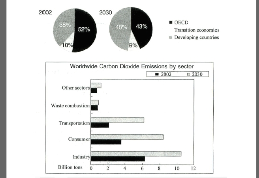
Band 6+: The pie graphs show greenhouse gas emissions worldwide in 2002 and the forecast for 2030. The column chart shows carbon dioxide emissions around the world. Summarise the information by selecting and reporting the main features, and make comparisons where relevant.

Image for topic: The pie graphs show greenhouse gas emissions worldwide in 2002 and the forecast for 2030. The column chart shows carbon dioxide emissions around the world. Summarise the information by selecting and reporting the main features, and make comparisons where relevant.
Our system will evaluate the answer based on this AI-generated description.
The image contains two separate data representations on carbon dioxide emissions. The first part shows two pie charts for 2002 and 2030 with three categories: OECD, Transition economies, and Developing countries. In 2002, OECD has 52%, Transition economies 10%, and Developing countries 38%; in 2030, OECD has 43%, Transition economies 9%, and Developing countries 48%. The second part shows a bar graph titled "Worldwide Carbon Dioxide Emissions by sector" with two bars for each sector representing 2002 and 2030. Sectors include Other sectors, Waste combustion, Transportation, Consumer, and Industry. In 2002, Other sectors have less than 2 billion tons, Waste combustion around 1.5 billion tons, Transportation nearly 6 billion tons, Consumer over 2 billion tons, and Industry approximately 10 billion tons. By 2030, Other sectors increase to just under 4 billion tons, Waste combustion around 2 billion tons, Transportation nearly 10 billion tons, Consumer around 3.5 billion tons, and Industry close to 12 billion tons.
Given the complexity of the image, the above description may not be entirely accurate.
Note: Both the topic and the answer were created by one of our users.

The presented pie charts highlights data about what percentage of greenhouse gas was produced by OECD, transition economies and developing countries in 2002 and some predictions for 2030 and the presented bar chart shows the information about how much Carbon Dioxide produced by five different sectors around the world in 2002 and some projection for 2030.

In general, what remarkably stands out from the diagrams is that the ratio of greenhouse gas which was produced by OECD was the highest in 2002, although that of developing countries will be the highest in 2030. Another striking point is that in 2002 and 2030, the amount of Carbon Dioxide Industry sector produced around the world is the highest among other sectors.

In 2002, the ratio of greenhouse gas developing countries produced was 38%, whereas it is likely to be 10% higher until 2030. Considering OECD, it fell by 9% between 2002 and 2030.

Regarding the amount of Carbon Dioxide which was produced by consumer sector, it stood at 2 billion tone, although it expected to be three-times as much as 2002 until 2030. That of industry sector in 2030 will be 4 billion tone higher that that of 2002, which was 6 billion tone.

Word Count: 202

Answers On The Same Topic:

The pie graphs show greenhouse gas emissions worldwide in 2002 and the forecast for 2030. The column chart shows carbon dioxide emissions around the world. Summarise the information by selecting and reporting the main features, and make comparisons where relevant.

While the pie charts provide greenhouse gas emissions worldwide between 2002 and 2030, the column chart illustrates carbon dioxide emissions in five different group included industry, consumer, transportation, waste combustion and other sectors. Overall, while the data of greenhouse gas emissions in OECD and transition economies experienced a downward trend between 2002 and 2030, the […]

The pie graphs show greenhouse gas emissions worldwide in 2002 and the forecast for 2030. The column chart shows carbon dioxide emissions around the world. Summarise the information by selecting and reporting the main features, and make comparisons where relevant.

The bar charts compare the proportion of greenhouse gas emissions worldwide in 2002 and prediction for 2030 and the chart illustrates global carbon dioxide emissions forecast among five sector in billions of tons. Overall, the most striking feature is that OECD accounted for the highest figure while the reverse was true for transition economies over […]

The pie graphs show greenhouse gas emissions worldwide in 2002 and the forecast for 2030. The column chart shows carbon dioxide emissions around the world. Summarise the information by selecting and reporting the main features, and make comparisons where relevant.

The pie charts compare the proportions of greenhouse gas emissions produced by three groups of countries worldwide in 2002 and provide a forecast for 2030. The bar chart illustrates global carbon dioxide emissions across five sectors in billions of tons. Overall, the main contributors to CO₂ emissions in both 2002 and the prediction for 2030 […]

The pie graphs show greenhouse gas emissions worldwide in 2002 and the forecast for 2030. The column chart shows carbon dioxide emissions around the world. Summarise the information by selecting and reporting the main features, and make comparisons where relevant.

The pie charts illustrate data the percentage of three categories – OECD, transition economies, and developing in 2002 and 2030, while the bar provides details on the proportion of carbon dioxide emissions according to five different departments in the same time. Overall, both OECD, and transition economies experienced downward trends, albeit to varying degrees over […]

The pie graphs show greenhouse gas emissions worldwide in 2002 and the forecast for 2030. The column chart shows carbon dioxide emissions around the world. Summarise the information by selecting and reporting the main features, and make comparisons where relevant.

The pie charts provide data about greenhouse gas emissions in whole world in 2002 and up to 2030, while the bar charts demonstrate carbon dioxide emissions globally. Overall, it is evident that OCED and developing countries sectors showed the dominance in given period, whereas transition economies had the lowest emissions in both years. Moreover, there […]

See All

Other Topics:

Global water use by sector and water consumption in two different countries

The given line graph illustrates changes in the consumption of water worldwide between 1900 and 2000, while the table compares population, irrigated land and per-capita water consumption in Brazil and the Democratic Republic of Congo in 2000. It is obvious that total worldwide water use experienced an upward trend over the period with agriculture consistently […]

Global water use by sector and water consumption in two different countries

The given line graph illustrates changes in the consumption of water worldwide between 1900 and 2000, while the table compares population, irrigated land and per-capita water consumption in Brazil and the Democratic Republic of Congo in 2000. It is obvious that total worldwide water use increased significantly over the period, with agriculture consistently being the […]

WRITING TASK 1 You should spend about 20 minutes on this task. The two line graphs below show New Zealand import figures from Australia and Japan in the years 1994 - 2004. Summarise the information by selecting and reporting the main features, and make comparisons where relevant. You should write at least 150 words.

The two line graphs illustrate the value of imports to New Zealand from Japan and Australia between 1994 and 2004, measured in NZ$ million. Overall, imports from Australia demonstrated a consistent upward trend despite some fluctuations, whereas imports from Japan initially increased but experienced a pronounced decline after 2000. Throughout the period, Australia remained New […]

the chart and table below give information about online shopping by Australia and New Zealand customers in 2012

The images below provide data on online shopping by consumers from Australia and New Zealand in 2012. Overall, the vast majority of customers in both Australia and New Zealand prefer to combine local and international websites for shopping, and only a small percentage of individuals buy exclusively from foreign resources. The prime reason for buying […]

Chart A below shows the rate of oil consumption (in millions of barrels) in a small country from 1950 to 2010. Chart B shows the number of people employed in the oil industry in that country, and also the rate of unemployment throughout the country over the same time.

The two given charts illustrates the annual consuption millionbarrels and oil employee and the percentage of national unemployment from the year 1950 to 2010.Generally the annual consumption has shot up though it remained constant at the start of the certain year but has mantained the trend despite the number of employee and unemployed reducing over […]

The bar charts give information about the salaries and university fees of students from three universities in two spheres - Law and Business. Summarize information by selecting and reporting the main features and make comparisons where relevant

The charts demonstrate three different universities in two categories: Law and Business; in addition, it shows the amount of money paid by students to tuition fees and their monthly revenue. In detail, University A is the only university where students receive and pay the same amount of money in the sphere of Law ($40,000). Nevertheless, […]

See All
We have detected unusual activity on your device.
Please verify your identity to continue.
Note: This verification step won't sign you in. If you have a premium account, please log in to access the service as usual.
Google/Gmail Verification
Or verify using Email/Code
We've sent a verification code to:
youremail@gmail.com (Not your email?)
Enter it below to complete the verification process.
Ensure your email address is correct, your inbox is not full, and you check your spam folder. If no email arrives, consider using an alternative email.
You will need a Premium plan to perform your action!
Note: If you already have a premium account, please log in to access our services as usual.

Plans & Pricing

Our mission is to make quality education accessible for everyone.
However, to keep our hardworking team running and this service alive, we genuinely need your support!
By opting for a premium plan, not only do you sustain us in achieving the mission, but you also unlock advanced features to enrich your learning experience.

Free

For learners who aren't pressed for time

What's included on Free
100+ Cambridge IELTS Tests
Instant IELTS Writing Task 1 & 2 Evaluation (2 times/month)
Instant IELTS Speaking Part 1, 2, & 3 Evaluation (2 times/month)
Instant IELTS Writing Task 1 & 2 Essay Generator (2 times/month)
500+ Dictation & Shadowing Exercises
100+ Pronunciation Exercises
Flashcards
Other Advanced Tools

Premium

For those serious about advancing their English proficiency, and for IELTS candidates aspiring to boost their band score by 1-2 points (especially in writing & speaking) in just 30 days or less

What's included on Premium
Save Your IELTS Test Progress & Analyze Mistakes By Question Type
Save Your Own Flashcard Sets & Use Them On Any Device
Unlock All Courses, IELTS Tests, Section & Part Practice
Unlimited AI Conversations
Unlimited AI Writing Enhancement Exercises
Unlimited IELTS Writing Task 1 & 2 Evaluation
Unlimited IELTS Speaking Part 1, 2, & 3 Evaluation
Checked Answers Will Not Be Published
Unlimited IELTS Writing Task 1 & 2 Essay Generator
Unlimited IELTS Speaking Part 1, 2, & 3 Sample Generator
Unlimited Usage Of Advanced Tools & AI Features
Priority Support within 24h (12-month plan only)

Due to the nature of our service and the provided free trials, payments are non-refundable.