🔥 Today Only: Save 30% on Premium — Offer Ends Soon! - Upgrade Now!
Multiple Graphs

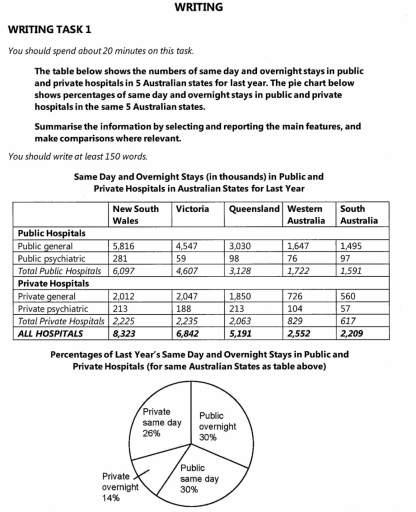
Band 7+: The table below shows the numbers of same day and overnight stays in public and private hospitals in 5 Australian states for last year. The pie chart below shows percentages of same day and overnight stays in public and private hospitals in the same 5 Australian states. Summarise the information by selecting and reporting the main features, and make comparisons where relevant. You should write at least 150 words.

Image for topic: The table below shows the numbers of same day and overnight stays in public and private hospitals in 5 Australian states for last year. The pie chart below shows percentages of same day and overnight stays in public and private hospitals in the same 5 Australian states. Summarise the information by selecting and reporting the main features, and make comparisons where relevant. You should write at least 150 words.
Our system will evaluate the answer based on this AI-generated description.
The image presents numerical data on hospital stays in Australian states with specific values: New South Wales recorded a total of 8,323 stays in public and private hospitals with breakdowns as follows – Public general: 5,816, Public psychiatric: 281, Private general: 2,012, Private psychiatric: 213; Victoria had a total of 6,842 with Public general: 4,547, Public psychiatric: 110, Private general: 2,047, Private psychiatric: 138; Queensland showed a total of 5,191 with Public general: 3,030, Public psychiatric: 98, Private general: 1,850, Private psychiatric: 213; Western Australia summed to 2,552 with Public general: 1,647, Public psychiatric: 19, Private general: 726, Private psychiatric: 160; South Australia had overall stays of 2,209 with Public general: 1,495, Public psychiatric: 96, Private general: 560, Private psychiatric: 58. Pie chart percentages are for same states and reveal Private same day 14%, Private overnight 26%, Public same day 30%, Public overnight 30%.
Given the complexity of the image, the above description may not be entirely accurate.
Note: Both the topic and the answer were created by one of our users.

The table and the pie chart illustrate how many and the proportion of same day and overnight stays in public hospitals and private hospitals in the same 5 Australian states in one year ago.

Overall, while the two factors of public hospitals accounted for the highest percentage of the total in 5 states, the opposite was true for private overnight. In addition, New South Wales was the most popular in both hospitals, whereas South Australia had the lowest figures.

Regarding the table, generalities were higher than psychiatric in both hospitals. For public hospitals, New South Wales had the highest data, at 6,097 of the total. This is followed by Victoria and Queensland, at 4,607 and 3,128, respectively. The figures for Western Australia and South Australia were relatively low, at 1,722 and 1,591 respectively. For private hospitals, the location of each state does not change, down from New South Wales to South Australia, with 2,225, 2,235, 2,063,829, 617 respectively.

Regarding the pie chart, public overnight and public same day had shared the proportion, at 30%, which was the highest percentage. This was followed by private same day at 26% and private overnight at 14%.

Word Count: 193

Answers On The Same Topic:

The table below shows the numbers of same day and overnight stays in public and private hospitals in 5 Australian states for last year. The pie chart below shows percentages of same day and overnight stays in public and private hospitals in the same 5 Australian states. Summarise the information by selecting and reporting the main features, and make comparisons where relevant. You should write at least 150 words.

The table illustrates the number of same-day and overnight hospital stays in both public and private hospitals across five Australian states over the past year, while the pie chart presents the proportion of these stays by hospital type and duration in the same regions. Overall, public hospitals accounted for the majority of both same-day and […]

The table below shows the numbers of same day and overnight stays in public and private hospitals in 5 Australian states for last year. The pie chart below shows percentages of same day and overnight stays in public and private hospitals in the same 5 Australian states. Summarise the information by selecting and reporting the main features, and make comparisons where relevant. You should write at least 150 words.

The table illustrates the number of same day and overnight stays in public and private hospitals across 5 Australian States for the previous year while the pie chart shows these data in percentage. Overall, New South Wale had the highest hospital stays while South Australia’ number was the lowest. The pie chart indicates that the […]

The table below shows the numbers of same day and overnight stays in public and private hospitals in 5 Australian states for last year. The pie chart below shows percentages of same day and overnight stays in public and private hospitals in the same 5 Australian states. Summarise the information by selecting and reporting the main features, and make comparisons where relevant. You should write at least 150 words.

The provided visuals illustrate the number of same-day and overnight stays in public and private hospitals across five Australian states during the previous year, alongside a pie chart that details the respective percentages of these stays. Overall, New South Wales recorded the highest total hospital stays, whereas South Australia had the lowest figures. The pie […]

See All

Other Topics:

the chart below shows the amount of money per week spent on fast food in britain. the graph shows the trends in consumption of fast foods.

The bar chart depicts expenditure on fast foods, namely hamburgers, fish and chips and pizza by three income groups, while the line chart provides information on how many grammes of junk foods were consumed between 1970 and 1990. Overall, high and average income groups spent the most pence on hamburgers, while fish and chips were […]

The bar chart and pie chart show the amount of carbon dioxide (CO₂) emitted by three different income groups in 1990 and 2000, and the proportion of the world's population represented by each income group in 2000.

The bar chart compares carbon dioxide emissions among three income groups in 1990 and 2000, while the pie chart illustrates the proportion of the global population belonging to each group in 2000. Overall, emissions from the middle-income group increased substantially, whereas those from the high-income group declined slightly. Notably, although the high-income group represented the […]

The bar chart and pie chart show the amount of carbon dioxide (CO₂) emitted by three different income groups in 1990 and 2000, and the proportion of the world's population represented by each income group in 2000.

The bar chart compares the amount of carbon dioxide emitted by three income groups in 1990 and 2000, whereas the pie chart illustrates each group’s share of the world’s population in 2000. Overall, the middle income group was the largest emitter in 2000, while the low income group produced a negligible share of emissions throughout […]

The charts below give information on the location and types of dance classes young people in a town in Australia are currently attending. Summarise the information by selecting and reporting the main features, and make comparisons where relevant. Write at least 150 words. Location of dance classes Community halls & other 18% 目 Private -studios 48% School halls (after-school) 24% College-based studios 10% Types of dance classes (by age group) Under 11 11-16 Ballet Tap Modern 100 200 96 →p. 136 300 400 Number of students 500 600 700

The given chart displays the information regarding the location and various types of dance classes children are attending in a town in Australia.Overall, it can be seen that, private studios are the top choices for children who want to learn dance whereas, college based studios are the least popular. Similarly, Ballet seems the most popular […]

The graphs below show four categories of citrus fruits and the top three countries to which these were exported (in thousand tonnes) in 2012. Summarise the information by selecting and reporting the main features, and make comparisons where relevant.

The charts illustrates the four categories of citrus fruits and top three countries with exports in 2012 . Overall, citrus fruits have different range of exports and different places.While, oranges have bigger number than others type of fruits . Lemons, grapefruits and other fruits have the similar number of exports and main two countries oto […]

The charts and table below show the percentage of customers choosing different kinds of websites when shopping online and the percentage of customers shopping online for different reasons on two countries in 2012.

The pie charts and table illustrate the percentages of online shoppers in Australia and New Zealand who use different websites and their main reasons for shopping on the Internet in 2012. Overall, a large proportion of customers in two countries used both overseas and local websites, whereas domestic websites were the least common option. The […]

See All
We have detected unusual activity on your device.
Please verify your identity to continue.
Note: This verification step won't sign you in. If you have a premium account, please log in to access the service as usual.
Google/Gmail Verification
Or verify using Email/Code
We've sent a verification code to:
youremail@gmail.com (Not your email?)
Enter it below to complete the verification process.
Ensure your email address is correct, your inbox is not full, and you check your spam folder. If no email arrives, consider using an alternative email.
You will need a Premium plan to perform your action!
Note: If you already have a premium account, please log in to access our services as usual.

Plans & Pricing

Our mission is to make quality education accessible for everyone.
However, to keep our hardworking team running and this service alive, we genuinely need your support!
By opting for a premium plan, not only do you sustain us in achieving the mission, but you also unlock advanced features to enrich your learning experience.

Free

For learners who aren't pressed for time

What's included on Free
100+ Cambridge IELTS Tests
Instant IELTS Writing Task 1 & 2 Evaluation (2 times/month)
Instant IELTS Speaking Part 1, 2, & 3 Evaluation (2 times/month)
Instant IELTS Writing Task 1 & 2 Essay Generator (2 times/month)
500+ Dictation & Shadowing Exercises
100+ Pronunciation Exercises
Flashcards
Other Advanced Tools

Premium

For those serious about advancing their English proficiency, and for IELTS candidates aspiring to boost their band score by 1-2 points (especially in writing & speaking) in just 30 days or less

What's included on Premium
Save Your IELTS Test Progress & Analyze Mistakes By Question Type
Save Your Own Flashcard Sets & Use Them On Any Device
Unlock All Courses, IELTS Tests, Section & Part Practice
Unlimited AI Conversations
Unlimited AI Writing Enhancement Exercises
Unlimited IELTS Writing Task 1 & 2 Evaluation
Unlimited IELTS Speaking Part 1, 2, & 3 Evaluation
Checked Answers Will Not Be Published
Unlimited IELTS Writing Task 1 & 2 Essay Generator
Unlimited IELTS Speaking Part 1, 2, & 3 Sample Generator
Unlimited Usage Of Advanced Tools & AI Features
Priority Support within 24h (12-month plan only)

Due to the nature of our service and the provided free trials, payments are non-refundable.