🔥 Today Only: Save 30% on Premium — Offer Ends Soon! - Upgrade Now!
Pie Chart

Band 4+: Two pie-chart show the amount of water used in one country in 1988 and 2000

Image for topic: Two pie-chart show the amount of water used in one country in 1988 and 2000
Our system will evaluate the answer based on this AI-generated description.
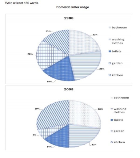
The image contains two pie charts depicting domestic water usage in the years 1988 and 2008. In the 1988 chart, percentages allocated to categories are as follows: bathroom (22%), washing clothes (15%), toilets (25%), garden (20%), and kitchen (18%). In the 2008 chart, the percentages for each category are displayed as: bathroom (28%), washing clothes (14%), toilets (29%), garden (7%), and kitchen (22%). The 2008 chart showcases a significant increase in water usage for bathrooms and toilets compared to the 1988 chart, with a 6% and 4% rise respectively. Conversely, the usage for washing clothes and garden are noticeably decreased by 1% and 13% respectively in the 2008 chart. Kitchen usage stays relatively similar across both years, only showing a slight increase of 4% in the 2008 chart. The charts are titled "Domestic water usage" and labeled with the specific years they represent.
Given the complexity of the image, the above description may not be entirely accurate.
Note: Both the topic and the answer were created by one of our users.

The givwn two pie-charts illustrates usage of domestic water ( including Bathroom , Washing clothes , Toilets , Garden , Kitchen ) in one country of two different years that is 1988 and 2008 . The data is caliberated in percentage .

Overall , the highes usage of domestic water was done by washing clothes in 1988 . In the sane year , usage of water for domestic purpose was for Kitchen. In the year 2008 , Garden turns out to be the one with least usage of water for dometic purpose .

As you can see from the given figure In the year 1988 , large amount of water used for domestic purpose was for washing clothes standing with 25 % while the lowest usage was for Kitchen surprisingly with 15% . The Toliets stood at 18% for usage of water . The water being used for Bathroom was 22% while the Garden was used water with just slight difference of 2% .

Well in the year 2008 , the data shows Kitchen being the highest domsetic water utilization with 29% being followed by Usage of water for Bathroom with only difference of 1%. Garden turns out to be the lowest dometic work for usage of water . Toilets stood at 14% water domestic usage while water utilize for washing clothes was 8% more than toilets

Word Count: 227

Answers On The Same Topic:

Two pie-chart show the amount of water used in one country in 1988 and 2000

The given two charts illustrate how much water utilized in a country between 1988 and 2000. Overall, it is clear that there were no huge changes without water which was used for kitchen from 1988 to 2000. In addtion, kitchen water increased highest level in last year of question. If we look at the picture […]

Two pie-chart show the amount of water used in one country in 1988 and 2000

Both pie charts illustrate the usage of water in a country, two years that apart by 10 years, in 1988 and 2000. They show the percentages of water used under five categories. those categories are bathroom, washing clothes, toilets, garden and kitchen. Overall, the water used in kitchen had increased significantly while the water used […]

Two pie-chart show the amount of water used in one country in 1988 and 2000

The pie chart illustrates the amount of spending water in five section and in one country from 1988 to 2008. Overall,it is evident that the most used figure were bathroom and washing clothes, while the users of water in the kitchen increased significantly.In contrast the amount of water for garden reduced dramatically and toilets remained […]

Two pie-chart show the amount of water used in one country in 1988 and 2000

Two pie charts compare information about consumption of water in different ways in one country from 1988 to 2008. Overall, it can be seen that in the beginning of the year water usage of washing clothes had the highest percent however, by the end it changed and kitchen became the highest. what is more, using […]

See All

Other Topics:

The pie charts compare ways of accessing the news in the UK and Brazil.

The pie charts showcase the different news media used in the UK and in Brazil. First of all, the dominance of the TV as a news outlet is prominent both in the UK and in Brazil. Online access to media is strong in both countries, especially in Brazil, where it consists the primary source of […]

The chart below shows the proportions for the ages of the populations of Yemen. Summarise the information by selecting and reporting the main features, and make comparisons where relevant.

The pie charts illustrates the ages of the populations of Yemen and Italy in 2000 and predictions for 2050. Overall, the percentage of the populations around 15-59 years in Yemen will increase while those for Italy showed opposite trend. Although the old people in both countries is projected to grow, the younger will experience the […]

The chart below shows the proportions for the ages of the populations of Yemen. Summarise the information by selecting and reporting the main features, and make comparisons where relevant.

The given pie chart showcases the proportion of population in Yemen and Italy by ages in 2000 and 2050. Overall, it is clearly seen from the chart is that 50% of Yemen people in 2000 were 0-14 aged, while in 2050, it will be overtaken with over 50% of 15-59 years old people. Additionally, in […]

The two pie charts show the distribution of world population and people's spending on education

The pie charts illustrate the global population by region and public education spending in 2000. Overall, the Asian Pacific region contains the largest share of the world’s population, while others contribute the least. In contrast, high school expenditures are the most significant, and public spending on further education took the lowest share in 2000. Europe […]

The chart below shows the results of a recent survey into the causes of poor school attendance in the UK. Summarise the information by selecting and reporting the main features, and make comparisons where relevant.

The pie chart illustrates the primary factors responsible for poor school attendance in the UK, based on a data from recent survey. Overall, the most significant cause of poor attendance is having both parents working, whereas upbringing accounts for the smallest proportion. Additionally, school discipline and social factors like peers pressure and bullying also contribute […]

The charts below show the main causes of deforestation in Southeast Asia in 2022 and the number of endangered species by category in North America in the same year. Summarise the information by selecting and reporting the main features, and make comparisons where relevant.

the grah illustrates the main aspects that generate deforestation in Asia in 2022 and at the same time the afected species in North America .Overall the agriculture is the main section that cause more damage in the lose of trees in Asia , while Mining is the cause that has a lower impact . First […]

See All
We have detected unusual activity on your device.
Please verify your identity to continue.
Note: This verification step won't sign you in. If you have a premium account, please log in to access the service as usual.
Google/Gmail Verification
Or verify using Email/Code
We've sent a verification code to:
youremail@gmail.com (Not your email?)
Enter it below to complete the verification process.
Ensure your email address is correct, your inbox is not full, and you check your spam folder. If no email arrives, consider using an alternative email.
You will need a Premium plan to perform your action!
Note: If you already have a premium account, please log in to access our services as usual.

Plans & Pricing

Our mission is to make quality education accessible for everyone.
However, to keep our hardworking team running and this service alive, we genuinely need your support!
By opting for a premium plan, not only do you sustain us in achieving the mission, but you also unlock advanced features to enrich your learning experience.

Free

For learners who aren't pressed for time

What's included on Free
100+ Cambridge IELTS Tests
Instant IELTS Writing Task 1 & 2 Evaluation (2 times/month)
Instant IELTS Speaking Part 1, 2, & 3 Evaluation (2 times/month)
Instant IELTS Writing Task 1 & 2 Essay Generator (2 times/month)
500+ Dictation & Shadowing Exercises
100+ Pronunciation Exercises
Flashcards
Other Advanced Tools

Premium

For those serious about advancing their English proficiency, and for IELTS candidates aspiring to boost their band score by 1-2 points (especially in writing & speaking) in just 30 days or less

What's included on Premium
Save Your IELTS Test Progress & Analyze Mistakes By Question Type
Save Your Own Flashcard Sets & Use Them On Any Device
Unlock All Courses, IELTS Tests, Section & Part Practice
Unlimited AI Conversations
Unlimited AI Writing Enhancement Exercises
Unlimited IELTS Writing Task 1 & 2 Evaluation
Unlimited IELTS Speaking Part 1, 2, & 3 Evaluation
Checked Answers Will Not Be Published
Unlimited IELTS Writing Task 1 & 2 Essay Generator
Unlimited IELTS Speaking Part 1, 2, & 3 Sample Generator
Unlimited Usage Of Advanced Tools & AI Features
Priority Support within 24h (12-month plan only)

Due to the nature of our service and the provided free trials, payments are non-refundable.