24 Hours Only: Get 39% OFF on Our Premium Plan - Check Out Now!
Bar Chart

Band 7+: You should spend about 20 minutes on this task. The bar chart below shows the total number of minutes (in billions) of telephone calls in Australia, divided into three categories, from 2001- 2008. Summarise the information by selecting and reporting the main features and make comparisons where relevant. You should write at least 150 words.

Image for topic: You should spend about 20 minutes on this task. The bar chart below shows the total number of minutes (in billions) of telephone calls in Australia, divided into three categories, from 2001- 2008. Summarise the information by selecting and reporting the main features and make comparisons where relevant. You should write at least 150 words.
Our system will evaluate the answer based on this AI-generated description.
The image contains a bar graph titled "Australia telephone calls, by category, 2001-2008," displaying three categories: Local, National & International, and Mobiles. In 2001, Local had 72 units, National & International had 38 units, and Mobiles had 2 units. In 2002, Local had 78 units, National & International had 41 units, and Mobiles had 5 units. In 2003, Local had 85 units, National & International had 45 units, and Mobiles had 7 units. In 2004, Local had 89 units, National & International had 48 units, and Mobiles had 9 units. In 2005, Local had 90 units, National & International had 50 units, and Mobiles had 12 units. In 2006, Local had 84 units, National & International had 55 units, and Mobiles had 23 units. In 2007, Local had 79 units, National & International had 50 units, and Mobiles had 39 units. In 2008, Local had 72 units, National & International had 46 units, and Mobiles had 51 units.
Given the complexity of the image, the above description may not be entirely accurate.
Note: Both the topic and the answer were created by one of our users.

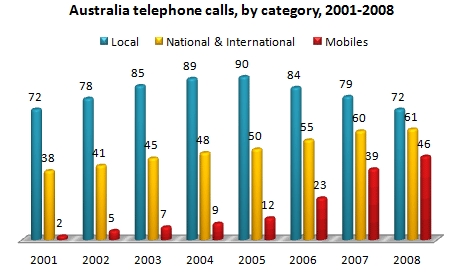
The chart provides information about the minutes spent on phone calls in Australia, categorized into three types, from 1998 to 2005. Overall, all types of calls generally increased over this period, with Local-landline calls accounting for the highest number of minutes.

In 1998, Local-landline calls started at 60 minutes and rose to 75 minutes by 2002, making it the highest call type during that time. However, by 2005, the minutes spent on Local-landline calls returned to 60 minutes, the same as when it started. In contrast, Mobile calls had the lowest number of minutes. They began at just 5 minutes in 1998 and ended at 35 minutes, remaining the lowest throughout the period.

The National & International-landline call type started at 30 minutes. Over the years, it increased to 40 minutes, but ultimately ended at 35 minutes, which made it the medium call type.

Word Count: 144

Answers On The Same Topic:

You should spend about 20 minutes on this task. The bar chart below shows the total number of minutes (in billions) of telephone calls in Australia, divided into three categories, from 2001- 2008. Summarise the information by selecting and reporting the main features and make comparisons where relevant. You should write at least 150 words.

The bar chart shows the total number of telephone call minutes in Australia between 2001 and 2008. The calls are divided into three categories: local, national and international, and mobiles. Overall, local calls were the most popular in all years, with a peak in 2005. In contrast, mobile calls had the lowest numbers, but they […]

You should spend about 20 minutes on this task. The bar chart below shows the total number of minutes (in billions) of telephone calls in Australia, divided into three categories, from 2001- 2008. Summarise the information by selecting and reporting the main features and make comparisons where relevant. You should write at least 150 words.

The bar chart illustrates the total minutes spent on telephone calls in Australia between 2001 and 2008, categorised into local, national and international, and mobile calls. Overall, the most significant trend is the dramatic increase in mobile call minutes, which overtook local calls by the end of the period. While local calls initially showed a […]

You should spend about 20 minutes on this task. The bar chart below shows the total number of minutes (in billions) of telephone calls in Australia, divided into three categories, from 2001- 2008. Summarise the information by selecting and reporting the main features and make comparisons where relevant. You should write at least 150 words.

The bar chart compares the total duration (in billions of minutes) of telephone calls in Australia, categorized by three types: local, national and international, and mobiles between 2001 and 2008. Overall, during the period, the durations of national and international and mobile calls consistently increased, albeit at different rates, while the figure for local calls […]

You should spend about 20 minutes on this task. The bar chart below shows the total number of minutes (in billions) of telephone calls in Australia, divided into three categories, from 2001- 2008. Summarise the information by selecting and reporting the main features and make comparisons where relevant. You should write at least 150 words.

The bar graph illustrates the volume of telephone calls, delineated by category, made in Australia from 2001 to 2008, measured in billions of minutes. Overall, local calls consistently dominated in terms of volume throughout the period, while national and international calls experienced steady growth. In contrast, mobile calls, although starting from a low base, exhibited […]

You should spend about 20 minutes on this task. The bar chart below shows the total number of minutes (in billions) of telephone calls in Australia, divided into three categories, from 2001- 2008. Summarise the information by selecting and reporting the main features and make comparisons where relevant. You should write at least 150 words.

The bar chart illustrates the total number of minutes (in billions) spent on three types of phone calls in Australia between 1998 and 2005. The call types include local landline, national and international landline, and mobile calls. Overall, local calls remained the most common type throughout the period, peaking in the early 2000s before declining. […]

See All

Other Topics:

The bar chart shows the number of hours men and women spent on different tasks on average per day in 2011.

The given bar chart illustrates the information regarding the amount of time men and women spent on their regular activities on average every day in 2011. Overall, both men and women spent most of their time working and sleeping. Women spent more time taking care of their kids and also shopping, while men consume more […]

The bar chart below shows the average number of hours per week that people in five different countries spent doing physical exercise in 2020, broken down by gender

The bar chart below demonstrates the average hours people spent by doing exercise from 5 different countries per week in 2020, broken down by gender. This essay break down this bar chart below, overview that in all 5 countries male has the highest number of physical exercise in 2020 rather then female. The bar chart […]

The bar chart shows the number of hours men and women spent on different tasks on average per day in 2011.

The given bar chart illustrates the information regarding the amount of the time men and women spent for their regular activity on average everyday in 2011. Overall, both men and women spent their most of the time by doing jobs and sleeping. Women spent more time for take caring of their kids and also for […]

The chart below shows the spending (in millions) by 18-20 year old in one country on five different products in 2010 and 2014.

The bar chart gives information about the spending of people aged 18-20 in five different activity. Overall, it is clear that food hit the highest point in both years. With the exception of books which significantly fell, spending on clothes, smartphones and toiletries rose. It shows that people’s preferences changed over time. In 2010 the […]

The graph below shows the population using internet in 4 different European countries.

The bar chart illustrates the percentage of people using the internet in five different countries, and the pie chart compares the amount of money spent on online shopping per person in Spain, France, Sweden, Germany, and the UK. It is clear that the Sweden had the highest percentage of internet users. It is also noticeable […]

The charts below show the proportions of the world's oil resources held defferent areas, togethee with the proportions consumed annually in the areas.

The chart shows data about the porportion of the world’s resources different areas- Middle East, Canada, Central and South America, Eastern Europe, Affrica, Asia, United States, Western Europe, Australia and New Zealand, and other countries. The data shows comparision between these countries annual oil consumption and world oil resourses. It is appearent from the information […]

See All
We have detected unusual activity on your device.
Please verify your identity to continue.
Note: This verification step won't sign you in. If you have a premium account, please log in to access the service as usual.
Google/Gmail Verification
Or verify using Email/Code
We've sent a verification code to:
youremail@gmail.com (Not your email?)
Enter it below to complete the verification process.
Ensure your email address is correct, your inbox is not full, and you check your spam folder. If no email arrives, consider using an alternative email.
You will need a Premium plan to perform your action!
Note: If you already have a premium account, please log in to access our services as usual.

Plans & Pricing

Our mission is to make quality education accessible and free for everyone.
However, to keep our hardworking team running and this service alive, we genuinely need your support!
By opting for a premium plan, not only do you sustain us in achieving the mission, but you also unlock advanced features to enrich your learning experience.

Free

For learners who aren't pressed for time

What's included on Free
1000+ IELTS Tests & Samples
Instant IELTS Writing Task 1 & 2 Evaluation (2 times/month)
Instant IELTS Speaking Part 1, 2, & 3 Evaluation (5 times/month)
Instant IELTS Writing Task 1 & 2 Essay Generator (2 times/month)
500+ Dictation & Shadowing Exercises
100+ Pronunciation Exercises
Flashcards
Other Advanced Tools

Premium

For those serious about advancing their English proficiency, and for IELTS candidates aspiring to boost their band score by 1-2 points (especially in writing & speaking) in just 30 days or less

What's included on Premium
Save Your IELTS Test Progress
Unlock All Courses & Content
Unlimited AI Conversations
Unlimited AI Writing Enhancement Exercises
Unlimited IELTS Writing Task 1 & 2 Evaluation
Unlimited IELTS Speaking Part 1, 2, & 3 Evaluation
Checked Answers Will Not Be Published
Unlimited IELTS Writing Task 1 & 2 Essay Generator
Unlimited IELTS Speaking Part 1, 2, & 3 Sample Generator
Unlimited Usage Of Advanced Tools

Due to the nature of our service and the provided free trials, payments are non-refundable.
Nếu bạn là người Việt Nam và không có hoặc không muốn trả bằng credit/debit cards, bạn có thể thanh toán bằng phương thức chuyển khoản:


Chọn gói:
279,000₫ 157,000 ₫ cho gói 1 tháng (chỉ 5,233₫/ngày)
819,000₫ 397,000 ₫ cho gói 3 tháng (chỉ 4,411₫/ngày)
1,649,000₫ 667,000 ₫ cho gói 6 tháng (chỉ 3,706₫/ngày)
3,299,000₫ 857,000 ₫ cho gói 12 tháng (chỉ 2,381₫/ngày)


Sau khi chuyển khoản, vui lòng đợi trình duyệt tự động điều hướng bạn trở lại Engnovate và bạn sẽ ngay lập tức nhận được mã kích hoạt tài khoản premium.
Nếu có lỗi xảy ra, bạn có thể liên hệ với team thông qua một trong các phương thức: email đến helloengnovate@gmail.com hoặc nhắn tin qua facebook.com/engnovate.
Vì toàn bộ công cụ trên website đều có thể sử dụng thử miễn phí, Engnovate không hỗ trợ hoàn tiền.