🔥 Today Only: Save 30% on Premium — Offer Ends Soon! - Upgrade Now!
Bar Chart

Band 7+: The bar chart below shows the number of houses built per year in two cities, Derby and Nottingham, between 2000 and 2009.

Image for topic: The bar chart below shows the number of houses built per year in two cities, Derby and Nottingham, between 2000 and 2009.
Our system will evaluate the answer based on this AI-generated description.
The image presents a bar chart comparing the number of houses built per year in two cities, Derby and Nottingham, from 2000 to 2009. In 2000, Derby had about 100 houses built, while Nottingham had about 50. In 2001, the number of houses built in Derby was just over 50, and Nottingham also built about 50 houses. Derby's numbers increased to almost 100 in 2002, whereas Nottingham's construction dropped below 50. 2003 shows a rise for both cities, with Derby reaching 150 houses and Nottingham surpassing 50. From 2004 to 2006, Derby's construction fluctuated around 150 houses annually, while Nottingham steadily increased from about 50 to nearly 150. In 2007, Derby built about 175 houses, Nottingham slightly fewer than 150. The year 2008 exhibited a significant increase in construction activity, Derby reaching about 200 houses, and Nottingham seeing an impressive jump to approximately 350 houses. The final year, 2009, Derby maintained around 200 houses, while Nottingham slightly decreased its construction to around 300 houses.
Given the complexity of the image, the above description may not be entirely accurate.
Note: Both the topic and the answer were created by one of our users.

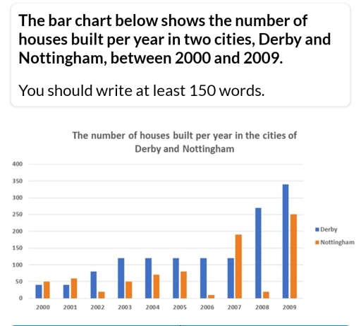
The bar graph highlights the number of houses consturcted per year in two cities, Derby and Nottingham, in the period between 2000 and 2009.

Overall, the number of houses built in Derby showed a generally upward trend throughout the decade, with a significant peak in 2009. In contrast, house construction in Nottingham fluctuated greatly over the years, ending with a noticeable increase in the final year.

In 2000 and 2001, both cities had similar figures, with approximately 40 to 60 houses built annually, However, in 2002, the number of constructions rose to around 85, while Nottingham experienced a drop to about 20.Starting from 2003 Nottingham showed an upward trend until 2005, while Derby stood at around 120 houses until 2007.

In the period Between 2006 and 2009, the number of houses built in Nottingham showed a fluctuating trend. After falling to its lowest point, it then rose sharply and reached a peak of around 250 in 2009.The number of houses built in Derby did not decline at any point during the entire period; on the contrary, it steadily increased, reaching its peak of approximately 350 2009.

Word Count: 186

Answers On The Same Topic:

The bar chart below shows the number of houses built per year in two cities, Derby and Nottingham, between 2000 and 2009.

The bar chart represented two different cites of houses, which was building from 2000 to 2009, namely Derby and Nottingham. Overall, the cite of Nottingham began high level than Derby. Firstly, Nottingham cite began 50 after increased slowly, but Derby cite has stayed on same level approximately 40 houses from 2000 to 2001. In the […]

The bar chart below shows the number of houses built per year in two cities, Derby and Nottingham, between 2000 and 2009.

The bar chart compares the number of houses built each year in the cities of dearby and nottingham,from 2000 to 2009. It is clear from the chart that the highest houses built in 2009 in each cities.on the other hand the lowest houses construct in dearby in 2001 followed by nottingham in 2006. In terms […]

The bar chart below shows the number of houses built per year in two cities, Derby and Nottingham, between 2000 and 2009.

The bar chart illustrates the annual number of houses constructed in the cities of Derby and Nottingham, over a ten-year period, from 2000 to 2009. Overall, it’s evident that both cities had a significant upward trend in house construction throughout the specified timeframe, with Derby exhibiting the most dramatic increase. In Derby, the initial year, […]

The bar chart below shows the number of houses built per year in two cities, Derby and Nottingham, between 2000 and 2009.

The given graph represents how many houses were built in the cities of Derby and Nottingham over the ten years commencing from 2000. A glance at the graph reveals that during the past ten years, the number of new houses in the cities of both Derby and Nottingham witnessed fluctuation; however, the variation of the […]

See All

Other Topics:

The bar chart below shows the spending of 18 - 20 people in five different activity.

The chart illustrates the expenditure by 18-20 years olds in one country on five different products (food, clothes, books, smartphones and toiletries) in 2010 and 2014. Overall, food accounted for the highest expenditure in both years, while books showed the least spending. Spending on food, smartphones and toiletries increased between 2010 and 2014, whereas expenditure […]

The bar chart below shows the number of students enrolled in three different courses (Math, English, and Science) at a college between 2015 and 2025. Summarise the information by selecting and reporting the main features, and make comparisons where relevant.

The table below illustrates the quentity of pupils who studied in three courses: Math, English and Science at a college between 2015 and 2025. Overall, between 2015 and 2025 there is no course which lost it’s popularity between youth. Usually, all subjects have been increasing their influence. In 2015, the most popular subject is Math, […]

The bar chart compares the percentages of households that owned six different electronic devices in three countries in 2023. Summarise the information by selecting and reporting the main features, and make comparisons where relevant.

The bar chart compares the percentages of households owning six types of digital devices in three countries in 2023. Overall, the figure for Country A was the highest in five out of six devices in the given year, while that of Country C represented the lowest proportions. By contrast, the figures were opposite in owning […]

The bar chart below shows information regarding the change in the percentage of the population aged 65 and above in three countries. Summarize the information by selecting and reporting the main features and make comparisons where relevant.

The bar chart compares the populations of Canada, Germany, and the UK in terms of the percentage of individuals aged 65 and older over a 50-year period, starting in 1980. Overall, Germany consistently had the highest percentage of seniors across this time frame. The figures for all three countries nearly increased throughout the period and […]

The following bar chart shows the different modes of transport used to travel to and from work in one European city in 1960, 1980 and 2000. Summarize the information by selecting and reporting the main features and make comparisons where relevant. Write at least 150 words.

The provided bar chart compares the way that a personnel commuted to and from working place, namely bus car bike and foot in an European City in the year 1960, 1980 and 2000 overall, all the categories documented a downward trend over the investigated period . except for the use of car which witnessed an […]

The bar chart shows the expected change of European young people in the next 20 years in 5 different areas. Summarize the information by selecting and reporting the main features, and make comparisons where relevant. (Bar Chart)

The chart ilusstrates the predicted change of young individuals who live in European in the next 20 years in 5 different areas. Overall, it can be seen that the rate of worse will higher than improve, which apart in people communication. The rate of improve always opposite with worse in five different field areas. Interpersonal […]

See All
We have detected unusual activity on your device.
Please verify your identity to continue.
Note: This verification step won't sign you in. If you have a premium account, please log in to access the service as usual.
Google/Gmail Verification
Or verify using Email/Code
We've sent a verification code to:
youremail@gmail.com (Not your email?)
Enter it below to complete the verification process.
Ensure your email address is correct, your inbox is not full, and you check your spam folder. If no email arrives, consider using an alternative email.
You will need a Premium plan to perform your action!
Note: If you already have a premium account, please log in to access our services as usual.

Plans & Pricing

Our mission is to make quality education accessible for everyone.
However, to keep our hardworking team running and this service alive, we genuinely need your support!
By opting for a premium plan, not only do you sustain us in achieving the mission, but you also unlock advanced features to enrich your learning experience.

Free

For learners who aren't pressed for time

What's included on Free
100+ Cambridge IELTS Tests
Instant IELTS Writing Task 1 & 2 Evaluation (2 times/month)
Instant IELTS Speaking Part 1, 2, & 3 Evaluation (5 times/month)
Instant IELTS Writing Task 1 & 2 Essay Generator (2 times/month)
500+ Dictation & Shadowing Exercises
100+ Pronunciation Exercises
Flashcards
Other Advanced Tools

Premium

For those serious about advancing their English proficiency, and for IELTS candidates aspiring to boost their band score by 1-2 points (especially in writing & speaking) in just 30 days or less

What's included on Premium
Save Your IELTS Test Progress
Unlock All Courses & IELTS Tests
Unlimited AI Conversations
Unlimited AI Writing Enhancement Exercises
Unlimited IELTS Writing Task 1 & 2 Evaluation
Unlimited IELTS Speaking Part 1, 2, & 3 Evaluation
Checked Answers Will Not Be Published
Unlimited IELTS Writing Task 1 & 2 Essay Generator
Unlimited IELTS Speaking Part 1, 2, & 3 Sample Generator
Unlimited Usage Of Advanced Tools
Priority Support within 24h (12-month plan only)

Due to the nature of our service and the provided free trials, payments are non-refundable.
Nếu bạn là người Việt Nam và không có hoặc không muốn trả bằng credit/debit cards, bạn có thể thanh toán bằng phương thức chuyển khoản:


Chọn gói:
419,000₫ 277,000 ₫ cho gói 1 tháng (chỉ 9,233₫/ngày)
1,239,000₫ 597,000 ₫ cho gói 3 tháng (chỉ 6,633₫/ngày)
2,469,000₫ 1,027,000 ₫ cho gói 6 tháng (chỉ 5,706₫/ngày)
4,929,000₫ 1,417,000 ₫ cho gói 12 tháng (chỉ 3,936₫/ngày)


Sau khi chuyển khoản, vui lòng đợi trình duyệt tự động điều hướng bạn trở lại Engnovate và bạn sẽ ngay lập tức nhận được mã kích hoạt tài khoản premium.
Nếu có lỗi xảy ra, bạn có thể liên hệ với team thông qua một trong các phương thức: email đến helloengnovate@gmail.com hoặc nhắn tin qua facebook.com/engnovate.
Vì toàn bộ công cụ trên website đều có thể sử dụng thử miễn phí, Engnovate không hỗ trợ hoàn tiền.