Our system will evaluate the answer based on this AI-generated description.
The image is a bar graph displaying carbon emissions from three fossil fuels (Gas, Oil, Coal) in the UK over four five-year intervals (1990, 1995, 2000, 2005, 2010). In 1990, Gas emissions were approximately 225 million tons, Oil approximately 75 million tons, and Coal approximately 200 million tons. In 1995, Gas emissions increased to around 275 million tons, Oil decreased to approximately 50 million tons, and Coal remained consistent at 200 million tons. In 2000, Gas emissions remained at 275 million tons, Oil decreased further to approximately 25 million tons, and Coal reduced to approximately 150 million tons. In 2005, Gas emissions decreased to around 225 million tons, Oil maintained at approximately 25 million tons, and Coal increased to approximately 175 million tons. In 2010, Gas emissions further decreased to approximately 175 million tons, Oil remained at approximately 25 million tons, and Coal reduced to around 150 million tons.
Given the complexity of the image, the above description may not be entirely accurate.
Skyrocket your IELTS band score by 1-2 points in under a month with our premium plan!
Note: Both the topic and the answer were created by one of our users.
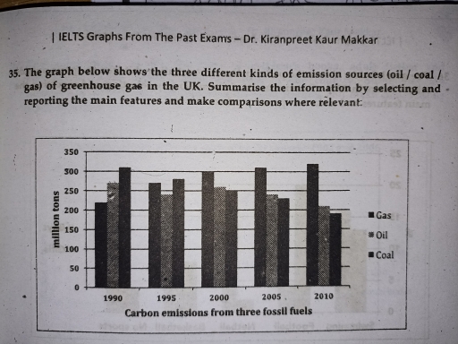
The given ban graph depicts the three different types of emission sources such as oil/coal/gas of greenhouse gas in the uk from 1990 to 2010. Here in the graph the horizontal line indicates the amount of emissions from fossil fuels In the number of million tons whereas the vertical line shows the time period of two decades.
Overall, in the graph Gas shows the highest number of emission in 2010 approximately between 300 and 350 million tons though in the same year coal get the least number which is slightly below 200 million tons. Alterrnatively, the year 1990 shows the exact opposite Scenario where gas is in the lowest amount and coal stands at the highest numeric of slightly over 300 million tons.after five years in the year 1995 the oil emission falls down slightly but coal and gas maintains a moderate differrence between them. After ten years the Carbon discharge from gas started going upward gradually. On the contrary coal decreased dramatically over the duration of twenty years.
Overall the bar graph clearly demonstrate the drastic changes of escalation and collapse for two kinds of fossil fuels(coal/gas) unlike the oil reservoir that fluctuated over the span.
Word Count: 197
