🔥 Today Only: Save 30% on Premium — Offer Ends Soon! - Upgrade Now!
Bar Chart

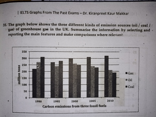
Band 5+: The graph below shows the three different kinds of emission sources ( oil/coal/gas) of greenhouse gas in UK.

Image for topic: The graph below shows the three different kinds of emission sources ( oil/coal/gas) of greenhouse gas in UK.
Our system will evaluate the answer based on this AI-generated description.
The image is a bar graph displaying carbon emissions from three fossil fuels (Gas, Oil, Coal) in the UK over four five-year intervals (1990, 1995, 2000, 2005, 2010). In 1990, Gas emissions were approximately 225 million tons, Oil approximately 75 million tons, and Coal approximately 200 million tons. In 1995, Gas emissions increased to around 275 million tons, Oil decreased to approximately 50 million tons, and Coal remained consistent at 200 million tons. In 2000, Gas emissions remained at 275 million tons, Oil decreased further to approximately 25 million tons, and Coal reduced to approximately 150 million tons. In 2005, Gas emissions decreased to around 225 million tons, Oil maintained at approximately 25 million tons, and Coal increased to approximately 175 million tons. In 2010, Gas emissions further decreased to approximately 175 million tons, Oil remained at approximately 25 million tons, and Coal reduced to around 150 million tons.
Given the complexity of the image, the above description may not be entirely accurate.
Note: Both the topic and the answer were created by one of our users.

The given bar charts illustrates the three different kinds of emission sources namely oil, coal, gas, of greenhouse gas in the UK.

Overall, the chart compares an upward trend in the number tons of gas emissions. In contrast, gas emissions was the highest throughout the period, while oil emissions saw an opposite change.

In 1990, gas emissions started at around 220 million tons then the generally rose during the period of 20 years from 1990 to 2010 and reached its peak at approximately at 325 million tons at 2010. However, the figure for coal emissions was the highest point of about 310 million tons in 1990 then rapidly dropped throughout the given period. In 2010, the chart of coal emissions hit the lowest point of about 190 million tons, which is less than the amount of gas emissions.

The figure for oil emissions fluctuated over a 20-year period, started at about 275 million tons in 1995, then fell to around 260 million tons in 2000. On the other hand, the chart then witnessed a surprising fall over 10-year period, decreased from 260 million tons in 2000 to below 200 million tons in 2010.

Word Count: 193

Answers On The Same Topic:

The graph below shows the three different kinds of emission sources ( oil/coal/gas) of greenhouse gas in UK.

The bar chart shows the carbon emissions from three different fossil fuels which are gas, oil and coal in the UK from 1990 to 2010. Overall, the amount of carbon emissions from gas was increase during the period. Oil and coal had some decrease. Gas was the highest at the end of the period, while […]

The graph below shows the three different kinds of emission sources ( oil/coal/gas) of greenhouse gas in UK.

The bar chart illustrates the amount of carbon footprint from three types of fossil fuels: gas, oil, and coal in the UK from 1990 to 2010. Overall, in 1990, gas had the lowest carbon emissions but it recoreded the highest figure in 2010. By contrast, while coal ranked first in 1990 but last in 2010. […]

The graph below shows the three different kinds of emission sources ( oil/coal/gas) of greenhouse gas in UK.

The graph illustrates the different types of pollution from the greenhouse gas in the UK within a period of 20 years. Overall, it is important to note that while coal has the highest release in the beginning of the trend, gas became the leading source at the end of it. To begin with, between 1990 […]

The graph below shows the three different kinds of emission sources ( oil/coal/gas) of greenhouse gas in UK.

The given ban graph depicts the three different types of emission sources such as oil/coal/gas of greenhouse gas in the uk from 1990 to 2010. Here in the graph the horizontal line indicates the amount of emissions from fossil fuels In the number of million tons whereas the vertical line shows the time period of […]

See All

Other Topics:

Total number of british cruise passenger by age in year of 1975 and 2003.

The bar graph illustrates information about britain cruise passengers by age between 1975 and 2003. Overall, the percentage for passenger of different age-groups increased considerably throughout the period, although the figure for passenger over 64 experienced a shaper rise. Comapared with 1975, the figure was significantly higher in 2003. The passenger age of 24, which […]

The chart below shows the number of graduate students applying for jobs in different sectors after finishing an undergraduate degree at a UK university in 2015 and 2025 and the predicted figure for 2035

The bar chart presents the quantity of UK students applying for jobs in education, retail, finance, and I.T. sectors after graduation in the years 2015 and 2025 and estimate for 2035. On the whole, between 2015 and 2025, there was a downward trend in undergraduates applying for jobs Education and Retail, and an increase in […]

The bar chart shows expectations for change of European young people in the next 20 years in five different areas.

The provided chart shows expectations for changes among European adults in the next 20 years in five different areas. Overall, there are certain areas that will improve in the future. Health and water quality are moderate. However, air quality will need to improve. We also expect that food quality and people’s communication will improve in […]

The chart below shows the percentages ofdifferent types of householdwaste that were recycled in one city between 1992 and 2002. Summarise the information by selecting and reporting the main featuresand make comparisons where relevant. Write at least 150 words.

The bar chart illustrated proportions of household waste-glass,paper,cans,plastic recycled in a single city from 1992 to 2002. Looking from overall perspective,it’s clear that in glass is most recycled material each year and plastic is least recycled material,while cans are recovered by the end of the period. In 1992,glass the figure was approximately 15 percentage recycled […]

World Production The bar graph shows the total manufacturing production in percentages Asia, Europe, and the rest of the world.

The bar chart elucidates the information from 1840 to 2000 the total number of percentages of manufacturing production in three distinctive continents Asia,Europe and remaining world Considering from an overall perspective,it can be comprehensively observed that the production among rest of the world subtracting Asia and Europe grows rapidly in the following years. However,Asia and […]

The chart below shows the places visited by different places living in Australia.

The chart depicts the destinations visited by various groups of people living in Australia. Overall, it is clear that cinema was mostly visited and preferred among most groups, whereas theatre turned out to be less desirable. Regarding the most popular entertainment options, the Library saw the highest rates of attendance for new migrants born in […]

See All
We have detected unusual activity on your device.
Please verify your identity to continue.
Note: This verification step won't sign you in. If you have a premium account, please log in to access the service as usual.
Google/Gmail Verification
Or verify using Email/Code
We've sent a verification code to:
youremail@gmail.com (Not your email?)
Enter it below to complete the verification process.
Ensure your email address is correct, your inbox is not full, and you check your spam folder. If no email arrives, consider using an alternative email.
You will need a Premium plan to perform your action!
Note: If you already have a premium account, please log in to access our services as usual.

Plans & Pricing

Our mission is to make quality education accessible for everyone.
However, to keep our hardworking team running and this service alive, we genuinely need your support!
By opting for a premium plan, not only do you sustain us in achieving the mission, but you also unlock advanced features to enrich your learning experience.

Free

For learners who aren't pressed for time

What's included on Free
100+ Cambridge IELTS Tests
Instant IELTS Writing Task 1 & 2 Evaluation (2 times/month)
Instant IELTS Speaking Part 1, 2, & 3 Evaluation (2 times/month)
Instant IELTS Writing Task 1 & 2 Essay Generator (2 times/month)
500+ Dictation & Shadowing Exercises
100+ Pronunciation Exercises
Flashcards
Other Advanced Tools

Premium

For those serious about advancing their English proficiency, and for IELTS candidates aspiring to boost their band score by 1-2 points (especially in writing & speaking) in just 30 days or less

What's included on Premium
Save Your IELTS Test Progress & Analyze Mistakes By Question Type
Save Your Own Flashcard Sets & Use Them On Any Device
Unlock All Courses, IELTS Tests, Section & Part Practice
Unlimited AI Conversations
Unlimited AI Writing Enhancement Exercises
Unlimited IELTS Writing Task 1 & 2 Evaluation
Unlimited IELTS Speaking Part 1, 2, & 3 Evaluation
Checked Answers Will Not Be Published
Unlimited IELTS Writing Task 1 & 2 Essay Generator
Unlimited IELTS Speaking Part 1, 2, & 3 Sample Generator
Unlimited Usage Of Advanced Tools & AI Features
Priority Support within 24h (12-month plan only)

Due to the nature of our service and the provided free trials, payments are non-refundable.