🔥 Today Only: Save 30% on Premium — Offer Ends Soon! - Upgrade Now!
Bar Chart

Band 5+: The graph below shows the three different kinds of emission sources ( oil/coal/gas) of greenhouse gas in UK.

Image for topic: The graph below shows the three different kinds of emission sources ( oil/coal/gas) of greenhouse gas in UK.
Our system will evaluate the answer based on this AI-generated description.
The image is a bar graph displaying carbon emissions from three fossil fuels (Gas, Oil, Coal) in the UK over four five-year intervals (1990, 1995, 2000, 2005, 2010). In 1990, Gas emissions were approximately 225 million tons, Oil approximately 75 million tons, and Coal approximately 200 million tons. In 1995, Gas emissions increased to around 275 million tons, Oil decreased to approximately 50 million tons, and Coal remained consistent at 200 million tons. In 2000, Gas emissions remained at 275 million tons, Oil decreased further to approximately 25 million tons, and Coal reduced to approximately 150 million tons. In 2005, Gas emissions decreased to around 225 million tons, Oil maintained at approximately 25 million tons, and Coal increased to approximately 175 million tons. In 2010, Gas emissions further decreased to approximately 175 million tons, Oil remained at approximately 25 million tons, and Coal reduced to around 150 million tons.
Given the complexity of the image, the above description may not be entirely accurate.
Note: Both the topic and the answer were created by one of our users.

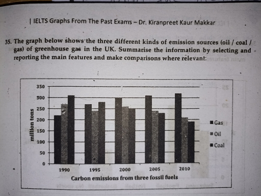
The graph illustrates the different types of pollution from the greenhouse gas in the UK within a period of 20 years.

Overall, it is important to note that while coal has the highest release in the beginning of the trend, gas became the leading source at the end of it.

To begin with, between 1990 and 1995, Coal produced 300 and 280 million tons of pollutants which was the highest as compared to gas and oil with gas being the least in 1990 at 230 million tons and 240 million tons in 1995.

However, In 2000, there was a gradual rise with gas emitting at 300 million tons while coal slowly descending to 250. There was a steady rise in gaseous sources between 2005 and 2010 accounting for 310 and 320 million tons respectively. While this happened, oil and cocoa maintained a downward trend with both having 210 million tons and just below 200 million tons individually.

Word Count: 157

Answers On The Same Topic:

The graph below shows the three different kinds of emission sources ( oil/coal/gas) of greenhouse gas in UK.

The given ban graph depicts the three different types of emission sources such as oil/coal/gas of greenhouse gas in the uk from 1990 to 2010. Here in the graph the horizontal line indicates the amount of emissions from fossil fuels In the number of million tons whereas the vertical line shows the time period of […]

The graph below shows the three different kinds of emission sources ( oil/coal/gas) of greenhouse gas in UK.

The given bar charts illustrates the three different kinds of emission sources namely oil, coal, gas, of greenhouse gas in the UK. Overall, the chart compares an upward trend in the number tons of gas emissions. In contrast, gas emissions was the highest throughout the period, while oil emissions saw an opposite change. In 1990, […]

The graph below shows the three different kinds of emission sources ( oil/coal/gas) of greenhouse gas in UK.

The given bar graph compares the emission of greenhouse gas in millions of tons from three different kinds of sources namely oil, coal, gas in the UK from 1990 to 2010. In 1990, the greenhouse gas emission gas stood at 220 millions tons. After five year’s the number of gas increased with 270 million tons. […]

See All

Other Topics:

Describe the foreign investments in India and China as demonstrated on the bar chart

The char illustrate the level of outside investment in the economics of India and china between 2014 and 2019. Overall, expenditure in China declined steadily through out the period but fluctuated in India. Despite this the total amount of money that followed into China was higher than in India. The Chinese economy recived just under […]

The bar chart gives the top eight online activities in Slovakia in a given month. Summarise the information by selecting and reporting the main features, and make comparisons where necessary.

The bar chart illustrates the top eight online activities in Slovakia for one mouth period by adult internet users females and males in particular. Overall, it can be seen that using Internet for communication is the most popular option, while the least popular activities are online education, health research and job hunting. Activities like Streaming […]

The bar chart shows the percentage of school children learning to play four different musical instruments. Summarise the information by selecting and reporting the main features, and make comparisons where relevant.

The illustrated bar chart shows the percentage of school children learning to play four various instruments in three separate years 2005, 2010, and 2015. Overall, aside from the violin, majority of the instruments were being learned by a noticeably larger group of children in 2015 compared to other years. Additionally, throughout the three years, guitar […]

The bar chart shows components of GDP in the aUK from 1992 to 2000

The bar chart depicts the elements of GDP sources in the United Kingdom between 1992 and 2000. Overall, It is evident that the gross domestic product from IT sector provides highest source of GDP throughout the year. On the other hand, the service industry fortunately rose over the period but the proportion was least comparing […]

• Task 1: The chart below compares the percentage of time Australian mothers and fathers spent helping their children with four activities in 2013.

The bar chart depicts the proportion of time that Australian mothers and fathers allocated to assist their children with four activities in 2013 Overview: mẹ cao nhất.., ba cao nhất.., both thấp nhất.. From an overall perspective, it is evident that mothers dedicated significant time to dressing and homework for the children while fathers spent […]

The vertical bar graph gives information about the number of deaths due to car crashes in the USA in the year 2010 and 2012. Summarize the information by selecting and reporting the main features and make comparisons where relevant.

The vertical bar graph illustrates of Deaths due to Road Accidents by Car in USA from 2010 to 2012. The vertical bar graph gives five graphic about months in the year. Overall, it can be seen that, USA deaths in the period given. The highest number of death was july and august in 2010 and […]

See All
We have detected unusual activity on your device.
Please verify your identity to continue.
Note: This verification step won't sign you in. If you have a premium account, please log in to access the service as usual.
Google/Gmail Verification
Or verify using Email/Code
We've sent a verification code to:
youremail@gmail.com (Not your email?)
Enter it below to complete the verification process.
Ensure your email address is correct, your inbox is not full, and you check your spam folder. If no email arrives, consider using an alternative email.
You will need a Premium plan to perform your action!
Note: If you already have a premium account, please log in to access our services as usual.

Plans & Pricing

Our mission is to make quality education accessible for everyone.
However, to keep our hardworking team running and this service alive, we genuinely need your support!
By opting for a premium plan, not only do you sustain us in achieving the mission, but you also unlock advanced features to enrich your learning experience.

Free

For learners who aren't pressed for time

What's included on Free
100+ Cambridge IELTS Tests
Instant IELTS Writing Task 1 & 2 Evaluation (2 times/month)
Instant IELTS Speaking Part 1, 2, & 3 Evaluation (5 times/month)
Instant IELTS Writing Task 1 & 2 Essay Generator (2 times/month)
500+ Dictation & Shadowing Exercises
100+ Pronunciation Exercises
Flashcards
Other Advanced Tools

Premium

For those serious about advancing their English proficiency, and for IELTS candidates aspiring to boost their band score by 1-2 points (especially in writing & speaking) in just 30 days or less

What's included on Premium
Save Your IELTS Test Progress
Unlock All Courses & IELTS Tests
Unlimited AI Conversations
Unlimited AI Writing Enhancement Exercises
Unlimited IELTS Writing Task 1 & 2 Evaluation
Unlimited IELTS Speaking Part 1, 2, & 3 Evaluation
Checked Answers Will Not Be Published
Unlimited IELTS Writing Task 1 & 2 Essay Generator
Unlimited IELTS Speaking Part 1, 2, & 3 Sample Generator
Unlimited Usage Of Advanced Tools
Priority Support within 24h (12-month plan only)

Due to the nature of our service and the provided free trials, payments are non-refundable.
Nếu bạn là người Việt Nam và không có hoặc không muốn trả bằng credit/debit cards, bạn có thể thanh toán bằng phương thức chuyển khoản:


Chọn gói:
419,000₫ 277,000 ₫ cho gói 1 tháng (chỉ 9,233₫/ngày)
1,239,000₫ 597,000 ₫ cho gói 3 tháng (chỉ 6,633₫/ngày)
2,469,000₫ 1,027,000 ₫ cho gói 6 tháng (chỉ 5,706₫/ngày)
4,929,000₫ 1,417,000 ₫ cho gói 12 tháng (chỉ 3,936₫/ngày)


Sau khi chuyển khoản, vui lòng đợi trình duyệt tự động điều hướng bạn trở lại Engnovate và bạn sẽ ngay lập tức nhận được mã kích hoạt tài khoản premium.
Nếu có lỗi xảy ra, bạn có thể liên hệ với team thông qua một trong các phương thức: email đến helloengnovate@gmail.com hoặc nhắn tin qua facebook.com/engnovate.
Vì toàn bộ công cụ trên website đều có thể sử dụng thử miễn phí, Engnovate không hỗ trợ hoàn tiền.