Our system will evaluate the answer based on this AI-generated description.
The image displays a line graph titled "Chart 1. Average annual expenditures on cell phone and residential phone services, 2001–2010," with two lines representing cell phone services and residential phone services. The y-axis ranges from $200 to $800 in increments of $100, and the x-axis lists years from 2001 to 2010. In 2001, the cell phone services line begins at approximately $210, while the residential phone services line starts at around $670. Over the 10-year period, the cell phone services line exhibits a steady upward trend, culminating at approximately $760 in 2010. Conversely, the residential phone services line experiences a gradual decline, falling to about $350 by 2010. The graph indicates a crossover point between the two lines around the year 2006, where expenditures on cell phone services surpass those on residential phone services for the first time. The exact numerical data points for each line at every year mark are not provided. The source of the data is cited as the U.S. Bureau of Labor Statistics, Consumer Expenditure Survey.
Given the complexity of the image, the above description may not be entirely accurate.
Skyrocket your IELTS band score by 1-2 points in under a month with our premium plan!
Note: Both the topic and the answer were created by one of our users.
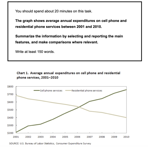
The graphs illustrate average annual spendings on cell phone and residential phone services over a nine-year period from 2001 and 2010.
Overall, the mean cell phone annual expenditures showed increased each year from 2001 until 2010 and reached a peak spendings in 2010. However, compare to the residential phone service, it decreased over almost a decade.
In 2001, the figure of spending money stood at 200 dollars and rose to 300 dollars in 2002. It was steady in 2003 without increased a lot of numbers around 315 dollars of spendings. The trends upward continued in 2004, when the spendings climbed to 400 dollars, in addition 2005 450 dollars higher than previous year. Afterward 2006 on 500 dollars increased 50 dollars. 2007 when the expenditures touch 600 dollars.
The expenditures increased extremely in 2008 to 2010 which surged each year and the highest peak in 2010 touched 700 dollars.
The difference with residential phone service fell down each year from 700 dollars in 2001 to 400 dollars in 2010.
Word Count: 168