🔥 Today Only: Save 30% on Premium — Offer Ends Soon! - Upgrade Now!
Bar Chart

Band 6+: The graphs below give information about computer ownership as a percentage of the population between 2002 and 2010, and by level of education for the years 2002 and 2010. Summarise the information by selecting and reporting the main features, and make comparisons where relevant

Image for topic: The graphs below give information about computer ownership as a percentage of the population between 2002 and 2010, and by level of education for the years 2002 and 2010. Summarise the information by selecting and reporting the main features, and make comparisons where relevant
Our system will evaluate the answer based on this AI-generated description.
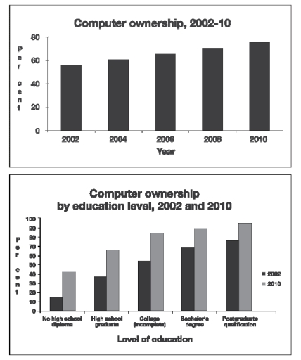
The image consists of two bar charts depicting computer ownership trends. The first chart shows computer ownership from 2002 to 2010, with the percentage of ownership increasing from approximately 58% in 2002 to around 76% in 2010, with notable increases approximately every two years. The second chart shows computer ownership by education level for both 2002 and 2010, with six categories: no high school diploma, high school graduate, some college (no diploma), college graduate, bachelor's degree, and postgraduate qualification. In 2002, the percentage of computer ownership for each category is roughly 20%, 60%, 75%, 83%, 86%, and 90%, respectively. In 2010, the percentages increase to approximately 40%, 80%, 90%, 94%, 96%, and 98%, respectively. The chart shows a correlation between higher education levels and increased computer ownership, with the most significant percentage increase occurring in the 'no high school diploma' category.
Given the complexity of the image, the above description may not be entirely accurate.
Note: Both the topic and the answer were created by one of our users.

The graphs demonstrate the proportion of residents who own computer between 2002 and 2010, and the rate of population owning computer categorized based on education level in the same period. In general, we can see the steady growth in the rate of computer ownership in the 8 years period start from 2002 and the second graph shows that the higher the level of education, the more computers are used.

To start with, there was a stable increase in the percentage of individuals possess computer from 2002 to 2010 in the first graph. The figure started with almost 60% and reached under 80% after 8 years.

Correlated with the trend, the second graph shows that, the proportion of computer acquisition divided by educational in 2010 always higher than that of the year 2002. The most noticeable augmentation is of no high school diploma level, with a growth of nearly three times in 8 years. Besides, the others level also witnessed the increment and with higher education level, the higher computer possession was.

Word Count: 171

Answers On The Same Topic:

The graphs below give information about computer ownership as a percentage of the population between 2002 and 2010, and by level of education for the years 2002 and 2010. Summarise the information by selecting and reporting the main features, and make comparisons where relevant

The provided graphs below illustrate comparative data on computer ownership as a percentage of the population between 2002 and 2010, and a breakdown by educational background specifically for 2002 and 2010. In 2002 , approximately 55% of the population owned a computer. This figure climbed steadily by roughly 5% every two years, eventually reaching a […]

The graphs below give information about computer ownership as a percentage of the population between 2002 and 2010, and by level of education for the years 2002 and 2010. Summarise the information by selecting and reporting the main features, and make comparisons where relevant

The two bar charts show the proportion of the population owning computers from 2002, as well as by levels of education in 2002 and 2010. Overall, the percentage of people owning a computer increased gradually throughout the given period. Notably, the vast majority of population with posgraduate qualification owned a computer. To begin with, computer […]

The graphs below give information about computer ownership as a percentage of the population between 2002 and 2010, and by level of education for the years 2002 and 2010. Summarise the information by selecting and reporting the main features, and make comparisons where relevant

The first of the given graphs represents the percentages of people who owned computers between the years 2002 – 2010. The second graph, on the other hand, compares the education levels of people who owned computers in 2002 and 2010. First of all, information from the first graph indicates that there had been a sequential […]

The graphs below give information about computer ownership as a percentage of the population between 2002 and 2010, and by level of education for the years 2002 and 2010. Summarise the information by selecting and reporting the main features, and make comparisons where relevant

The two bar charts illustrate computer ownership by a percent of the population from 2002 to 2010, and ownership of computers by education level in 2002 and 2010. Overall, there has been a gradual increase in the number of computers owned by individuals, with postgraduates owning the most whereas people with no high school diploma […]

The graphs below give information about computer ownership as a percentage of the population between 2002 and 2010, and by level of education for the years 2002 and 2010. Summarise the information by selecting and reporting the main features, and make comparisons where relevant

The two bar charts illustrate the rate of computer availability among citizens from 2002 to 2010, and based on their academic degree for 2002 and 2010. Overall, there was a slight increase in computer possession throughout the time frame. Although more than half of the population had access to computers in 2002,compared to other years […]

See All

Other Topics:

The bar chart shows average years individuals in different age groups (25-35,35-45) can stay in one job in Europe and the USA between 1985 and 2005.

The bar chart illustrates the typical years people in various age groups are able to stay in particular job in Europe and the USA from 1985 to 2005. Overall, it is clear that all of the bars decreased by one year regardless of their initial height. However, the highest point is reached by Europe citizens, […]

You should spend about 20 minutes on this task. The chart below shows the percentage of children in a European country who took part in four kinds of activities in 2009. Summarise the information by selecting and reporting the main features, and make comparisons where relevant. You should write at least 150 words. <

The column chart depicts the proportion of children from 5 to 15 years old who participated in four kinds of activities, namely watching TV, reading comics, playing video games, and riding bikes, in a European country in 2009. Overall, the vast majority of all responders watched TV as an activity in 2009. Meanwhile, the remaining […]

The chart below gives information about Someland's main exports in 2005, 2015, and future projections for 2025.

The chart illustrates data regarding major exports, namely meat products, dairy products and international tourism of Someland between 2005 and 2015, and future predictions for 2025. Overall,it is clear from the graph that International tourism gradually uplifted throughout the period.Meanwhile, Meat products were the lowest production and experienced a slight fell. However, Dairy products significantly […]

The bar chart shows the percentage of drug company's total sale, per region, from 2002 to 2006.

The bar chart illustrates the percentage distribution of a pharmaceutical company’s total sales across four regions – Asia, Europe and Africa, North America, and South America – between 2002 and 2006. Overall, Europe and Africa accounted for the largest proportion of sales throughout the period, although their share declined slightly towards the end. In contrast, […]

The bar chart shows the percentage of drug company's total sale, per region, from 2002 to 2006.

The bar chart gives information about total sales of drug company in 4 different regions ( Asia, European and African, North America and South America) between 2002 to 2006. Units are measured in percentage. Overall, despite rises and drops in European and Africa regions, it maintains the highest proportion of selling drugs. In 2002, European […]

The graphs below show the percentage of people holding full driving licenses in Great Britain by age and sex. Summarise the information by selecting and reporting the main features, and make comparisons where relevant

The given graphs illustrate the proportion of individuals who hold full driving licenses in Great Britan by the age and gender in 1975/76 and 2006. Overall, is can clearly be seen that the percentage of the men who have full licenses always larger than women at all age in both 1975/76 and 2006. Additionally, in […]

See All
We have detected unusual activity on your device.
Please verify your identity to continue.
Note: This verification step won't sign you in. If you have a premium account, please log in to access the service as usual.
Google/Gmail Verification
Or verify using Email/Code
We've sent a verification code to:
youremail@gmail.com (Not your email?)
Enter it below to complete the verification process.
Ensure your email address is correct, your inbox is not full, and you check your spam folder. If no email arrives, consider using an alternative email.
You will need a Premium plan to perform your action!
Note: If you already have a premium account, please log in to access our services as usual.

Plans & Pricing

Our mission is to make quality education accessible for everyone.
However, to keep our hardworking team running and this service alive, we genuinely need your support!
By opting for a premium plan, not only do you sustain us in achieving the mission, but you also unlock advanced features to enrich your learning experience.

Free

For learners who aren't pressed for time

What's included on Free
100+ Cambridge IELTS Tests
Instant IELTS Writing Task 1 & 2 Evaluation (2 times/month)
Instant IELTS Speaking Part 1, 2, & 3 Evaluation (5 times/month)
Instant IELTS Writing Task 1 & 2 Essay Generator (2 times/month)
500+ Dictation & Shadowing Exercises
100+ Pronunciation Exercises
Flashcards
Other Advanced Tools

Premium

For those serious about advancing their English proficiency, and for IELTS candidates aspiring to boost their band score by 1-2 points (especially in writing & speaking) in just 30 days or less

What's included on Premium
Save Your IELTS Test Progress
Unlock All Courses & IELTS Tests
Unlimited AI Conversations
Unlimited AI Writing Enhancement Exercises
Unlimited IELTS Writing Task 1 & 2 Evaluation
Unlimited IELTS Speaking Part 1, 2, & 3 Evaluation
Checked Answers Will Not Be Published
Unlimited IELTS Writing Task 1 & 2 Essay Generator
Unlimited IELTS Speaking Part 1, 2, & 3 Sample Generator
Unlimited Usage Of Advanced Tools
Priority Support within 24h (12-month plan only)

Due to the nature of our service and the provided free trials, payments are non-refundable.
Nếu bạn là người Việt Nam và không có hoặc không muốn trả bằng credit/debit cards, bạn có thể thanh toán bằng phương thức chuyển khoản:


Chọn gói:
419,000₫ 277,000 ₫ cho gói 1 tháng (chỉ 9,233₫/ngày)
1,239,000₫ 597,000 ₫ cho gói 3 tháng (chỉ 6,633₫/ngày)
2,469,000₫ 1,027,000 ₫ cho gói 6 tháng (chỉ 5,706₫/ngày)
4,929,000₫ 1,417,000 ₫ cho gói 12 tháng (chỉ 3,936₫/ngày)


Sau khi chuyển khoản, vui lòng đợi trình duyệt tự động điều hướng bạn trở lại Engnovate và bạn sẽ ngay lập tức nhận được mã kích hoạt tài khoản premium.
Nếu có lỗi xảy ra, bạn có thể liên hệ với team thông qua một trong các phương thức: email đến helloengnovate@gmail.com hoặc nhắn tin qua facebook.com/engnovate.
Vì toàn bộ công cụ trên website đều có thể sử dụng thử miễn phí, Engnovate không hỗ trợ hoàn tiền.