Our system will evaluate the answer based on this AI-generated description.
The image consists of two charts labeled Chart A and Chart B. Chart A, titled "Films screened in the UK and Australia, 2001," is a bar chart with percentage on the X-axis ranging from 0% to 90% and categories on the Y-axis labeled "US Films," "UK Films," "Australian Films," and "Others." Data points for Australia: US Films slightly above 80%, UK Films approximately 10%, Australian Films just below 10%, Others nearly 0%. Data points for the UK: US Films slightly under 70%, UK Films just above 20%, Australian Films around 5%, Others close to 5%. Chart B, titled "UK and Australian cinema admissions, 1976 to 2006," is a line graph with years on the X-axis ranging from 1975 to 2005 and "Admissions in millions" on the Y-axis from 0 to 200 in increments of 20. The UK line starts around 100 in 1975, dips to below 60 in the early '80s, rises to 120 in the early '90s, drops to 100 in the mid-90s, and then climbs steadily to just below 180 in 2006. The Australia line starts just above 20 in 1975, climbs to above 40 in the early '80s, hovers around 40 until the early '90s, then rises steadily to just above 80 in 2006.
Given the complexity of the image, the above description may not be entirely accurate.
Skyrocket your IELTS band score by 1-2 points in under a month with our premium plan!
Note: Both the topic and the answer were created by one of our users.
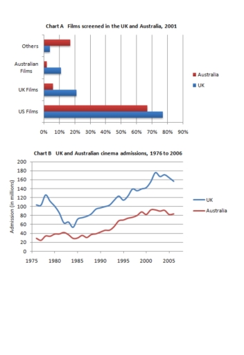
The charts compare the rates about screened movies in the United Kingdom and Australia in 2001 and their cinema admission between 1976 and 2006.
Overall, the highest records in the chart of films screened was in US whereas other sections were completely below. Nevertheless, it is evident that their admission process showed increases in both countries but with fluctuations.
According to the films shown chart in 2001, USA illustrates an enormous rise in both countries where UK took 75% and Australia around 68%. However, movies that was recorded in UK was not so popular among its citizens achieving only 20% while Australia about 7%. Australian films attracted only 3% of its residents but UK more than 10% respectively. In other countries UK took 5%, Australia 17%.
In terms of admission section, UK showed a dramatic dip from 1977, fell down from 120 million9 to less than 60 by 1985 but started growing rapidly in the same year achieving its peak in 2004 by almost 180 million.
In comparison, Australian permits were much more stable than UK, during the period from 1975 to 1990 remained its 40 million, however, in 1993 started to took of and rose by its maximum in 2001 to 79%.
Word Count: 203