🔥 Today Only: Save 30% on Premium — Offer Ends Soon! - Upgrade Now!
Multiple Graphs

Band 6+: Charts A and B show the share of the UK and Australian cinema market in 2001 and cinema admission in the UK and Australia from 1976 to 2006.

Image for topic: Charts A and B show the share of the UK and Australian cinema market in 2001 and cinema admission in the UK and Australia from 1976 to 2006.
Our system will evaluate the answer based on this AI-generated description.
The image consists of two charts labeled Chart A and Chart B. Chart A, titled "Films screened in the UK and Australia, 2001," is a bar chart with percentage on the X-axis ranging from 0% to 90% and categories on the Y-axis labeled "US Films," "UK Films," "Australian Films," and "Others." Data points for Australia: US Films slightly above 80%, UK Films approximately 10%, Australian Films just below 10%, Others nearly 0%. Data points for the UK: US Films slightly under 70%, UK Films just above 20%, Australian Films around 5%, Others close to 5%. Chart B, titled "UK and Australian cinema admissions, 1976 to 2006," is a line graph with years on the X-axis ranging from 1975 to 2005 and "Admissions in millions" on the Y-axis from 0 to 200 in increments of 20. The UK line starts around 100 in 1975, dips to below 60 in the early '80s, rises to 120 in the early '90s, drops to 100 in the mid-90s, and then climbs steadily to just below 180 in 2006. The Australia line starts just above 20 in 1975, climbs to above 40 in the early '80s, hovers around 40 until the early '90s, then rises steadily to just above 80 in 2006.
Given the complexity of the image, the above description may not be entirely accurate.
Note: Both the topic and the answer were created by one of our users.

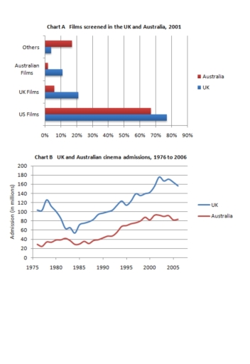
The given charts vividly illustrate that the proportion of Australian and the UK cinema market in 2001 and cinema admission between 1976 and 2006 in Australia and the UK.

Overall, in 2001 the highest percentage of films screened was US films for both Australia and the UK. In contrast, the least for the UK was Australian films. Additionally, In Australia Uk films and Australian films allocated a slight percentage. Moreover, the UK had the highest proportion of admissions from 1976 to 2005.

In 2001, US films were the highest percentage of films screeen for both the UK and Australia with 78% and 68%, respectively. It is noticeable that Australian films in Australia allocated the least percentage of films screened with merely 2% in 2001. In addition, the least for the UK was others with 4% in 2001.

From 1976 to 2006, cinema admissions for the UK experienced a drop between 1976 and 1985 from 110 million dropped to 55 million. After that it gradually increased and peacked at 155 million in 2006. Notably, in the all periods UK was dominant. In the comparison, Australian cinema market from 1976 with 30 million rose steadily and reached 82 million in 2006.

Word Count: 199

Answers On The Same Topic:

Charts A and B show the share of the UK and Australian cinema market in 2001 and cinema admission in the UK and Australia from 1976 to 2006.

The charts compare the rates about screened movies in the United Kingdom and Australia in 2001 and their cinema admission between 1976 and 2006. Overall, the highest records in the chart of films screened was in US whereas other sections were completely below. Nevertheless, it is evident that their admission process showed increases in both […]

Charts A and B show the share of the UK and Australian cinema market in 2001 and cinema admission in the UK and Australia from 1976 to 2006.

The charts provide information about the films screened in the UK and Australia in 2001, and their cinema admissions between 1976 and 2006. Overall, it is evident that the United States dominated the largest segment in the value of the English and Australian markets. The figures for cinema admissions in both countries grew over the […]

Charts A and B show the share of the UK and Australian cinema market in 2001 and cinema admission in the UK and Australia from 1976 to 2006.

Charts A and B illustrate which countries’ films were shown most frequently in UK and Australian cinemas in 2001 and how many tickets were sold in both countries between 1976 and 2006. Overall, American films were the most popular with both Australian and British audiences in 2001. In contrast, Australian films ranked lowest in their […]

See All

Other Topics:

The first chart below shows the percentages of women and men in a country involved in some kinds of home tasks (cooking, cleaning, pet caring and repairing the house). The second chart shows the amount of time each gender spent on each task per day.

Two bar charts provide information about the percentages of men and women involved in different kinds of household tasks in a country, as well as the average amount of time they spend on these activities each day. Overall, cooking is the most common household activity for both genders, while house repairs are the least common. […]

The graph below shows the value of clothing exported from Bangladesh between 1988 and 2012, and pie chart shows the destination and value of exported clothing in 2012

The grapghs illustrate the figure of clothing exported from Bangladesh from 1988 to 2012. Overall, from the statistics, it can be inferred that by over time the exporting value rapidly raised. Additionally, European Union (EU) has a dominance value in the bar chart with more than half percent. Looking at the grapgh, in 1988 the […]

The charts below show the percentage of electricity consumed by different sectors in Eastern Australia in 2007 and 2010.

The provided pie charts illustrate the proportion of electricity consumption by various sectors in Eastern Australia in 2007 and 2010. Overall, it’s clear that the rate of electricity used by other metals, manufacturing, aluminum and agriculture saw changes, while the rest of fields remained stable throughout the period between two years. Even though the residential […]

The charts below show the percentage of water used for differnt purposes in six areas of the world.

The charts show the percentage of water used for agriculture, industry and domestic purposes in six different regions of the world. Overall, agriculture uses the most water in South America, Africa, Central Asia and South East Asia, while industry is the main use in North America and Europe. Domestic use is the lowest in most […]

The two pie chart below show the proportions of diffrent types of buildings in a European city in 1990 and 2020. Summarise the information by selecting and reporting the main features, and make comparisons where relevant.

The pie charts illustrate the proportions of different types of buildings in a European city in 1990 and 2020. Overall, the city saw a clear shift away from historic and traditional residential buildings towards modern residential and commercial buildings. Modern residential buildings became the largest category by 2020, while public facilities remained one of the […]

THE CHARTS BELOW SHOW THE PROPORTION OF EXPENDITURE BY STUDENTS, ON AVERAGE, AT ONE UNIVERSITY, IN 2000 AND 2010.SUMMARIZE THE INFORMATION BY SELECTING AND REPORTING THE MAIN FEATURES, AND MAKE COMPARISONS WHERE RELEVANT.

The pie chats compare the percentage of average spending of students at one university, in 2000 and 2010. Overall, it is clear that the figures for eating out, utilities and transport experienced an upward trend, while the reverse was true for clothing. It is also worth mentioning that student’s expenses on food and drink remained […]

See All
We have detected unusual activity on your device.
Please verify your identity to continue.
Note: This verification step won't sign you in. If you have a premium account, please log in to access the service as usual.
Google/Gmail Verification
Or verify using Email/Code
We've sent a verification code to:
youremail@gmail.com (Not your email?)
Enter it below to complete the verification process.
Ensure your email address is correct, your inbox is not full, and you check your spam folder. If no email arrives, consider using an alternative email.
You will need a Premium plan to perform your action!
Note: If you already have a premium account, please log in to access our services as usual.

Plans & Pricing

Our mission is to make quality education accessible for everyone.
However, to keep our hardworking team running and this service alive, we genuinely need your support!
By opting for a premium plan, not only do you sustain us in achieving the mission, but you also unlock advanced features to enrich your learning experience.

Free

For learners who aren't pressed for time

What's included on Free
100+ Cambridge IELTS Tests
Instant IELTS Writing Task 1 & 2 Evaluation (2 times/month)
Instant IELTS Speaking Part 1, 2, & 3 Evaluation (5 times/month)
Instant IELTS Writing Task 1 & 2 Essay Generator (2 times/month)
500+ Dictation & Shadowing Exercises
100+ Pronunciation Exercises
Flashcards
Other Advanced Tools

Premium

For those serious about advancing their English proficiency, and for IELTS candidates aspiring to boost their band score by 1-2 points (especially in writing & speaking) in just 30 days or less

What's included on Premium
Save Your IELTS Test Progress
Unlock All Courses & IELTS Tests
Unlimited AI Conversations
Unlimited AI Writing Enhancement Exercises
Unlimited IELTS Writing Task 1 & 2 Evaluation
Unlimited IELTS Speaking Part 1, 2, & 3 Evaluation
Checked Answers Will Not Be Published
Unlimited IELTS Writing Task 1 & 2 Essay Generator
Unlimited IELTS Speaking Part 1, 2, & 3 Sample Generator
Unlimited Usage Of Advanced Tools
Priority Support within 24h (12-month plan only)

Due to the nature of our service and the provided free trials, payments are non-refundable.
Nếu bạn là người Việt Nam và không có hoặc không muốn trả bằng credit/debit cards, bạn có thể thanh toán bằng phương thức chuyển khoản:


Chọn gói:
419,000₫ 277,000 ₫ cho gói 1 tháng (chỉ 9,233₫/ngày)
1,239,000₫ 597,000 ₫ cho gói 3 tháng (chỉ 6,633₫/ngày)
2,469,000₫ 1,027,000 ₫ cho gói 6 tháng (chỉ 5,706₫/ngày)
4,929,000₫ 1,417,000 ₫ cho gói 12 tháng (chỉ 3,936₫/ngày)


Sau khi chuyển khoản, vui lòng đợi trình duyệt tự động điều hướng bạn trở lại Engnovate và bạn sẽ ngay lập tức nhận được mã kích hoạt tài khoản premium.
Nếu có lỗi xảy ra, bạn có thể liên hệ với team thông qua một trong các phương thức: email đến helloengnovate@gmail.com hoặc nhắn tin qua facebook.com/engnovate.
Vì toàn bộ công cụ trên website đều có thể sử dụng thử miễn phí, Engnovate không hỗ trợ hoàn tiền.