24 Hours Only: Get 39% OFF on Our Premium Plan - Check Out Now!
Multiple Graphs

Band 6+: Global water use by sector and water consumption in two different countries

Image for topic: Global water use by sector and water consumption in two different countries
Our system will evaluate the answer based on this AI-generated description.
The image presents a line graph titled "Global water use by sector" and a table for "Water consumption in Brazil and Congo in 2000". The graph, with a y-axis in km³ and an x-axis from 1900 to 2000, shows water use for three sectors. Agriculture water use (km³) was approximately: 1900-500, 1910-600, 1920-700, 1930-800, 1940-1000, 1950-1200, 1960-1500, 1970-1800, 1980-2200, 1990-2600, 2000-3000. Industrial use (km³): 1900-50, 1910-60, 1920-80, 1930-100, 1940-150, 1950-200, 1960-400, 1970-600, 1980-800, 1990-1100, 2000-1400. Domestic use (km³): 1900-20, 1910-30, 1920-40, 1930-50, 1940-60, 1950-100, 1960-150, 1970-200, 1980-250, 1990-350, 2000-500. The table for the year 2000 shows for Brazil: a population of 176 million, 26,500 km² of irrigated land, and 359 m³ water consumption per person. For the Democratic Republic of Congo: a population of 5.2 million, 100 km² of irrigated land, and 8 m³ water consumption per person.
Given the complexity of the image, the above description may not be entirely accurate.
Note: Both the topic and the answer were created by one of our users.

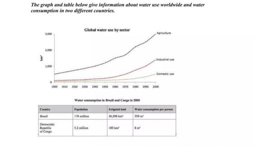
The line graph illustrates the global water use by sector from 1900 to 2000. whilst table shows the consumption of water in two countries in 2000s.

Agriculture has been the biggest consumer of water through twentieth century reaching 3,000km while industrial and domestic use was remaining at the same level before 2000s when industrial consumption reached over 1000km.

For the two countries compared we can see the huge difference between them in terms of numbers and statistics. As the population of the Brazil and irrigated land is larger then Congo the water consumption in the first country is exceeds the country below more than 50 times.

To conclude the given information form both line graph and table it is clear that the Brazil is the bigger consumer in terms of water use and the agriculture is rising rapidly holding the first place amongst different sectors as a consumer.

Word Count: 148

Answers On The Same Topic:

Global water use by sector and water consumption in two different countries

The graphs represent findings about worldwide water usage and water consumption in two various countries: Brazil and Congo, in 2000. Overall, it is clear that an agriculture sector was using significant proportions of water in contrast to other sectors. Likewise, Brazil was also consuming great amounts of water, while Congo showed only minor consumption of […]

Global water use by sector and water consumption in two different countries

Thе graph and table illustrate the information about water global usage and water consumed in Brazil and Congo.Overall, agriculture sector consumed the most part of global water km^2, while other sectors are consumed significantly lower. First of all, agriculture category in 1900 expended about 500 km^2 of water, and slightly increased next 50 years.After that, […]

See All

Other Topics:

The four bar charts compare the percentage of male and female students who achieved high grades (A and B) in five subjects at Parston School and the national average.

The given bar charts depict the distribution of female and male high-score achievers in five particular subjects, namely math, science, humanities subjects, arts, and languages among Parston School students and the national average. Overall, the figures in four charts display relatively similar pattern, with math leading the five categories, followed by science, humanities, and languages. […]

The charts below show the percentage of time used for different activities in the office in the US in 1980 and 2000.

The given pie charts compare the proportions of time spent on different activities in the office in the US in 1980 and 2000. Overall, it is noticeable that activities, namely computer, phone, paper documents, and meetings, changed noticeably, while other activities and face-to-face communication remained unchanged. Another interesting point is that employees did not spend […]

The graph below shows the demand for electricity in England during typical days in winter and summer. The pie chart shows how electricity is used in an average English home. Summarise the information by selecting and reporting the main features, and make comparisons where relevant.

There are two charts show the consumption of electricity in England during typical days in winter and summer. The graph gives information about English’s demand and the pie chart shows statistics about how electricity is used for in an English home. According to the first chart, it can be seen that the demand for electricity […]

The pie charts show the class size in primary schools in four states in Australia in 2010. Summarise the information by selecting and reporting the main features, and make comparisons where relevant.

The pie charts illustrate the class size in the schools among children in four different states in Australia. Overall ,The most important state with classes where may be located 26-30 students is Australia Capital Territory. South Australia pie chart show very large and significant percent of classes where can sit 31 and more stidents. In […]

The pie chart shows the information about the reasons for death of patients in two different hospitals.

The two pie charts represent the information about six different causes of death of patients in two hospitals. Overall, cancer diseases have the highest proportions of death in the two hospitals. By contrast, allergy and trauma have the lowest figures at hospital 1 and hospital 2, respectively. In hospital 1, cancer, HIV, and Tuberculosis have […]

The pie chart shows the information about the reasons for death of patients in two different hospitals.

The two pie charts represent the information about six different causes of death of patients in two hospitals. Overall, cancer deseases has the highest proportions of death in the two hospitals. By contrast, allergy and trauma has the lowest figures at hospital 1 and hostpital 2, respectively. In hospital 1, cancer, HIV, and Tuberculo has […]

See All
We have detected unusual activity on your device.
Please verify your identity to continue.
Note: This verification step won't sign you in. If you have a premium account, please log in to access the service as usual.
Google/Gmail Verification
Or verify using Email/Code
We've sent a verification code to:
youremail@gmail.com (Not your email?)
Enter it below to complete the verification process.
Ensure your email address is correct, your inbox is not full, and you check your spam folder. If no email arrives, consider using an alternative email.
You will need a Premium plan to perform your action!
Note: If you already have a premium account, please log in to access our services as usual.

Plans & Pricing

Our mission is to make quality education accessible and free for everyone.
However, to keep our hardworking team running and this service alive, we genuinely need your support!
By opting for a premium plan, not only do you sustain us in achieving the mission, but you also unlock advanced features to enrich your learning experience.

Free

For learners who aren't pressed for time

What's included on Free
1000+ IELTS Tests & Samples
Instant IELTS Writing Task 1 & 2 Evaluation (2 times/month)
Instant IELTS Speaking Part 1, 2, & 3 Evaluation (5 times/month)
Instant IELTS Writing Task 1 & 2 Essay Generator (2 times/month)
500+ Dictation & Shadowing Exercises
100+ Pronunciation Exercises
Flashcards
Other Advanced Tools

Premium

For those serious about advancing their English proficiency, and for IELTS candidates aspiring to boost their band score by 1-2 points (especially in writing & speaking) in just 30 days or less

What's included on Premium
Save Your IELTS Test Progress
Unlock All Courses & Content
Unlimited AI Conversations
Unlimited AI Writing Enhancement Exercises
Unlimited IELTS Writing Task 1 & 2 Evaluation
Unlimited IELTS Speaking Part 1, 2, & 3 Evaluation
Checked Answers Will Not Be Published
Unlimited IELTS Writing Task 1 & 2 Essay Generator
Unlimited IELTS Speaking Part 1, 2, & 3 Sample Generator
Unlimited Usage Of Advanced Tools

Due to the nature of our service and the provided free trials, payments are non-refundable.
Nếu bạn là người Việt Nam và không có hoặc không muốn trả bằng credit/debit cards, bạn có thể thanh toán bằng phương thức chuyển khoản:


Chọn gói:
279,000₫ 157,000 ₫ cho gói 1 tháng (chỉ 5,233₫/ngày)
819,000₫ 397,000 ₫ cho gói 3 tháng (chỉ 4,411₫/ngày)
1,649,000₫ 667,000 ₫ cho gói 6 tháng (chỉ 3,706₫/ngày)
3,299,000₫ 857,000 ₫ cho gói 12 tháng (chỉ 2,381₫/ngày)


Sau khi chuyển khoản, vui lòng đợi trình duyệt tự động điều hướng bạn trở lại Engnovate và bạn sẽ ngay lập tức nhận được mã kích hoạt tài khoản premium.
Nếu có lỗi xảy ra, bạn có thể liên hệ với team thông qua một trong các phương thức: email đến helloengnovate@gmail.com hoặc nhắn tin qua facebook.com/engnovate.
Vì toàn bộ công cụ trên website đều có thể sử dụng thử miễn phí, Engnovate không hỗ trợ hoàn tiền.