🔥 Today Only: Save 30% on Premium — Offer Ends Soon! - Upgrade Now!
Line Graph

Band 5+: IELTS Academic Writing Task 1: You should spend about 20 minutes on this task. The graph below gives information about the percentage of the population in four Asian countries living in cities from 1970 to 2020, with predictions for 2030 and 2040. Summarise the information by selecting and reporting the main features, and make comparisons where relevant.

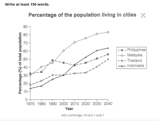
Image for topic: IELTS Academic Writing Task 1: You should spend about 20 minutes on this task. The graph below gives information about the percentage of the population in four Asian countries living in cities from 1970 to 2020, with predictions for 2030 and 2040. Summarise the information by selecting and reporting the main features, and make comparisons where relevant.
Our system will evaluate the answer based on this AI-generated description.
The image displays the urban population percentage from 1970 to 2040 for four countries: Philippines, Malaysia, Thailand, and Indonesia. In 1970, the Philippines had about 30%, Malaysia 25%, Thailand 15%, and Indonesia 10%. By 1980, the Philippines reached approximately 35%, Malaysia 35%, Thailand 20%, and Indonesia 15%. By 1990, the Philippines climbed to about 44%, Malaysia held steady around 45%, Thailand about 25%, and Indonesia around 25%. In 2000, Malaysia peaked at approximately 55%, Philippines 48%, Thailand 30%, and Indonesia 30%. By 2010, Malaysia reached roughly 63%, Philippines around 50%, Thailand 34%, and Indonesia 40%. In 2020, Malaysia's figure was around 70%, Philippines 53%, Thailand 38%, and Indonesia 50%. The projection for 2030 suggests Malaysia will be at about 75%, the Philippines at 58%, Thailand at 42%, and Indonesia at 55%. By 2040, Malaysia is expected to be at approximately 80%, Philippines 63%, Thailand about 46%, and Indonesia about 60%.
Given the complexity of the image, the above description may not be entirely accurate.
Note: Both the topic and the answer were created by one of our users.

The curv chart represents data about percentage of the city residents in four countries in Southeast Asia.

In Phillippines, the persentage of the population started to increase in 1980. Then, in 1990, the cutv rised up to 50 percent. We also can see a small decline that lasted until 2010; the percentage was about 40 percent. Finally, the number of the population is expected to grow; it might be more than 50 percent.

In Malaysia, in 1970, the population living in cities was 30 percent. In 1980, it eventually started to grow; there is 40 percent on the chart. In general, we can see a stable increase of the curv; in the future, the number will be growing to 80 percent.

In Thailand, the number originally was not that significant; it was about 20 percent in 1970. The increase in this country is quite stable and not active. By 2020, the number grew to 30 percent; it is also expected to increase to 40 percent in 2040.

Talking about Indonesia, the origin percentage of residents was small as well; it was 15 percent in 1970. After that, the number significantly grew; it was 40 percent in 2020. By 2040, we can expect it to increase 55 percent.

Word Count: 207

Answers On The Same Topic:

IELTS Academic Writing Task 1: You should spend about 20 minutes on this task. The graph below gives information about the percentage of the population in four Asian countries living in cities from 1970 to 2020, with predictions for 2030 and 2040. Summarise the information by selecting and reporting the main features, and make comparisons where relevant.

The chart illustrates the percentage of the total population in four different countries living in cities over the period of 1970 and 2020, with forecasts for 2030 and 2040. Overall, the population in all four given countries is predicted to display a significant growth towards the end of the predictions, in comparison with 1970. Including […]

IELTS Academic Writing Task 1: You should spend about 20 minutes on this task. The graph below gives information about the percentage of the population in four Asian countries living in cities from 1970 to 2020, with predictions for 2030 and 2040. Summarise the information by selecting and reporting the main features, and make comparisons where relevant.

The line graph above presents data on percentages of the urban population in four different countries between 1970 and 2040. It is evident that there are upward trends for all of them and the figure for Malaysia shows a constant domination in the majority of the period given. Focusing on the proportions of people living […]

IELTS Academic Writing Task 1: You should spend about 20 minutes on this task. The graph below gives information about the percentage of the population in four Asian countries living in cities from 1970 to 2020, with predictions for 2030 and 2040. Summarise the information by selecting and reporting the main features, and make comparisons where relevant.

The line graph depicts data about the percentage of urban population in four Asian countries and shows that there were upward trends for all the countries. When looking at the percentage of population living in Malaysis and the Philippines, the starting figures of both countries were at similar levels, but the population in Malaysia is […]

IELTS Academic Writing Task 1: You should spend about 20 minutes on this task. The graph below gives information about the percentage of the population in four Asian countries living in cities from 1970 to 2020, with predictions for 2030 and 2040. Summarise the information by selecting and reporting the main features, and make comparisons where relevant.

The line graph depicts data about the percentage of Asian population who live in urban arear in four countries and shows that there are upward trends for all the countries. When looking at the percentage of population in Malaysia and Philippines, the starting figures of both countries were at similar level, but the population in […]

IELTS Academic Writing Task 1: You should spend about 20 minutes on this task. The graph below gives information about the percentage of the population in four Asian countries living in cities from 1970 to 2020, with predictions for 2030 and 2040. Summarise the information by selecting and reporting the main features, and make comparisons where relevant.

The graph displays the percentage of projrcted population among four Asian countries living in cities: the Philippines, Malaysia, Thailand, Indonasia. Starting with the highest percentage at 31% the Philippines in 1970. Furthermore Malaysia started with exact 30%, Thailand below 20% and Indonasia the lowest at 12%. In the upcoming years the Philippines remained stable but […]

See All

Other Topics:

The chart below shows the amount of money spent on fast food each week in Lakeville.

Society has been addicted to fast food for a while.People do not think about their health ad mental issues.Humans suppose that consuming lots of unhealthy products will be enabled to harm their lifestyles.For instance,by 2000 pizza had become the largest bought meal and fried chicken had become the least bought. Ordering a lot of fast […]

The line graph below shows the average monthly rainfall in four cities around the world from 2010 to 2020. Summarise the information by selecting and reporting the main features, and make comparisons where relevant.

The provided line graph illustrates the average monthly rainfall in four specific cities over a span of 10 years between 2010 and 2020. Overall, Sydney emerged as the dominant recipient of rainfall throughout the period, consistently surpassing other cities. Meanwhile New York experienced less rainfalls. It intersected with Sydney in 2015 before separating ways. London […]

The chart below shows the average cost of a monthly contract from four different mobile phone providers in a European country

The mutiple line chart brings the information of the average cost of a monthly from four different mobile phone suppliers in a European country. Overall, it is clear that figures for Lex and Alpha increased over the period, while the opposite trend was seen in Domo and Sim TX. In addition, Alpha remained the highest […]

The graph below describes the use of fixed telephone lines, mobile phones, and internet between 1994 and 2005 in China. Summarise the information by selecting and reporting the main features, and make comparisons where relevant.

The given line graph illustrates the changes in the use of different means of communication – fixed telephone lines, mobile phones, and the internet – in China between 1994 and 2005. Overall, the use of diverse communication channels adhered to rising trends, albeit to varying degrees. While mobile phones generally had the highest number of […]

The line graph shows the percentage of New Zealand population from 1950 to 2050. Summarize the information by selecting and reporting the main features and make comparisons where relevant.

The line graph illustrates the proportion of the population in New Zealand in a century between 1950 and 2050. Overall, people in the age of 0 to 14 years old and 38 to 45 years old recorded an upward trend, while the remaining groups experienced the opposite. In details, the elderly was and will be […]

The chart below shows the percentage of households in a city with access to four types of modern technology from 2000 to 2020. Summarize the information by selecting and reporting the main features, and make comparisons where relevant.

The line graph compares the percentages of households in a country that had access to the internet, mobile phones and landline phones between 2000 and 2020. Overall, access to the internet and mobile phones increased substantially over the period, whereas the proportion of households with landline phones declined. By 2020, mobile phones were the most […]

See All
We have detected unusual activity on your device.
Please verify your identity to continue.
Note: This verification step won't sign you in. If you have a premium account, please log in to access the service as usual.
Google/Gmail Verification
Or verify using Email/Code
We've sent a verification code to:
youremail@gmail.com (Not your email?)
Enter it below to complete the verification process.
Ensure your email address is correct, your inbox is not full, and you check your spam folder. If no email arrives, consider using an alternative email.
You will need a Premium plan to perform your action!
Note: If you already have a premium account, please log in to access our services as usual.

Plans & Pricing

Our mission is to make quality education accessible for everyone.
However, to keep our hardworking team running and this service alive, we genuinely need your support!
By opting for a premium plan, not only do you sustain us in achieving the mission, but you also unlock advanced features to enrich your learning experience.

Free

For learners who aren't pressed for time

What's included on Free
100+ Cambridge IELTS Tests
Instant IELTS Writing Task 1 & 2 Evaluation (2 times/month)
Instant IELTS Speaking Part 1, 2, & 3 Evaluation (2 times/month)
Instant IELTS Writing Task 1 & 2 Essay Generator (2 times/month)
500+ Dictation & Shadowing Exercises
100+ Pronunciation Exercises
Flashcards
Other Advanced Tools

Premium

For those serious about advancing their English proficiency, and for IELTS candidates aspiring to boost their band score by 1-2 points (especially in writing & speaking) in just 30 days or less

What's included on Premium
Save Your IELTS Test Progress & Analyze Mistakes By Question Type
Save Your Own Flashcard Sets & Use Them On Any Device
Unlock All Courses, IELTS Tests, Section & Part Practice
Unlimited AI Conversations
Unlimited AI Writing Enhancement Exercises
Unlimited IELTS Writing Task 1 & 2 Evaluation
Unlimited IELTS Speaking Part 1, 2, & 3 Evaluation
Checked Answers Will Not Be Published
Unlimited IELTS Writing Task 1 & 2 Essay Generator
Unlimited IELTS Speaking Part 1, 2, & 3 Sample Generator
Unlimited Usage Of Advanced Tools & AI Features
Priority Support within 24h (12-month plan only)

Due to the nature of our service and the provided free trials, payments are non-refundable.