🔥 Today Only: Save 30% on Premium — Offer Ends Soon! - Upgrade Now!
Line Graph

Band 4+: line graph showing information on UK acid rain emission between 1990 and 2007.

Image for topic: line graph showing information on UK acid rain emission between 1990 and 2007.
Our system will evaluate the answer based on this AI-generated description.
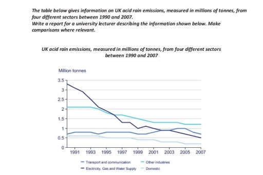
The image presents UK acid rain emissions (million tonnes) from 1990 to 2007 across four sectors: Transport and Communication, Electricity Gas and Water Supply, Domestic, and Other Industries. In 1991, emissions were approximately 3.3 (Transport and Communication), 2 (Electricity, Gas and Water Supply), 1 (Other Industries), less than 0.5 (Domestic). By 1995, these were about 2.2 (Transport and Communication), 1.5 (Electricity, Gas and Water Supply), 1 (Other Industries), less than 0.5 (Domestic). By 2000, numbers dropped to around 1.3 (Transport and Communication), 1.2 (Electricity, Gas and Water Supply), approximately 0.9 (Other Industries), and remained under 0.5 (Domestic). Finally, in 2007 levels were roughly 1 (Transport and Communication), 0.5 (Electricity, Gas and Water Supply), less than 0.5 (Other Industries), and below 0.1 (Domestic). Emissions generally show a decreasing trend across all sectors.
Given the complexity of the image, the above description may not be entirely accurate.
Note: Both the topic and the answer were created by one of our users.

The line graph shows information on UK acid rain emissions , measured in millions of tonnes , from different sectors between 1990 and 2007 .

First in 1991 the electrcity took highest barely 3.3 million tonnes . The second was other industries merely 2.1 million tonnes . Transport and communication and Domestic under 1 million tonnes . In 1993 there is nothing specially changed but the electrcity declined to around 2.1 million tonnes . In 1995 the electrcity and other industries was at same statistics . After 2 years other industries got barely 1.7 million tonnes and was the peak in this statistics and the electrcity continued deacrease and others categories still did not reach 1 millions tonnes . In 1 year 21 century other industries was still the highest but this time the second one was transport and communication . In 2003 nothing specially changed every sector was stable . In 2007 other instrudies the highest million tonnes and the lowest was dimastic .

Overall , electrcity was the highest but after years the statistics fell down and dimastic was lowest million tonnes .

Word Count: 185

Answers On The Same Topic:

line graph showing information on UK acid rain emission between 1990 and 2007.

The table illustrate information of acid rain in UK measured in millions of tonnes, from four various section between 1990 and 2007. Overall,it showing of acid rain in UK that’s are transport, communication, electricity,gas,water supply, domestic and other industries. In 1990, electricity and water supply was larger contributer about 3.3 millions tonnes but gradually it […]

line graph showing information on UK acid rain emission between 1990 and 2007.

The line graph illustrates the acid rain emissions in the UK, measured in millions of tonnes, from various sectors between 1990 and 2007. In 1991, electricity generation was the largest source of emissions, accounting for nearly 3.3 million tonnes. This was followed by other industries, which emitted around 2.1 million tonnes. Transport and communication, along […]

line graph showing information on UK acid rain emission between 1990 and 2007.

The line graph illustrates the data about the production of acid rain emission in the UK by four diverse sectors, namely transport and communication; other industries; electricity, gas and water supply; and domestic over a period of 17 years. Overall, the total amount of acid rain emission experienced a dramatic drop especially in electricity, gas […]

line graph showing information on UK acid rain emission between 1990 and 2007.

The line graph illustrates the data on acid rain emissions in the Great Britain from four areas over a 17-year period ending in 2007. Units are measured in million tons. Overall, it is clear that this emission from rain acid experienced a decline over the timeframe for all sectors, albeit with different amounts. Regarding to […]

See All

Other Topics:

the line graph below shows changees in the amount and type of fast food consumed by Australian teenagers from 1975 to 2000.

The supplied illustration of the line graph demonstrates the frequency of consumed fast food by Australian teenagers,such as pizza,hamburgers,fish and chips over the period of 25 years between 1975 and 2000. Overall,it is obvious that the frequency of (consumer fast food in Australia )consumed pizza and hamburgers rose gradually ,while the frequency consumed fish and […]

The line graph below shows the percentage of tourists who visited four attractions in a city between 1990 and 2020.

The line graph compares how the proportion of the tourists visiting four attractions in a city from 1990 and 2020. Overall, the percentage of tourists visiting the Zoo and Botanical Garden followed a consistently upward trajectory throughout the period, whereas as Museum and Art Gallary showed the opposite pattern, reaching their peaks before experiencing decline. […]

The graph gives information about the consumption of fast food (in grams per week), in the UK from 1970 to 1990.

The provided line graph depicts the changes in the amount of three different types of fast food consumed weekly by individuals in the United Kingdom over a 30-year period, spanning from 1990 to 2020. Overall, it is clear that while the consumption of fish and chips experienced a significant decline over the three decades, the […]

The graph and table below show the average monthly temperatures and the average number of hours of sunshine per year in three major cities. Summarise the information by selecting and reporting the main features and make comparisons where relevant.

The two charts illustrate average temperatures per month and total hours of sunshine per year in London, New York, and Sydney. It is clear from the line chart that London and New York have their lowest temperatures at the beginning and end of the year and their highest in the middle, whereas Sydney follows the […]

the line graph below shows the number of single-family homes constructed in the United States by region over a period of six years.

The line graph illustrates the total number of single-family residential properties built across four distinct regions of the United States – the Northeast, Midwest, South, and West – between 2006 and 2012. Overall, all four regions experienced a significant decline in the number of newly constructed homes over the six-year period, with the sharpest drops […]

You should spend about 20 minutes on this task. The line graph below shows the percentage of spending in Turkey, from 1960 to 2000. Summarise the information by selecting and reporting the main features, and make comparisons where relevant. You should write at least 150 words.

The presented graph demonstrates an average percentage of expenses by Turkish people from 1960 to 2000. Overall, the general trend shows that by 2000 locals increased the level of spending money only for buying clothing, while expenses on food, leisure, transport, and energy went down gradually. In 1960, more than 50% of income went toward […]

See All
We have detected unusual activity on your device.
Please verify your identity to continue.
Note: This verification step won't sign you in. If you have a premium account, please log in to access the service as usual.
Google/Gmail Verification
Or verify using Email/Code
We've sent a verification code to:
youremail@gmail.com (Not your email?)
Enter it below to complete the verification process.
Ensure your email address is correct, your inbox is not full, and you check your spam folder. If no email arrives, consider using an alternative email.
You will need a Premium plan to perform your action!
Note: If you already have a premium account, please log in to access our services as usual.

Plans & Pricing

Our mission is to make quality education accessible for everyone.
However, to keep our hardworking team running and this service alive, we genuinely need your support!
By opting for a premium plan, not only do you sustain us in achieving the mission, but you also unlock advanced features to enrich your learning experience.

Free

For learners who aren't pressed for time

What's included on Free
100+ Cambridge IELTS Tests
Instant IELTS Writing Task 1 & 2 Evaluation (2 times/month)
Instant IELTS Speaking Part 1, 2, & 3 Evaluation (5 times/month)
Instant IELTS Writing Task 1 & 2 Essay Generator (2 times/month)
500+ Dictation & Shadowing Exercises
100+ Pronunciation Exercises
Flashcards
Other Advanced Tools

Premium

For those serious about advancing their English proficiency, and for IELTS candidates aspiring to boost their band score by 1-2 points (especially in writing & speaking) in just 30 days or less

What's included on Premium
Save Your IELTS Test Progress
Unlock All Courses & IELTS Tests
Unlimited AI Conversations
Unlimited AI Writing Enhancement Exercises
Unlimited IELTS Writing Task 1 & 2 Evaluation
Unlimited IELTS Speaking Part 1, 2, & 3 Evaluation
Checked Answers Will Not Be Published
Unlimited IELTS Writing Task 1 & 2 Essay Generator
Unlimited IELTS Speaking Part 1, 2, & 3 Sample Generator
Unlimited Usage Of Advanced Tools
Priority Support within 24h (12-month plan only)

Due to the nature of our service and the provided free trials, payments are non-refundable.
Nếu bạn là người Việt Nam và không có hoặc không muốn trả bằng credit/debit cards, bạn có thể thanh toán bằng phương thức chuyển khoản:


Chọn gói:
419,000₫ 277,000 ₫ cho gói 1 tháng (chỉ 9,233₫/ngày)
1,239,000₫ 597,000 ₫ cho gói 3 tháng (chỉ 6,633₫/ngày)
2,469,000₫ 1,027,000 ₫ cho gói 6 tháng (chỉ 5,706₫/ngày)
4,929,000₫ 1,417,000 ₫ cho gói 12 tháng (chỉ 3,936₫/ngày)


Sau khi chuyển khoản, vui lòng đợi trình duyệt tự động điều hướng bạn trở lại Engnovate và bạn sẽ ngay lập tức nhận được mã kích hoạt tài khoản premium.
Nếu có lỗi xảy ra, bạn có thể liên hệ với team thông qua một trong các phương thức: email đến helloengnovate@gmail.com hoặc nhắn tin qua facebook.com/engnovate.
Vì toàn bộ công cụ trên website đều có thể sử dụng thử miễn phí, Engnovate không hỗ trợ hoàn tiền.