24 Hours Only: Get 39% OFF on Our Premium Plan - Check Out Now!
Bar Chart

Band 5+: The bar chart below shows the percentage of unemployed graduates, aged 20-24, in one European country over a two-year period. Summarise the information by selecting and reporting the main features, and making comparisons where relevant.

Image for topic: The bar chart below shows the percentage of unemployed graduates, aged 20-24, in one European country over a two-year period. Summarise the information by selecting and reporting the main features, and making comparisons where relevant.
Our system will evaluate the answer based on this AI-generated description.
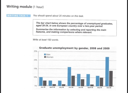
The image presents a bar chart representing graduate unemployment by gender from January 2008 to October 2009 for individuals aged 20-24 in an unspecified European country. In January 2008, both men and women recorded approximately 10% and just below 10% unemployment, respectively. By April 2008, men's unemployment decreased slightly below 10%, while women's neared 10%. July 2008 data reveals men's percentage at about 7% and women's just above 10%. A marked increase is seen in October 2008, with men's unemployment rising to approximately 15% and women's to around 17%. January 2009 shows a slight decrease, with men at roughly 12% and women at 13%. Numbers for April 2009 depict men at 10% and women around 11%. In July 2009, unemployment climbed for men to about 12% and women to 13%. Significantly, October 2009 shows men at around 22% and women slightly above 14%.
Given the complexity of the image, the above description may not be entirely accurate.
Note: Both the topic and the answer were created by one of our users.

The bar graph provides data on the proportion of graduate joblessness by gender, aged 20-24 between 2008 and 2009.

Overall, the percentage of unemployed graduates by male and female made up the bulk of the rates in October both years, while in April and July unemployed graduates were reponsible for a far less percentage in 2008.

In 2008, unemployed graduates for men and women began at 10% and 7%, respevtively. In April and July stayed stable both gender , without exceeding 10%. It then peaked at 16% for men and 11% for women.

In 2009, graduate unempoyment by men remained at 13% in January and April. In the following month, decreased slightly to reach 11%, after it incresed 22% which is the highest proportion. Coming to graduate unemployment by women, fell from 11% in January to 6% in April. It climbed at a rate of 4% in each subsequent period until October.

Word Count: 152

Answers On The Same Topic:

The bar chart below shows the percentage of unemployed graduates, aged 20-24, in one European country over a two-year period. Summarise the information by selecting and reporting the main features, and making comparisons where relevant.

The bar graph illustrates the unemployment rates of male and female graduates aged 20-24 in one European country from 2008 to 2009. Overall, it is obvious that the percentage of unemployed male graduates was consistently higher than that of female throughout the period. Meanwhile, both figures fluctuated between 2008 and 2009. Looking at the graph […]

The bar chart below shows the percentage of unemployed graduates, aged 20-24, in one European country over a two-year period. Summarise the information by selecting and reporting the main features, and making comparisons where relevant.

The given graph illustrates information about average 20-24 age group of people, who graduated, but jobless in Europe country between 2008 and 2009. Overall, unemployed men are much higher, while women graduates are half as high as men percentages in the end. In January 2008, men unoccupied are more than female joblesses, with respective figures […]

The bar chart below shows the percentage of unemployed graduates, aged 20-24, in one European country over a two-year period. Summarise the information by selecting and reporting the main features, and making comparisons where relevant.

The chart compares the proportion of unemployed graduates by gender from 2008 to 2009. Overall, it is clear from the chart that the unemployment rates for both men and women declined during this period. Notably, the rate for men was consistently higher than that for women. Starting at exactly 10% in January 2008, the percentage […]

The bar chart below shows the percentage of unemployed graduates, aged 20-24, in one European country over a two-year period. Summarise the information by selecting and reporting the main features, and making comparisons where relevant.

The chart compared the proportion of jobless graduates by gender from 2008 to 2009. Overall, it is crystal clear from the chart that the unemployment rate of both men and women declined over the period. Notably, the rate of men was always superior to women. Starting off at exactly 10% in Jan 08, the percentage […]

See All

Other Topics:

The chart shows the percentage of individuals living alone across five distinct age categories in the United States from 1850 to 2000.Provide an overview of the information by identifying and describing the key details, and include comparisons where appropriate.

The bar chart illustrates the percentage of US residents who lived alone across five age brackets at fifty-year intervals from 1850 to 2000. Overall, the prevalence of individualism in living arrangementsalone rose rapidly over the period in the US across all ages, most notably among middle-aged and older adults. Additionally, the figure for single-personthose aged […]

The graph shows the percentage of people who recycle their rubbish, in five countries, over 12 years. Summarise the information by selecting and reporting the main features, and make comparisons where relevant. Write at least 150 words.

The provided bar chart gives information about the proportion of individuals from five different nations, recycling their garbage, between 1992 and 2004. Overall, the UK showed the highest percentages and this was followed by the USA. However, Germany ranked the last place with its lowest and stable shares. Notably, the proportion in Singapore was pretty […]

The bar chart showed the percentage of school children learning to play four different musical instruments (violin, guitar, piano, drums) in 3 years 2005, 2010, 2015. Summarise the information by selecting and reporting the main features, and make comparisons where relevant.

The bar chart show the percentage of school children who learning four musical instrument (guitar, piano, drum and violin) in 2005, 2010 and 2015. Overall, guitar and piano was the most popular instrument in all years, and their number increase a lot. While drum and violin was less popular and only change a little. In […]

The bar chart showed the percentage of school children learning to play four different musical instruments (violin, guitar, piano, drums) in 3 years 2005, 2010, 2015. Summarise the information by selecting and reporting the main features, and make comparisons where relevant.

The bar chart illustrates the proportions of school children learning four musical instruments – guitar, piano, drums, and violin – in 2005, 2010, and 2015. Overall, guitar and piano were consistently the most popular choices, and their participation rates rose steadily over the period. In contrast, drums and violin attracted fewer students, showing only modest […]

The chart shows the percentage of male and female teachers in six different types of educational settings in the UK in 2010. Summarize the information by selecting and reporting the main features, and make comparisons where relevant.

The table below shows the percentage of male and female teachers who worked in different educational settings in the UK in 2010. According to the chart, women choose to work more as teachers, especially in educational institutions for small kids, like nursery, pre-school or primary school. While some men do take this job as well, […]

Task 1: The chart below shows information about changes in average house prices in five different cities between 1990 and 2002 compared with the average house prices in 1989. Summarize the information by selecting and reporting the main features, and make comparisons where relevant. Write at least 150 words.

In order to explain this bar chart effecientlly, I will break it down into two sections. First from 1990-1995 the second will be from 1996-2002. In the first section, we can see that a majority of cities are lower interms of prices, some even reaching below the -5% mark. While the other two locations are […]

See All
We have detected unusual activity on your device.
Please verify your identity to continue.
Note: This verification step won't sign you in. If you have a premium account, please log in to access the service as usual.
Google/Gmail Verification
Or verify using Email/Code
We've sent a verification code to:
youremail@gmail.com (Not your email?)
Enter it below to complete the verification process.
Ensure your email address is correct, your inbox is not full, and you check your spam folder. If no email arrives, consider using an alternative email.
You will need a Premium plan to perform your action!
Note: If you already have a premium account, please log in to access our services as usual.

Plans & Pricing

Our mission is to make quality education accessible and free for everyone.
However, to keep our hardworking team running and this service alive, we genuinely need your support!
By opting for a premium plan, not only do you sustain us in achieving the mission, but you also unlock advanced features to enrich your learning experience.

Free

For learners who aren't pressed for time

What's included on Free
1000+ IELTS Tests & Samples
Instant IELTS Writing Task 1 & 2 Evaluation (2 times/month)
Instant IELTS Speaking Part 1, 2, & 3 Evaluation (5 times/month)
Instant IELTS Writing Task 1 & 2 Essay Generator (2 times/month)
500+ Dictation & Shadowing Exercises
100+ Pronunciation Exercises
Flashcards
Other Advanced Tools

Premium

For those serious about advancing their English proficiency, and for IELTS candidates aspiring to boost their band score by 1-2 points (especially in writing & speaking) in just 30 days or less

What's included on Premium
Save Your IELTS Test Progress
Unlock All Courses & Content
Unlimited AI Conversations
Unlimited AI Writing Enhancement Exercises
Unlimited IELTS Writing Task 1 & 2 Evaluation
Unlimited IELTS Speaking Part 1, 2, & 3 Evaluation
Checked Answers Will Not Be Published
Unlimited IELTS Writing Task 1 & 2 Essay Generator
Unlimited IELTS Speaking Part 1, 2, & 3 Sample Generator
Unlimited Usage Of Advanced Tools

Due to the nature of our service and the provided free trials, payments are non-refundable.
Nếu bạn là người Việt Nam và không có hoặc không muốn trả bằng credit/debit cards, bạn có thể thanh toán bằng phương thức chuyển khoản:


Chọn gói:
279,000₫ 157,000 ₫ cho gói 1 tháng (chỉ 5,233₫/ngày)
819,000₫ 397,000 ₫ cho gói 3 tháng (chỉ 4,411₫/ngày)
1,649,000₫ 667,000 ₫ cho gói 6 tháng (chỉ 3,706₫/ngày)
3,299,000₫ 857,000 ₫ cho gói 12 tháng (chỉ 2,381₫/ngày)


Sau khi chuyển khoản, vui lòng đợi trình duyệt tự động điều hướng bạn trở lại Engnovate và bạn sẽ ngay lập tức nhận được mã kích hoạt tài khoản premium.
Nếu có lỗi xảy ra, bạn có thể liên hệ với team thông qua một trong các phương thức: email đến helloengnovate@gmail.com hoặc nhắn tin qua facebook.com/engnovate.
Vì toàn bộ công cụ trên website đều có thể sử dụng thử miễn phí, Engnovate không hỗ trợ hoàn tiền.