🔥 Today Only: Save 30% on Premium — Offer Ends Soon! - Upgrade Now!
Table

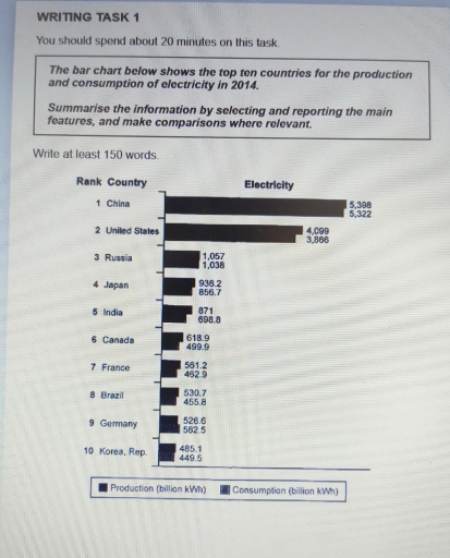
Band 5+: The bar chart below shows the top ten countries for the production and consumption of electricity in 2014. Summarise the information by selecting and reporting the main features, and make comparisons where relevant.

Image for topic: The bar chart below shows the top ten countries for the production and consumption of electricity in 2014. Summarise the information by selecting and reporting the main features, and make comparisons where relevant.
Our system will evaluate the answer based on this AI-generated description.
The image displays a bar chart with two sets of bars for each of the top ten countries, one representing production and the other consumption of electricity in 2014, with production in the first bar and consumption in the second for each pair. Production and consumption are measured in billion kWh. China ranks first with production at 5,398 and consumption at 5,322, followed by the United States with production at 4,099 and consumption at 3,866. Russia is third with production at 1,057 and consumption at 1,038. Japan's production is 936.2 and consumption is 857.6, coming in fourth. India, in fifth place, shows production at 871 and consumption at 698.8. Canada has a production of 619.9 and consumption at 518, taking the sixth spot. Seventh-ranked France shows production at 529.9 and consumption at 462.9. Brazil, in eighth place, has production at 530.7 and consumption at 455.8. Germany, ranking ninth, shows production at 526.6 and consumption at 582.5. The tenth-ranked Korea, Rep. has production at 485.1 and consumption at 449.5. There is a key at the bottom indicating production with a full bar and consumption with a striped bar.
Given the complexity of the image, the above description may not be entirely accurate.
Note: Both the topic and the answer were created by one of our users.

The bar graph depicts information about the electricity consumed and produced by leading nations in 2014.

Overall, it is clear that all the given countries produced electricity by own. Also, the maximum amount of electricity was generated and utilized by China.

To begin with, five countries who is generating electricity over the 800 Kwh. The high amount of electricity produced and consumed by China which is accounted for 5,398 and 5,322 kWh respectively. Followed by, United States was the second highest in producing electricity, at nearly 4,100 kWh while in utilizing it was 3866 kWh. Further, Russia and Japan had below 1000 kWh of producing and using electricity. The former was producing with the figure of 1057 kWh and latter Was 936.2 kWh. However, 871 kWh electricity generated by India while in utilizing it was 698.8 kWh.

Subsequently, Canada had been produced almost 619 kWh electricity and it was used approximately 500 kWh. France and Brazil nearly share equal amount of electricity in utilizing and producing. This was almost above 561 kWh in producing besides in utilizing it was nearly 466 kWh in both the countries. On the contrary, Germany was the only country which electricity was utilizing most rather than generating electricity. Lastly, Korea is the least country which are using and making the least amount of electricity with the figure of almost 500 kWh and 485.1 kWh.

Word Count: 229

Answers On The Same Topic:

The bar chart below shows the top ten countries for the production and consumption of electricity in 2014. Summarise the information by selecting and reporting the main features, and make comparisons where relevant.

he bar chart compares the production and consumption of electricity for the top ten countries in 2014. It is clear that China and the United States produced and consumed the largest proportion of electricity among all the other countries. In contrast, Brazil, Germany and Korea showed the lowest figures among the top 10 countries. Except […]

The bar chart below shows the top ten countries for the production and consumption of electricity in 2014. Summarise the information by selecting and reporting the main features, and make comparisons where relevant.

The chart illustrates how much electricity had been produced and consumed by ten nations in 2014. Overall, it was discernible from the bar chart that the production of electricity in ten countries was the highest. Notably, the electricity which was produced and consumed in Korea Republic was the lowest throughout the surveyed. Turning to production […]

The bar chart below shows the top ten countries for the production and consumption of electricity in 2014. Summarise the information by selecting and reporting the main features, and make comparisons where relevant.

The bar chart compares the best 10 countries for the production and using of electricity in 2014. It is clear that China was the world’s most popular country for the production electricity in 2014. However, the USA saw a rise of large of prodaction, but fewer than China. In that year, China’s prodaction and consamption […]

The bar chart below shows the top ten countries for the production and consumption of electricity in 2014. Summarise the information by selecting and reporting the main features, and make comparisons where relevant.

The chart gives information on ten countries that has generated and consumed the most amount of electricity in 2014. Overall, the electricity that produced by a country, is similar to the electricity value that consumed by the same country. China is the leading country in both electricity production and consumption where Korea Republic has the […]

The bar chart below shows the top ten countries for the production and consumption of electricity in 2014. Summarise the information by selecting and reporting the main features, and make comparisons where relevant.

The given bar chart gives information about how the production and consumption of electricity changed in the top ten countries in 2014. Overall, the most significant fact to emerge from the graph is that while China maintained its dominance, Korea Republic experienced a lower production and consumption level. in 2014, China indicated the highest point […]

See All

Other Topics:

The table shows the two age groups participating in the marathon from 2008 to 2012. Summarize the information by selecting and reporting the main features, and make comparisons where relevant.

The table gives data on age groups attending in the marathon over the 4 year period between 2008 and 2012. Overall, it is clear that in both ages of participating showed an upward trend throughout the period. In addition, total of participants increased from 2000 in 2000 year to 2800 in 2012 year. In 2008, […]

The table shows the average annual expenditure of university students in three different countries in 2017. Summarize the information by selecting and reporting the main features, and make comparisons where relevant.

The provided diagram showcases the amount of money university students spend yearly in three countries. Overall, students in Country A spend the most total amount of spending, whereas those in Country C have the lowest, compared to other two countries. In addition, Accommodation accounts for the greatest proportion spent by students in Country A and […]

The table below gives the information about the amount of tax collected (as % of GDP) in five countries for 4 years between 1975 and 2005

The table illustrates how much percent tax collected in five countries, namely Sweden, USA, Korea, Japan and Turkey between 1975 and 2005. Overall, we can see Sweden, which ranked firstly over all years, while Turkey ranked lastly with USA in last year. In Sweden, 46% and 47% tax collected in 1975 and 1985 years and […]

The chart below shows the percentage of passenger kilometers by different modes of transport in Shanghai.

The table shows the percentage of passenger kilometers traveled by various transportation types in Shanghai in 1996 and offers a forecast for 2030. Overall, while the bus was the most popular form of transport at the earlier date, the car is expected to be the most popular in 2030. First of all, although bus had […]

The table illustrates data on the underground railway networks in six different countries, categorized by time, size, and passengers per year.

The Table presents the data of Underground railway systems of several cities. Overall, London has the oldest and longest railway track, whereas Los Angeles has the most recently established system. In contrast, Tokyo records the highest annual passenger figures, while kyoto has both shortest route and lowest passenger number. London’s underground highway opened in 1863, […]

The table details the international tourist arrivals in millions in 8 countries in 2009 and 2010 and the changes (in percentages).

The table compares eight different nations in terms of their population figures in two separate years: 2009 and 2010. Overall, almost all countries recorded increasing figures to varying degrees, save for France, whose population number remained static at high levels over a year. Notably, Germany’s population, despite being consistently modest compared to other nations, registered […]

See All
We have detected unusual activity on your device.
Please verify your identity to continue.
Note: This verification step won't sign you in. If you have a premium account, please log in to access the service as usual.
Google/Gmail Verification
Or verify using Email/Code
We've sent a verification code to:
youremail@gmail.com (Not your email?)
Enter it below to complete the verification process.
Ensure your email address is correct, your inbox is not full, and you check your spam folder. If no email arrives, consider using an alternative email.
You will need a Premium plan to perform your action!
Note: If you already have a premium account, please log in to access our services as usual.

Plans & Pricing

Our mission is to make quality education accessible for everyone.
However, to keep our hardworking team running and this service alive, we genuinely need your support!
By opting for a premium plan, not only do you sustain us in achieving the mission, but you also unlock advanced features to enrich your learning experience.

Free

For learners who aren't pressed for time

What's included on Free
100+ Cambridge IELTS Tests
Instant IELTS Writing Task 1 & 2 Evaluation (2 times/month)
Instant IELTS Speaking Part 1, 2, & 3 Evaluation (2 times/month)
Instant IELTS Writing Task 1 & 2 Essay Generator (2 times/month)
500+ Dictation & Shadowing Exercises
100+ Pronunciation Exercises
Flashcards
Other Advanced Tools

Premium

For those serious about advancing their English proficiency, and for IELTS candidates aspiring to boost their band score by 1-2 points (especially in writing & speaking) in just 30 days or less

What's included on Premium
Save Your IELTS Test Progress & Analyze Mistakes By Question Type
Save Your Own Flashcard Sets & Use Them On Any Device
Unlock All Courses, IELTS Tests, Section & Part Practice
Unlimited AI Conversations
Unlimited AI Writing Enhancement Exercises
Unlimited IELTS Writing Task 1 & 2 Evaluation
Unlimited IELTS Speaking Part 1, 2, & 3 Evaluation
Checked Answers Will Not Be Published
Unlimited IELTS Writing Task 1 & 2 Essay Generator
Unlimited IELTS Speaking Part 1, 2, & 3 Sample Generator
Unlimited Usage Of Advanced Tools & AI Features
Priority Support within 24h (12-month plan only)

Due to the nature of our service and the provided free trials, payments are non-refundable.