🔥 Today Only: Save 30% on Premium — Offer Ends Soon! - Upgrade Now!
Multiple Graphs

Band 5+: the changes in ownership of electical appliances and amount of time spent doing housework in households in one country

Image for topic: the changes in ownership of electical appliances and amount of time spent doing housework in households in one country
Our system will evaluate the answer based on this AI-generated description.
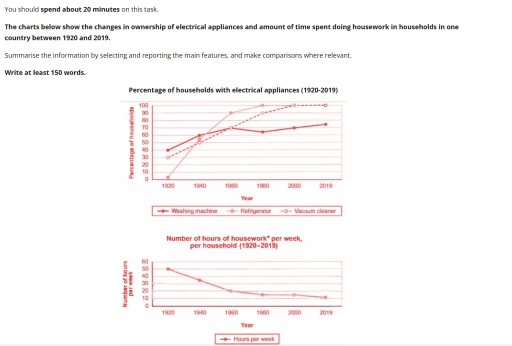
The image presents two charts: The first displays the percentage of households with specific electrical appliances from 1920 to 2019, and the second illustrates the average number of hours of housework per household per week within the same years. In 1920, ownership data: washing machines at 0%; refrigerators at 0%; vacuum cleaners at 30%. By 1940, vacuum cleaner ownership rose to 60%, washing machines to 40%, refrigerators to 50%. In 1960, vacuum cleaners at 80%, washing machines close to 67%, refrigerators peaked at 90%. In 1980, vacuum cleaners reached 90%, refrigerators maintained at 100%, washing machines at 70%. From 2000 to 2019, all appliances showed full saturation at 100% ownership. In the second chart, weekly housework hours started at 50 in 1920, declining to 40 by 1940, dropping below 20 by 1980, settling at roughly 10 hours in 2000 and consistent through 2019.
Given the complexity of the image, the above description may not be entirely accurate.
Note: Both the topic and the answer were created by one of our users.

the two graphs presented illustrate the changes of households with electrical appliances and the number of hours housework spent per week over the period from 1920 until 2019.

Overall, the percentage of refrigerator usage with electrical appliances sharply rose, while the duration of houseworks shows a downward trend over the period.

There are three percentage of households that shown in graph, such as washing machine, refrigerator, and lastly vacuum cleaner. At the beginning, in 1920, washing machine had the largest percentage of households, meanwhile with no percentage, refrigerator is the least, which mean no one used refrigerator at that time. By 1960, the number of refrigerator escalated rapidly to 90%, consequently replaced the amount of washing machine. During the time until 2019, the percentage of washing machine usage also gradually increased following the number of refrigerator. In the other hand, vacuum cleaner fluctuated steadily with least changes of percentage until 2019.

Initially, the work hours of housework was at the peak which is around 50%. Over time, the duration that spent by houseworks is fallen gradually to 10% at the end of 2019.

Word Count: 183

Answers On The Same Topic:

the changes in ownership of electical appliances and amount of time spent doing housework in households in one country

The two line charts illustrate the percentage of households with electrical appliances and the time dedicated weekly to housework within a household, in a country during a 100-year period, from 1920 to 2019. Overall, the number of hours needed for chores and housework kept decreasing sharply over the years as the electrical appliances were gaining […]

the changes in ownership of electical appliances and amount of time spent doing housework in households in one country

The charts illustrate the percentage of households with electrical appliances compared in 3 kinds of electronics devices: washing machine, refrigerator, and vacuum cleaner, throughout the century (1920-2019). Overall, when comparing 3 kinds of electronics devices, the washing machine at 1920 starts off the highest percentages at 40% of the households. Then starting to significantly increases […]

the changes in ownership of electical appliances and amount of time spent doing housework in households in one country

The line graphs below present the information about usage of electrical domestic appliances in household and time people spent on chores during 1920 to 2019. Overall, it is clear that the percentage of new technologies at houses risen drastically and so doing housework become faster and easier. Starting from 1920, refrigerator, washing machine and vacuum […]

See All

Other Topics:

The graph and chart below provide information about migration to the UK. The graph shows how long immigrants who arrived between 2000 and 2008 intended to stay in the UK, while the pie chart shows the reasons for migration in 2008. Summarise the information by selecting and reporting the main features, and make comparisons where relevant.

The line graph illustrates the information about the duration of immigrants who arrived between the year 2000 and 2008 tends to stay in the UK. The pie chart depicts the various reasons for migration in the year 2008. Overall, the maximum number of people stay in UK for upto 2 years whereas the minimum number […]

The table below shows the average amount of money spent per month on different categories of goods by people in four age groups in 2020. The pie chart shows the percentage of total spending that each category represents. Summarise the information by selecting and reporting the main features and make comparisons where relevant.

The table depicts the average amount of money spent on different commodities of goods by people of various age groups in the year 2020. The pie chart, on the other hand, illustrates the total percentage of spending on various categories of goods by people of various age groups, consists of 18-55 years. Overall, the food […]

The table shows the proportion of fifty-year-old adults who were never married over five decades in Japan. The chart represents the Japanese marriage and divorce rate from 1970 to 2016. Summarise the data by selecting and reporting the main features and make comparisons where relevant. Write at least 150 words.

The table illustrates the percentage of japanese adults who were never married over five decades and the line graph depicts the number of japanese marriage and divorce rate from 1970 to 2016. Overall,the proportion of japanese citizens who were never married were very low in the initial year while it increased gradually over the period.Similarly,the […]

The graph and chart below provide information about migration to the UK. The graph shows how long immigrants who arrived between 2000 and 2008 intended to stay in the UK, while the pie chart shows the reasons for migration in 2008. Summarise the information by selecting and reporting the main features, and make comparisons where relevant.

The line graph illustrates data on the length of the period that immigrants purposed to stay in UK between two years^2000 and 2008. Turning to pie chart, it compares the proportion of reasons for migration to UK in 2008. Overall, the number of immigrants who intended to stay in UK for 4 or more years […]

In June 1996, an experimental flu vaccine was trialed in a large country town on females only. Above are the graphs depicting the activities related. Summarize the information and compare where relevant, by selecting and reporting the key features. You should write at least 150 words.

The experimental flu vaccine was trialed in a large country town on females only, while the provided diagrams detail about deaths rates, number of cases and groups of people who were most at risk from flu. Overall, it can be seen that females were more vulnerable to flu than males. Concurrently, the flu posed most […]

The table below shows student enrolment at three types of institution in 2000 and 2020. The pie chart shows the main reasons students gave for choosing online study in 2020. Summarise the information by selecting and reporting the main features, and make comparisons where relevant.

The table compares student enrolment at three types of institution in 2000 and 2020, while the pie chart illustrates why students chose to study online in 2020. Overall, enrolment rose at all three types of institution, with online study growing the fastest, although public universities remained the most popular. In addition, flexibility and cost were […]

See All
We have detected unusual activity on your device.
Please verify your identity to continue.
Note: This verification step won't sign you in. If you have a premium account, please log in to access the service as usual.
Google/Gmail Verification
Or verify using Email/Code
We've sent a verification code to:
youremail@gmail.com (Not your email?)
Enter it below to complete the verification process.
Ensure your email address is correct, your inbox is not full, and you check your spam folder. If no email arrives, consider using an alternative email.
You will need a Premium plan to perform your action!
Note: If you already have a premium account, please log in to access our services as usual.

Plans & Pricing

Our mission is to make quality education accessible for everyone.
However, to keep our hardworking team running and this service alive, we genuinely need your support!
By opting for a premium plan, not only do you sustain us in achieving the mission, but you also unlock advanced features to enrich your learning experience.

Free

For learners who aren't pressed for time

What's included on Free
100+ Cambridge IELTS Tests
Instant IELTS Writing Task 1 & 2 Evaluation (2 times/month)
Instant IELTS Speaking Part 1, 2, & 3 Evaluation (2 times/month)
Instant IELTS Writing Task 1 & 2 Essay Generator (2 times/month)
500+ Dictation & Shadowing Exercises
100+ Pronunciation Exercises
Flashcards
Other Advanced Tools

Premium

For those serious about advancing their English proficiency, and for IELTS candidates aspiring to boost their band score by 1-2 points (especially in writing & speaking) in just 30 days or less

What's included on Premium
Save Your IELTS Test Progress & Analyze Mistakes By Question Type
Save Your Own Flashcard Sets & Use Them On Any Device
Unlock All Courses, IELTS Tests, Section & Part Practice
Unlimited AI Conversations
Unlimited AI Writing Enhancement Exercises
Unlimited IELTS Writing Task 1 & 2 Evaluation
Unlimited IELTS Speaking Part 1, 2, & 3 Evaluation
Checked Answers Will Not Be Published
Unlimited IELTS Writing Task 1 & 2 Essay Generator
Unlimited IELTS Speaking Part 1, 2, & 3 Sample Generator
Unlimited Usage Of Advanced Tools & AI Features
Priority Support within 24h (12-month plan only)

Due to the nature of our service and the provided free trials, payments are non-refundable.