🔥 Today Only: Save 30% on Premium — Offer Ends Soon! - Upgrade Now!
Line Graph

Band 6+: The chart below gives information about computer ownership in the US from 1997 to 2012.

Image for topic: The chart below gives information about computer ownership in the US from 1997 to 2012.
Our system will evaluate the answer based on this AI-generated description.
The image displays a line chart on computer ownership in the US from 1997 to 2012: No computer ownership started at 60% in 1997, declining to about 45% in 2000, further decreasing to just over 30% in 2003, dropping to roughly 25% in 2006, falling beneath 20% in 2009, and reaching around 10% in 2012. Ownership of 1 computer started at 25% in 1997, increased to near 40% in 2000, peaking above 50% in 2003, then dropping back to around 40% in 2006, stabilizing around 35% in 2009, and slightly decreasing to just under 30% in 2012. Ownership of 2 computers began at 10% in 1997, rose to about 15% in 2000, continued increasing to near 20% in 2003, maintained a similar level in 2006, rose slightly again in 2009, and peaked just below 30% in 2012. Ownership of 3 or more computers started at below 10% in 1997, minimally increased in 2000, gradually rose to about 10% in 2003, increased marginally to around 15% in 2006, rose to just below 20% in 2009, and further increased to approximately 25% in 2012.
Given the complexity of the image, the above description may not be entirely accurate.
Note: Both the topic and the answer were created by one of our users.

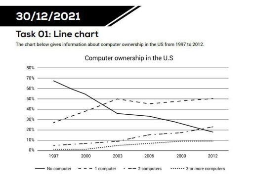
The line chart presents the percentage of American households which possessed personal computers during 15-year period from 1997 to 2012.

Overall, the proportion of households without a computer was highest in 1997 but sharply decreased over time .Otherwise, the figure for families which had over two computers underwent a significant upward trend while those with 1 computer fluctuated.

Regarding the upward trend, the percentage of households with 2 computers began at nearly 5% then rose dramatically to approximately 20% in 2009 and increased to about 23% in the next three years. The figure for families with over 3 computers started at 0% and remained nearly unchanged until 2000. Afterwards, It grew gradually by 10% in 2009 before declining insignificantly in 2012.

Concerning the other trends, nearly 68% of households did not own any computer in 1997, which accounted for the highest proportion at that time. After 6 years later, it plummeted to nearly a half to under 40% then kept decreasing to around 19% until 2012. By contrast, the figure for families with 1 computer increased sharply from nearly 28% to 50% between 1997 and 2003 before reducing slightly to about 45% in 2006 then rose back to the same level as 2003 at the end of the period.

Word Count: 209

Answers On The Same Topic:

The chart below gives information about computer ownership in the US from 1997 to 2012.

The line graph shows information about computer ownership in the US from 1997 to 2012. Overall, the number of people without a computer went down, while the number of people with computers went up. One computer became the highest group by the end of the period. In 1997, about 65% of people did not have […]

The chart below gives information about computer ownership in the US from 1997 to 2012.

The graph illsutrates data on owning computers in the US between 1997 and 2012. Overall, while without computers remained dominat at the beggining of the period, a figure that then declined significantly over the period. Several computer owneships opposed to without computer ownerships. At the beginning of the year, it had a lowest figure, but […]

The chart below gives information about computer ownership in the US from 1997 to 2012.

The line graph illustrates the proportion of households in the United States owning different numbers of computers between 1997 and 2012. Overall, there was a pronounced shift from non-ownership to multi-computer ownership over the fifteen-year period. While the percentage of households without a computer declined dramatically, ownership of two or more computers rose steadily. Although […]

The chart below gives information about computer ownership in the US from 1997 to 2012.

The line graph illustrates changes in computer ownership in the United States between 1997 and 2012, categorized by the number of computers per household. Overall, computer ownership became significantly more widespread over the period. The proportion of households without a computer declined markedly, while ownership of multiple computers rose steadily. Although one-computer households initially increased […]

The chart below gives information about computer ownership in the US from 1997 to 2012.

The line graph illustrates information about the proportion of computer owners like, people who had no computer, people who had 1 computer, people who had 2 computers and people who had 3 computers in US between 1997 and 2012. Overall the percentage of people who had 1, 2 and 3 computers or more has raised […]

See All

Other Topics:

The graph below shows the usage of oil in four different countries between 1966 and 2006 as a percentage of total energy use within each nations.

The chart illustrates the oil usage in four countries from 1966 to 2006. Overall, oil usage declined significantly in Sweden and Italy over the period, while Turkey experienced a steady increase, from the bottom to the top. Italy consistently recorded the highest oil consumption percentage, although its figures fluctuated throughout the period. According to the […]

The line graoh shows the percentage of tourists to Scotland who visited four different attractions in Wdinburgh. Summarize the information by selecting and reporting the main features, and make comparisons where relevant.

The line graph illustrates the proportion of tourists who visited four different attractions in Scotland between 1980 and 2010. Overall, it is clear that while the castle experienced a significant rise in popularity to become the most visited attraction, the aquarium and the festival saw long-term declines. Meanwhile, the zoo showed a notable recovery in […]

The graph below shows radio and television audiences throughout the day in 1992. Summarise the information by selecting and reporting the main features, and make comparisons where relevant. Write at least 150 words.

The line graph illustrates the amount of people consuming radio and television all over the day in the period between October and December in UK in 1992. Overall, it could be seen that radio have been using bigger population among audiences in early morning hours, while the number of people who wached TV was considerably […]

Here is your line graph showing trends in two categories (A and B) from 2010 to 2020. You can now describe it for your IELTS Writing Task 1.

The line chart illustrates the value of trends in two categories (A and B) over a period of 10 years, starting from 2010. It can be seen from the graph, both categories witnessed an upward trend. The highest value experienced by group A, while the lowest reported by category B. With the respect of group […]

This line graph illustrates the participation levels for five different activities at a social centre in Melbourne from 2000 to 2020.

The line graph shows the number of participants for five different activities at one cosial centre in Melbourne,Australia between 2000 and 2020. Overall, we can see from the chart that ratio of people who participate for film club and martial arts showed almost steadily growth, while the number of amateur dramatics decreased over the given […]

The charts below show the number of visitors arriving in a particular country for a short trip, and the number of residents leaving that country for a short trip, from 2009 to 2011. Summarise the information by selecting and reporting the main features, and make comparisons where relevant. Write at least 150 words.

The charts illustrate the number of visitors on a short trip to a specific country and the number of indigenes moving out of the country for a short trip starting from 2009 to 2011. Overall, the number of departing residents from the country increased significantly over the years while the number of visitors to the […]

See All
We have detected unusual activity on your device.
Please verify your identity to continue.
Note: This verification step won't sign you in. If you have a premium account, please log in to access the service as usual.
Google/Gmail Verification
Or verify using Email/Code
We've sent a verification code to:
youremail@gmail.com (Not your email?)
Enter it below to complete the verification process.
Ensure your email address is correct, your inbox is not full, and you check your spam folder. If no email arrives, consider using an alternative email.
You will need a Premium plan to perform your action!
Note: If you already have a premium account, please log in to access our services as usual.

Plans & Pricing

Our mission is to make quality education accessible for everyone.
However, to keep our hardworking team running and this service alive, we genuinely need your support!
By opting for a premium plan, not only do you sustain us in achieving the mission, but you also unlock advanced features to enrich your learning experience.

Free

For learners who aren't pressed for time

What's included on Free
100+ Cambridge IELTS Tests
Instant IELTS Writing Task 1 & 2 Evaluation (2 times/month)
Instant IELTS Speaking Part 1, 2, & 3 Evaluation (5 times/month)
Instant IELTS Writing Task 1 & 2 Essay Generator (2 times/month)
500+ Dictation & Shadowing Exercises
100+ Pronunciation Exercises
Flashcards
Other Advanced Tools

Premium

For those serious about advancing their English proficiency, and for IELTS candidates aspiring to boost their band score by 1-2 points (especially in writing & speaking) in just 30 days or less

What's included on Premium
Save Your IELTS Test Progress
Unlock All Courses & IELTS Tests
Unlimited AI Conversations
Unlimited AI Writing Enhancement Exercises
Unlimited IELTS Writing Task 1 & 2 Evaluation
Unlimited IELTS Speaking Part 1, 2, & 3 Evaluation
Checked Answers Will Not Be Published
Unlimited IELTS Writing Task 1 & 2 Essay Generator
Unlimited IELTS Speaking Part 1, 2, & 3 Sample Generator
Unlimited Usage Of Advanced Tools
Priority Support within 24h (12-month plan only)

Due to the nature of our service and the provided free trials, payments are non-refundable.
Nếu bạn là người Việt Nam và không có hoặc không muốn trả bằng credit/debit cards, bạn có thể thanh toán bằng phương thức chuyển khoản:


Chọn gói:
419,000₫ 277,000 ₫ cho gói 1 tháng (chỉ 9,233₫/ngày)
1,239,000₫ 597,000 ₫ cho gói 3 tháng (chỉ 6,633₫/ngày)
2,469,000₫ 1,027,000 ₫ cho gói 6 tháng (chỉ 5,706₫/ngày)
4,929,000₫ 1,417,000 ₫ cho gói 12 tháng (chỉ 3,936₫/ngày)


Sau khi chuyển khoản, vui lòng đợi trình duyệt tự động điều hướng bạn trở lại Engnovate và bạn sẽ ngay lập tức nhận được mã kích hoạt tài khoản premium.
Nếu có lỗi xảy ra, bạn có thể liên hệ với team thông qua một trong các phương thức: email đến helloengnovate@gmail.com hoặc nhắn tin qua facebook.com/engnovate.
Vì toàn bộ công cụ trên website đều có thể sử dụng thử miễn phí, Engnovate không hỗ trợ hoàn tiền.