🔥 Today Only: Save 30% on Premium — Offer Ends Soon! - Upgrade Now!
Multiple Graphs

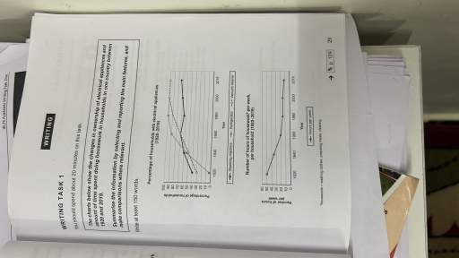
Band 7+: The chart below show the changes in ownership of electrical appliances and amount of time spent doing housework in households in one country between 1920 and 2019. summarise the information by selecting and reporting the main features, and make comparisons where relavant

Image for topic: The chart below show the changes in ownership of electrical appliances and amount of time spent doing housework in households in one country between 1920 and 2019. summarise the information by selecting and reporting the main features, and make comparisons where relavant
Our system will evaluate the answer based on this AI-generated description.
The image presents two line graphs; the first graph shows the number of whales killed from 1950 to 1985 with categories: blue whales (1950: 8000, 1955: 6000, 1960: 5000, 1965: 4000, 1970: 3000, 1975: 0, 1980: 0, 1985: 0), fin whales (1950: 24000, 1955: 30000, 1960: 34000, 1965: 10000, 1970: 20000, 1975: 10000, 1980: 2000, 1985: 0), sperm whales (1950: 10000, 1955: 17000, 1960: 20000, 1965: 30000, 1970: 20000, 1975: 10000, 1980: 1000, 1985: 0), sei whales (1950: 3000, 1955: 4000, 1960: 10000, 1965: 9000, 1970: 12000, 1975: 10000, 1980: 3000, 1985: 0); the second graph details the number of seals killed from 1950 to 1985 with categories: harp seals (1950: 100000, 1955: 80000, 1960: 50000, 1965: 30000, 1970: 40000, 1975: 30000, 1980: 20000, 1985: 10000), hooded seals (1950: 50000, 1955: 30000, 1960: 20000, 1965: 10000, 1970: 20000, 1975: 10000, 1980: 50000).
Given the complexity of the image, the above description may not be entirely accurate.
Note: Both the topic and the answer were created by one of our users.

The above graph states the changes in the amount of time spent doing housework and in the ownership of electrical appliances in households, in one country, over a period of one hundred years between 1920 and 2019.

To summarize, we can observe a drastic change in appliances for the house, which has increased from the year 1920 to 2019, and the time for completing household tasks has decreased to 10 hours per week.

In the first graph, we can observe that household appliances like washing machines, refrigerators, and vacuum cleaners have increased from 1920 to the year 2019. In 1920, there were only 30% of washing machines and 40% of vacuum cleaners, but there was no sign of a refrigerator in any household. Talking about housework in the year 1920, there was an increase in the hours of time people were spending to complete their work. As time changed, one can observe a dramatic change in the increase of electrical appliances. In the year 2019, we can see 100% of refrigerators and vacuum cleaners and 75% of washing machines in their residences. An increase in appliances will decrease working hours in the house.

Word Count: 193

Answers On The Same Topic:

The chart below show the changes in ownership of electrical appliances and amount of time spent doing housework in households in one country between 1920 and 2019. summarise the information by selecting and reporting the main features, and make comparisons where relavant

The graph above illustrates the changes in the amount of time spent on housework and the ownership of electrical appliances in households within a single country over a span of one hundred years, from 1920 to 2019. In summary, there has been a significant increase in the number of household appliances from 1920 to 2019, […]

The chart below show the changes in ownership of electrical appliances and amount of time spent doing housework in households in one country between 1920 and 2019. summarise the information by selecting and reporting the main features, and make comparisons where relavant

The above graph states the changes in the amount of time spent doing housework and in the ownership of electrical appliances in households, in one country, over a period of one hundred years between 1920 and 2019. To summarize, we can observe a drastic change in appliances for the house, which has increased from the […]

See All

Other Topics:

You should spend about 20 minutes on this task. The charts below show the number of Japanese tourists travelling abroad between 1985 and 1995 and Australia's share of the Japanese tourist market. Write a report for a university lecturer describing the information shown below. You should write at least 150 words.

The bar chart illustrates the total number of Japanese tourists travelling overseas between 1985 and 1995, while the line graph shows the percentage of these tourists who chose Australia as their destination over the same ten-year period. Overall, both the total number of Japanese outbound travellers and Australia’s share of this tourist market experienced a […]

The chart below show the proportion of holiday-makers using four different types of accommodations in three different years

The given three pie charts compare the percentage of holidaymakers using four different types of accommodation in 1988, 1998, and 2008. Overall, it is clear that rented apartment showed an upward trajectory throughout the period, whereas camping experienced a decline by the given years. It is also evident that staying with family had the highest […]

The chart below show the percentage of people aged 23-65 in different occupations in one UK town and in the Uk as a whole in 2008

The pie charts illustrate the proportion of people aged 23-65 in different jobs in Ashby and in the UK as a whole in 2008. Overall, the workload is fairly distributed in Ashby and the UK. Notably, office work and personal service were the primary occupations for residents regardless of regions. In Ashby, a majority of […]

The pie charts illustrate the proportion of graduates with different levels of qualifications in science and art working in a specific engineering company between 1980 and 2008.

The two pie charts compare the proportions of graduates with different qualifications in science and art who worked for a particular engineering company in 1980 and 2008. **Overall,** the proportion of employees with Ph.D. qualifications increased in both fields, while the shares of first-degree graduates declined. The percentage of science graduates with a Master’s degree […]

The puie graph below shows how electricity is produced in ireland and the table shows the primary reasons for using electricity in the same country

The pie chart illustrates the main sources that are used in the production of power in Ireland, while the table below demonstrates the main purposesfor which electricity is consumed by Irish. Overall, four different energy sources are used to generate electricity in Ireland. Coal and gas are the most used sources, while wind and solar […]

The bar graph gives information about the number of library books borrowed from Lammertown Public Library in 1991 and 2001 and the pie chart gives information about the library's membership in 2010.

The bar and pie charts illustrate how many books of various types were borrowed in Lammertown public Library in 1991 and 2001 and the proportion of genders in Library Membership in 2010. Overall, the number of self-improvement, language, thriller and romance books borrowed increased, while the figures for the remaining categories fell noticeably or remained […]

See All
We have detected unusual activity on your device.
Please verify your identity to continue.
Note: This verification step won't sign you in. If you have a premium account, please log in to access the service as usual.
Google/Gmail Verification
Or verify using Email/Code
We've sent a verification code to:
youremail@gmail.com (Not your email?)
Enter it below to complete the verification process.
Ensure your email address is correct, your inbox is not full, and you check your spam folder. If no email arrives, consider using an alternative email.
You will need a Premium plan to perform your action!
Note: If you already have a premium account, please log in to access our services as usual.

Plans & Pricing

Our mission is to make quality education accessible for everyone.
However, to keep our hardworking team running and this service alive, we genuinely need your support!
By opting for a premium plan, not only do you sustain us in achieving the mission, but you also unlock advanced features to enrich your learning experience.

Free

For learners who aren't pressed for time

What's included on Free
100+ Cambridge IELTS Tests
Instant IELTS Writing Task 1 & 2 Evaluation (2 times/month)
Instant IELTS Speaking Part 1, 2, & 3 Evaluation (2 times/month)
Instant IELTS Writing Task 1 & 2 Essay Generator (2 times/month)
500+ Dictation & Shadowing Exercises
100+ Pronunciation Exercises
Flashcards
Other Advanced Tools

Premium

For those serious about advancing their English proficiency, and for IELTS candidates aspiring to boost their band score by 1-2 points (especially in writing & speaking) in just 30 days or less

What's included on Premium
Save Your IELTS Test Progress & Analyze Mistakes By Question Type
Save Your Own Flashcard Sets & Use Them On Any Device
Unlock All Courses, IELTS Tests, Section & Part Practice
Unlimited AI Conversations
Unlimited AI Writing Enhancement Exercises
Unlimited IELTS Writing Task 1 & 2 Evaluation
Unlimited IELTS Speaking Part 1, 2, & 3 Evaluation
Checked Answers Will Not Be Published
Unlimited IELTS Writing Task 1 & 2 Essay Generator
Unlimited IELTS Speaking Part 1, 2, & 3 Sample Generator
Unlimited Usage Of Advanced Tools & AI Features
Priority Support within 24h (12-month plan only)

Due to the nature of our service and the provided free trials, payments are non-refundable.