🔥 Today Only: Save 30% on Premium — Offer Ends Soon! - Upgrade Now!
Bar Chart

Band 7+: The chart below shows how much land was used for different purposes in an Asian Country in 2011. Summaries the information by selecting and reporting the main features and make comparison where

Image for topic: The chart below shows how much land was used for different purposes in an Asian Country in 2011. Summaries the information by selecting and reporting the main features and make comparison where
Our system will evaluate the answer based on this AI-generated description.
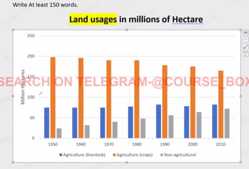
The image displays a bar chart detailing land usage measured in millions of hectares from 1950 to 2010 across three categories: Agriculture (livestock), Agriculture (crops), and Non-agricultural. In 1950, livestock usage is approximately 40 million hectares, crops are at 210 million hectares, and non-agricultural lands are at 80 million hectares. By 1960, livestock remains at 40 million, crops at 210 million, non-agricultural slightly increases to about 90 million hectares. In 1970, livestock is just below 40 million, crops maintain 210 million, and non-agricultural is around 100 million. By 1980, livestock increases marginally to around 60 million, crops stay at 200 million, non-agricultural usage remains at 100 million hectares. In 1990, livestock is just over 50 million, crops dip slightly below 200 million, non-agricultural lands are over 110 million. In 2000, livestock is at approximately 80 million, with crops maintaining near-constant at just below 200 million, while non-agricultural stays steady at 110 million. In 2010, livestock usage is nearly at 90 million, crops return to 200 million, and non-agricultural land usage slightly decreases to around 95 million hectares.
Given the complexity of the image, the above description may not be entirely accurate.
Note: Both the topic and the answer were created by one of our users.

The bar chart illustrates the amount of area used for different reasons in an Asian country in 2011.

Overall, the amount of land to cultivate crops decreased over the given period of time. And the amount of land used for non-agriculture increased, but for livestock it fluctuated.

From 1950 to 1980, the amount of land used for cultivating crops diminished from almost under 200 million hectares to around one 192 million hectares. It started falling moderately from 1992 to 2010 . The amount decreased by 20 million hectares over the 40 year period.

The amount of land used for livestock fluctuated from nearly 75 million to around 76 million hectares in the years 1950 and 2000. However, there was a slight increase on this figure of almost 4 million hectares from 2000 to 2010. Meanwhile, the amount of land people had for non-agriculture increased over the 60 year period from nearly a quarter to almost two-third of a 100 million.

Word Count: 160

Answers On The Same Topic:

The chart below shows how much land was used for different purposes in an Asian Country in 2011. Summaries the information by selecting and reporting the main features and make comparison where

The bar graph provides information about the amount of land which was used for crop farming, livestock farming, and non-agricultural purposes in a country in Asia in 2011. Overall, it can be seen that land use for crop agriculture decreased, whereas that for livastock agriculture and non-agricultural use increased. Further, the uses of land for […]

The chart below shows how much land was used for different purposes in an Asian Country in 2011. Summaries the information by selecting and reporting the main features and make comparison where

The bar chart depicts the information about how much land usages for various reasons in an Asian nation between 1950 and 2010. Firstly, land used for agriculture in crops was the highest in all these years, even land usage for crops in 1950 was the highest compare to other years, at around 199 million hectares. […]

The chart below shows how much land was used for different purposes in an Asian Country in 2011. Summaries the information by selecting and reporting the main features and make comparison where

The bar chart depicts the information of number of hectares land usages for various reasons in Asian nation between 1950 to 2010. Firstly, land used for agriculture in crops was the highest in all these years, even the land usage for crops in 1950 was highest compare to other years, around 199 million hectares. Also, […]

The chart below shows how much land was used for different purposes in an Asian Country in 2011. Summaries the information by selecting and reporting the main features and make comparison where

The bar graph illustrates how land was allocated for livestock farming, crop cultivation, and non-agricultural activities in an Asian country from 1950 to 2010. Overall, crop farming consistently occupied the largest share of land throughout the period, despite a gradual decline. In contrast, the areas dedicated to livestock and non-agricultural purposes expanded steadily, with the […]

The chart below shows how much land was used for different purposes in an Asian Country in 2011. Summaries the information by selecting and reporting the main features and make comparison where

The bar graph provides information about land usage for livestock farming, crop farming, and non-agricultural purposes in a country in Asia in 2011. Overall, it can be seen that the amount of land used for crop agriculture decreased, whereas land used for livestock farming and non-agricultural purposes increased. Furthermore, land used for crop agriculture was […]

See All

Other Topics:

the graph shows the percentages of people going to the cinemas in a European country on different days

The bar chart illustrates days of week and the proportion of people going to cinemas in a European country in 2003, 2005 and 2007. Overall, the percentage of people on the first 4 days was under a quarter, whereas on Friday people showed the same proprtion. Meanwhile, Saturday demonstrated the most significant percentage in comparison […]

The chart below shows the spending (in millions) by 18-20 year olds in one country on five different products in 2010 and 2014. Summarise the information by selecting and reporting the main features, and make comparisons where relevant. Write at least 150 words.

The bar chart illustrates the expenditure of people aged from 18 to 20 years use for serval products in a country between 2010 and 2014. Overall, it can be clearly seen that teenagers spent most money for food, it was recorded the significant rise over the period, follow this upward trend was smartphones. In contrast, […]

The bar graph below represents data about the clubs joined by people of two different age groups at a leisure centre in a small city.

The provided bar chart illustrates the number of people aged 25-35 and 55-65 engaging in six different activities, including gardening, photography, fitness, arts & crafts, music/dance and cycling at a leisure centre in a small city. Overall, it is clear that most activities saw a greater participation of people aged 25-35, with the exception of […]

The bar graph below represents data about the clubs joined by people of two different age groups at a leisure centre in a small city.

The provided bar chart illustrates the number of people aged 25-35 and 55-65 engaging in six different activities, including gardening, photography, fitness, arts & crafts, music/dance and cycling at a leisure centre in a small city. Overall, it is clear that most activities embraced a greater participation of people aged 25-35, with the exception of […]

COFEE AND TEA BUYING AND DRINKING HABITS IN FIVE CITIES IN AUSTRALIA

The bar graph illustrates the outcome of a survey conducted about the consumption and purchase of coffee and tea habits in Sydney, Melbourne, Brisbane, Adelaide, and Hobart. Overall, among the five cities, visiting a café for coffee or tea was the most popular activity, consistently showing the highest percentages, with Adelaide being the only exception. […]

Writing Task 1 You should spend about 20 minutes on this task. The chart below shows the percentage of a drug company's total sales, by region, from 2002 to 2006.Summarise the information by selecting and reporting the main features, and make comparisons where relevant. You should write at least 150 words.

The bar chat illustrates the proportions of total sales from drugs facilities in different in three nations; America, Europe and Asia from 2002 to 2006. Overall, American’s consumed alot of drugs at the begining of the period. followed by the Europen country , and Asian the least of them, which topped at the end of […]

See All
We have detected unusual activity on your device.
Please verify your identity to continue.
Note: This verification step won't sign you in. If you have a premium account, please log in to access the service as usual.
Google/Gmail Verification
Or verify using Email/Code
We've sent a verification code to:
youremail@gmail.com (Not your email?)
Enter it below to complete the verification process.
Ensure your email address is correct, your inbox is not full, and you check your spam folder. If no email arrives, consider using an alternative email.
You will need a Premium plan to perform your action!
Note: If you already have a premium account, please log in to access our services as usual.

Plans & Pricing

Our mission is to make quality education accessible for everyone.
However, to keep our hardworking team running and this service alive, we genuinely need your support!
By opting for a premium plan, not only do you sustain us in achieving the mission, but you also unlock advanced features to enrich your learning experience.

Free

For learners who aren't pressed for time

What's included on Free
100+ Cambridge IELTS Tests
Instant IELTS Writing Task 1 & 2 Evaluation (2 times/month)
Instant IELTS Speaking Part 1, 2, & 3 Evaluation (2 times/month)
Instant IELTS Writing Task 1 & 2 Essay Generator (2 times/month)
500+ Dictation & Shadowing Exercises
100+ Pronunciation Exercises
Flashcards
Other Advanced Tools

Premium

For those serious about advancing their English proficiency, and for IELTS candidates aspiring to boost their band score by 1-2 points (especially in writing & speaking) in just 30 days or less

What's included on Premium
Save Your IELTS Test Progress & Analyze Mistakes By Question Type
Save Your Own Flashcard Sets & Use Them On Any Device
Unlock All Courses, IELTS Tests, Section & Part Practice
Unlimited AI Conversations
Unlimited AI Writing Enhancement Exercises
Unlimited IELTS Writing Task 1 & 2 Evaluation
Unlimited IELTS Speaking Part 1, 2, & 3 Evaluation
Checked Answers Will Not Be Published
Unlimited IELTS Writing Task 1 & 2 Essay Generator
Unlimited IELTS Speaking Part 1, 2, & 3 Sample Generator
Unlimited Usage Of Advanced Tools & AI Features
Priority Support within 24h (12-month plan only)

Due to the nature of our service and the provided free trials, payments are non-refundable.