🔥 Today Only: Save 30% on Premium — Offer Ends Soon! - Upgrade Now!
Bar Chart

Band 6+: The chart below shows how much land was used for different purposes in an Asian Country in 2011. Summaries the information by selecting and reporting the main features and make comparison where

Image for topic: The chart below shows how much land was used for different purposes in an Asian Country in 2011. Summaries the information by selecting and reporting the main features and make comparison where
Our system will evaluate the answer based on this AI-generated description.
The image displays a bar chart detailing land usage measured in millions of hectares from 1950 to 2010 across three categories: Agriculture (livestock), Agriculture (crops), and Non-agricultural. In 1950, livestock usage is approximately 40 million hectares, crops are at 210 million hectares, and non-agricultural lands are at 80 million hectares. By 1960, livestock remains at 40 million, crops at 210 million, non-agricultural slightly increases to about 90 million hectares. In 1970, livestock is just below 40 million, crops maintain 210 million, and non-agricultural is around 100 million. By 1980, livestock increases marginally to around 60 million, crops stay at 200 million, non-agricultural usage remains at 100 million hectares. In 1990, livestock is just over 50 million, crops dip slightly below 200 million, non-agricultural lands are over 110 million. In 2000, livestock is at approximately 80 million, with crops maintaining near-constant at just below 200 million, while non-agricultural stays steady at 110 million. In 2010, livestock usage is nearly at 90 million, crops return to 200 million, and non-agricultural land usage slightly decreases to around 95 million hectares.
Given the complexity of the image, the above description may not be entirely accurate.
Note: Both the topic and the answer were created by one of our users.

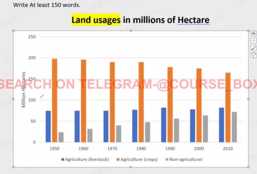
The bar chart depicts the information about how much land usages for various reasons in an Asian nation between 1950 and 2010.

Firstly, land used for agriculture in crops was the highest in all these years, even land usage for crops in 1950 was the highest compare to other years, at around 199 million hectares. Also, the lowest use of land in these years was non-agricultural. Moreover, the land usage for livestock was the same in years 1950, 1960, and 1970, at about 70 million hectares.

Furthermore, in 1970 and 1980, the number of hectares used for crops was the same, at 190 million hectares. As well, area used for non-agricultural reason rose every year and reached around 75 million hectares, in last year. Additionally, farmland used for crops was decreasing year by year and reached at 160, in the year 2010. In addition, land usage for livestock in 1990 and 2010 was the same, at 76 million hectares.

Overall, land used mostly for crop farming, even after decreasing every year, and non-agricultural use of land was the lowest.

Word Count: 179

Answers On The Same Topic:

The chart below shows how much land was used for different purposes in an Asian Country in 2011. Summaries the information by selecting and reporting the main features and make comparison where

The bar graph provides information about the amount of land which was used for crop farming, livestock farming, and non-agricultural purposes in a country in Asia in 2011. Overall, it can be seen that land use for crop agriculture decreased, whereas that for livastock agriculture and non-agricultural use increased. Further, the uses of land for […]

The chart below shows how much land was used for different purposes in an Asian Country in 2011. Summaries the information by selecting and reporting the main features and make comparison where

The bar chart depicts the information of number of hectares land usages for various reasons in Asian nation between 1950 to 2010. Firstly, land used for agriculture in crops was the highest in all these years, even the land usage for crops in 1950 was highest compare to other years, around 199 million hectares. Also, […]

The chart below shows how much land was used for different purposes in an Asian Country in 2011. Summaries the information by selecting and reporting the main features and make comparison where

The bar graph illustrates how land was allocated for livestock farming, crop cultivation, and non-agricultural activities in an Asian country from 1950 to 2010. Overall, crop farming consistently occupied the largest share of land throughout the period, despite a gradual decline. In contrast, the areas dedicated to livestock and non-agricultural purposes expanded steadily, with the […]

The chart below shows how much land was used for different purposes in an Asian Country in 2011. Summaries the information by selecting and reporting the main features and make comparison where

The bar graph provides information about land usage for livestock farming, crop farming, and non-agricultural purposes in a country in Asia in 2011. Overall, it can be seen that the amount of land used for crop agriculture decreased, whereas land used for livestock farming and non-agricultural purposes increased. Furthermore, land used for crop agriculture was […]

See All

Other Topics:

You should spend about 20 minutes on this task. The chart below shows the percentage of children in a European country who took part in four kinds of activities in 2009. Summarise the information by selecting and reporting the main features, and make comparisons where relevant. You should write at least 150 words. <

The provided chart illustrates the proportion of habitual leisure activities among children in a European nation in 2009. The activities for children aged 5 to 15 are categorized into four types: watching TV, reading comics, playing video games, and riding bikes. Watching TV and riding bikes are the two most popular activities for the 5-8 […]

You should spend about 20 minutes on this task. The chart below shows the percentage of children in a European country who took part in four kinds of activities in 2009. Summarise the information by selecting and reporting the main features, and make comparisons where relevant. You should write at least 150 words. <

The given chart illustrates poportion about the habitual works of kids in European nation over the year 2009. It is shown that, the leisur activitis of child’s aged between 5 to 15 is limited only by four kinds of deeds which are watching TV, reading comics, playing games as well as riding bikes. Watching TV […]

The graph below shows the proportion of the population aged 65 and over between 1940 and 2040 in 3 different countries.

The line graph illustrates the percentage of the population aged 65 or more in three different countries over a period of 100 years. Overall, the proportion of elderly people increases in each country between 1940 and 2040. Japan is expected to see the most significant changes in the elderly proportion. In 1940, around 9% of […]

The table below shows the number of international students in three different countries in 2010 and 2020. The bar chart illustrates the percentage of these students enrolled in different fields of study in 2020. Summarize the information by selecting and reporting the main features and make comparisons where relevant. Table: Number of International Students (in thousands) Country 2010 2020 USA 600 750 UK 480 520 Australia 280 420

The bar graph illustrates the percentage of students from three countries, the USA, UK and Australia in different fields of business, engineering, social sciences and others in 2020. Overall, the USA recorded the highest number of scholars in business, followed almost the same by Australia.The least number of students in social studies in the USA. […]

The percentage of men and women executives in six different professions across the UK in 2007 is shown in the graph. Summarize the data by choosing and highlighting the key elements, and make comparisons where necessary.

Enhanced Report The bar chart provides a comparative analysis of the gender composition of executives in six distinct professions within the UK, specifically in the year 2007. Overall, the data reveals a pronounced male predominance in sectors such as construction and manufacturing, whereas women are notably overrepresented in education and health-related fields. In the construction […]

The percentage of men and women executives in six different professions across the UK in 2007 is shown in the graph. Summarize the data by choosing and highlighting the key elements, and make comparisons where necessary.

The bar chart shows the number of men and women executives in six different professions in the UK. Overall, men dominate in some jobs like construction and manufacturing, while women are more in education and health jobs. Some professions have almost similar numbers of both genders. In construction, men are very high, but women are […]

See All
We have detected unusual activity on your device.
Please verify your identity to continue.
Note: This verification step won't sign you in. If you have a premium account, please log in to access the service as usual.
Google/Gmail Verification
Or verify using Email/Code
We've sent a verification code to:
youremail@gmail.com (Not your email?)
Enter it below to complete the verification process.
Ensure your email address is correct, your inbox is not full, and you check your spam folder. If no email arrives, consider using an alternative email.
You will need a Premium plan to perform your action!
Note: If you already have a premium account, please log in to access our services as usual.

Plans & Pricing

Our mission is to make quality education accessible for everyone.
However, to keep our hardworking team running and this service alive, we genuinely need your support!
By opting for a premium plan, not only do you sustain us in achieving the mission, but you also unlock advanced features to enrich your learning experience.

Free

For learners who aren't pressed for time

What's included on Free
100+ Cambridge IELTS Tests
Instant IELTS Writing Task 1 & 2 Evaluation (2 times/month)
Instant IELTS Speaking Part 1, 2, & 3 Evaluation (5 times/month)
Instant IELTS Writing Task 1 & 2 Essay Generator (2 times/month)
500+ Dictation & Shadowing Exercises
100+ Pronunciation Exercises
Flashcards
Other Advanced Tools

Premium

For those serious about advancing their English proficiency, and for IELTS candidates aspiring to boost their band score by 1-2 points (especially in writing & speaking) in just 30 days or less

What's included on Premium
Save Your IELTS Test Progress
Unlock All Courses & IELTS Tests
Unlimited AI Conversations
Unlimited AI Writing Enhancement Exercises
Unlimited IELTS Writing Task 1 & 2 Evaluation
Unlimited IELTS Speaking Part 1, 2, & 3 Evaluation
Checked Answers Will Not Be Published
Unlimited IELTS Writing Task 1 & 2 Essay Generator
Unlimited IELTS Speaking Part 1, 2, & 3 Sample Generator
Unlimited Usage Of Advanced Tools
Priority Support within 24h (12-month plan only)

Due to the nature of our service and the provided free trials, payments are non-refundable.
Nếu bạn là người Việt Nam và không có hoặc không muốn trả bằng credit/debit cards, bạn có thể thanh toán bằng phương thức chuyển khoản:


Chọn gói:
419,000₫ 277,000 ₫ cho gói 1 tháng (chỉ 9,233₫/ngày)
1,239,000₫ 597,000 ₫ cho gói 3 tháng (chỉ 6,633₫/ngày)
2,469,000₫ 1,027,000 ₫ cho gói 6 tháng (chỉ 5,706₫/ngày)
4,929,000₫ 1,417,000 ₫ cho gói 12 tháng (chỉ 3,936₫/ngày)


Sau khi chuyển khoản, vui lòng đợi trình duyệt tự động điều hướng bạn trở lại Engnovate và bạn sẽ ngay lập tức nhận được mã kích hoạt tài khoản premium.
Nếu có lỗi xảy ra, bạn có thể liên hệ với team thông qua một trong các phương thức: email đến helloengnovate@gmail.com hoặc nhắn tin qua facebook.com/engnovate.
Vì toàn bộ công cụ trên website đều có thể sử dụng thử miễn phí, Engnovate không hỗ trợ hoàn tiền.