🔥 Today Only: Save 30% on Premium — Offer Ends Soon! - Upgrade Now!
Bar Chart

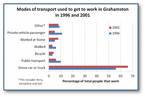
Band 6+: The chart below shows how people traveled to work in 1996 and 2001.

Image for topic: The chart below shows how people traveled to work in 1996 and 2001.
Our system will evaluate the answer based on this AI-generated description.
The image depicts a bar chart showing the percentage of total people that work in Grahamston using different modes of transport in 1996 and 2001, with a footnote mentioning that "Other*" includes ferry, aeroplane, and taxi. The x-axis measures from 0 to 70 in increments of 10 percentage points, and the y-axis lists modes of transport in descending order as follows: Drove car or truck, Public transport, Bicycle, Walked, Worked at home, Private vehicle passenger, and Other*. For 1996, the percentages are approximately: Drove car or truck 60%, Public transport 50%, Bicycle 20%, Walked 10%, Worked at home 5%, Private vehicle passenger 15%, Other* 5%. For 2001, the percentages are approximately: Drove car or truck 65%, Public transport 40%, Bicycle 13%, Walked 20%, Worked at home 8%, Private vehicle passenger 12%, Other* 3%. The bars are depicted in pairs for each mode of transport, with one bar representing 1996 and one bar representing 2001.
Given the complexity of the image, the above description may not be entirely accurate.
Note: Both the topic and the answer were created by one of our users.

The graph illustrates the proportion of people who go to work with distinct types of transportation during the given time.

Overall, over the period from 1996 to 2001, people had a preference to go to work by car or truck while the other types of vehicles took up small minorities.

In 1996, people who drove car or truck reached 67%, the figure rose significantly to 78% in 2001. By contrast, the proportion of workers who used public transport saw a slight reduction from 10% to 8%. Similarly, the share of people who walked to work fell from roughly 8% to 5%. People who went to work as car passengers decreased from 11% to 5%

According to the chart, other categories showed minor variations. The percentage of people who rode bikes to work experienced a small rise from 3% to 5% from 1996 to 2001. Also, people had a tendency to do home-working, which increased from 5% to 8% during the same period. Simultaneously, the *Other* category which included ferry, aeroplane and taxi remained unchanged at around 9%.

Word Count: 177

Answers On The Same Topic:

The chart below shows how people traveled to work in 1996 and 2001.

THE BAR CHART ILLUSTRATES THE PROPORTION OF USED TRANSPORT TO GET TO WORK THROUGHOUT THE TIME PERIOD BETWEEN 1996 AND 2001. OVERALL, OVER ALL TIME PERIOD GIVEN WORKERS USED CARS AND TRUCKS MORE FREQUENTLY THEN OTHER TRANSPORTS. MOREOVER OTHER VARITIES OF WAY DO NOT EXCEEDED UNDER 20%. WITH REGARDS TO EMPLOYEES WHO DROVE CAR OR […]

The chart below shows how people traveled to work in 1996 and 2001.

The bar chart gives information about different types of transport used to commute to work in Grahamston in 1996 and 2001. Overall, car and truck emerged as the most prevalent modes of transport to get to work in 1996, and it increased by 2001, as did the proportions of people who cycled to work and […]

The chart below shows how people traveled to work in 1996 and 2001.

The bar chart illustrates the percentage of transport’s types used to get to work in grahamston over the 5 years period. Overall, it is clear that category “drove car or truck” in 2001 recorded with the highest figure, while “bycicle” in1996 and “walked” in 2001 showed the lowest point over the trend. In 1996, driving […]

The chart below shows how people traveled to work in 1996 and 2001.

The bar chart compares the percentage of transport usage in Grahamston over the period from 1996 to 2001. Overall, it is clear that Drove car or truck had the highest figures, while bicycle recorded the lowest. Another noticeable trend is that private vehicle passenger showed a higher percentage. In contrast, the walked presented the lower […]

See All

Other Topics:

The bar chart shows clothing import prices to the EU from six countries in 1993 and 2003.

The bar chart indicated clothing import prices to the EU from six countries in 1993 and 2003. Overall, Argentina showed a highest rise in both years, followed by Brazil, while,China, India, along with Bangladesh the lowest positions, whereas Japen increased significantly afterwards. In 1993, the clothing import prices Argentina were the most well-known, cournty around […]

The bar chart shows clothing import prices to the EU from six countries in 1993 and 2003.

The bar chart indicated clothing import prices to the EU from six countries in 1993 and 2003. Overall, Argentina shown a highetst rose in both years, follwed by Brazill, while, China, India, along with Bangladesh the lowest position, wheres Japen increased significantly afterwards. In 1993, the clothing import prices Argentina was is the most well-know […]

The chart below shows the number of passengers in thousands who used public transport in Somewhere town from 2012 to 2015.

The bar chart illustrates the number of commuters using three means of public transportation in Somewhere town between 2012 and 2015. The number is presented in thousands of passengers. Overall, the number of tram passengers exhibited the most significant increase, whereas both train and bus experienced considerable fluctuations. Notably, trams became the most popular means […]

The charts below show the percentage of male and female students of different age groups who studied in Australia for full-time and part-time education in 2006. Summarize the information by selecting and reporting the main features, and make comparisons where relevant.

The charts illustrate how many male and female students in Australia in four different age groups chose whether they study full-time or part-time education in 2006. Overall, male and female students from 20 to 24 years old were the largest. In addition, the tendency of choosing part-time education occurred in almost all age groups, except […]

You should spend about 20 minutes on this task. The bar chart shows the percentage of the total world population in 4 countries in 1950 and 2002, and projections for 2050. Summarise the information by selecting and reporting the main features and make comparisons where relevant. You should write at least 150 words.

the bar chart illustrates the proportion of total world inhabitants in 4 countries namely – India, China, the USA and Japan – from 1950 to 2002 with forecasts for 2050. overall, it is clear that there is a downward trend among all countries. China was was country with highest percentage of inhabitants in 1950 and […]

The graph below shows the percentage of people going to cinemas in one European country on different days. Summarize the information by selecting and reporting the main features and make comparisons where relevant.

The proportion of people in one particular European country who visited cinemas based on days of the week showed by the bar chart in three different years. Overall, among all three years, the number of people going to cinemas is increasing throughout the week from monday to saturday. At the first day of the week, […]

See All
We have detected unusual activity on your device.
Please verify your identity to continue.
Note: This verification step won't sign you in. If you have a premium account, please log in to access the service as usual.
Google/Gmail Verification
Or verify using Email/Code
We've sent a verification code to:
youremail@gmail.com (Not your email?)
Enter it below to complete the verification process.
Ensure your email address is correct, your inbox is not full, and you check your spam folder. If no email arrives, consider using an alternative email.
You will need a Premium plan to perform your action!
Note: If you already have a premium account, please log in to access our services as usual.

Plans & Pricing

Our mission is to make quality education accessible for everyone.
However, to keep our hardworking team running and this service alive, we genuinely need your support!
By opting for a premium plan, not only do you sustain us in achieving the mission, but you also unlock advanced features to enrich your learning experience.

Free

For learners who aren't pressed for time

What's included on Free
100+ Cambridge IELTS Tests
Instant IELTS Writing Task 1 & 2 Evaluation (2 times/month)
Instant IELTS Speaking Part 1, 2, & 3 Evaluation (2 times/month)
Instant IELTS Writing Task 1 & 2 Essay Generator (2 times/month)
500+ Dictation & Shadowing Exercises
100+ Pronunciation Exercises
Flashcards
Other Advanced Tools

Premium

For those serious about advancing their English proficiency, and for IELTS candidates aspiring to boost their band score by 1-2 points (especially in writing & speaking) in just 30 days or less

What's included on Premium
Save Your IELTS Test Progress & Analyze Mistakes By Question Type
Save Your Own Flashcard Sets & Use Them On Any Device
Unlock All Courses, IELTS Tests, Section & Part Practice
Unlimited AI Conversations
Unlimited AI Writing Enhancement Exercises
Unlimited IELTS Writing Task 1 & 2 Evaluation
Unlimited IELTS Speaking Part 1, 2, & 3 Evaluation
Checked Answers Will Not Be Published
Unlimited IELTS Writing Task 1 & 2 Essay Generator
Unlimited IELTS Speaking Part 1, 2, & 3 Sample Generator
Unlimited Usage Of Advanced Tools & AI Features
Priority Support within 24h (12-month plan only)

Due to the nature of our service and the provided free trials, payments are non-refundable.