🔥 Today Only: Save 30% on Premium — Offer Ends Soon! - Upgrade Now!
Bar Chart

Band 6+: The chart below shows how people traveled to work in 1996 and 2001.

Image for topic: The chart below shows how people traveled to work in 1996 and 2001.
Our system will evaluate the answer based on this AI-generated description.
The image depicts a bar chart showing the percentage of total people that work in Grahamston using different modes of transport in 1996 and 2001, with a footnote mentioning that "Other*" includes ferry, aeroplane, and taxi. The x-axis measures from 0 to 70 in increments of 10 percentage points, and the y-axis lists modes of transport in descending order as follows: Drove car or truck, Public transport, Bicycle, Walked, Worked at home, Private vehicle passenger, and Other*. For 1996, the percentages are approximately: Drove car or truck 60%, Public transport 50%, Bicycle 20%, Walked 10%, Worked at home 5%, Private vehicle passenger 15%, Other* 5%. For 2001, the percentages are approximately: Drove car or truck 65%, Public transport 40%, Bicycle 13%, Walked 20%, Worked at home 8%, Private vehicle passenger 12%, Other* 3%. The bars are depicted in pairs for each mode of transport, with one bar representing 1996 and one bar representing 2001.
Given the complexity of the image, the above description may not be entirely accurate.
Note: Both the topic and the answer were created by one of our users.

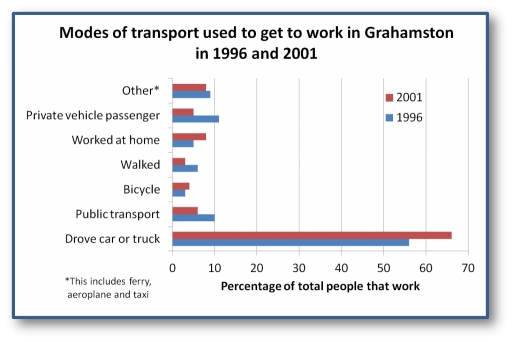
The bar chart illustrates the percentage of transport’s types used to get to work in grahamston over the 5 years period.

Overall, it is clear that category “drove car or truck” in 2001 recorded with the highest figure, while “bycicle” in1996 and “walked” in 2001 showed the lowest point over the trend.

In 1996, driving a car or truck was already the dominant means of commuting, accounting for over half of all workers, thus this figure increased significantly by 2001, reaching roughly 65%. The public transport was the second most same method in 1996 at about 10%, but its share fell substantially by 2001. The proportion of people travelling as private vehicle passengers also falled noticeably over the same period.

On the other hand, other categories showed smaller results. Working from home rose slightly, climbing from around 7% in 1996 to approximately 10% in 2001. Additionally, walking and cycling remained minor modes of transport, with both experiencing slight declines over the whole period. The “other” category, which includes options like taxis and ferries, increased slightly between the 2 years.

Word Count: 179

Answers On The Same Topic:

The chart below shows how people traveled to work in 1996 and 2001.

THE BAR CHART ILLUSTRATES THE PROPORTION OF USED TRANSPORT TO GET TO WORK THROUGHOUT THE TIME PERIOD BETWEEN 1996 AND 2001. OVERALL, OVER ALL TIME PERIOD GIVEN WORKERS USED CARS AND TRUCKS MORE FREQUENTLY THEN OTHER TRANSPORTS. MOREOVER OTHER VARITIES OF WAY DO NOT EXCEEDED UNDER 20%. WITH REGARDS TO EMPLOYEES WHO DROVE CAR OR […]

The chart below shows how people traveled to work in 1996 and 2001.

The bar chart gives information about different types of transport used to commute to work in Grahamston in 1996 and 2001. Overall, car and truck emerged as the most prevalent modes of transport to get to work in 1996, and it increased by 2001, as did the proportions of people who cycled to work and […]

The chart below shows how people traveled to work in 1996 and 2001.

The bar chart compares the percentage of transport usage in Grahamston over the period from 1996 to 2001. Overall, it is clear that Drove car or truck had the highest figures, while bicycle recorded the lowest. Another noticeable trend is that private vehicle passenger showed a higher percentage. In contrast, the walked presented the lower […]

The chart below shows how people traveled to work in 1996 and 2001.

The graph illustrates the proportion of people who go to work with distinct types of transportation during the given time. Overall, over the period from 1996 to 2001, people had a preference to go to work by car or truck while the other types of vehicles took up small minorities. In 1996, people who drove […]

See All

Other Topics:

The bar chart below illustrates five different industries’ percentage share of Brazil’s economy in 2009 and 2019 with a forecast for 2029. Summarise the information by selecting and reporting the main features, and make comparisons where relevant.

The bar chart presents a comparative analysis of the percentage share of five distinct industries within Brazil’s economy, covering the years 2009, 2019, and forecasts for 2029. Overall, the data indicates a significant shift in the contributions of various industries, with finance witnessing a drastic decline, whilst food processing and oil, coal, and gas exhibit […]

people eating five portionson of fruit and vegetables per day

The bar chart illustrates the percentage of male, female and children’s consumption of fruits and vegetables per day between 2001 and 2008 in the UK. Overall, it can be observed that women had more percentage of eating fruits and vegetables each year in contrast to other gender. Both the men and children began the year […]

The bar chart below shows the percentage of people living alone in 5 different age groups in the US between 1850 and 2000.

The Bar chart illustrates the percentage of people who live alone in the USA between 1850 and 2000. Overall, there were more people who age of 55 to 64 were live alone then other age, while age of 17 to 26 were less. In 1850 and 1900, people who age of 37 to 46 were […]

The graph shows the estimate population of gorillas in 1990 and 2015

The bar chart illustrates the number of gorilla population in the wild in seven countries in Africa continent between 1990 and 2015. Overall, Uganda recorded the largest number of gorilla in both years, even though it saw a decline. A similar downward trend was observed in Central African Republic and Rwanda. In contrast, the remaining […]

The chart below shows the number of men and female in further education in Britain in three periods and whether they were studying full time or part time.

The chart depicts the amount of men and women in continuing education in Britain in three different time periods and two types of education full-time and part-time. Overall, it is clear that the part time education was very popular between the male and female gender while the full time wasn’t really used by many individuals. […]

The chart below shows the annual number of rentals and sales (in various formats) of films from a particular store between 2002 and 2011.

The bar chart compares the yearly number of film rentals and the sales of three formats (VHS, DVD and Blu-ray) in a particular shop from 2002 to 2011. Overall, the data highlights a clear shift from older formats to newer ones, alongside a steady reduction in rental demand. At the beginning of the period, rentals […]

See All
We have detected unusual activity on your device.
Please verify your identity to continue.
Note: This verification step won't sign you in. If you have a premium account, please log in to access the service as usual.
Google/Gmail Verification
Or verify using Email/Code
We've sent a verification code to:
youremail@gmail.com (Not your email?)
Enter it below to complete the verification process.
Ensure your email address is correct, your inbox is not full, and you check your spam folder. If no email arrives, consider using an alternative email.
You will need a Premium plan to perform your action!
Note: If you already have a premium account, please log in to access our services as usual.

Plans & Pricing

Our mission is to make quality education accessible for everyone.
However, to keep our hardworking team running and this service alive, we genuinely need your support!
By opting for a premium plan, not only do you sustain us in achieving the mission, but you also unlock advanced features to enrich your learning experience.

Free

For learners who aren't pressed for time

What's included on Free
100+ Cambridge IELTS Tests
Instant IELTS Writing Task 1 & 2 Evaluation (2 times/month)
Instant IELTS Speaking Part 1, 2, & 3 Evaluation (5 times/month)
Instant IELTS Writing Task 1 & 2 Essay Generator (2 times/month)
500+ Dictation & Shadowing Exercises
100+ Pronunciation Exercises
Flashcards
Other Advanced Tools

Premium

For those serious about advancing their English proficiency, and for IELTS candidates aspiring to boost their band score by 1-2 points (especially in writing & speaking) in just 30 days or less

What's included on Premium
Save Your IELTS Test Progress
Unlock All Courses & IELTS Tests
Unlimited AI Conversations
Unlimited AI Writing Enhancement Exercises
Unlimited IELTS Writing Task 1 & 2 Evaluation
Unlimited IELTS Speaking Part 1, 2, & 3 Evaluation
Checked Answers Will Not Be Published
Unlimited IELTS Writing Task 1 & 2 Essay Generator
Unlimited IELTS Speaking Part 1, 2, & 3 Sample Generator
Unlimited Usage Of Advanced Tools
Priority Support within 24h (12-month plan only)

Due to the nature of our service and the provided free trials, payments are non-refundable.
Nếu bạn là người Việt Nam và không có hoặc không muốn trả bằng credit/debit cards, bạn có thể thanh toán bằng phương thức chuyển khoản:


Chọn gói:
419,000₫ 277,000 ₫ cho gói 1 tháng (chỉ 9,233₫/ngày)
1,239,000₫ 597,000 ₫ cho gói 3 tháng (chỉ 6,633₫/ngày)
2,469,000₫ 1,027,000 ₫ cho gói 6 tháng (chỉ 5,706₫/ngày)
4,929,000₫ 1,417,000 ₫ cho gói 12 tháng (chỉ 3,936₫/ngày)


Sau khi chuyển khoản, vui lòng đợi trình duyệt tự động điều hướng bạn trở lại Engnovate và bạn sẽ ngay lập tức nhận được mã kích hoạt tài khoản premium.
Nếu có lỗi xảy ra, bạn có thể liên hệ với team thông qua một trong các phương thức: email đến helloengnovate@gmail.com hoặc nhắn tin qua facebook.com/engnovate.
Vì toàn bộ công cụ trên website đều có thể sử dụng thử miễn phí, Engnovate không hỗ trợ hoàn tiền.