Our system will evaluate the answer based on this AI-generated description.
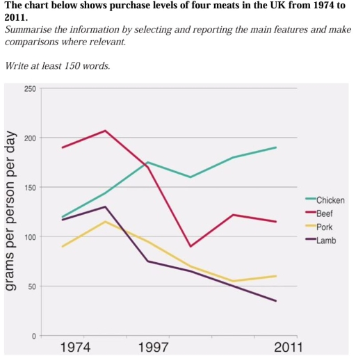
The image presents a line graph tracking the purchase levels of four meats - chicken, beef, pork, and lamb - in the UK for the years 1974, 1997, and 2011. The y-axis displays the weight of meat in grams per person per day ranging from 0 to 250, with markers at intervals of 50. The x-axis represents the years in question.
In 1974, beef had the highest purchase level at just over 200g, followed by chicken at just under 150g, then lamb at approximately 150g, and pork was the least purchased at around 100g. By 1997, chicken saw a dramatic increase to around 250g, becoming the most purchased meat, while beef and lamb experienced a significant decline to approximately 100g and 50g respectively, and pork remained relatively stable at around 100g. In 2011, chicken maintained its top position at nearly 250g, pork increased slightly to around 150g, beef continued to decrease to just over 50g, and lamb hit its lowest point at about 25g. Overall, chicken's popularity grew substantially, pork saw a small rise, while beef and lamb faced a steep downward trend over the 37-year period.
Given the complexity of the image, the above description may not be entirely accurate.
Skyrocket your IELTS band score by 1-2 points in under a month with our premium plan!
Note: Both the topic and the answer were created by one of our users.
The line chart illustrates the total amount of grams per person purched over 4 different type of meat from individuals living in UK over the period 1974 and 2011.
Overall it is apparent that chicken had gown up significantly over the years and never had a downfall, while beef even though it startet with large amount of purches around 180 it had a huge downfall to just bellow 100, but in 2011 raeched around 120 .
Pork and Lamb had the most constant changes between 1974 and 2011. In 1974 pork startet with around 80 grams it slightly rise around 1980 but decrease dramatically with just adove 50. but in 2011 it had a minimal increase. While lamb 1974 started with almost 120 and increased almost in 1980 was followed by a significant drop in 1997 and followed afer with even more dramatic decrease in untill 2011 when reached just bellow 50.
On the other hand beef and chicken had the most rapid changes over the years . Beef had the largest purches with just below 200 had a incrase above 200 then was followed by a considerable fall over the years raching around 80 , after that was followed by increased around year 2000 but ended up falling again . BY contrast chicken never had only one decrease over the time line . The purches reached the highest in 2011 with just around 180. The largest data reached ever was from beef with above 200 and the lowest ever reached from lumb in 2011.
Word Count: 255
