🔥 Today Only: Save 30% on Premium — Offer Ends Soon! - Upgrade Now!
Multiple Graphs

Band 5+: The chart below shows the amount of money (in pence) per week spent on fast foods in Britain in 1990. The graph shows the trends in consumption of fast foods. Write a report for a university lecturer describing the information shown below.

Image for topic: The chart below shows the amount of money (in pence) per week spent on fast foods in Britain in 1990. The graph shows the trends in consumption of fast foods. Write a report for a university lecturer describing the information shown below.
Our system will evaluate the answer based on this AI-generated description.
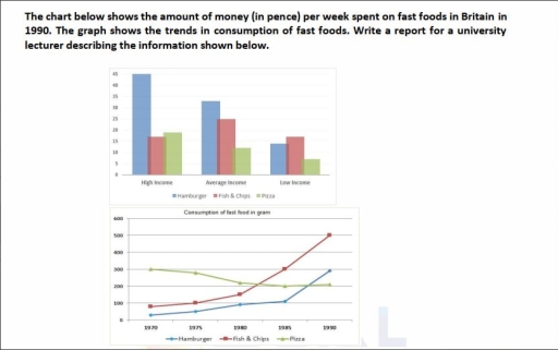
The image features two graphics: a bar chart above and a line graph below. The top bar chart has a vertical axis from 0 to 45 (interval 5) and displays three categories on the horizontal axis: High Income, Average Income, and Low Income, with a legend for Hamburger, Fish & Chips, and Pizza. For High Income, Hamburger is approximately 43, Fish & Chips is approximately 17, and Pizza is approximately 19; for Average Income, Hamburger is approximately 33, Fish & Chips is 25, and Pizza is approximately 12; for Low Income, Hamburger is approximately 14, Fish & Chips is approximately 17, and Pizza is approximately 7. The bottom line graph, titled 'Consumption of fast food in gram', has a vertical axis ranging from 0 to 600 (interval 100) and a horizontal axis with years 1970, 1975, 1980, 1985, and 1990, alongside a legend for Hamburger, Fish & Chips, and Pizza. Hamburger records approximately 30 grams (1970), 50 grams (1975), 90 grams (1980), 110 grams (1985), and 290 grams (1990); Fish & Chips records approximately 80 grams (1970), 100 grams (1975), 150 grams (1980), 300 grams (1985), and 500 grams (1990); Pizza records 300 grams (1970), approximately 280 grams (1975), approximately 220 grams (1980), 200 grams (1985), and approximately 210 grams (1990).
Given the complexity of the image, the above description may not be entirely accurate.
Note: Both the topic and the answer were created by one of our users.

The chart illustrates the figure for money spent per week on fast food in Britain in 1990 and the consumption of three types of fast over a 20- year period.

Overall, it is clear that people in high income group used most money on fast food, while those in the low-income group paid the least. In terms of consumption, the figure for hamburger, fish and chips rose markedly, whereas pizza decried slightly.

In 1990, the figure for high income group used money on hamburger stood at 45 pence. Also, the amount of average income on hamburger was recorded at about 33 pence. Similarly, the proportion of low-income people group reached at 15 pence. As for fish and chips, the high-income group spent about 17 pence, compared with approximately 25 pence for the average-income group and 15 pence for the low-income group. Regarding pizza, the figures were around 18, 12 and 7 pence for the high-, average- and low-income groups, respectively.

In the first year, Th figure for people consumption pizza on gram was 300 grams. The amount fell from 300 grams to 200 grams in 1985 and this proportion remained stable in 1990. The consumption of fish and chips recorded about 98 grams in 1970. The figure rose by 500 grams in 1990 and this number was accounted the highest amount in final period. The figure for hamburger eating was approximately 20 grams in 1970. This number of hamburger increased markedly to 300 grams in the final year.

Word Count: 248

Other Topics:

the chart and table below give information about online shopping by Australia and New Zealand customers in 2012

The table and chart illustrates data in Australia and New Zealand customers in terms of online shopping in 2012. Overall, it is clear that both countries high amount of people used local websites and both overseas while the major reason for online shopping is that lower prices than in store in both countries. However, the […]

1. The graph below shows the viewership of different TV programs among three different age groups.

The pie charts compare the percentage of viewers of several TV programs wich are watched by three different age groups. Overall, among three groups, watching film and drama on the TV were the most popular activity, while news channels were used fewer. Regarding the 10-15 age group, sport and cartoon TV shows stand out, both […]

The charts below give information on the location and types of dance classes young people in a town in Australia are currently attending. Summarise the information by selecting and reporting the main features, and make comparisons where relevant. Write at least 150 words. Location of dance classes Community halls & other 18% 目 Private -studios 48% School halls (after-school) 24% College-based studios 10% Types of dance classes (by age group) Under 11 11-16 Ballet Tap Modern 100 200 96 →p. 136 300 400 Number of students 500 600 700

The pie charts and bar graph illustrates some data about currently location and types of dacne that attedinding young people in a town in Australia. Overall, the largest amount visiting is private studios and it can be seen that it is very popular among children. As for types, the ballet in great request for children […]

The table and charts below provide information about the destinations and employment of UK first degree holders. Summarize the information by selecting and reporting the main features, and make comparisons where relevant.

The table provides the data about the destinations of UK first-degree graduates from 2007 to 2010, while the pie charts illustrate the proportion of salaries distribution between male and female for 2009 and 2010. Overall, full-time employment had the highest percentages throughout the period, whereas part-time employment and study had the lowest percentages. Regarding salaries, […]

The table and charts below provide information about the destinations and employment of UK first degree holders. Summarize the information by selecting and reporting the main features, and make comparisons where relevant.

The table provides the data on UK graduates who had different destination for academic year from 2007 to 2010, while pie charts illustrate the proportion of salaries distribution between male and female for 2009 and 2010. Overall, full-time employment had the highest percentages throughout the period, whereas part-time employment and study had the lowest percentages. […]

The first graph shows the number of train passengers from 2000 to 2009; the second compares the percentage of trains running on time and target in the period. Summarise the information by selecting and reporting the main features, and make comparisons where relevant.

The first line graph depicts the number of train users between 2000 and 2009, while second graph illustrates the comparison between proportion of trains running and target. Overall, number of passengers fluctuated over the period and, while percentage of trains running on time remained stable, target increased during the period. Regarding first graph, number of […]

See All
We have detected unusual activity on your device.
Please verify your identity to continue.
Note: This verification step won't sign you in. If you have a premium account, please log in to access the service as usual.
Google/Gmail Verification
Or verify using Email/Code
We've sent a verification code to:
youremail@gmail.com (Not your email?)
Enter it below to complete the verification process.
Ensure your email address is correct, your inbox is not full, and you check your spam folder. If no email arrives, consider using an alternative email.
You will need a Premium plan to perform your action!
Note: If you already have a premium account, please log in to access our services as usual.

Plans & Pricing

Our mission is to make quality education accessible for everyone.
However, to keep our hardworking team running and this service alive, we genuinely need your support!
By opting for a premium plan, not only do you sustain us in achieving the mission, but you also unlock advanced features to enrich your learning experience.

Free

For learners who aren't pressed for time

What's included on Free
100+ Cambridge IELTS Tests
Instant IELTS Writing Task 1 & 2 Evaluation (2 times/month)
Instant IELTS Speaking Part 1, 2, & 3 Evaluation (2 times/month)
Instant IELTS Writing Task 1 & 2 Essay Generator (2 times/month)
500+ Dictation & Shadowing Exercises
100+ Pronunciation Exercises
Flashcards
Other Advanced Tools

Premium

For those serious about advancing their English proficiency, and for IELTS candidates aspiring to boost their band score by 1-2 points (especially in writing & speaking) in just 30 days or less

What's included on Premium
Save Your IELTS Test Progress & Analyze Mistakes By Question Type
Save Your Own Flashcard Sets & Use Them On Any Device
Unlock All Courses, IELTS Tests, Section & Part Practice
Unlimited AI Conversations
Unlimited AI Writing Enhancement Exercises
Unlimited IELTS Writing Task 1 & 2 Evaluation
Unlimited IELTS Speaking Part 1, 2, & 3 Evaluation
Checked Answers Will Not Be Published
Unlimited IELTS Writing Task 1 & 2 Essay Generator
Unlimited IELTS Speaking Part 1, 2, & 3 Sample Generator
Unlimited Usage Of Advanced Tools & AI Features
Priority Support within 24h (12-month plan only)

Due to the nature of our service and the provided free trials, payments are non-refundable.