🔥 Today Only: Save 30% on Premium — Offer Ends Soon! - Upgrade Now!
Multiple Graphs

Band 6+: the chart below shows the amount of money per week spent on fast food in britain. the graph shows the trends in consumption of fast foods.

Image for topic: the chart below shows the amount of money per week spent on fast food in britain. the graph shows the trends in consumption of fast foods.
Our system will evaluate the answer based on this AI-generated description.
The image contains two sections: "Expenditure on fast foods by income groups" displayed as a bar chart, and "Consumption of fast foods 1970 - 1990" illustrated as line graphs. The bar chart shows expenditure on hamburgers, fish and chips, and pizza by high, average, and low-income groups, with high income spending the most on hamburgers (~44 pence per week) and pizza (~30 pence per week), and average income spending the most on fish and chips (~18 pence per week). The low-income group spends less in all categories, with ~20 pence on hamburgers, ~12 pence on fish and chips, and ~10 pence on pizza. The line graphs depict the consumption trends of hamburgers, fish and chips, and pizza over two decades, with hamburger consumption increasing from ~0 grams in 1970 to ~500 grams by 1990, fish and chips starting at ~300 grams in 1970 and declining to ~200 grams by 1990, and pizza consumption starting at ~0 grams in 1970 and rising to ~300 grams by 1990.
Given the complexity of the image, the above description may not be entirely accurate.
Note: Both the topic and the answer were created by one of our users.

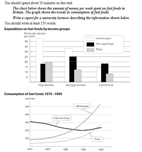
The given graphs depict fast food expenditure in Britain based on income groups and how fast food consumption has changed over time.

In the provided bar chart we can see that fish and chips are the most popular food with low income class but its vice versa for the high earners who prefer to spend more money on hamburgers. Average earners also follow high earners in spending most money on hamburgers but unlike them their least bought fast food is pizza a trait they share with low earning class.

Following the bar chart we are presented with a line chart that displays the consumption of fast food has been on climb between 1970 and 1990 thanks to a steady increase in hamburger and pizza consumption, whereas fish and chips, even though they started as the most popular back in the 70s, they started gradually declining in popularity and only in 1985 they started getting some rhythm back.

Word Count: 157

Answers On The Same Topic:

the chart below shows the amount of money per week spent on fast food in britain. the graph shows the trends in consumption of fast foods.

The provided visuals delineate the weekly expenditure on fast food across diverse income strata in Britain, coupled with an analysis of evolving consumption patterns spanning two decades. A salient observation is the propensity of higher-income earners to allocate a greater proportion of their fast-food budget to hamburgers, while their lower-income counterparts demonstrate a marked preference […]

the chart below shows the amount of money per week spent on fast food in britain. the graph shows the trends in consumption of fast foods.

The chout below compare the expenditure and the consecmption og fast food per person in Britian. The measurements in the prest graph are pence per person, whereas in the second graph & the indicators are measured in grammes. Intel Overall, the indicators of hamburger showed the highest results in bath charts. By contrast, the numbers […]

the chart below shows the amount of money per week spent on fast food in britain. the graph shows the trends in consumption of fast foods.

The bar chart compares the amount of money spent per person per week on three types of fast food in Britain across different income groups, while the line graph illustrates changes in the consumption of these foods between 1970 and 1990. Overall, people with higher incomes spent significantly more on fast food than those with […]

the chart below shows the amount of money per week spent on fast food in britain. the graph shows the trends in consumption of fast foods.

The provided visuals delineate the weekly expenditure on fast food across diverse income strata in Britain, coupled with an analysis of evolving consumption patterns spanning two decades. A salient observation is the propensity of higher-income earners to allocate a greater proportion of their fast-food budget to hamburgers, while their lower-income counterparts demonstrate a marked preference […]

the chart below shows the amount of money per week spent on fast food in britain. the graph shows the trends in consumption of fast foods.

The provided diagrams illustrate the weekly expenditure on various fast foods across different income groups in Britain, alongside an analysis of the consumption trends from 1970 to 1990. Overall, it is evident that higher-income individuals predominantly allocated greater financial resources toward fast food, with a significant inclination towards hamburgers, while lower-income groups exhibited a marked […]

See All

Other Topics:

The table shows the age profile of tourists on backpacking holidays and guided tours in New Zealand in 2005, and the pie chart gives the satisfaction rating of their stay. Summarise the information by selecting and reporting the main features, and make comparisons where relevant.

The given table illustrates the proportion of various age groups travelers travling on backpacking and guided tours holidays, while the pie charts depict the percentage of satisfaction rating in three categories in new zealand in the year of 2005. It is evident from the graph that in 2005, in the year 18-30, the highest majority […]

The charts below give information about how water was used in the world and different countries in 2000. Summarise the information by selecting and reporting the main features, and make comparisons where relevant.

This two charts illustrate the use of water in the world and different countries in 2000. First of all, most of the water was used for agricultural about 70%, and domestic use water was the least, about 8% in the world. In addition, the remaining water is used for industry , about 22%. In some […]

The graph and chart below give information on the average daily and minimum temperatures in degrees Celsius and the average number of days with rainfall each month for two Australian cities.

The line graph shows the daily temperatures in Brisbane and Canberra – two Australian cities – throughout the year, while the bar chart focuses on the rainy days in the same cities. Overall, it can be seen that the figures for maximum and minimum temperatures in Brisbane and Canberra witnessed similar trends, rising at the […]

The charts give information about the percentage of men and women who had driving licenses in one European country in various years.

The provided charts compare the percentage of men and women with driving license in total and percentage of young drivers between 17 and 20 years old in one European nation in various years. Overall, men dominated in both charts, with the percentage of driving license among men and women increased year by year. In terms […]

The chart displays the percentage of people using internet, and the pie chart shows the average of spending on shopping on the internet in different countries.

The given bar graph shows the proportion of internet users for five European countries, while the pie chart illustrates the average amount of money spent by residents of these countries online. Overall, Sweden greatly outperforms other countries in the number of internet users in their population. At the same time, the pie chart is spread […]

The charts below show the percentage of time used for different activities in the office in the US in 1980 and 2000.

The pie graphs compare how much time office workers spent on various tasks in 1980 and 2000 in the US. Over this period, computer use has developed into the main activity, surpassing former most time-consuming task – using phones. Furthermore, while unspecified activities and in-person communication remained unaltered, paper documents, meeting and phones had taken […]

See All
We have detected unusual activity on your device.
Please verify your identity to continue.
Note: This verification step won't sign you in. If you have a premium account, please log in to access the service as usual.
Google/Gmail Verification
Or verify using Email/Code
We've sent a verification code to:
youremail@gmail.com (Not your email?)
Enter it below to complete the verification process.
Ensure your email address is correct, your inbox is not full, and you check your spam folder. If no email arrives, consider using an alternative email.
You will need a Premium plan to perform your action!
Note: If you already have a premium account, please log in to access our services as usual.

Plans & Pricing

Our mission is to make quality education accessible for everyone.
However, to keep our hardworking team running and this service alive, we genuinely need your support!
By opting for a premium plan, not only do you sustain us in achieving the mission, but you also unlock advanced features to enrich your learning experience.

Free

For learners who aren't pressed for time

What's included on Free
100+ Cambridge IELTS Tests
Instant IELTS Writing Task 1 & 2 Evaluation (2 times/month)
Instant IELTS Speaking Part 1, 2, & 3 Evaluation (5 times/month)
Instant IELTS Writing Task 1 & 2 Essay Generator (2 times/month)
500+ Dictation & Shadowing Exercises
100+ Pronunciation Exercises
Flashcards
Other Advanced Tools

Premium

For those serious about advancing their English proficiency, and for IELTS candidates aspiring to boost their band score by 1-2 points (especially in writing & speaking) in just 30 days or less

What's included on Premium
Save Your IELTS Test Progress
Unlock All Courses & IELTS Tests
Unlimited AI Conversations
Unlimited AI Writing Enhancement Exercises
Unlimited IELTS Writing Task 1 & 2 Evaluation
Unlimited IELTS Speaking Part 1, 2, & 3 Evaluation
Checked Answers Will Not Be Published
Unlimited IELTS Writing Task 1 & 2 Essay Generator
Unlimited IELTS Speaking Part 1, 2, & 3 Sample Generator
Unlimited Usage Of Advanced Tools
Priority Support within 24h (12-month plan only)

Due to the nature of our service and the provided free trials, payments are non-refundable.
Nếu bạn là người Việt Nam và không có hoặc không muốn trả bằng credit/debit cards, bạn có thể thanh toán bằng phương thức chuyển khoản:


Chọn gói:
419,000₫ 277,000 ₫ cho gói 1 tháng (chỉ 9,233₫/ngày)
1,239,000₫ 597,000 ₫ cho gói 3 tháng (chỉ 6,633₫/ngày)
2,469,000₫ 1,027,000 ₫ cho gói 6 tháng (chỉ 5,706₫/ngày)
4,929,000₫ 1,417,000 ₫ cho gói 12 tháng (chỉ 3,936₫/ngày)


Sau khi chuyển khoản, vui lòng đợi trình duyệt tự động điều hướng bạn trở lại Engnovate và bạn sẽ ngay lập tức nhận được mã kích hoạt tài khoản premium.
Nếu có lỗi xảy ra, bạn có thể liên hệ với team thông qua một trong các phương thức: email đến helloengnovate@gmail.com hoặc nhắn tin qua facebook.com/engnovate.
Vì toàn bộ công cụ trên website đều có thể sử dụng thử miễn phí, Engnovate không hỗ trợ hoàn tiền.