🔥 Today Only: Save 30% on Premium — Offer Ends Soon! - Upgrade Now!
Bar Chart

Band 6+: The chart below shows the annual number of rentals and sales (in various formats) of films from a particular store between 2002 and 2011.

Image for topic: The chart below shows the annual number of rentals and sales (in various formats) of films from a particular store between 2002 and 2011.
Our system will evaluate the answer based on this AI-generated description.
The image is a bar graph that displays the annual number of rentals and sales (in various formats) of films from a particular store between 2002 and 2011. The vertical axis represents the annual number of rentals/sales, ranging from 0 to 250,000. The horizontal axis represents the years, ranging from 2002 to 2011. Four types of film formats are shown: Rentals, VHS sales, DVD sales, and Blu-ray sales. Each year has four bars representing the number for each format. The bars for rentals are consistently the tallest across all years, with a slight decline from 2002 to 2011. VHS sales start from a considerable number in 2002, with a steep decline to almost negligible by 2011. DVD sales show an upward trend until 2005, remain relatively stable until 2009, and then display a slight decrease in 2010 and 2011. Blu-ray sales start from zero in 2002, show a small increase in 2006, and then a significant upward trend from 2007 onwards, reaching a peak in 2011. Specific numerical data points or percentages are not visible; however, the trends and relative comparisons between formats and over the years are clear.
Given the complexity of the image, the above description may not be entirely accurate.
Note: Both the topic and the answer were created by one of our users.

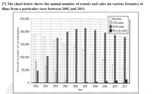
The bar graph illustrates the yearly proportion of film rentals and sales from a store in four formats mainly rentals, VHS sales, DVD sales and Blu-ray sales across 2002 to 2011.

Overall, it is apparent that rentals had a gradual fall while, DVD sales had significant growth over the given 10 year period. Additionally, its is important to note that while VHS sales dipped over the first five years, the Blu-ray sales rose in the last five years.

In 2002, the overall proportion of rentals was about 180,000 which prominently tapered down to about 60,000 by 2011. In contrast, the DVD sales initiated over 40,000 in 2002 and surged to almost 210,000 by 2007 which apparently was the highest sales amongst all the formats of films in the period given. However, the amount started falling gradually and ending at 180,000 by 2011.

In addition to the two formats, both VHS and Blu-ray sales depicts a different scenario . Although VHS started at around 80,000 sales in 2002 which further decreased to 10,000 by 2005, it completely stopped to be sold by 2006. Blu-rays sales commenced only by 2007 at marginal 5000 sales and transitioned smoothly upto 15,000 sales by 2011.

Word Count: 200

Answers On The Same Topic:

The chart below shows the annual number of rentals and sales (in various formats) of films from a particular store between 2002 and 2011.

The diagrams illustrate the amount of rentals and sales of films from specific market from 2002 to 2011. Overall, it can be clearly seen that at the beginning of diagram the number of rental was higher than final year and Blu-ray sales were started from only 2007. Firstly, in 2002 rentals were leader and number […]

The chart below shows the annual number of rentals and sales (in various formats) of films from a particular store between 2002 and 2011.

The bar graph illustrates quantity of variant rentals and sales of broadcasts in a choosen store in a period of an year from 2002 to 2011. Overview,the rentals showed a consistent sink from the begining while bussiness on DVD potrays steady climb throughout despite a drop at the end period.VHS taked the third position with […]

The chart below shows the annual number of rentals and sales (in various formats) of films from a particular store between 2002 and 2011.

The presented bar graph illustrates the annual number of rentals and sales of films from a specific store, categorized by format, spanning the years 2002 to 2011. Overall, the data reveals a predominant decline in rentals and VHS sales, contrasting with the rising DVD and Blu-ray formats, particularly notable from 2007 onwards. In terms of […]

The chart below shows the annual number of rentals and sales (in various formats) of films from a particular store between 2002 and 2011.

The bar chart illustrates the yearly volume of film rentals and purchases between 2002 and 2011, with sales divided into VHS, DVD, and Blu-ray formats. Overall, it is evident that the demand for rentals declined steadily throughout the period. In comparison, purchases shifted dramatically from VHS to DVD, whereas Blu-ray, despite entering the market later, […]

The chart below shows the annual number of rentals and sales (in various formats) of films from a particular store between 2002 and 2011.

The chart illustrates the annual shops’ movie renting and selling each year from 2002 to 2011. Overall, it is clear that, there was a rapid increase in DVD sales with a small decrease while a minor increase in blu-ray sales. Opposite to that, rentals and VHS sales show decrease in sales. Looking at the chart […]

See All

Other Topics:

The charts illustrate the number of people who were affected by four types of noise pollution in day and night in cities and rural areas in 2007.

The bar charts compare the level of human exposure to four distinct categories of noise during the day and night in a specific location in 2007. Overall, urban area residents were affected profoundly compared to people who lived in the countryside, especially during the day. Of particular note is that the noise which was generated […]

The bar graph shows the average hours of daily sunshine throughout the year in two cities of Australia. Summarise the information by selecting and reporting the main features, and make comparisons where relevant.

The bar graph compares the standard number of sunlight hours per day in Sydney versus Perth, Australia. Overall, it is clear that Perth has the highest average sunshine for almost all of the months, whereas Sydney has low sunshine duration per day. In terms of Perth, for the first three months, January to March, the […]

The bar chart shows percentages of three groups of australian children taking part in four kinds of activities in 2012. Summarize the information by selecting and reporting the main features , and make comparisons where relevant.

The bar chart provides a comparison of three age groups who participated in four leisure activities in 2012, measured in percentage. Overall, considerable differences can be observed among the categories presented. While watching TV accounted for the highest figures across all age groups, the opposite was true for art, which generally recorded comparativley lower values. […]

The bar chart shows percentages of three groups of australian children taking part in four kinds of activities in 2012. Summarize the information by selecting and reporting the main features , and make comparisons where relevant.

The bar chart provides a comparison of three age groups who participated in four leisure activities in 2012, measured in percentage. Overall, considerable differences can be observed among the categories presented. While watching TV accounted for the highest figures across all age groups, the opposite was true for art, which generally recorded comparatively lower values. […]

The bar chart below shows the number of people employed in five different sectors (sales, accounting, computing, nursing, and farming) in a region of Australia in 2001 and 2008. Summarise the information by selecting and reporting the main features, and make comparisons where relevant.

The bar chart illustrates the number of public employed in different five types of work such as ( sales, accounting, computing, nursing and farming ) on one region of Australia between 2001 and 2008. Overall, it is clear that sales had the highest component over the period, while farming was the least and declined. Moreover, […]

The graph below shows the three different kinds of emission sources in the UK from 1990 to 2010.

The bar chart compares the distribution of carbon emissions generated from three types of fossil fuels – gas, oil, and coal – in the UK between 1990 and 2010. Overall, a significant increase could be observed in the emissions from gas, while the figures for remaining fuel types decreased. Notably, coal and oil were the […]

See All
We have detected unusual activity on your device.
Please verify your identity to continue.
Note: This verification step won't sign you in. If you have a premium account, please log in to access the service as usual.
Google/Gmail Verification
Or verify using Email/Code
We've sent a verification code to:
youremail@gmail.com (Not your email?)
Enter it below to complete the verification process.
Ensure your email address is correct, your inbox is not full, and you check your spam folder. If no email arrives, consider using an alternative email.
You will need a Premium plan to perform your action!
Note: If you already have a premium account, please log in to access our services as usual.

Plans & Pricing

Our mission is to make quality education accessible for everyone.
However, to keep our hardworking team running and this service alive, we genuinely need your support!
By opting for a premium plan, not only do you sustain us in achieving the mission, but you also unlock advanced features to enrich your learning experience.

Free

For learners who aren't pressed for time

What's included on Free
100+ Cambridge IELTS Tests
Instant IELTS Writing Task 1 & 2 Evaluation (2 times/month)
Instant IELTS Speaking Part 1, 2, & 3 Evaluation (5 times/month)
Instant IELTS Writing Task 1 & 2 Essay Generator (2 times/month)
500+ Dictation & Shadowing Exercises
100+ Pronunciation Exercises
Flashcards
Other Advanced Tools

Premium

For those serious about advancing their English proficiency, and for IELTS candidates aspiring to boost their band score by 1-2 points (especially in writing & speaking) in just 30 days or less

What's included on Premium
Save Your IELTS Test Progress
Unlock All Courses & IELTS Tests
Unlimited AI Conversations
Unlimited AI Writing Enhancement Exercises
Unlimited IELTS Writing Task 1 & 2 Evaluation
Unlimited IELTS Speaking Part 1, 2, & 3 Evaluation
Checked Answers Will Not Be Published
Unlimited IELTS Writing Task 1 & 2 Essay Generator
Unlimited IELTS Speaking Part 1, 2, & 3 Sample Generator
Unlimited Usage Of Advanced Tools
Priority Support within 24h (12-month plan only)

Due to the nature of our service and the provided free trials, payments are non-refundable.
Nếu bạn là người Việt Nam và không có hoặc không muốn trả bằng credit/debit cards, bạn có thể thanh toán bằng phương thức chuyển khoản:


Chọn gói:
419,000₫ 277,000 ₫ cho gói 1 tháng (chỉ 9,233₫/ngày)
1,239,000₫ 597,000 ₫ cho gói 3 tháng (chỉ 6,633₫/ngày)
2,469,000₫ 1,027,000 ₫ cho gói 6 tháng (chỉ 5,706₫/ngày)
4,929,000₫ 1,417,000 ₫ cho gói 12 tháng (chỉ 3,936₫/ngày)


Sau khi chuyển khoản, vui lòng đợi trình duyệt tự động điều hướng bạn trở lại Engnovate và bạn sẽ ngay lập tức nhận được mã kích hoạt tài khoản premium.
Nếu có lỗi xảy ra, bạn có thể liên hệ với team thông qua một trong các phương thức: email đến helloengnovate@gmail.com hoặc nhắn tin qua facebook.com/engnovate.
Vì toàn bộ công cụ trên website đều có thể sử dụng thử miễn phí, Engnovate không hỗ trợ hoàn tiền.