🔥 Today Only: Save 30% on Premium — Offer Ends Soon! - Upgrade Now!
Bar Chart

Band 7+: The chart below shows the annual pay (thousands of US dollars) for doctors and other workers in seven countries in 2004. Summarise the information by selecting and reporting the main features, and make comparisons where relevant.

Image for topic: The chart below shows the annual pay (thousands of US dollars) for doctors and other workers in seven countries in 2004. Summarise the information by selecting and reporting the main features, and make comparisons where relevant.
Our system will evaluate the answer based on this AI-generated description.
The image contains a bar graph showing the annual pay for doctors and other workers in seven countries in 2004, measured in thousands of US dollars. The countries represented are France, Italy, Czech Republic, Germany, Finland, Switzerland, and the US. In France, other workers earn just above 20, while doctors earn around 60. In Italy, other workers earn just below 20, while doctors earn around 60. The Czech Republic has other workers earning around 10, and doctors earning just above 40. Germany shows other workers earning around 20, while doctors earn over 40. Finland has other workers earning around 20, and doctors earning over 60. Switzerland displays other workers earning over 40, and doctors earning over 120. The US has other workers earning around 40, and doctors earning over 100. Two shades of bars represent the data, with lighter bars indicating other workers and darker bars indicating doctors. The x-axis is labeled from 0 to 140. The title of the graph is "Annual pay for doctors and other workers in seven countries in 2004".
Given the complexity of the image, the above description may not be entirely accurate.
Note: Both the topic and the answer were created by one of our users.

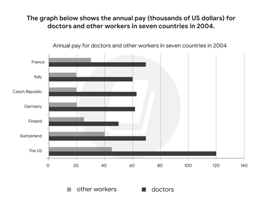
The bar chart illustrates the yearly pay of doctors compared to other professions in seven different nations in 2004.

Overall, it can be seen that the annual salary of doctors was higher than that of other workers over the period. In addition, the pay of US doctors was the highest among the seven nations.

In terms of the yearly salary of doctors, the US ranked the first with a considerable $120,000 USD per year, followed by France and Switzerland where doctors earned $70,000. In 2004, doctors in Italy, Czech Republic and Germany earned around $60,000 annually, higher than the figure for Finland by $10,000.

Regarding the salaries for other workers, the US still topped the list with approximately $50,000, while the figures for Switzerland and France were $40,000 and $30,000 respectively. The lowest annual pay for other workers were Italy, Germany and the Czech Republic, at exactly $20,000, lower than that of Finland by nearly $10,000.

Word Count: 156

Answers On The Same Topic:

The chart below shows the annual pay (thousands of US dollars) for doctors and other workers in seven countries in 2004. Summarise the information by selecting and reporting the main features, and make comparisons where relevant.

The graph shows the yearly pay for medical practitioners and other workers in the US and six European countries in 2004. Overall, in all countries pay for doctors more than other jobs, and the US pay highest salary for both doctors and other workers. Doctor’s lowest salary in Finland and other workers’ in Germany. The […]

The chart below shows the annual pay (thousands of US dollars) for doctors and other workers in seven countries in 2004. Summarise the information by selecting and reporting the main features, and make comparisons where relevant.

The bar chart illustrates how the occupational earnings for doctors and other workers varied across seven nations in 2004. Overall, physicians consistently commanded higher salaries than other professionals in all countries surveyed. The United States topped the list for both doctors and other workers in terms of annual income. Doctors’ annual salaries exhibited a wide […]

The chart below shows the annual pay (thousands of US dollars) for doctors and other workers in seven countries in 2004. Summarise the information by selecting and reporting the main features, and make comparisons where relevant.

The bar chart below gives information about the salary of doctors and other workers received per year from 7 distinct countries in the year of 2004. In general, The US holds the biggest pay for doctors, in contrast to Italy, Czech Republic, Germany all of which hit a low of payment for other workers. Noticeably, […]

The chart below shows the annual pay (thousands of US dollars) for doctors and other workers in seven countries in 2004. Summarise the information by selecting and reporting the main features, and make comparisons where relevant.

The chart given illustrates the annual salary earned by doctors and other careers in seven different nations in the year 2004. Overall, it is clear that the annual wage for doctors was much higher than for other occupations. Moreover, the biggest amount of money paid for doctors and other jobs was recorded in the US. […]

The chart below shows the annual pay (thousands of US dollars) for doctors and other workers in seven countries in 2004. Summarise the information by selecting and reporting the main features, and make comparisons where relevant.

he bar chart gives information about the yearly salaries of doctors compared to other professions across various countries in 2004. Overall, the US was the top payer for both doctors and other workers, while salaries in Italy, the Czech Republic, and Germany were relatively similar. Additionally, doctors received significantly higher annual pay than people doing […]

See All

Other Topics:

You should spend 20 minutes on this task. The chart below shows the percentage of people accessing news media via different media in one country in 2013, 2015, and 2017. Summarise the information by selecting and reporting the main features, and make comparisions where relevant. Write at least 150 words.

The bar chart compares how the figures for accessing news via four different media forms (TV, Newspapers, Radio and Internet) changed between 2013 and 2017. Overall, it is clear that the volume of all media access experienced downward trends with the exception of internet with the rate of it presenting the most noticeable growth. Of […]

Describe the bar chart below. + Use the past tense when you describe events in the charts. The ONLY sentence with the present tense is your introduction: The bar charts describe

This bar chart provides information about the quantity of young people with first-hand knowledge of corruption in different years. All figures are measured in percentages. In general, the most noticeable trend was in the 2018, when the every indicator grew significantly, in every aspect of life. In contrast with the lowest level of corruption, which […]

The chat below shows population category from 2006 to 2018.

The bar chart illustrates changes in three population categories between 2006 and 2018. Overall, the green category experienced the most significant growth over the period, eventually becoming the largest group in 2018, whereas the blue category fluctuated before rising again. In contrast, the red category showed relatively minor changes throughout the years. In 2006, the […]

The chart below shows the percentage of the population in the UK who consumed the recommended daily fruits and vegtables in 2002, 2006 and 2010.

The bar graph shows the percentage of the population in the UK who consumed the suggested daily quantity of fresh produce in 2002, 2006, and 2010. Overall, women consistently recorded higher proportions than men and children. All groups reached their peak in 2006. Children increased slightly before declining slightly in 2010. In 2002, children recorded […]

The chart below shows the percentage of the population in the UK who consumed the recommended daily fruits and vegtables in 2002, 2006 and 2010.

The bar graph shows the percentage of the population in the UK who used the suggested daily quantity of fresh produce in 2002, 2006 and 2010 Overall, women consistently recorded higher proportions than men and children. All groups reached their peak in 2006. Children increased slightly before declining slightly in 2010. In 2002, children recorded […]

The bar chart below describes the gross domestic spending on research and development in five countries between 2001 and 2011. Summarise the information by selecting and reporting the main features, and make comparisons where relevant.

The bar chart illustrates the research and progress in different countries from 2001 to 2011, due to spending from gross domestic. Overall, the graph shows the declined in Spain and flactuation in four other countries. While the USA shows the highest income in the overall graph. First of all, China has the GDP percentage under […]

See All
We have detected unusual activity on your device.
Please verify your identity to continue.
Note: This verification step won't sign you in. If you have a premium account, please log in to access the service as usual.
Google/Gmail Verification
Or verify using Email/Code
We've sent a verification code to:
youremail@gmail.com (Not your email?)
Enter it below to complete the verification process.
Ensure your email address is correct, your inbox is not full, and you check your spam folder. If no email arrives, consider using an alternative email.
You will need a Premium plan to perform your action!
Note: If you already have a premium account, please log in to access our services as usual.

Plans & Pricing

Our mission is to make quality education accessible for everyone.
However, to keep our hardworking team running and this service alive, we genuinely need your support!
By opting for a premium plan, not only do you sustain us in achieving the mission, but you also unlock advanced features to enrich your learning experience.

Free

For learners who aren't pressed for time

What's included on Free
100+ Cambridge IELTS Tests
Instant IELTS Writing Task 1 & 2 Evaluation (2 times/month)
Instant IELTS Speaking Part 1, 2, & 3 Evaluation (5 times/month)
Instant IELTS Writing Task 1 & 2 Essay Generator (2 times/month)
500+ Dictation & Shadowing Exercises
100+ Pronunciation Exercises
Flashcards
Other Advanced Tools

Premium

For those serious about advancing their English proficiency, and for IELTS candidates aspiring to boost their band score by 1-2 points (especially in writing & speaking) in just 30 days or less

What's included on Premium
Save Your IELTS Test Progress
Unlock All Courses & IELTS Tests
Unlimited AI Conversations
Unlimited AI Writing Enhancement Exercises
Unlimited IELTS Writing Task 1 & 2 Evaluation
Unlimited IELTS Speaking Part 1, 2, & 3 Evaluation
Checked Answers Will Not Be Published
Unlimited IELTS Writing Task 1 & 2 Essay Generator
Unlimited IELTS Speaking Part 1, 2, & 3 Sample Generator
Unlimited Usage Of Advanced Tools
Priority Support within 24h (12-month plan only)

Due to the nature of our service and the provided free trials, payments are non-refundable.
Nếu bạn là người Việt Nam và không có hoặc không muốn trả bằng credit/debit cards, bạn có thể thanh toán bằng phương thức chuyển khoản:


Chọn gói:
419,000₫ 277,000 ₫ cho gói 1 tháng (chỉ 9,233₫/ngày)
1,239,000₫ 597,000 ₫ cho gói 3 tháng (chỉ 6,633₫/ngày)
2,469,000₫ 1,027,000 ₫ cho gói 6 tháng (chỉ 5,706₫/ngày)
4,929,000₫ 1,417,000 ₫ cho gói 12 tháng (chỉ 3,936₫/ngày)


Sau khi chuyển khoản, vui lòng đợi trình duyệt tự động điều hướng bạn trở lại Engnovate và bạn sẽ ngay lập tức nhận được mã kích hoạt tài khoản premium.
Nếu có lỗi xảy ra, bạn có thể liên hệ với team thông qua một trong các phương thức: email đến helloengnovate@gmail.com hoặc nhắn tin qua facebook.com/engnovate.
Vì toàn bộ công cụ trên website đều có thể sử dụng thử miễn phí, Engnovate không hỗ trợ hoàn tiền.