🔥 Today Only: Save 30% on Premium — Offer Ends Soon! - Upgrade Now!
Bar Chart

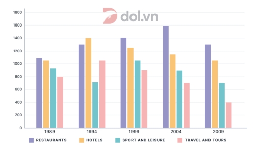
Band 5+: The chart below shows the number of jobs in tourism-related industries in on UK city between 1989 and 2009. (

Image for topic: The chart below shows the number of jobs in tourism-related industries in on UK city between 1989 and 2009. (
Our system will evaluate the answer based on this AI-generated description.
The image shows a bar chart with four categories tracked across five years: 1989, 1994, 1999, 2004, 2009. The categories are Restaurants, Hotels, Sport and Leisure, and Travel and Tours. In 1989, Restaurants had a value of approximately 700, Hotels around 600, Sport and Leisure near 500, and Travel and Tours close to 400. In 1994, Restaurants increased to roughly 800, Hotels to about 700, Sport and Leisure to around 900, and Travel and Tours to approximately 850. In 1999, Restaurants reached 1000, Hotels 1100, Sport and Leisure 1400, and Travel and Tours 1200. In 2004, Restaurants had a value of nearly 800, Hotels around 1400, Sport and Leisure close to 1600, and Travel and Tours approximately 1200. Lastly, in 2009, Restaurants were at about 600, Hotels close to 1600, Sport and Leisure near 1500, and Travel and Tours around 1400.
Given the complexity of the image, the above description may not be entirely accurate.
Note: Both the topic and the answer were created by one of our users.

The bar chart provides information regarding amount of tourism-related jobs in city of the UK between the period of 1989 and 2009.

Overall, restaurants have shown the biggest figures throughout the whole period, whereas the reverse was true for travel and tours. Additionally hotel and restaurants witnessed a notable incerase, whereas the reversed trend was true for other two categories.

To begin with, hospitality industry was responsible for approximately 1100 job spaces. The figure experienced a dramatic growth, peaking at all-time high 1500 by 2004. A rise was followed by slight drop to nearly 1250 by 2009. Similarly, hotels provided almost 100 workspaces in 1989. The figure grew to roughly 1400 by 1994, but then saw a mild fall to initial values by 2009.

To continue, sports and leisure category fluctuated between approximately 1200 and 700 jobs, finishing with 700 workspaces by the end of the span. Travel and tours followed this fluctuating trend, dropping from nearly 800 to 400 jobs by the end of the period.

Word Count: 167

Answers On The Same Topic:

The chart below shows the number of jobs in tourism-related industries in on UK city between 1989 and 2009. (

The bar chart gives information about the number of jobs in four different tourism-related industries in a city in the UK from 1989 to 2009. Overall, restaurants and housing generally experienced upward trends, while travel and tours declined significantly. Noticeably, the number of jobs in restaurants was mostly the highest throughout the period shown, while […]

The chart below shows the number of jobs in tourism-related industries in on UK city between 1989 and 2009. (

The bar graph compares the count of employees in four tourism-related occupations namely Restaurants, Hotels, Sport and Leisure, and Travel and Tours in a UK city from 1989 to 2009. Overall, the most prominent feature upon looking at the bar graph is that while the employment figures for the four tourism-related sectors experienced various fluctuations, […]

The chart below shows the number of jobs in tourism-related industries in on UK city between 1989 and 2009. (

The bar chart illustrates the number of jobs in 4 tourism-related industries (restaurants, hotels, sport and leisure, travel and tours) in city of UK from 1989 to 2009. Overall, the jobs of restaurants and hotels were higher than others tourism sectors all over the period. The travel and tours and sport and leisure were fluctuated […]

The chart below shows the number of jobs in tourism-related industries in on UK city between 1989 and 2009. (

The bar chart illustrates the number of tourism-related jobs in a specific city in the United Kingdom over the course of 20 years, starting from 1989. Overall, there was an upward trend in the amount of employment generated by the tourism-related Restaurants industry, as opposed to the data for Sport and leisure, as well as […]

The chart below shows the number of jobs in tourism-related industries in on UK city between 1989 and 2009. (

the bar chart illustrates the number of jobs in four tourism-related sectors-restaurants,hotels,sports and leisure , and travel and tours-in a UK city over a 20 year period from 1989to2009. Overall,employment in the tourism industry experienced flutuations,with restaurants concictently employing the highest number of people .in contrast, travel and tours remained the smallest sector throudhout the […]

See All

Other Topics:

The bar chart below shows figures of annual coffee and meat consumption.

The bar chart depicts the consumption of coffee and meat anually in 7 developed countries. It can be clearly seen from the chart that meat consumption is the highest among 7 countries, while coffee is the lowest. USA occupies the top rank of meat consumption by 122 kilograms per person. Furthermore, the consumption of meat […]

The graph shows the percentage of males aged 16-25 in a particular country who prefer watching sports to males who prefer participating in sports. Summarise the information by selecting and reporting the main features and make comparisons where relevant.

The diagram depicts the preferences of males aged 16-25 concerning viewing versus participating in various sports. It is evident that the proportion of males preferring watching is larger than that of spectators, whereas fishing stands out as a notable exception with the participation rate far surpassing the viewership. Another notable pattern is that football as […]

The graph below shows the sales of 5 types of items in four different seasons in a US department store in 2011.

The graph illustrates which kinds of goods were sold in winter, spring, summer, and autumn in a US department store in 2011. Units are measured in US dollars. Overall, the sales of women’s clothes were dominant throughout. While the figures for cosmetics and jewellery were relatively lower in winter and spring compared to those for […]

The graphs below show four categories of citrus fruits and the top three countries to which these were exported (in thousand tonnes) in 2012. Summarise the information by describing the main features of the charts and making comparisons where appropriate.

The charts demonstrate the four categories of citrus fruits – oranges, lemons, grapefruits, and other type and the top three countries to which these were exported in thousand tonnes in 2012. Overall, South Africa exported the greatest amount of oranges, while Turkey was the leading destination for lemons and grapefruits . In contrast , Mexico […]

The chart below shows the number of Asian elephants between 1997 and 2004.

The bar graph compares the number of elephants in Asian countries in two years-1997 and 2004. Overall, the number of India elephants was the highest throughout while the opposite was true for the figure for China elephants. The number of elephants in most Asian nations in 1997 was the higher than that in 2004 expect […]

The chart below shows the amount spent on six consumer goods in four European countries. Write a report for a university lecturer describing the information shown below. Spending in Thousand Pound Sterling.

The given chart reveals the amount of money spent on six types of consumer goods in each of the four countries. Overall, It is clear that British people spent significantly more money than people in the other three countries on all six goods. Of the six items, consumers spent the most money on photographic film. […]

See All
We have detected unusual activity on your device.
Please verify your identity to continue.
Note: This verification step won't sign you in. If you have a premium account, please log in to access the service as usual.
Google/Gmail Verification
Or verify using Email/Code
We've sent a verification code to:
youremail@gmail.com (Not your email?)
Enter it below to complete the verification process.
Ensure your email address is correct, your inbox is not full, and you check your spam folder. If no email arrives, consider using an alternative email.
You will need a Premium plan to perform your action!
Note: If you already have a premium account, please log in to access our services as usual.

Plans & Pricing

Our mission is to make quality education accessible for everyone.
However, to keep our hardworking team running and this service alive, we genuinely need your support!
By opting for a premium plan, not only do you sustain us in achieving the mission, but you also unlock advanced features to enrich your learning experience.

Free

For learners who aren't pressed for time

What's included on Free
100+ Cambridge IELTS Tests
Instant IELTS Writing Task 1 & 2 Evaluation (2 times/month)
Instant IELTS Speaking Part 1, 2, & 3 Evaluation (2 times/month)
Instant IELTS Writing Task 1 & 2 Essay Generator (2 times/month)
500+ Dictation & Shadowing Exercises
100+ Pronunciation Exercises
Flashcards
Other Advanced Tools

Premium

For those serious about advancing their English proficiency, and for IELTS candidates aspiring to boost their band score by 1-2 points (especially in writing & speaking) in just 30 days or less

What's included on Premium
Save Your IELTS Test Progress & Analyze Mistakes By Question Type
Save Your Own Flashcard Sets & Use Them On Any Device
Unlock All Courses, IELTS Tests, Section & Part Practice
Unlimited AI Conversations
Unlimited AI Writing Enhancement Exercises
Unlimited IELTS Writing Task 1 & 2 Evaluation
Unlimited IELTS Speaking Part 1, 2, & 3 Evaluation
Checked Answers Will Not Be Published
Unlimited IELTS Writing Task 1 & 2 Essay Generator
Unlimited IELTS Speaking Part 1, 2, & 3 Sample Generator
Unlimited Usage Of Advanced Tools & AI Features
Priority Support within 24h (12-month plan only)

Due to the nature of our service and the provided free trials, payments are non-refundable.