🔥 Today Only: Save 30% on Premium — Offer Ends Soon! - Upgrade Now!
Line Graph

Band 5+: The chart below shows the percentage of Australian people who were born in different places of the world. Summarise the information by selecting and reporting the main features, and make comparisons where relevant.

Image for topic: The chart below shows the percentage of Australian people who were born in different places of the world. Summarise the information by selecting and reporting the main features, and make comparisons where relevant.
Our system will evaluate the answer based on this AI-generated description.
The image presents a line graph detailing the percentage of Australian-born individuals originating from various global regions between 1976 and 2011. In 1976, the Total was approximately 23%, UK was around 14%, Other was about 8%, and Asia was roughly 0%. By 1981, these figures were roughly 23% Total, about 13% UK, approximately 9% Other, barely 1% Asia. In 1986, percentages were around 24% Total, 12% UK, nearly 10% Other, slightly above 1% Asia. In 1991, Total was approximately 25%, UK was around 11%, Other roughly 11%, Asia nearly 2%. For 1996, Total remained near 25%, around 10% UK, about 12% Other, 3% Asia. By 2001, Total was around 26%, UK was near 8%, Other roughly 13%, Asia slightly below 4%. In 2006, Total was about 27%, UK at nearly 7%, Other at approximately 14%, Asia slightly above 5%. Finally, in 2011, Total reached about 28%, UK stayed around 6%, Other roughly 16%, with Asia just under 7%.
Given the complexity of the image, the above description may not be entirely accurate.
Note: Both the topic and the answer were created by one of our users.

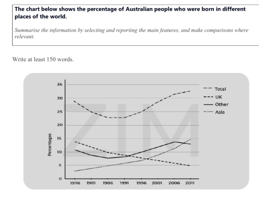
The line chart illustrates the rates of Australian people who were born in different places of the world between 1976 and 2011. Overall people who were born in total countries had the highest rate through the period, while UK seem drop over a year. People who born in other and Asia countries showed a consistent upward trend.

In 1976, slightly to 30% of people who born in total places. Thereafter this figure seem dramaticly decrease in 1986 constant to 1991 near 25%. Although in 2011 the Total rose it’s peak of around 35%. In contrast UK percentage decrease steadily from a lower than 15% in 1976 and hit its lowest rate to 5% in 2011.

Meanwhile the data of people who were born in other counties has around 11% in 1976 but there is a minor decrease in 1986 about 8% then reach it’s peak in 2006 slightly to 15%, thereafter there was a slight dip in 2011. Subsquently Asia had the lowest data, beginning at around 3% in 1976 but the rate begun to increased steadily through the period and reach it’s peak to 15% in 2011.

Word Count: 188

Answers On The Same Topic:

The chart below shows the percentage of Australian people who were born in different places of the world. Summarise the information by selecting and reporting the main features, and make comparisons where relevant.

The line graph depicts the percentage of Australian people who were born in various areas of the entire world, from 1976 to 2011. Overall, throughout the period, a decline in the birth rate of Australian people was seen only in the UK. In other areas, however, it saw an increase with some trend changes. A […]

The chart below shows the percentage of Australian people who were born in different places of the world. Summarise the information by selecting and reporting the main features, and make comparisons where relevant.

The line graph illustrates the percentage of people living in Australia who were born in various parts of the world. Overall,it can be seen that, while all of the given regions presented simillar mild flactuation,the highest was reached by all parts of the world. Initially, in 1976 the percentage of individuals who born in Asia […]

The chart below shows the percentage of Australian people who were born in different places of the world. Summarise the information by selecting and reporting the main features, and make comparisons where relevant.

The graph illustrates the proportions of Australian residents who were born in different regions of the world between 1976 and 2011. In general, it is clear that the number of Australians born overseas rose steadily over the period. Although, the percentage from the UK declined, while in Asia and other countries showed growth. In detail, […]

The chart below shows the percentage of Australian people who were born in different places of the world. Summarise the information by selecting and reporting the main features, and make comparisons where relevant.

The given line graph illustrates the proportion of Australian individuals who were born in various part of the world-Total, UK,Other and Asia from 1976 to 2011. Overall, it is clear that the percentage of born in total and other part of the country increased to varying degrees over the period shown.While this figure for Asia […]

See All

Other Topics:

The line graph illustrates the amount of spreads consumed from 1981 to 2007, in grams

The line graph illustrates changes in the amount of three types of spreads consumption – margarine, reduced – fat reduced spreads, and butter – between 1981 and 2007. Overall, all the figures showed a downward trend over the given period. It is also clear that although the consumption of butter was the highest at first, […]

The line graph shows the change in population of 5 countries from 1800 to 2020.

The given line graph provides data regarding 5 countries’ change in population between 1800 and 2020. Overall, what stands out from the graph is that there was a significant increase in population of China ad India, whereas the population of United States, Indonesia and Brazil saw a considerable upward trend too, but they had far […]

The graph shows average annual expenditures on cell phone and residential phone services between 2001 and 2010. Summarize the information by selecting and reporting the main features, and make comparisons where relevant.

The given chart illustrates the anual money spending tendecy on services of cell phones, marked with the red line and residential phones, represented in green, from 2001 to 2010. For starters, in the first analized year it is clearly visible that the difference between residential and cell phones services si almost 500 dollers. Residential phones […]

the graph below gives information on the number of participants for different activities at one social centre.

The line graph demonstrate the information on the number of people participating in different activities at a particular social centre in two cities from 2000 to 2020. Overall, the graph reflects the participants of the people from the year 2000 to 2020, where it can be clearly visible that people are more likely to involve […]

The graph below shows the percentage of people in one country who accessed the news from four sources between 1995 and the present, with projections to 2025.

The line graph provides information about the proportion of citizens in a country who using several media such as TV, Radio, Newspaper, and Internet for accessed news between 1995 and 2020, with predictions for 2025. Units are measured in percentage. Overall, the percentage of people who used radio and newspaper generally decrease within the period, […]

The graph below shows the percentage of electricity generated from different sources in the world from 1987 to 2019.

The given figure illustrates the electricity percentage produced by various resources between the years of 1987 and 2019. Among these 7 sectors, only 2 of them, red and purple, could increase their percentage at the end of the period, while the rest of them have declined in their production. The purple line stayed constant in […]

See All
We have detected unusual activity on your device.
Please verify your identity to continue.
Note: This verification step won't sign you in. If you have a premium account, please log in to access the service as usual.
Google/Gmail Verification
Or verify using Email/Code
We've sent a verification code to:
youremail@gmail.com (Not your email?)
Enter it below to complete the verification process.
Ensure your email address is correct, your inbox is not full, and you check your spam folder. If no email arrives, consider using an alternative email.
You will need a Premium plan to perform your action!
Note: If you already have a premium account, please log in to access our services as usual.

Plans & Pricing

Our mission is to make quality education accessible for everyone.
However, to keep our hardworking team running and this service alive, we genuinely need your support!
By opting for a premium plan, not only do you sustain us in achieving the mission, but you also unlock advanced features to enrich your learning experience.

Free

For learners who aren't pressed for time

What's included on Free
100+ Cambridge IELTS Tests
Instant IELTS Writing Task 1 & 2 Evaluation (2 times/month)
Instant IELTS Speaking Part 1, 2, & 3 Evaluation (5 times/month)
Instant IELTS Writing Task 1 & 2 Essay Generator (2 times/month)
500+ Dictation & Shadowing Exercises
100+ Pronunciation Exercises
Flashcards
Other Advanced Tools

Premium

For those serious about advancing their English proficiency, and for IELTS candidates aspiring to boost their band score by 1-2 points (especially in writing & speaking) in just 30 days or less

What's included on Premium
Save Your IELTS Test Progress
Unlock All Courses & IELTS Tests
Unlimited AI Conversations
Unlimited AI Writing Enhancement Exercises
Unlimited IELTS Writing Task 1 & 2 Evaluation
Unlimited IELTS Speaking Part 1, 2, & 3 Evaluation
Checked Answers Will Not Be Published
Unlimited IELTS Writing Task 1 & 2 Essay Generator
Unlimited IELTS Speaking Part 1, 2, & 3 Sample Generator
Unlimited Usage Of Advanced Tools
Priority Support within 24h (12-month plan only)

Due to the nature of our service and the provided free trials, payments are non-refundable.
Nếu bạn là người Việt Nam và không có hoặc không muốn trả bằng credit/debit cards, bạn có thể thanh toán bằng phương thức chuyển khoản:


Chọn gói:
419,000₫ 277,000 ₫ cho gói 1 tháng (chỉ 9,233₫/ngày)
1,239,000₫ 597,000 ₫ cho gói 3 tháng (chỉ 6,633₫/ngày)
2,469,000₫ 1,027,000 ₫ cho gói 6 tháng (chỉ 5,706₫/ngày)
4,929,000₫ 1,417,000 ₫ cho gói 12 tháng (chỉ 3,936₫/ngày)


Sau khi chuyển khoản, vui lòng đợi trình duyệt tự động điều hướng bạn trở lại Engnovate và bạn sẽ ngay lập tức nhận được mã kích hoạt tài khoản premium.
Nếu có lỗi xảy ra, bạn có thể liên hệ với team thông qua một trong các phương thức: email đến helloengnovate@gmail.com hoặc nhắn tin qua facebook.com/engnovate.
Vì toàn bộ công cụ trên website đều có thể sử dụng thử miễn phí, Engnovate không hỗ trợ hoàn tiền.