🔥 Today Only: Save 30% on Premium — Offer Ends Soon! - Upgrade Now!
Line Graph

Band 7+: The line graph shows the change in population of 5 countries from 1800 to 2020.

Image for topic: The line graph shows the change in population of 5 countries from 1800 to 2020.
Our system will evaluate the answer based on this AI-generated description.
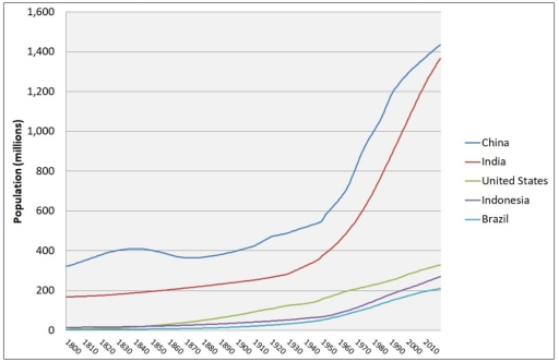
The image displays a line graph representing population in millions from 1800 to 2010 for five countries. The vertical axis, Population (millions), scales from 0 to 1,600, while the horizontal axis indicates years in 10-year increments. The approximate data points for each country are: China (in millions) 1800:320, 1810:350, 1820:380, 1830:400, 1840:410, 1850:410, 1860:380, 1870:360, 1880:370, 1890:380, 1900:400, 1910:420, 1920:470, 1930:500, 1940:520, 1950:560, 1960:650, 1970:820, 1980:980, 1990:1150, 2000:1280, 2010:1420; India (in millions) 1800:160, 1810:170, 1820:175, 1830:180, 1840:190, 1850:200, 1860:210, 1870:220, 1880:230, 1890:240, 1900:250, 1910:260, 1920:270, 1930:300, 1940:350, 1950:400, 1960:500, 1970:600, 1980:750, 1990:920, 2000:1100, 2010:1350; United States (in millions) 1800:5, 1810:7, 1820:10, 1830:13, 1840:17, 1850:23, 1860:31, 1870:40, 1880:50, 1890:63, 1900:76, 1910:92, 1920:106, 1930:123, 1940:132, 1950:151, 1960:179, 1970:203, 1980:227, 1990:250, 2000:282, 2010:310; Indonesia (in millions) 1800:10, 1810:12, 1820:15, 1830:18, 1840:22, 1850:26, 1860:30, 1870:35, 1880:40, 1890:45, 1900:50, 1910:55, 1920:60, 1930:65, 1940:70, 1950:80, 1960:95, 1970:120, 1980:150, 1990:180, 2000:210, 2010:240; Brazil (in millions) 1800:3, 1810:4, 1820:5, 1830:6, 1840:7, 1850:8, 1860:9, 1870:10, 1880:12, 1890:15, 1900:18, 1910:22, 1920:27, 1930:34, 1940:41, 1950:54, 1960:72, 1970:96, 1980:121, 1990:150, 2000:175, 2010:200.
Given the complexity of the image, the above description may not be entirely accurate.
Note: Both the topic and the answer were created by one of our users.

The given line graph provides data regarding 5 countries’ change in population between 1800 and 2020.

Overall, what stands out from the graph is that there was a significant increase in population of China ad India, whereas the population of United States, Indonesia and Brazil saw a considerable upward trend too, but they had far fewer numbers of people compared to China and India, by the end of the period. Looking at the details, as regards China, the number of residents started at around 350 million and then it rose steadily to about 600 million from 1800 to 1950. After that it increased sharply to just above 1.4 billion in 70 years. With respect to India, the situation of this country was similar to China. The population of India was just under 200 million at the start of the timeline. Following a similar gradual rise to China, India’s population then surged to about 1.4 billion, which was roughly 50 million lower compared to the population of China.

By contrast, the United States, Indonesia and Brazil, they had around 5-10 million in 1800. Over 220-year period, the population of these countries experienced a considerable growth to about 300 million people. Among these countries, the United States recorder the highest figure at 350 million, while Indonesia and Brazil did not have more than 250 million. Despite growing significantly, the population of the United States, Indonesia and Brazil remained below those of China and India.

Word Count: 242

Answers On The Same Topic:

The line graph shows the change in population of 5 countries from 1800 to 2020.

The illustration displays the difference between different countries’ populations. Overall China and India had the best results among the mentioned candidates, whereas Indonesia, Brazil and The United States had almost the same number. It is hard to point out where is Indonasia’s and Brazil’s statistics just because they were roughly the same. According to this […]

The line graph shows the change in population of 5 countries from 1800 to 2020.

The illustrationg displays the difference between different countries’ population. Overall China and India had the best results among the mentioned candidates, whereas Indonesia, Brazil and The United States had almost the same number. It is hard to point out where is Indonasia’s and Brazil’s statistics is just because they were roughly the same. According to […]

The line graph shows the change in population of 5 countries from 1800 to 2020.

The line graph compares population changes in five countries – China, India, the United States, Indonesia, and Brazil – over a 220-year period between 1800 and 2020. Overall, all five countries experienced population growth throughout the period, but the increases in China and India were far more rapid and substantial than in the other three […]

The line graph shows the change in population of 5 countries from 1800 to 2020.

The line graph compares the amount of changing in a citizens in five nations such as China, India,United state,Indonesia,Brazil in 1800 and 2010. overall, china reamained the largest population throughout the period,while Brazil was consistently the smallest.Notably, india saw the second figure ,whereas Unied state and Indonesia experienced a increase slightly. in 1800, china approximately […]

See All

Other Topics:

Changes in the amount of fast food consumption by Australian teenagers

The graph provides information on changes in the amount of fast food consumption by Australian teenagers. Overall, from my point of view, the consumption of three types of fast food, like pizza and hamburgers, increased, and fish & chips decreased from 1975 to 2000. From 1975 to 1980, pizza consumption grew approximately 18%. In the […]

Changes in the amount of fast food consumption by Australian teenagers

The graph provides tne information changes in the amount of fast food consumption by Australian teenagers. Overall from my point of view three type of fast food like Pizza and Hamburgers increasaed and Fish & Chips decreased from 1975 to 2000. Pizza number of grams 1975 to 1980 approximately 18% grow this five year Pizza […]

The line graph and pie chart below show information on crime in the UK for the last year. Summarise the information by selecting and reporting the main features, and make comparisons where relevant. You should write at least 150 words.

The following data analyzes the line graph and pie chart depicted the information happned crimes in the UK in last year. The line graph illustrates the crimes happaned in UK the highest rate of the crime the ages of 16 to 20 and the ages of 56 to 60 the ratio declined, however the ages […]

The graph below shows the number of library books read by boys and girls at Starmouth School from 2006 to the present. Summarize the information by selecting and reporting the main features, and make comparisons where relevant.

The chart illustrates the number of library books read by boys and girls at Starmouth School from 2006 to the present. Overall, the boys had a general upward trend at the beginning and decreased minimally at the end. Besides that, the girls increased dramatically over the period. In 2009, the girls read about 25 books. […]

The graph below shows average carbon dioxide (CO2) emissions per person in the Uk, sweden, portugal and italy

The line graph demonstrates the average carbon footprint per individual in the United Kingdom, Sweden, Italy and Portugal in 1967 to 2007. Overview, United Kingdom was releasing CO2 most over the years but after a decade, emission got decreased as year passed. Whereas Portugal was ejecting CO2 gas comparatively low than other countries. Initially, Portugal […]

The graph below shows the number of international tourists visiting three different regions (Asia, Europe, and America) between 2000 and 2020. Summarize the information by selecting and reporting the main features, and make comparisons where relevant.

In this graph we can observe the fluctuations between the years 2000 and 2020 in international tourism over three different regions, them being Asia, Europe and America. It is noticeable that the number of international tourists in america has grown significantly, going from less than a hundred million vistors at the start of the century, […]

See All
We have detected unusual activity on your device.
Please verify your identity to continue.
Note: This verification step won't sign you in. If you have a premium account, please log in to access the service as usual.
Google/Gmail Verification
Or verify using Email/Code
We've sent a verification code to:
youremail@gmail.com (Not your email?)
Enter it below to complete the verification process.
Ensure your email address is correct, your inbox is not full, and you check your spam folder. If no email arrives, consider using an alternative email.
You will need a Premium plan to perform your action!
Note: If you already have a premium account, please log in to access our services as usual.

Plans & Pricing

Our mission is to make quality education accessible for everyone.
However, to keep our hardworking team running and this service alive, we genuinely need your support!
By opting for a premium plan, not only do you sustain us in achieving the mission, but you also unlock advanced features to enrich your learning experience.

Free

For learners who aren't pressed for time

What's included on Free
100+ Cambridge IELTS Tests
Instant IELTS Writing Task 1 & 2 Evaluation (2 times/month)
Instant IELTS Speaking Part 1, 2, & 3 Evaluation (5 times/month)
Instant IELTS Writing Task 1 & 2 Essay Generator (2 times/month)
500+ Dictation & Shadowing Exercises
100+ Pronunciation Exercises
Flashcards
Other Advanced Tools

Premium

For those serious about advancing their English proficiency, and for IELTS candidates aspiring to boost their band score by 1-2 points (especially in writing & speaking) in just 30 days or less

What's included on Premium
Save Your IELTS Test Progress
Unlock All Courses & IELTS Tests
Unlimited AI Conversations
Unlimited AI Writing Enhancement Exercises
Unlimited IELTS Writing Task 1 & 2 Evaluation
Unlimited IELTS Speaking Part 1, 2, & 3 Evaluation
Checked Answers Will Not Be Published
Unlimited IELTS Writing Task 1 & 2 Essay Generator
Unlimited IELTS Speaking Part 1, 2, & 3 Sample Generator
Unlimited Usage Of Advanced Tools
Priority Support within 24h (12-month plan only)

Due to the nature of our service and the provided free trials, payments are non-refundable.
Nếu bạn là người Việt Nam và không có hoặc không muốn trả bằng credit/debit cards, bạn có thể thanh toán bằng phương thức chuyển khoản:


Chọn gói:
419,000₫ 277,000 ₫ cho gói 1 tháng (chỉ 9,233₫/ngày)
1,239,000₫ 597,000 ₫ cho gói 3 tháng (chỉ 6,633₫/ngày)
2,469,000₫ 1,027,000 ₫ cho gói 6 tháng (chỉ 5,706₫/ngày)
4,929,000₫ 1,417,000 ₫ cho gói 12 tháng (chỉ 3,936₫/ngày)


Sau khi chuyển khoản, vui lòng đợi trình duyệt tự động điều hướng bạn trở lại Engnovate và bạn sẽ ngay lập tức nhận được mã kích hoạt tài khoản premium.
Nếu có lỗi xảy ra, bạn có thể liên hệ với team thông qua một trong các phương thức: email đến helloengnovate@gmail.com hoặc nhắn tin qua facebook.com/engnovate.
Vì toàn bộ công cụ trên website đều có thể sử dụng thử miễn phí, Engnovate không hỗ trợ hoàn tiền.