24 Hours Only: Get 39% OFF on Our Premium Plan - Check Out Now!
Line Graph

Band 8+: The line graph shows the change in population of 5 countries from 1800 to 2020.

Image for topic: The line graph shows the change in population of 5 countries from 1800 to 2020.
Our system will evaluate the answer based on this AI-generated description.
The image displays a line graph representing population in millions from 1800 to 2010 for five countries. The vertical axis, Population (millions), scales from 0 to 1,600, while the horizontal axis indicates years in 10-year increments. The approximate data points for each country are: China (in millions) 1800:320, 1810:350, 1820:380, 1830:400, 1840:410, 1850:410, 1860:380, 1870:360, 1880:370, 1890:380, 1900:400, 1910:420, 1920:470, 1930:500, 1940:520, 1950:560, 1960:650, 1970:820, 1980:980, 1990:1150, 2000:1280, 2010:1420; India (in millions) 1800:160, 1810:170, 1820:175, 1830:180, 1840:190, 1850:200, 1860:210, 1870:220, 1880:230, 1890:240, 1900:250, 1910:260, 1920:270, 1930:300, 1940:350, 1950:400, 1960:500, 1970:600, 1980:750, 1990:920, 2000:1100, 2010:1350; United States (in millions) 1800:5, 1810:7, 1820:10, 1830:13, 1840:17, 1850:23, 1860:31, 1870:40, 1880:50, 1890:63, 1900:76, 1910:92, 1920:106, 1930:123, 1940:132, 1950:151, 1960:179, 1970:203, 1980:227, 1990:250, 2000:282, 2010:310; Indonesia (in millions) 1800:10, 1810:12, 1820:15, 1830:18, 1840:22, 1850:26, 1860:30, 1870:35, 1880:40, 1890:45, 1900:50, 1910:55, 1920:60, 1930:65, 1940:70, 1950:80, 1960:95, 1970:120, 1980:150, 1990:180, 2000:210, 2010:240; Brazil (in millions) 1800:3, 1810:4, 1820:5, 1830:6, 1840:7, 1850:8, 1860:9, 1870:10, 1880:12, 1890:15, 1900:18, 1910:22, 1920:27, 1930:34, 1940:41, 1950:54, 1960:72, 1970:96, 1980:121, 1990:150, 2000:175, 2010:200.
Given the complexity of the image, the above description may not be entirely accurate.
Note: Both the topic and the answer were created by one of our users.

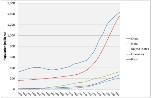
The line graph compares population changes in five countries – China, India, the United States, Indonesia, and Brazil – over a 220-year period between 1800 and 2020.

Overall, all five countries experienced population growth throughout the period, but the increases in China and India were far more rapid and substantial than in the other three countries, particularly from the mid-20th century onwards.

In 1800, China had the largest population at just over 300 million, while India’s population stood at around 180 million. Both countries saw relatively modest growth during the 19th century, reaching approximately 400 million and 300 million respectively by around 1900. However, after 1950, their populations surged dramatically, with China climbing to about 1.44 billion and India rising to roughly 1.38 billion by 2020, making them by far the most populous nations on the graph.

By contrast, population growth in the United States, Indonesia, and Brazil followed a slower and steadier pattern. The US population began to rise more noticeably after 1860, increasing from around 50 million to about 130 million by 1940, before accelerating to slightly over 300 million by 2020. Meanwhile, both Indonesia and Brazil remained below 100 million until around 1960, after which their populations expanded rapidly to approximately 280 million and 210 million respectively by the end of the period.

Word Count: 216

Answers On The Same Topic:

The line graph shows the change in population of 5 countries from 1800 to 2020.

The line graph compares the amount of changing in a citizens in five nations such as China, India,United state,Indonesia,Brazil in 1800 and 2010. overall, china reamained the largest population throughout the period,while Brazil was consistently the smallest.Notably, india saw the second figure ,whereas Unied state and Indonesia experienced a increase slightly. in 1800, china approximately […]

The line graph shows the change in population of 5 countries from 1800 to 2020.

The given line graph illustares information about the change in population of 5 countries such as China, India, United States, Indonesia, and Brazil over a period between 1800 and 2010. Overall, the data highlight notable differences and developments across the categories presented. Broadly speaking, it is evident that China and India experienced the greatest change, […]

The line graph shows the change in population of 5 countries from 1800 to 2020.

The chart illustrates how population in 5 different nations changed in last two centuries. Overall,both China and India experienced dramatic increase,China having largest number in two centuries.In comparison other three didn’t grow up much,having the same picture for all three in the entire time period. In the start,China had the biggest population with 400 million […]

The line graph shows the change in population of 5 countries from 1800 to 2020.

The line graph illustrates how the populations of 5 countries (China, India, the United States, Indonesia and Brazil) have changed over a 220 year period, from 1800 to 2020. Overall, all countries have experienced a rise in population, though the change has been the most dramatic for China and India. Looking first at the data […]

See All

Other Topics:

The graph shows the percentage of travel by four different types of transport in one country between 1985 and 2015.

The line graph illustrates changes in the percentage of travel by four different means of transport in one country from 1985 to 2015. Overall, while the proportion of trips by car increased dramatically, the opposite trend was observed in bus and other modes, except for rail where the figure remained unchanged. Notably, car demonstrated the […]

The chart below shows the percentage of households in four different countries that had internet access between 1999 and 2009

The line graph illustrates the percentage of households with internet access in four different nations over a ten-year period from 1999 to 2009. Overall, it is evident that internet access increased in all four countries over the period. While all countries started at relatively low levels, they experienced steady growth and reached their highest figures […]

There is a line graph illustrating the figures of cars in three regions in the UK

There is a line graph illustrating the figures of cars in three regions in the UK between 1998 and 2008. Overall, it is obvious that the UK mainland was a region which maintained a dominant number during this period. In addition, these three regions only had a slight change in the number of cars from […]

The line graphs show the percentage of people using public transport and people using private cars in five cities of Australia from 2000 to 2010

The line graphs show the percentage of people using public transport and people using private cars in five cities of Australia over 10 years from 2000 to 2010. Overall, it is evident that private car usage increased significantly over 10 years in Sydney, Perth, Adelaide, Canberra, and Melbourne. The five cities in Australia consistently showed […]

The line graph below shows active daily users on Facebook in three different countries. Summarize the information by selecting and reporting the main features, and make comparisons where relevant.

This grapgh illustrates the number of users in three different countries vietnam,cambodia and Thailand from 2007 to 2014. Users are measured in millions. overall, it is clear that in the beginning, Thailand had highest users while, Vietnam had seened lowest. Approximately in 2007, Thailand had 25 million users and it significantly decreased to around 5 […]

Comparative Analysis of Solar Power Consumption in Four Countries (1995-2015)

The portrayed line diagram illustrates the trends in the total use of power from the sun in the USA, Germany, Japan and China from the year 1995 to 2015. At a first glance, it is clear that America and China’s use of solar power increased significantly over the entire time period shown. In stark contrast, […]

See All
We have detected unusual activity on your device.
Please verify your identity to continue.
Note: This verification step won't sign you in. If you have a premium account, please log in to access the service as usual.
Google/Gmail Verification
Or verify using Email/Code
We've sent a verification code to:
youremail@gmail.com (Not your email?)
Enter it below to complete the verification process.
Ensure your email address is correct, your inbox is not full, and you check your spam folder. If no email arrives, consider using an alternative email.
You will need a Premium plan to perform your action!
Note: If you already have a premium account, please log in to access our services as usual.

Plans & Pricing

Our mission is to make quality education accessible and free for everyone.
However, to keep our hardworking team running and this service alive, we genuinely need your support!
By opting for a premium plan, not only do you sustain us in achieving the mission, but you also unlock advanced features to enrich your learning experience.

Free

For learners who aren't pressed for time

What's included on Free
1000+ IELTS Tests & Samples
Instant IELTS Writing Task 1 & 2 Evaluation (2 times/month)
Instant IELTS Speaking Part 1, 2, & 3 Evaluation (5 times/month)
Instant IELTS Writing Task 1 & 2 Essay Generator (2 times/month)
500+ Dictation & Shadowing Exercises
100+ Pronunciation Exercises
Flashcards
Other Advanced Tools

Premium

For those serious about advancing their English proficiency, and for IELTS candidates aspiring to boost their band score by 1-2 points (especially in writing & speaking) in just 30 days or less

What's included on Premium
Save Your IELTS Test Progress
Unlock All Courses & Content
Unlimited AI Conversations
Unlimited AI Writing Enhancement Exercises
Unlimited IELTS Writing Task 1 & 2 Evaluation
Unlimited IELTS Speaking Part 1, 2, & 3 Evaluation
Checked Answers Will Not Be Published
Unlimited IELTS Writing Task 1 & 2 Essay Generator
Unlimited IELTS Speaking Part 1, 2, & 3 Sample Generator
Unlimited Usage Of Advanced Tools

Due to the nature of our service and the provided free trials, payments are non-refundable.
Nếu bạn là người Việt Nam và không có hoặc không muốn trả bằng credit/debit cards, bạn có thể thanh toán bằng phương thức chuyển khoản:


Chọn gói:
279,000₫ 157,000 ₫ cho gói 1 tháng (chỉ 5,233₫/ngày)
819,000₫ 397,000 ₫ cho gói 3 tháng (chỉ 4,411₫/ngày)
1,649,000₫ 667,000 ₫ cho gói 6 tháng (chỉ 3,706₫/ngày)
3,299,000₫ 857,000 ₫ cho gói 12 tháng (chỉ 2,381₫/ngày)


Sau khi chuyển khoản, vui lòng đợi trình duyệt tự động điều hướng bạn trở lại Engnovate và bạn sẽ ngay lập tức nhận được mã kích hoạt tài khoản premium.
Nếu có lỗi xảy ra, bạn có thể liên hệ với team thông qua một trong các phương thức: email đến helloengnovate@gmail.com hoặc nhắn tin qua facebook.com/engnovate.
Vì toàn bộ công cụ trên website đều có thể sử dụng thử miễn phí, Engnovate không hỗ trợ hoàn tiền.