🔥 Today Only: Save 30% on Premium — Offer Ends Soon! - Upgrade Now!
Bar Chart

Band 7+: The chart below shows the percentage of people accessing news via different media in one country in 2013, 2015 and 2017. Summate the informa in te seeting and reporting the main features,

Image for topic: The chart below shows the percentage of people accessing news via different media in one country in 2013, 2015 and 2017. Summate the informa in te seeting and reporting the main features,
Our system will evaluate the answer based on this AI-generated description.
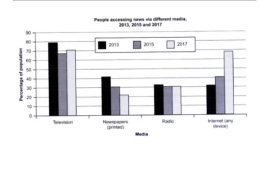
The image displays a bar graph titled "People accessing news via different media, 2013, 2015 and 2017" with the y-axis representing "Percentage of population" ranging from 0 to 90 in increments of 10, and the x-axis denotes "Media" divided into "Television," "Newspapers (printed)," "Radio," and "Internet (any device)." Each media category contains three bars corresponding to the years 2013, 2015, and 2017. In 2013, Television has the highest percentage at approximately 85, Newspapers follows with roughly 35, Radio is near 25, and Internet usage is around 30. In 2015, Television sees a slight decrease to just under 85, Newspapers drop to nearly 25, Radio remains constant at about 25, and Internet use increases to approximately 40. In 2017, Television decreases further to around 82, Newspapers continue to fall to about 18, Radio stays steady at 25, and Internet usage surges to around 70.
Given the complexity of the image, the above description may not be entirely accurate.
Note: Both the topic and the answer were created by one of our users.

The bar chart provides data about the proportion of people who accessed news in one country between 2013 and 2017. Overall, despite a minor decline, Television remained dominant throughout the period. Of particular note is that, despite being one of the lowest trends at the beginning, Internet has grown significantly, becoming the second most popular news source in 2017.

In terms of the most significant features of the bar graph, in 2015, the share of Television stood at 79%. After dipping slightly to approximately 67% in 2015, the graph grew to 71% in the final year. In contrast, Internet news usage more than doubled in 5 years, with 32% and 41% in 2013 and 2015 respectively; then, the figure surged to 68% in 2017.

Concerning Newspapers along with Radio facilities, the former less than halved in the given period. Starting with 42% in 2015, the trend fell to 30% in 2015, then finished with 22%. As regards Radio usage, it showed a minor drop. After decreasing from 32% to 30% in 2015, the proportion of this category remained stable until the end of the given span.

Word Count: 186

Answers On The Same Topic:

The chart below shows the percentage of people accessing news via different media in one country in 2013, 2015 and 2017. Summate the informa in te seeting and reporting the main features,

Overall, while television consistently remained the leading source of news despite a decline in popularity, the Internet rapidly overtook other media types and nearly rivaled television by 2017; meanwhile, both radio and printed newspapers experienced a decline, albeit to varying degrees, over the period. Focusing first on media with declines in popularity, printed newspapers saw […]

The chart below shows the percentage of people accessing news via different media in one country in 2013, 2015 and 2017. Summate the informa in te seeting and reporting the main features,

The bar chart illustrates the proportion of people accessing news through four different media – television, printed newspapers, radio, and the Internet – in a particular country in 2013, 2015, and 2017. Overall, it is clear that television remained the most popular source of news throughout the period, while the Internet experienced a dramatic increase […]

The chart below shows the percentage of people accessing news via different media in one country in 2013, 2015 and 2017. Summate the informa in te seeting and reporting the main features,

The bar chart compares the percentage of people who listen news via four ways in a country between 2018 and 2017. Overall, the highest percentage of people who accessing news by television , while by printed newspapers accessing news was lowest in the given years. In terms of accessing news, in 2013,by watching television 80% […]

The chart below shows the percentage of people accessing news via different media in one country in 2013, 2015 and 2017. Summate the informa in te seeting and reporting the main features,

The given line chart examines data about the USA in terms of the percentage of people who accessed news from 2013 to 2015. From an overall perspective, all figures experienced a downward trend, with the exception of pattern for internet. Of particular note is internet, which was true in reverse position to TV in question, […]

The chart below shows the percentage of people accessing news via different media in one country in 2013, 2015 and 2017. Summate the informa in te seeting and reporting the main features,

The chart depicts the proportion of individuals in a particular country who obtained news via television, newspapers, radio, and the internet in the years 2013, 2015, and 2017. Overall, television remained the most popular source of news, although its use had declined slightly. Meanwhile, internet use increased significantly, reaching the same level of popularity as […]

See All

Other Topics:

Writing task 1 The chart below shows the percentages of time Australian mothers and fathers spent helping their children with four activities at home in 2013. Summarise the information by selecting and reporting the main features, and make comparisons where relevant.

The bar illustrates the percentages of time mothers and fathers in Australia spent helping their children with four domestic activities in 2013. Overall mothers spend much more time helping with dressing and homework whereas fathers spent the highest percentage of time playing games and preparing for beds with their children. Initially the activities which both […]

The bar chart below shows figures of annual coffee and meat consumption.

The bar chart illustrates data about how much coffee and meat are consumed by seven different countries. Overall, seven countries show higher amount of meat consumption where the U.S. shown the highest of all. By contrast, coffee consumption recorded a lower figure. In terms of meats, the United Stated of America recorded the highest consumption […]

the chart below shows the avarage minutes per day that men and women spend on household activities.

The bar chart illustrates the amount of time males and females spend on household activities. Overall, while the amount of time on women activities involved in preparing food, cleaning and laundry is higher, that of men in garden care and repair work is considerable higher than the opposite gender. In addition females spend more time […]

You should spend 20 minutes on this task. The chart below shows the percentage of people accessing news media via different media in one country in 2013, 2015, and 2017. Summarise the information by selecting and reporting the main features, and make comparisions where relevant. Write at least 150 words.

The three varieties of bar charts illustrate the years that individuals stay up to date with the news from alternative media in a single country. Overall, by analyzing the bar charts, the television remained as the priority source of news for the whole community throughout the years. Continuously, the internet also experienced a dramatic growth, […]

You are given a stacked bar chart that displays quarterly sales by product category. Analyse the sales trends accross different quarters and compare the performance of product categories

The stacked bar graph compares the number of total sales in four quarters of three different products A, B and, C , in the year 2020. Overall, it is clear that product A had the highest sales in 3rd quarter, while in the fourth quarter product B had mojority of sales as compared to product […]

the chart shows information about the actual and expected figures of population in three cities

The bar chart illustrates the populations of three cities in 1990, and their predicted and actual figures for 2000. Overall, population of three cities increased over the period. Sao Paulo recorded the largest population, while Jakarta had the smallest population throughout the period. In addition, the actual number of population exceeded the predicted number in […]

See All
We have detected unusual activity on your device.
Please verify your identity to continue.
Note: This verification step won't sign you in. If you have a premium account, please log in to access the service as usual.
Google/Gmail Verification
Or verify using Email/Code
We've sent a verification code to:
youremail@gmail.com (Not your email?)
Enter it below to complete the verification process.
Ensure your email address is correct, your inbox is not full, and you check your spam folder. If no email arrives, consider using an alternative email.
You will need a Premium plan to perform your action!
Note: If you already have a premium account, please log in to access our services as usual.

Plans & Pricing

Our mission is to make quality education accessible for everyone.
However, to keep our hardworking team running and this service alive, we genuinely need your support!
By opting for a premium plan, not only do you sustain us in achieving the mission, but you also unlock advanced features to enrich your learning experience.

Free

For learners who aren't pressed for time

What's included on Free
100+ Cambridge IELTS Tests
Instant IELTS Writing Task 1 & 2 Evaluation (2 times/month)
Instant IELTS Speaking Part 1, 2, & 3 Evaluation (2 times/month)
Instant IELTS Writing Task 1 & 2 Essay Generator (2 times/month)
500+ Dictation & Shadowing Exercises
100+ Pronunciation Exercises
Flashcards
Other Advanced Tools

Premium

For those serious about advancing their English proficiency, and for IELTS candidates aspiring to boost their band score by 1-2 points (especially in writing & speaking) in just 30 days or less

What's included on Premium
Save Your IELTS Test Progress & Analyze Mistakes By Question Type
Save Your Own Flashcard Sets & Use Them On Any Device
Unlock All Courses, IELTS Tests, Section & Part Practice
Unlimited AI Conversations
Unlimited AI Writing Enhancement Exercises
Unlimited IELTS Writing Task 1 & 2 Evaluation
Unlimited IELTS Speaking Part 1, 2, & 3 Evaluation
Checked Answers Will Not Be Published
Unlimited IELTS Writing Task 1 & 2 Essay Generator
Unlimited IELTS Speaking Part 1, 2, & 3 Sample Generator
Unlimited Usage Of Advanced Tools & AI Features
Priority Support within 24h (12-month plan only)

Due to the nature of our service and the provided free trials, payments are non-refundable.