🔥 Today Only: Save 30% on Premium — Offer Ends Soon! - Upgrade Now!
Bar Chart

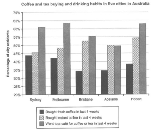
Band 8+: The chart below shows the results survey about people’s coffee and tea buying and drinking habits in five Australian cities.

Image for topic: The chart below shows the results survey about people’s coffee and tea buying and drinking habits in five Australian cities.
Our system will evaluate the answer based on this AI-generated description.
The image shows a bar graph comparing coffee and tea buying and drinking habits in five Australian cities: Sydney, Melbourne, Brisbane, Adelaide, and Hobart. The y-axis represents the percentage of city residents, ranging from 0% to 70%. Each city has three bars representing the percentage of residents who bought fresh coffee, bought instant coffee, or went to a café for coffee or tea in the last four weeks. In Sydney, around 65% bought fresh coffee, 50% bought instant coffee, and 60% went to a café. In Melbourne, approximately 55% bought fresh coffee, 45% bought instant coffee, and 55% went to a café. Brisbane had around 50% for fresh coffee, 42% for instant coffee, and 38% for café visits. In Adelaide, about 45% bought fresh coffee, 38% bought instant coffee, and 40% went to a café. Lastly, Hobart had nearly 60% for fresh coffee, 40% for instant coffee, and 50% for café visits.
Given the complexity of the image, the above description may not be entirely accurate.
Note: Both the topic and the answer were created by one of our users.

The bar graph displays the data collected in a survey about the coffee and tea buying and drinking habits of residents in five cities in Australia in the last four weeks.

Overall, in all the cities except Adelaide, more people went to a cafe for coffee or tea than bought instant or fresh coffee. In Adelaide, going to a cafe and buying instant coffee were almost equally common.

Most residents in Melbourne, Hobart, Sydney, and Brisbane visited a cafe for coffee or tea, at approximately 64%, 63%, 62%, and 55% respectively, whereas just under half of residents in Adelaide did so. These five cities also had roughly half of residents purchasing instant coffee, and the figures in Hobart and Brisbane were almost 55%.

In comparison, the proportion of people who bought fresh coffee was never as high as 45% in any of the five cities, with those in Brisbane and Adelaide, both at nearly 35%, less likely than those in the other three cities to do so.

Word Count: 167

Answers On The Same Topic:

The chart below shows the results survey about people’s coffee and tea buying and drinking habits in five Australian cities.

The bar graph displays the data collected in a survey about the coffee and tea buying and drinking habits of residents in five cities in Australia in the last four weeks. Overall, in all the cities except Adelaide, more people went to a cafe for coffee or tea than bought instant or fresh coffee. In […]

The chart below shows the results survey about people’s coffee and tea buying and drinking habits in five Australian cities.

The bar graph provides information about the proportion of Australian citizens who bought tea and coffee with different drinking habits in the last 4 weeks in five cities. Overall, enjoying coffee or tea at a cafe reigns supreme in popularity while drinking fresh coffee is the least chosen option in all cities. When comparing between […]

The chart below shows the results survey about people’s coffee and tea buying and drinking habits in five Australian cities.

The provided bar chart presents data on the coffee and tea buying and drinking behaviors of residents in five major Australian cities, based on a recent survey. Overall, there was a notable preference for consuming coffee and tea at cafes in all cities except Adelaide, where instant coffee was favored. The least common habit across […]

The chart below shows the results survey about people’s coffee and tea buying and drinking habits in five Australian cities.

The bar chart provided illustrates the drinking and purchasing habits of citizens in five cities in Australia concerning coffee and tea, based on a recent survey. Overall, there was a significantly higher preference for consuming coffee and tea at coffeehouses in all cities except for Adelaide, where the majority preferred instant coffee. Moreover, the least […]

The chart below shows the results survey about people’s coffee and tea buying and drinking habits in five Australian cities.

The chart below compares the percentage of coffee and tea buying and drinking habits among Australian residents in five cities. It is clear that the majority of people went to a cafe for coffee or tea in the last four weeks in almost all cities. In addition, residents of all cities had the lowest tendency […]

See All

Other Topics:

The bar graphs shows the shares of expenditure in five categories

The bar chart depicts expenditures for five huge categories in four countries: the USA, Canada, the UK and Japan in 2009. Overall, generally all four countries had the highest percentage shares in first three categories ( food, housing and transportation), while those of health care and clothing were the lowest throughout the period. Starting with […]

the chart below shows the most visited museums in pakistan in 2024. summarise all the information in the chart below

The bar graph compares the most visited museums in Pakistan in 2024. Overall, the number of the visitors was highest in August while, June recorded the lowest number of visitors, in contrast July and September had the same figure. In June, 300 people visited the Maritime Museum, similarly 300 visitors visited the Maritime Museum in […]

The chart below shows the expenditure of two countries on customer goods in 2010.

The provided bar chart illustrates the amount of money France and the UK spent on consumer goods, such as cars, computers, books, perfume, and cameras in 2010. Units measured in pounds sterling. Overall, the UK spent more money on consumer goods than France in the period given. Both coutries spent most of money on cars. […]

The chart below shows how people travelled to work in three cities in 2023. Summarise the information by selecting and reporting the main features, and make comparisons where relevant.

The bar chart compares several transports which people used to commute in three different cities labelled as city A, B, C in 2023. Overall, cars were the main transport vehicle to travel to the work, while the reverse was true for on foot. Additionally, workers in city C used all four vehicles in balance. Focusing […]

The chart compares the average cost per kilogram of clothing imported by the European Union from six major source countries in 1997 and 2003. Summarise the information by selecting and reporting the main features, and make comparisons where relevant.

The given chart illustrates the average price per kilogram of clothing purchased by European Union from six different nations between 1997 and 2003. Overall, it is obvious that clothing imported from Argentina and Brazil were the most expensive throughout the period. Conversely, the cost of clothing from Asian countries witnessed significant growth, except for Japan […]

the graph below shows the amount of energy generated wind in four countries in the period 1980-2000

The bar chart illustrates changes in the amount of wind energy generated in India, Denmark, Germany and the United States between 1985 and 2000. Overall, wind energy generation was higher in all four countries at the end of the period than at the beginning. Although the United States was the largest producer initially, Denmark had […]

See All
We have detected unusual activity on your device.
Please verify your identity to continue.
Note: This verification step won't sign you in. If you have a premium account, please log in to access the service as usual.
Google/Gmail Verification
Or verify using Email/Code
We've sent a verification code to:
youremail@gmail.com (Not your email?)
Enter it below to complete the verification process.
Ensure your email address is correct, your inbox is not full, and you check your spam folder. If no email arrives, consider using an alternative email.
You will need a Premium plan to perform your action!
Note: If you already have a premium account, please log in to access our services as usual.

Plans & Pricing

Our mission is to make quality education accessible for everyone.
However, to keep our hardworking team running and this service alive, we genuinely need your support!
By opting for a premium plan, not only do you sustain us in achieving the mission, but you also unlock advanced features to enrich your learning experience.

Free

For learners who aren't pressed for time

What's included on Free
100+ Cambridge IELTS Tests
Instant IELTS Writing Task 1 & 2 Evaluation (2 times/month)
Instant IELTS Speaking Part 1, 2, & 3 Evaluation (2 times/month)
Instant IELTS Writing Task 1 & 2 Essay Generator (2 times/month)
500+ Dictation & Shadowing Exercises
100+ Pronunciation Exercises
Flashcards
Other Advanced Tools

Premium

For those serious about advancing their English proficiency, and for IELTS candidates aspiring to boost their band score by 1-2 points (especially in writing & speaking) in just 30 days or less

What's included on Premium
Save Your IELTS Test Progress & Analyze Mistakes By Question Type
Save Your Own Flashcard Sets & Use Them On Any Device
Unlock All Courses, IELTS Tests, Section & Part Practice
Unlimited AI Conversations
Unlimited AI Writing Enhancement Exercises
Unlimited IELTS Writing Task 1 & 2 Evaluation
Unlimited IELTS Speaking Part 1, 2, & 3 Evaluation
Checked Answers Will Not Be Published
Unlimited IELTS Writing Task 1 & 2 Essay Generator
Unlimited IELTS Speaking Part 1, 2, & 3 Sample Generator
Unlimited Usage Of Advanced Tools & AI Features
Priority Support within 24h (12-month plan only)

Due to the nature of our service and the provided free trials, payments are non-refundable.